Category Archives: Design

Hyphens, ellipses, and word counts

TexasBarToday_TopTen_Badge_Small

According to reliable style manuals (I’ve cited four at the bottom of this post), writers should use the en dash, not the hyphen, for number spans.

  • With a hyphen (wrong): 343-44
  • With an en dash (right): 343–44

I don’t know if you can see the difference, but the en dash, the correct mark, is longer than the hyphen. Although I agree with the rule, I’ve recently learned something that could affect your choice of horizontal mark.

  • With a hyphen, Microsoft Word counts this as one word: 343-44
  • With an en dash, it counts it as two: 343–44

You get a 50% savings with the hyphen. In a lengthy brief subject to a word count, you could save some words by using the hyphen.

But wait. There’s more.

Do you know the difference between the ellipsis symbol (…) and the Bluebook ellipsis (. . .), which is just three periods with spaces? For example:

  • Bluebook: The court . . . concluded
  • Ellipsis symbol: The court … concluded

In Typography for Lawyers (cited below), Matthew Butterick recommends the ellipsis symbol. You probably never gave it much thought, but check the word counts:

  • With periods and spaces, Word counts this as six words: The court . . . concluded
  • With the ellipsis symbol, it counts it as four: The court … concluded

You save two words every time you use the symbol instead of periods and spaces.

A former student alerted me to these two strange word-count anomalies and said, “On my last brief to the Seventh Circuit, these two tips cut off close to 200 words, and I ended up 119 words under the limit.”

_____

  • Bryan A. Garner, The Redbook: A Manual on Legal Style § 8.13 (3d ed. 2013).
  • Joan Ames Magat, The Lawyer’s Editing Manual 43 (2008)
  • Chicago Manual of Style § 6.78 (16th ed. 2010)
  • Matthew Butterick, Typography for Lawyers 49, 53-54 (2010)

Headings, part 1: Kinds, Typefaces, and Placement

TexasBarToday_TopTen_Badge_Small

Nearly every legal document can benefit from clear, consistent headings. The guidelines here are particularly useful for memos, motions, and briefs. In part 1, I describe two kinds of headings, give typeface advice, and offer suggestions for placement and alignment. I’ll discuss two kinds of headings: topic headings and explanatory headings.

Topic Headings
I use the name topic heading for single-word or short-phrase headings that identify topics, like Argument, Discussion, and Statement of Facts. Because a topic heading isn’t a complete sentence, it doesn’t take a period, and you typically capitalize each main word (Initial Caps). I use the mnemonic C-A-P to remember to capitalize everything but conjunctions, articles, and prepositions. The heading above this paragraph is a topic heading.

Topic headings should stand out from the body text, and here are three good options. (1) Use boldface. Yes, ALL-CAPITALS and underlining are common for topic headings, but if you follow modern typographic principles, you’ll avoid them: they can impede reading and are vestiges of the typewriter. (2) Make topic headings slightly larger than the body text by 1 or 2 points, then add boldface. (3) Use a contrasting font (my preference).

A contrasting font? Yes. If the body text is in a serifed font like Cambria, Garamond, or Century Schoolbook—and it probably should be—then topic headings in a sans-serif font like Calibri, Tahoma, or Verdana will really stand out.

Topic headings designate the major sections of a legal document. For example, in a motion for summary judgment, the topic headings might be Introduction, Statement of Facts, Motion Standard, Argument, and Relief Sought. Because of their nature and the way they’re displayed, they don’t require numbering.

Topic headings are often centered, but that’s not a rule; it’s merely a common convention. Knowing, as we do, that many readers will read memos, motions, and briefs on a screen, and knowing that screen readers have a top-left viewing preference and skim a lot, it makes sense to put topic headings on the left margin. That’s what I do.

Legal documents often use explanatory (point) headings.
I use the name explanatory heading (and point heading) for the full-sentence headings and sub-headings that break up a discussion or argument. The persuasive point headings in motions and briefs are the most common types of explanatory headings, but lawyers use non-persuasive explanatory headings, too. I used one above this paragraph.

If a heading is a complete sentence, and an explanatory heading generally should be, then it takes a period. If it’s a sentence, use sentence case, capitalizing only the first word. DON’T SHOUT AT THE READER WITH ALL-CAPITALS, and Avoid Using Initial Caps For Explanatory Headings Because It Looks Odd.

The best way to make explanatory headings stand out is to use the same (serifed) font as the body text but to emphasize it with boldface, bold italics, or italics. That gives you three outline levels beneath the topic headings. Generally, place the first-level explanatory heading on the left margin and indent each lower level one more tab length.

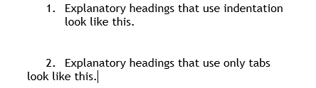
As you format explanatory headings, keep these tips in mind: (1) Avoid over-indenting. If you indent more than three tab lengths, you spoil the left-alignment screen readers and skimmers prefer. (2) Keep explanatory headings to three outline levels if possible. It simplifies things for the reader and helps prevent over-indenting. (3) Use indentation, not mere tabbing, so subsequent lines of text align with the first. Look at these examples.

Indent

Yours should look like number 1.

_____

To comment, email me.

Writing for screen readers

Today, many judges, lawyers, supervisors, and clients will read your writing on a screen instead of on paper. According to a book on the subject of on-screen legal writing, readers behave differently when reading on the screen as compared to reading on paper. Robert Dubose, Legal Writing for the Rewired Brain: Persuading Readers in a Paperless World (2010). Good legal writers know the tendencies of screen readers and write accordingly. In this column, I introduce some screen-reader traits and offer some suggestions.

Here are some tendencies we’re coming to understand about screen readers:

  • Screen readers get impatient, Dubose at 42, and tend to spend less time on a screen document than they would on a print document.
  • Screen readers skim a lot, Dubose at 39, perhaps even more than when reading a printed document.
  • Screen readers show a top-left preference: they focus more on text at the screen’s top and left and less on text at the bottom and right. The preference is called the F-pattern, Dubose at 37, because the screen reader’s eyes move in a pattern that resembles an uppercase F.

Given these tendencies, what should you do when writing for screen readers? The advice is not surprising and, frankly, would benefit print readers, too.

1. Be brief.
Accommodate screen readers’ brief attention with a brief document. Let me clarify: what I advocate here is really concision. Brief simply means shorter, and anything can be made shorter but cutting content. Concise means as short as possible while preserving content. Sure, some content deserves cutting. But don’t cut crucial content. Instead, preserve necessary content while using as few words as possible. Be concise.

2. Provide summaries.
At the top of the document, as early as the rules and conventions allow, summarize your main points or give the answer with reasons or state your request and support it—whatever the document calls for. In short, provide a substantive summary. I recommend a “substantive” summary rather than a mere roadmap (“Part A presents X; part B discusses Y.”) because the impatient screen reader wants the goods, not just a description of where the goods can be found. A substantive summary that doubles as a roadmap is even better. Do it by presenting the substantive points in the order they’ll appear in the document’s body.

You can also include a mini-summary for every major section of the document and even a single-sentence summary for every paragraph, or what we might call a “topic sentence.”

3. Use headings and subheadings.
Accommodate heavy skimming by making your documents easy to skim. Headings facilitate skimming. Use short, often single-word headings for the main sections of a document: Facts, Argument, Discussion, Analysis, and so on. Use short, sentence-type, explanatory headings for other parts. The headings in this column are examples of short, sentence-type, explanatory headings.

By rule or convention, some legal documents already require explanatory headings, like the assertive point headings in a motion or brief, though you shouldn’t let them get too long. But other documents can benefit from the skim-ability of explanatory headings: email, letters, CLE articles, newsletters, and more.

4. Left-align headings and make them stand out.
Given the top-left preference and the tendency toward skimming, aligning headings and subheadings on the left margin helps screen readers. Headings on the left margin are easy to skim. Centered headings are harder to skim. Centering your main section headings is harmless, but even they can be placed on the left margin. Never center explanatory headings.

To differentiate heading levels, apply a consistent numbering system, use contrasting typefaces (larger size, bold, italics), or indent each lower heading level one additional tab length. If you want to indent your headings, follow these tips:

  1. Use the indentation function—different from a mere tab—so each line of text aligns with first line, like this example.
  2. Don’t over-indent; if you indent three or more tab lengths, you’ll destroy the left alignment that eases skimming.

Ultimately, think about how you read on the screen. Write and layout your text in a way you’d like to read.

_____
If you’d like to comment on this or any post, please email me. I’ve had to disable comments because of excessive spam. Sorry.

Superscript ordinals

In legal writing, we don’t use superscript ordinals. In other words, we do this:

5th

not this:

5th

(Background: numbers that have the additional letters, like st, nd, rd, and th are called ordinals: 1st, 2nd, 3rd, and 4th. When you shrink the letters and elevate them, they’re called superscript ordinals: 1st, 2nd, 3rd, and 4th.)

So why do many legal documents use superscript ordinals? Because Microsoft Word comes with a default auto-correct setting that automatically converts ordinals to superscript ordinals.

But legal writers shouldn’t accept the Word default for ordinals. Turn it off. Here’s how:

Go to File > Options > Proofing

Click on the “AutoCorrect Options” button

Click on the “AutoFormat As You Type” tab

Uncheck the “Ordinals (1st) with superscript” box

Then:

Click on the “AutoFormat” tab

Uncheck the “Ordinals (1st) with superscript” box

That should do it.

I don’t consider superscript ordinals a glaring mistake. It’s a small distraction at worst. But it’s a symptom of a larger problem. Legal writers should not unthinkingly accept all Word defaults. Take control.