
The opinions herein reflect those of the author and in no way represent those of the Legislative Budget Board of Texas
When someone asks me what I do at the LBB, I jokingly describe my position as “graph-monkey”. But there’s a bit more to it than that: My internship at the LBB is creating interactive graphs with a piece of software called Tableau. Tableau lets you create data visualizations with a drag and drop graphical interface that is amazingly simple to use relative to how powerful it is. You could say that it’s what Apple’s operating system is to Linux. Or what Excel is to R. Or what SimCity is to German transit simulation games.[1]
This internship is only 10 weeks long, which is actually a perfect amount of time for learning the ins and outs of this software. It’s simple enough to get the hang of in a week or two, but complex enough that you’re still learning its more advanced uses as you go. You discover its limitations (each axis must be in a single unit of measurement, so no mixing percentages with integers), but you also discover how to cleverly trick it into doing the things you want (removing outlier distortion from map shading).
Oh, that’s right, you haven’t actually seen a Tableau graph so you have no idea what I’m talking about. Here you go.
As of the writing of this blog post, the LBB has put up a few graphs all dealing with population migration. Alas, I didn’t work on any of these, but they’re a great illustration of the advantages of interactive vs. static graphs. For example, click on the “population projections from 2010 to 2030”. The graphs by themselves contain a wealth of information, and the slider can show you variations on them over the course of 21 different years, so we’ve already got 21 graphs in one here.
But there’s more to it than that: What the interactivity adds to this population graph that couldn’t be replicated statically is the ability to see the entire population pyramid change over time. Clicking from one year to the next allows the user to actually see the year-by-year change as it happens in all categories. Try it, it’s fun!
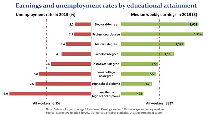
This actually ties into a fundamental part of designing infographics: when you compare units of information on a graph the effect of just displaying them side-by-side creates new information. For example, look at the graph at the top of this post: we have unemployment rates and earnings, we also have degrees attained. But when we combine both of these into a single chart, we see a completely new piece of information that wasn’t there before: the trend of more education=more earnings and lower unemployment.[2]
With interactivity this effect is compounded enormously: some interactive graphs can show information that would take literally hundreds of static graphs to display. And as far as the LBB graphs go, population migration is just the beginning; there are more on the way. You can be sure I will obnoxiously self-promote the ones I’ve worked on the minute they come out: at parties,[3] on Facebook,[4] over Twitter ,[5] you name it. You’ll have so much to look forward to by the time classes start up again!
[1] In Cities in Motion 2 you can not only build multiple rail, trolley, bus, ferry, and helicopter transit stops with varying passenger comfort levels, construct dozens of varieties of road and rail alignments that include things like bus lanes and paired tracks, purchase numerous styles of train cars and buses each with their own passenger limits and maintenance costs, issue capital improvement bonds, and set fares for passenger use and pay grades for your employees, but you can also dictate stop schedules on at the minute-by-minute basis over the course of a 168-hour week for each individual transportation line you have built.
At that point, why not just work for an actual transit authority?
[2] Not all trend information is useful, though. Some very funny examples of trend information being total garbage is http://www.tylervigen.com/, which depicts correlations between things like “Annual US Swimming Pool Drownings” and “Nicolas Cage Film Appearances”.
[3] “Hi, I’m Noah, have you seen my graph? Hi, I’m Noah, have you seen my graph? Hi, I’m Noah, have you seen my graph? Hi I’m Noah, have you. . ..”
[4] “I made an interactive graph. Just reminding you for the 20th day in a row! Here is a picture of a cat.”
[5] “@everyone check out this graph I made!!!1!1 #awesomepossum #data4eva #yolo”