
Cartography is pretty hot these days. Maps tap into our brains’ spatial reasoning abilities to make any public issue more immediate and understandable to wider audiences—and with the advent of open data and free tools, anyone with a computer can produce maps.
Clearly, the trend has particular consequences for policymaking, although the burden of proof is on the mapmaker to answer a crucial question: “can your map actually change anything?”
In my time with AidData, Innovations for Peace and Development, and most recently USAID’s Africa Bureau, this has been the recurring response to pretty maps explaining aid allocation or aid effectiveness, which usually follow the formula “aid-project-locations-overlaid-with-X”. The problem, I think, is that the purposes of maps are often conflated.
Some maps excel as decision-making tools; others make a data-intensive subject more accessible. Very rarely can they do both well. We need a better typology to distinguish the two functions, and it begins with understanding intended audiences.
Pretty maps found on the internet are consumer products. As demonstrated by three new data journalism sites, they assume a base-zero knowledge of complex topics and distill them to plain geography. (As I discovered with my summer project, internet maps move public communications towards engaging illustrations, and away from mundane talking points.) Yes, flashy maps frequently oversimplify and overpromise, but visually-compelling “clickbait” can draw the crowd into a viral gateway for further exploring the issue, and in some cases spur dialogue or activism.

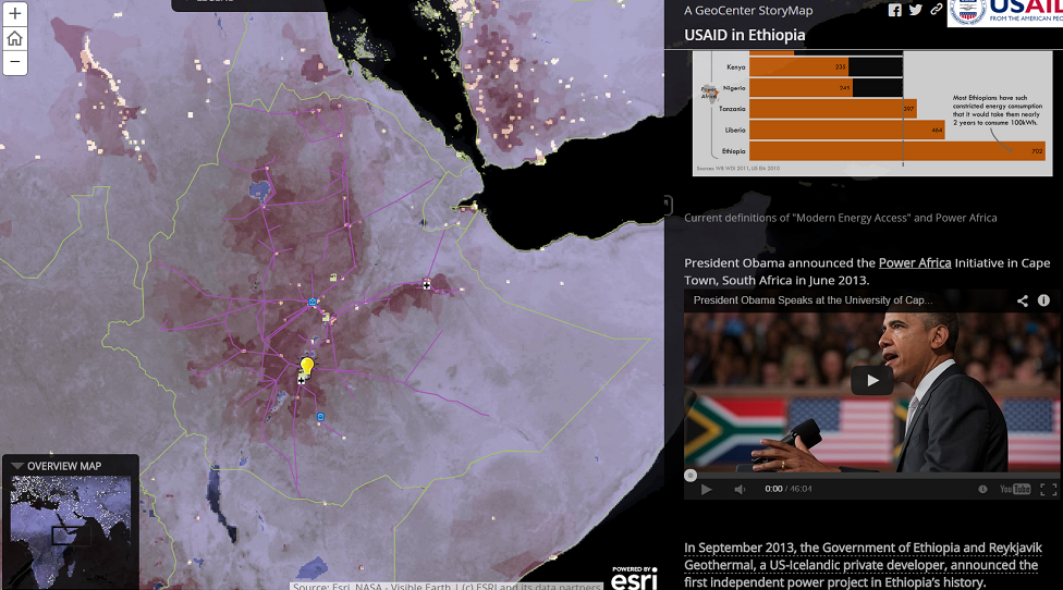
In my proof-of-concept map below, subnational data on Ethiopia population density (top) and electricity access (bottom) were overlaid with select USAID project locations. Illustrative graphics and Youtube videos showcasing each project were included in the sidebar to help the viewer understand USAID’s objectives in Ethiopia.

Screenshots of Author’s maps. Interactive release on USAID website forthcoming
Despite the rise in online mapping, I would still argue that most paper and electronic maps are decision-making tools first, and aesthetic objects second. Yet to make useful “industry products” in policy circles, you need to get those maps in the hands of decision-makers who actually have the power and expertise to set policy. In this sense, the number of technocrats who qualify as true decision-makers is very small, and perhaps inversely proportionate to the topic’s complexity.
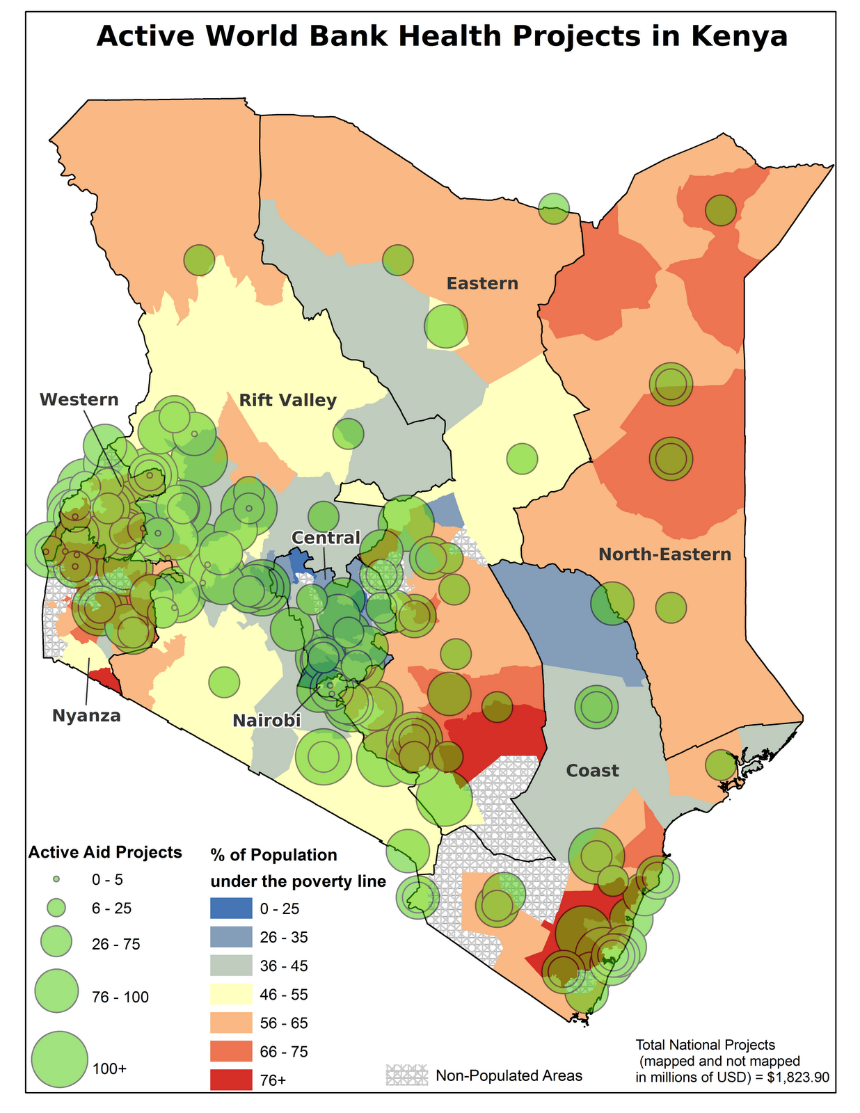
Take this groundbreaking map produced by AidData for the World Bank’s Mapping for Results initiative in 2010. Subnational data on poverty level are overlaid with locations of World Bank health projects, revealing that poor areas of the north and east were not receiving adequate funding. It raises more questions than answers—which is precisely the point.
Assuming the data are accurate and accessible (a weighty presumption to be explored in another blogpost), a World Bank employee could rationalize this apparently inequitable distribution with concepts such as budget cycle, centrally-managed funds, project lifespan, country ownership, international donor coordination, or the individual decisions of locally-based implementing partners. More than likely, this aid worker does not have the magic wand to correct aid distribution in Kenya. However, he or she can set allocation policies that better reflect subnational disparities. In the case of the World Bank in Kenya, it appears this map did not alter allocation decisions. A current search of active projects reveals no new health project locations in Kenya’s north or east.
The change-oriented mapmaker needs an understanding of a) who makes important decisions, b) how and when decisions happen, and c) how to incorporate this knowledge into the map design and distribution process.
Decision-making maps generally look a bit messier, with emphasis on exploratory detail and timeliness over aesthetics and background information. In development, great examples are this map of drought and famine vulnerability, or this map of USAID’s recent humanitarian assistance in northern Iraq. The truth is, many maps like these exist and are rarely made public. I fear social scientists producing maps know too little about who really wants to use these tools, and even less about the informal networks followed to find them.
Here, a Proposed Research Agenda for Mapmaking in Policy
- Before building another map, consider interpretation. What is the political and social framing used by a subject who views the policy-oriented map?
- Identify who makes the policy-relevant decision of interest, and what factors they consider important in the decision-making process
- Examine how information flows within the organization and target key network “nodes”, or info-distribution hubs
- If the map is intended to spur bottom-up social change, which map characteristics make it go viral in the context of Less Developed Countries or impoverished communities?
To make maps that actually empower change-makers, a new research overlay of network analysis, organizational culture, and graphic design would be worth exploring. Until then, we can stop knocking the simple and pretty maps for failing at what they weren’t designed to do.
One reply on “In Defense of Pretty Maps”
Great post! Never thought about maps and date this way before.