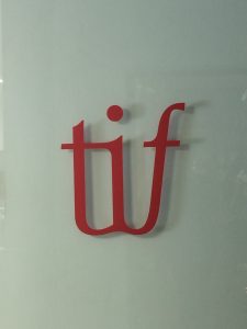
 The logo of TIF using ligatures.
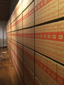 The printed sheet music cataloged.
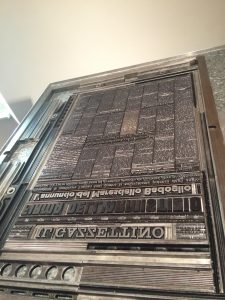 Example printing layout for mono and line type.
Our trip to Tipoteca Italiana fondazione introduced me to a type of business I was not aware existed. Walking in, I could feel the esteem of the place and the company. With the first few showrooms alone were rich in information. Researched and tried, there was a comfort in listening to the tour because they did not leave much room for skepticism. Everything seemed so incredibly thorough in understanding the processes of type and printing, but in also the explanation of those processes.With so much knowledge, it is impossible not to feel so fortunate to listen. Even better than that, Tipoteca Italiana fondazione opens their doors to the community and those who share a common interest. I am only newly entering the world of the design and researching about different companies, but I think this is the first non-school establishment to offer lesson and classes. A company that endorses learning so much that they offer classes to public people is immensely empowering to know opportunities to learn will still exist for life after college for people. This place in ways was my own version of “The Magic School” where you learn by doing and greatly mimicked the style of learning during the trip.