Today marked the bittersweet ending of our wonderful month abroad. For one of our final visits, we saw the Campari Gallery, a museum exhibition showcasing the history and art of a famous Italian liqueur company.
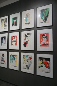
One of the most interesting things we saw was the unique form of advertisement that Campari executed in the 1900s. From music and film to prints and paintings, we saw a history of interdisciplinary advertising that often challenged norms and made Campari the company it is today. One billboard we dissected was named controversial because of the details of her hair color, which ring finger had a wedding ring, etc.
Campari also designed many different everyday objects with their branding to promote the company. There were subway handles, dog bowls, pianos, all fitting the same color scheme and logo that made Campari recognizable.
I loved seeing all the artwork and posters made to promote Campari, as they had so many creative graphic designs that showcased a variety of fonts and themes that created a strong identity for the brand.


It was my first time to visit the Gallerie Campari and I agree the tour and the collection were fantastic and inspiring.