The Italian Take Away

I call this the “Italian Take Away” because it is not the “Italian To Go” because each time I asked that in a restaurant I met a blank stare followed by a correction. To atone for my poor verbiage abroad the following is therefore the notions I Took Away from Milan (just like the pizza I wish I could have taken away). 

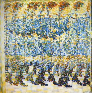
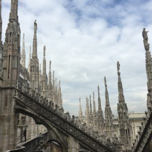
The morning after I arrived home from Italy, I sat on my couch at home and picked up a book. It was Fahrenheit 451, a popular book that most people have already read long ago. Stories of book burning, fast cars, and galleries of smashed windows were wrapped up in its pages. It struck me as a Futurist haven. This was the world they had envisioned, and it brought me back to talking about them on one of our first days atop the Duomo.

Talks + Views from the Duomo

After reading the Futurist’s manifestos and ideals, I was simply struck by how naïve such educated men could be. Burn the books, throw away the classical paintings, tear down the architecture. Start new. Go fast. (Most people in Fahrenheit 451 end up committing suicide in such a world and I don’t blame them). My distaste for them has only grown over my month spent in Europe. They wanted to destroy everything that I now hold so dear and close to my heart. Italy has changed me for the best, because of the history and stories written in its art, architecture, and most importantly to me: its design.

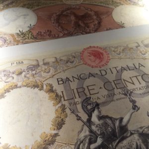
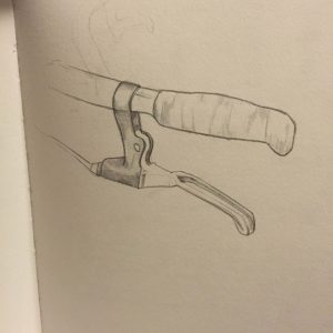
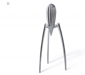
Italy is rich in Italian design history. When visiting Alessi we were greeted with story upon story of designers. The Bomb teapot, the alien lemon squeezer of Phillippe Starck, also combined with the new pop/affordable line. Absolutely everything has a story, as all designed objects do. The difference between American and Italy, is that Italy tries its best to archive and present this history.

The Phillipe Starck Juicy Salif
Alessi Collection, showcasing the old along with the new

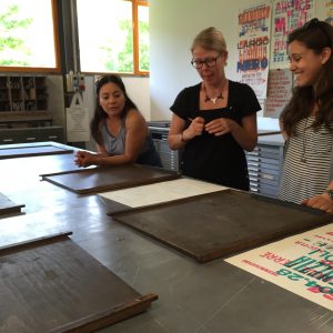
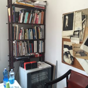
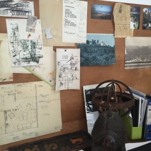
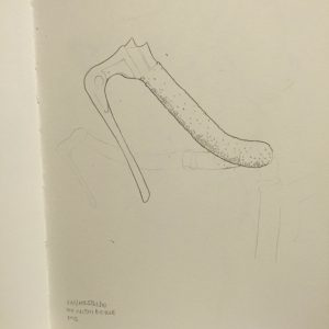
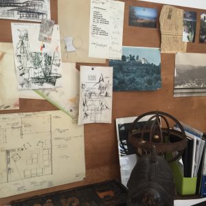
This was best demonstrated at the office of Vico Magistretti. His granddaughter is constantly archiving all of his works. It is a constant dedication to the works of the past, both his architectural and design ones. (Sidenote: The long work process also prompted me to be aware of my poor recording habits.) This was especially dicult as Vico shared most of his descriptions over the phone and often refused to draw.

Documented work of Vico's
Documented work of Vico’s

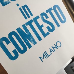
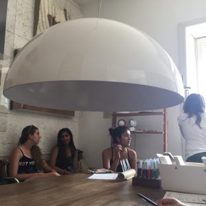
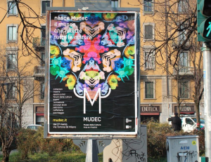
Yet, Italian design showed more than just its history; it showed its future. FM studio was one of the most influential visits of the trip. They are a graphic design studio that focuses on identity, art direction, exhibit design, digital, editorial, and wayfinding. They showed what interesting and important work there still is to do. Transforming museums, way finding at extravagant hotels, and the future of food to name a few. Our speaker also gave good advice on the ‘follow your strengths’ tail, which I am always an advocate of. He was also very pleased with the all female turnout, claiming we are the future of design (an idea I love to indulge in).

Kaleidoscope patterning done by FM Studio, showcasing their new approaches

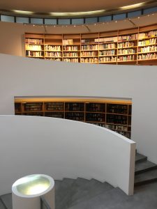
What struck me most about the design culture in Italy is that there was one. Museums (the Triennale) devoted just to the history and future of design. Expos that were proud of their design talent. When one says they are a designer they are asked what kind? This encourages to treat design just as importantly in America, not just a means to create a profit in the market place. Design is a way of thinking, and I am happy to bring home the all encompassing view Italy has now given me.

Treinnale Exhibit
Treinnale Exhibit

Dear Futurists, Thank you for failing. Love Bri


Week 5: Tipoteca

Tipoteca is an amazing type foundry tucked away in the heart of Treviso. They are dedicated to the preservation of the origins of type. Our guide showed us the history of linotype and monotype. We were even shown a video on the art of engraving music into sheets of metal. Each line was carved into the sheet, as each note and mark was stamped in. It seemed even more complex than setting type, as no mistake could be easily corrected.

Tipoteca's ligature
Tipoteca’s ligature

Upstairs there was a fantastic exhibit showing the complexities of printed items, namely money. All of the secret patterns and swirls were painstakingly done by hand. They were truly impossible to copy perfectly unless one were to have the original plate. Tiny stamps were also on display alongside beautiful flourishes and posters.

Printed money
Detail of money

We then got to play with our own type. Our poster making process included first, of course, the idea. We decided upon a poster that highlighted the names of the greats we have learned about during this trip (Castiglioni, Starck, Magistretti, etc) with Design in Contesto in blue. We chose this dark blue in accordance with a lighter green that would hopefully ‘pop’ against the dark. I’m happy the poster was composed of all cool colors as they matched well with the warmness of the yellow paper. We were able to use a wide array of beautiful typefaces and allowed to turn the wheel as we spun our prints out. It was a lovely refresher into the world of typography.

Working with the type/ideas at Tipoteca
The half-way product

Week 5: Fabrica

On our very last day, we visited a highly motivational space: Fabrica. Fabrica is a program/place founded in 1994 that offers a one-year scholarship for talented individuals (under 25) to enhance their design, visual communication, photography, interaction, video, music and journalism skills. It is a place that is midway between school and work.

We began the tour by standing in the grounds with a reflection pool adorned with columns. Our guide talked of the reunion they just had which they were very proud of. 378 past students returned to Fabrica from all corners of the earth. Here she (the guide) got to meet their families and/or hear of their accomplishments and new standings in the world/business field.

Fabrica Reflection Pool

Moving forward, we got to view the works of these talented students. We saw giant portraits of women who had once been disfigured by acid, not painted on acid on giant slabs of rusted metal. (Here is a link to the video showing the collaboration between Erik Ravel and Pakistani activist Iram Saaed: http://www.fabrica.it/facing/). We saw the sadly room where COLORS was once produced. Sadly it is not in print right now, yet their online presence is maintained. I am looking forward to finding/buying past copies of it.

One of my favorite parts included the visit into the library. It was a giant swirling white staircase of design, art, history, and anything the students found interesting and wanted to order. Here I found my two favorite books, Miracle Village (about life during and after being convicted of molestation) and Where Children Sleep (an account of different childhoods over the world).

Fabrica Library
Fabrica Library
Where Children Sleep
Miracle Village
Miracle Village

Most importantly, we got to speak to the director of design department, Sam Baron. He spoke of his path to Fabrica, namely an education in Paris and a later on interest in porcelain projects that were well received. He divulged his opinions of design and where it is headed. He stressed his disappointment that being a designer is becoming a ‘trendy thing’ i.e. posting a sketch on instagram and calling one’s self a designer. Being a designer, a good one, takes much more than instant gratification. “Stop the dreamy image” he says. He also explains that things are just tools, and one can’t just barf out images. One will always need the simple necessities of a pen, paper, and hand to create ideas. And this idea, this grandeur of thoughts, should be ablde to be explained within one sentence. “No bullshit, just practice”.

For me, Fabrica reminds me of this story in the bible: the Tower of Babel. This story was meant to explain the origins of different languages. In short, every man was trying to reach heaven without dying. They created a huge tower that spanned towards the heavens. God was angered by their efforts and zapped them, giving them different tongues/spoken languages. The men all fumbled around unable to create the tower because of the barrier. I see Fabrica as the conquerer of this challenge. They not only overcome distance barriers, but encourage them. The more collaboration and confusion the better. Different students merge not only their cultures, but also their past design educations, taking the good from each side and creating a new language of designs.

Week 4: Vico Magistretti

June 24, 2016
We took a visit to the old studio of Vico, the architect + designer. The studio was modest, but the beauty was in the details. The front space had been set as a welcome + learning space for visitors, showcasing some of Vico’s work (which is still being continually documented by his granddaughter).

Then, one travels into his office. Apparently he didn’t allow a computer into this room until 2003, and even at this, Vico never touched it. The most he would allow before that time was a phone and a fax machine. He kept a mirror by his window, so that from his desk he could look out and see the reflection of a building his father (or possibly grandfather, my notes got smeared at this part) had built. Milan was indeed his city.

He also allowed a small radio in his office
A collection of Vico's notes still on the wall
A collection of Vico’s notes still on the wall

In his meeting room, a table with a large white light hanging above it and his seats (along with some of Kartell’s) encompassing it, we learned of his life. His granddaughter sat at the head of the table and recalled his projects, mainly held over the phone, relaying his ‘simple’ ideas to manufactures. The statement, “That’s so stupid I could do it myself,” was indeed his favorite compliment.

His own lighting creation

The simple yet genius (and what he definitely considered genius) nature of his thought shows in the simple yet beautiful + functional designs of his lamps and chairs.


“Look at usual things with unusual eyes” – Vico Magistretti

Week 4: FM Studio

A Project of FM Studio
Mudec: Brand Identity/Advertising 2015

FM studio was challenged with creating a new fun/playful identity for the museum of culture, Mudec. It had to be playful to invite people in to see such a seemingly scattered collection of artifacts. To entice people they had several campaigns. Firstly, they created the identity + logo. FM studied the history of written language, and created a logo that contained interesting marks used in the past. Their logo can change with time and can be mixed/matched many different ways. They also studied the history of horns to create the winged marks on the edged of the ‘M’. This playful logo was a call to younger guests/viewers.

Study of writing + language

Their second campaign utilized images of the pieces actually within the museum, all colored brightly and arranged in a kaleidoscope pattern. They wanted colors that clashed, loud colors.

Kaleidoscope patterning

For the third visualization, FM decided to show off the beauty of the museum’s architecture. They placed the logo on top of images of the space, edited in bright colors.

Architeture + Identity
Architecture + Identity

The fourth campaign, they decided it was time to ‘take off the mask’ and show people what was inside the exhibit. In this way they decided to photograph the visually interesting pieces and place them on a black background. The background gave the pieces mystery, a kind of creepy call for viewers to look closer.

FM's favorite museum piece
FM’s favorite museum piece

This project was a great insight into all the different ways a studio can explain the launch + emotion of a place. It included their initial research of the client + audience + application.


Week 3: Mapping

The mapping is ready to be presented! We did our walk twice, from the Pirelli building to Via Marcello Malpighi. The first time we played the role of the casual observer. We were good little flâneurs. We took note of signs in different styles (Art Deco, Rationalist, etc). We took note of smells, colors, culture, and food.

Then our second walk took on the spirit of the Situationists International. The situationists believed that it was important to construct situations, deliberately, to reawaken the soul. We did not want to simply take our walk as observers, but create a situation in which we had to directly interact with our walk. Our solution was to acquire as many business cards as possible from establishments that held meaning to us.

By collecting cards and talking to people from cafes, sushi bars, massage parlors, and commercial shopping, we experienced an array of (often awkward) encounters. Yet, I can assure the reader that each place is remembered and now dear to me. Our map presentation showcases the cards we received and guides the viewer through some of their subtle (or not subtle) historical references in Milan’s patchwork of the past. Top of map + Musings

Bottom of map + Musings
Shopping + American + Contemporary
Italian + Art Nouveau

Week 3: Sketchbook

This entire trip my sketchbook has been torn between my love of bicycles, and interest in the variety of appliances (aka toilet handles). The toilet handles have hit a little bit of a plateau and are starting to look the same, which does of course mean I can now start researching the brands and functions. Yet this week, while adding a few new sketches to the flushers (including one very obnoxious one found on the way home from Rome that flushed without warning) I was entirely enamored with a bike exhibit within one of the Triennales we visited.

I figured I’d go ahead and post about my secret obsession (bike handles) because it has been consuming a lot of pages within my book. These bike-handle sketches have also made me realized how unique the craftsmanship and variety is in Milan. I will look more carefully when I return home to Texas, but I swear I haven’t noticed such extravagant bikes in such common areas as I do here. The Triennale show also introduced me to Paolo Manfredi and his talk about about craft-built bicycles in Italy, another venue to look down.

Bike outside apartment-very common
Street bike with wrapped handles w/ holes
Marble + plastic handle
The Urushi Bicycle, 2015
Awful + mean trenitalia flusher

Week: Artemide

This year I had a very special birthday. It entailed a day touring the ground of Artemide, a lighting company. Founded in 1959 by Mundi, they pride themselves on their ingenuity and attention to detail. They focus on the relationship between man and light. How does man interact with light, and how does light affect man’s surroundings and emotions? Their products/projects attend to these ideas.

They produced “The Human Light” (1980-1990) which was an idea that focussed on how light can change the perception of a place. After this they created touch sensitive lighting that changed colors (1900-2000) which gave the user more control and creativity in their lighting process using Metamorforsi Technology. My favorite project was a group of lights that all interacted with each other. They were all bulbs of glass with a single light emitted through one point. As a user touches one in a sliding motion, it dims this light, but all the others as well. In this way one can connect with all of the lights through any point, not simply through a switch on the wall. This is useful, yet also an interesting study in the way that appliances can relate and interact with eachother.

We then discussed the change of their production methods as the LED light was produced. This was a time with innovation met tradition, as LED technology was combined with traditional Italian design such as their glass factory in Venice. With this we were shown a list of patents of that Artemide had acquired. Their passion was transferred not only through design but into the sciences. The Alphabet of Light, Ameluna, LoT, LoT Reflectors were some patents, to name just a few.

We viewed this passion through their creations and facility. We were allowed to walk through their factory. Here, dawned in our orange reflective vests, we saw metal pellets being spat from the mouths of machines. We saw CNC routers cutting sheets of metal as a man shook out the results. Piles of metal lined the shelves that reached the factory ceiling. Pieces of lamps hung from a rack and moved throughout the building.

We then removed the vests and traveled to the laboratory. Here we learned just how much attention Artemide paid to details. They had a machine that tested the intensity and light distribution of their products with a rotating mirror and sensors. Another room tested the longevity of the lights. The products were put in devices that heated them and acted as x-many years of outdoor life. Most interesting, there was a machine (looked as a simple sphere on a pole) that received the radiation as a human body would. In this way they can attend to all of the Italian regulations.

Artemide was a wonderful example of collaboration. Designers + scientists + engineers all coming together to produce products that spread light + innovation.

Artemide Sketch
Artemide Sketch
Artemide: Light Testing
The Little Orange Vest Crew

Week 2: Sketchbook + Mapping

Here you can see the transition to Scottish buttons at the bottom of the page
Details of divisions of flushers

This week I gathered more toilet handles from interesting places. Portaluppi’s creations housed the most handle (often traditional in America) devices. Terrangi’s kindergarten. Alessi’s bathroom. Such famous handles. Out of the roughly 15 photos/drawings I have made only two even vaguely match up. Terrangi’s and Portaluppi’s handles seem to have the same thin silver handle, unfortunately I did not think to ask the tour guide if these were originally there or later altered (something I will be better about in the future). Also branding, in my rushed moments of taking photos in a bathroom stall, the images of the brands often come out unidentifiable. It’s already so easy to identify how much more variation in branding and form Milan has than the US.

Snapshot sketch of some of the Edinburgh views

Taking photos of toilet handles in Edinburgh, Scotland (on our beautiful weekend trip) also showed a change from Italy’s. Most of them were not handles at all, but a circle push. It’s interesting to see the transition in my sketchbook as the variety of the forms single down to circular shapes.

I may have to do background research and match branding up with the handles post image and online. After this I plan to reserve a page each for all of the different brands I learn about, their history and (if any) company mottos of functionality/design. I have also divided up the devices by material (plastic, metal, glass, rubber) and automatic vs manual. I am starting to take more interest in their locations and what establishment they were found in.

As for the mapping, my group and I have lightly established what we find interesting about the project (although we have been unable to walk to the actual path yet). My idea is that since we have been so heavily focusing on the history of the architecture of Milan, I was thinking it would be interesting to pick out little traces of history (ie: an art nouveau window bar, any remnants of rationalism on a street corner, etc). It could be as specific or broad as we wanted. And then creating a sort of ‘timeline’ that includes our present walk down the street + all of these historical moments (could be with simply typography + line mapping + possibly icons).

This historical map could be combined with our own little intricacies. How we feel at each spot. Where gum got on our shoes. Where I may or may not trip and skin my knee. Where the pasta smells good and garbage smells bad. It could be a huge collaboration of time periods clashing (could be shown in different colors or directions of the lines). Walking the area will most definitely affect my vision, but I’m so excited to have an idea I am passionate about to spark ideas from!

Week 2: Palazzo Reale+ Museo Del Novecento

The two musuems, of Palazzo Reale (showcasing Boccioni) and the Museo Del Novecento, offered varying perspectives on the tumultuous time before and during the Futurists. The Boccioni museum gave an indepth account of his life, as a student and then master. Umberto Boccioni, one of the future signers of the Futurist Manifesto, was once a student of Impressionism. In this way, the museum walks viewers through his education, later rejection of this education, and to his new futuristic creations. A piece that struck me was, La madre dell artista (1913). This piece seemed to defy the oft violent nature of the Futurists, and instead depicted a motherly figure (specifically his). Although the lines of the sketch are brash, quick, and bold, the rosiness of her cheeks seem to soften both her face and the entirety of the sketch. It is a moment in which modernity to meets motherhood. One can also note his interest in Picasso’s work  intertwined with his own (towards the end of his life) in this sketch..

Bocciolini
Boccioni Personal Sketch

At the Museao Del Novecento, one can see another female depicted with a Futurist twist in Bambina per Balcone by Giacomo Balla in 1912. The painting is a blur of blocks depicting his daughters motion across the floor. (Interestingly, Balla was a Divisionist teacher of Boccioni’s in 1902 and they later on they both signed the Futurist Manifsto in 1910.) This painting is not the study of a car, or horse, or train’s movement, but that of a little girl. Both pieces showcase a refreshing intervention of femininity into the Futurist movement.


Giacomo Balla, 1912
Giacomo Balla, 1912
Boccioni 1913
Boccioni 1913