From the moment that I landed in Milan, it became clear that it was a city of intention, where architecture and design were crafted with both functionality and beauty in mind. There was design in everything, every object or building that we looked at, but that principle became more clear at certain sites. In particular, I believe that some examples of design resonated more strongly because of their ability to define space. Thus, I have selected the moments below for their manipulation of space, how they are able to control where people can go or what they’re intended to do.
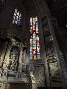
The first site where the power of design became evident to me was the Duomo, which we saw on the first day of class. It is a giant building whose visual presence cannot be missed, from the moment that you walk into the plaza or exit the metro station. People are forced to walk around it if they are going to the Museo del Novecento or the Galleria. Even inside, the high, vaulted ceilings, floor to ceiling stained glass windows, and ambient lighting communicate the sacred nature of the Duomo. Based on the buildings manipulation of space, its effect and function become clear.

The second site at which I observed this power did not happen during a class excursion, but rather on our group walk for the Mapping the City assignment. The Arco della Pace features beautiful design on an impressive scale – my very first impression was of how ornate the arch appeared, even at a distance. The space of this building is especially interesting as well, as the design encourages people to walk under it instead of around it. However, its grand, neoclassical nature almost makes you feel intimidated to do so, like you may not be nearly as grand as the arch.
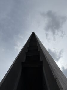
The third site I have included here is built on a manipulation of space. The Lombardy Region Building is a government building in Milan, but it is probably the most unique and unusual office building that I have ever seen. The building manipulates space for hundreds of meters up into the air, and the supports of the building are intended to support that. As we learned on our tour, the pillar supports of the building thin out as you go higher and higher. In my view, the in-person experience of being in the building is in line with that physical architecture. Looking up, the building seems to disappear into a point in the sky, looming far above you. I do believe that this effect is potentially beneficial for a government – a government wants to communicate its power over the city, its ability to control and see what is going on.
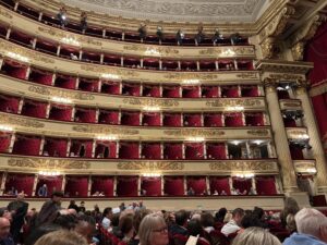
The fourth site, La Scala, is both a moment and a piece of design. My view of this building is strongly influenced by the suspense that led up to our visit as a class, which fueled lots of dress and shoe shopping. Preparing to go to La Scala was an event in and of itself, which suggests that the power of this building’s design extends far beyond the physical structure. When we arrived at the performance hall, those boundaries between interpersonal and spatial experience continued to blur. Most of the seats stretched out in two groups of rows, although I could see smaller seating rooms on the floors above. The high ceilings and stage immediately suggest that the room is a theater meant for performance. Furthermore, the interior design of the building seems to be chosen carefully to support the ornate and grand architecture. The red seats and the golden decoration communicate luxury, as if everything is plush and sparkly in this room.
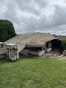
The fifth site that I selected, the Memoriale Brion, is something that I already discussed in my Week 3 blog post. However, I loved this site and visit so much that I couldn’t leave it out of my overall in review. I first studied the tomb in class and was intrigued by its shape and design, but I was still completely unprepared for how it felt in person. The curve of upper section swoops over the two tombs, granting a protective feeling similar to that of a wing or a mound. As a visitor to the site, the spatial layout of the memorial welcomed me in, demonstrating that it was alright to walk around and explore. Everywhere that I looked, there were hidden details of design: gold accents, interlocking circles, beautiful tiling, and geometric edges.
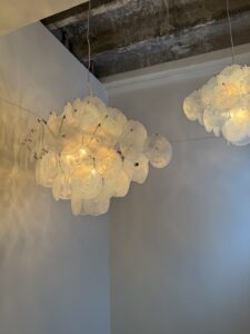
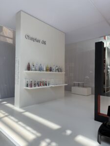
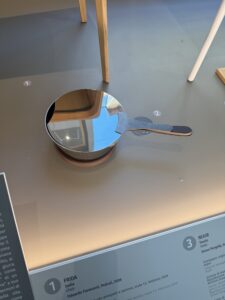
Finally, the last site that I have selected is truly more of a moment. During our visit to the Fragile showroom, this pair of lamps caught my eye, and I took dozens of photos trying to capture the way that they reflected the light. It seems that the lamp itself is a wire frame upon which many circular pieces of glass are hung, and there is a light fixture inside. This structure is what produced such variation in the reflection of the light, and thus the space around the lamp. Therefore, it seems that lamps, these small pieces of design, are just as capable of manipulating space and experience as large buildings. Even in such a small scale, I felt like I flowed with the changes in the light, and I appreciated its soft, calming glow.
Overall, this Maymester taught me that design is always present around me, waiting to be observed in architecture, objects, or moments. I hope that I will be just as vigilant about noticing it when I return to Austin, regardless of how many other things also demand attention. In addition, I want to continue noticing the intersection between interpersonal and spatial experience. Milan has showed me that a carefully designed building is capable of influencing us, our actions, and our feelings. How might the design of other cities do the same?
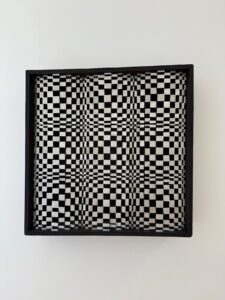
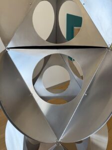
 And some other geometric shapes that inspired me!
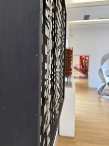
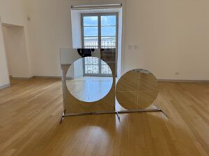