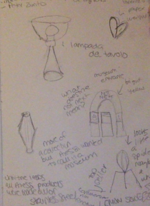
I’ll be honest, until I started taking this course I had never heard of Giovanni Alessi or his company. After doing some research I was under the impression that Alessi was similar to an Italian Ikea. I was completely wrong. When we walked into the Alessi Museum I felt like I was in an inventor’s laboratory. I saw objects I would have never been able to imagine in my wildest dreams. Impressed would not begin to describe the way I felt. A few different items that caught my eye included the giant yellow arch in the front of the museum with the words “NOT NEXT” written on the top of it, a heart shaped paper weight, and a lemon squeezer. As silly as it sounds, I LOVED the lemon squeezer. It looked like a spider and I wasn’t entirely sure what it was until the guide explained its function to us. I really like the idea that Alessi features the work of over 200 different designers. Not only does that supply a plethora of ideas for new objects , but it gives a large amount of emerging designers an opportunity for work. I’m grateful for this course, because I’m not entirely sure If I would come across the Alessi company if it wasn’t for this class!
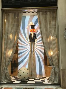
When I heard one of our main projects for this course was going to involve sketching I immediately felt uneasy. Drawing has never been my forte and I tried figuring out what subject I wanted to focus on before arriving in Milan; however, I did not have any luck. The first day we arrived in Milan we were walking around the Galleria when suddenly a store window display caught my eye. The display featured a normal sized female mannequin, but with extremely long pinstripe flared pants. The woman sported fiery red hair, a top hat, a blazer, and was in the process of juggling bowling pins, creating a circus-esque themed window display. This was not the typical window display I’m used to seeing, so I couldn’t help but feel excited and inspired. It was then that I decided I wanted the focus of my sketchbook to be on boutique window displays.
The Boutique Display the Inspired my Sketchbook
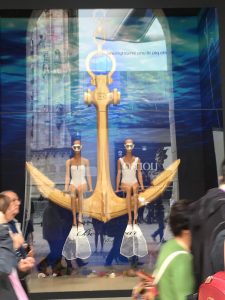
I believe it was last Wednesday that we went on a walking tour around the Duomo and the Galleria. This was the perfect opportunity for me to walk around and sketch and find inspiration. We encountered various stores including Stella McCartney, Prada, Chanel, Ermanno Scervino and Salvatore Ferragamo. My personal favorite window display was the of Ermanno Scervino’s. The display had an aquatic theme with two mannequins sporting white swimsuits sitting on a golden anchor.
Ermanno Scervino Window Display
I had a difficult time sketching the mannequins because they were sitting down. I think that’s my biggest frustration. The ideas I have in my mind do not translate well onto paper. I’ve seen the illustrations of other girls in our class and I feel like they are leaps and bounds ahead of me skill-wise. One of the biggest reasons I chose to major in textiles & apparel merchandising rather than textiles & apparel design was because I did not feel I was creative or talented enough for design. Sometimes I do feel discouraged, but I believe that my sketching skills are starting to progress with each sketch I do. I recently sketched the window display from an Alexander McQueen store and I don’t think it looked half bad! I think I was able to really capture the pattern of the dress and the ruffles at the bottom of the garment.
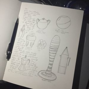
I originally felt like I was limited to sketching window boutiques, but as of yesterday I received the confidence to sketch other objects too, such as some of the appliances from the Alessi museum. My sketchbook may not be as professional as some of the other students, but I believe it’s a work in progress and that practice really does lead to perfection. I’m excited that I’m going to be able to take something back and show my family and friends what I’ve been up to!
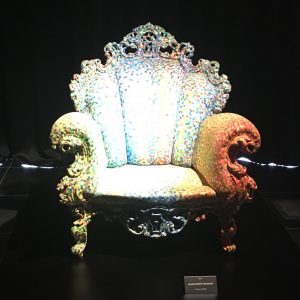
This week I wanted to concentrate on my visits to Museo del Design 1880-1980, and Bar Luce, which is part of Fondazione Prada. While visiting the Museo del Design, I was instantly drawn to Alessandro Mendini’s Poltroon di Proust. This chair was part of the “Made in Italy” movement after WWII. This time period was a “wide diffusion” of artistic experimentation and youth protest which created a new creative energy in Italian Design. Mendini’s “Proust” chair, became a series of redesigns in which Mendini took inspirations from structures and detail of past designs in furniture and design history. The actual structure of this chair was modeled from a Neo-Baroque style chair, and the exterior upholstery is hand-painted, using similar impasto brush strokes from the Impressionists. Mendini perfectly tied the ideas from specific art time periods to help create the radical design movement of post war in Italy.
A few days later I visited Bar Luce at Fondazione Prada. The exterior buildings of the Fondazione Prada is very minimal, and physically walking to the location feels like you are in the middle of nowhere in Milan, with the surrounding area being less developed and is much less populated. The closest comparison I can think of is the contemporary work of Donald Judd in Marfa Texas. At the Fondazione Prada is a bar and cafe called Bar Luce, which was designed by an American film (Raised in Houston) director Wes Anderson. The moment you walk in the bar, you have left the overwhelming feeling of vast contemporary art to a cafe that is modeled after post World War Two Milan. This was were I noticed the similarities of the design from Mendini’s work from the “Made in Italy Movement” and theme of combining old ideas with current times. Bar Luce has a vaulted ceiling, and the upper section of walls display architectural and decorative motifs from the Galleria Vittorio Emanuele. The interior design and furniture are modeled after classical cafe aesthetic from the 1950s to 1960s. The aesthetic and appearance is pushed in new ways creating this time warp that takes you back five decades. The color of the branding is light diner pink, and there are different hues of olive and army greens and yellows that make the pink branding pop. There is a giant record jukebox, several pinball style games that are still in the same appearance as the rest of bar. There are tables, and you can also walk up to the bar and get a quick coffee or drink standing, but also have the option to sit back and enjoy.
In summary I liked both views of the different interpretations of classical post WWII Milan.
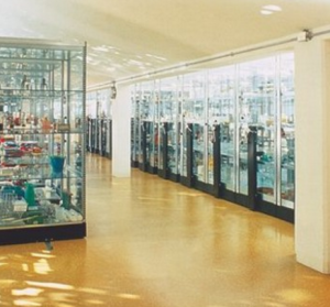
Alessi’s wonders and storiesDisplay area for Alessi’s creations
We were welcomed into Alessi’s large arrangement of items, arranged from the newest, the nicest, and the contemporary ‘pop’ items in the back. These items were what is currently available in their store. What showed us the truer story of Alessi were the stories placed in their upstairs ‘museum’. This museum was out of the ordinary, no name tags, no pedastals. Instead the shelves were full of un-launched projects and designs. In this way, we were told, each object had a greater depth of struggle and of story.
We were shown the Bomb teapot, a rejected Mendini vase, and Stark’s famous lemon squeezers (or non-squeezers what have you). Yet my favorite story of all was that of the collaboration between Alessi and artists, specifically Salvador Dali. Their collaboration (to serve art + design to the lower class at an affordable price) would eventually become what Alberto Alessi would later call the biggest flop of his career. The complex nature of the projects increased their production costs and decreased the interest of the ‘common’ man. This being said, we were reminded that although this project was a flop, it was a revolutionary idea that set Alessi apart. Through this endeavor they proved their willingness to take risks and be innovative, two actions necessary for good design.
The greatest notion I received is that flops are evidence of honest work. Flops are the spice of design. Without them innovation is impossible, and design would remain stagnant.
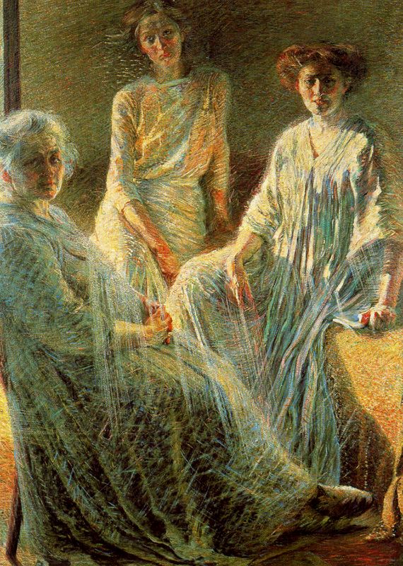
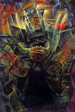
I picked two paintings from the Palazzo Reale exhibition on the work of Umberto Boccioni. In my opinion, these two paintings, “Three Women” and “Materia,” are pivotal moments in Boccioni’s evolution into a Futurist painter.
In the first painting, “Three Women,” Boccioni starts to play with movement in the image through his painting methods. You can see the short and rapid brush strokes that energize and bring to life the light in the painting. This is one of the first works of his that begins to show signs of moving towards a more abstracted way of painting. The caption next to the painting describe it as “extraordinary luminous energy” with “glowing colors.”
In the second painting, that stood out to me, “Materia,” Boccioni really embraced the abstracted form. This is a painting of his mother, which used as subject material a lot. This painting again, reference light. There is an aura of light that surround his mother in the painting. Most of the painting uses darker colors, but then there is a bright pop of light around her head. The background of the painting seems to resemble a factory and city life. This really speaks to the Futurist Manifesto, which is enthralled with mechanical and industrial processes.
Umberto Boccioni was and is the key and arguably most important artist of the Futurist period. This was quite evident due to the fact that there was one entire gallery at the Palazzo Reale dedicated to his work and several pieces by him at the Novecento.
The ideals of the Futurists seemed rather entitled and exclusive but the artwork is amazing nonetheless. One of their central pillars was the use of speed and motion. There are also many references in his work to cubism and the work of Picasso.
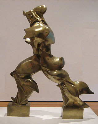
‘Unique Forms in Continuity’ Umberto Boccioni 1913
Boccioni’s most famous piece Forme uniche della continuità nello spazio (1913) is a sculpture that combines multiple forms created by a man in stride. It’s a three dimensional rendition of what cubists created in the form of painting. This piece magnificently captures the futurist ideals of portraying speed and motion, as is very apparent. The texture and form are a more subtle hint at the chaos and “war” that the Futurists are so taken up with.
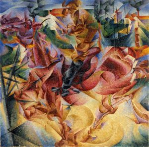
Elasticità (1912) once again by Boccioni also employs the Futurist elements of motion and chaos. The picture evokes a sense of urgency through the use of contrasting colours, the overlapping lines of the figures blending together to create one amorphous form. Circular shapes that create undulating contours add to the motion of the piece. There is also a similarity between cubist abstraction and the portrayal of motion in Boccioni’s piece.
Both these pieces utilize human figures to embody the Futurist principles, but incidentally use traditional forms of travel. The man in the sculpture is using the age old mode of transportation, walking, while the painting is of a man on horseback. Both modes are common for the time, but not the new and upcoming technologies that the Futurists aspired to embrace and embody.