One big advantage of building a website with UT Drupal Kit is that, out of the box, your site is fully responsive. Regardless whether it’s viewed on a desktop, tablet, or smart phone, content fits intelligently to the screen width.
To qualify as fully responsive, that means that tables also need to fit. This is no straightforward task. How, for example, should the following table fit into a portrait-oriented phone display and still be readable?
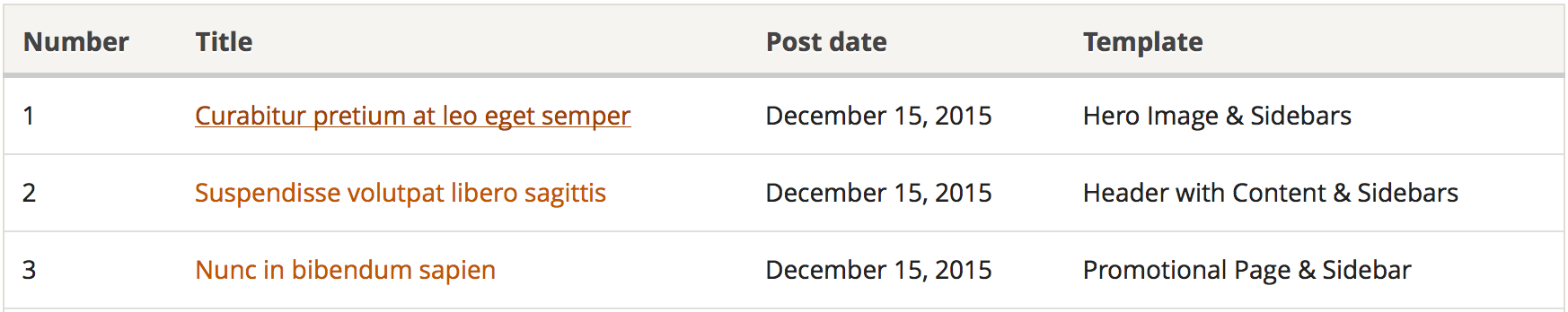
There are a number of approaches that tackle this challenge. The design firm behind the homepage redesign, Springbox, selected the Filament Group‘s “Tablesaw” approach, and when we set out to build a Drupal distribution for the UT community, we concurred with that decision.
Tablesaw uses JavaScript to print column headings with each cell and then stack the row so that items appear vertically, rather than horizontally, on smaller screens. The table above would look like this on narrow screens:
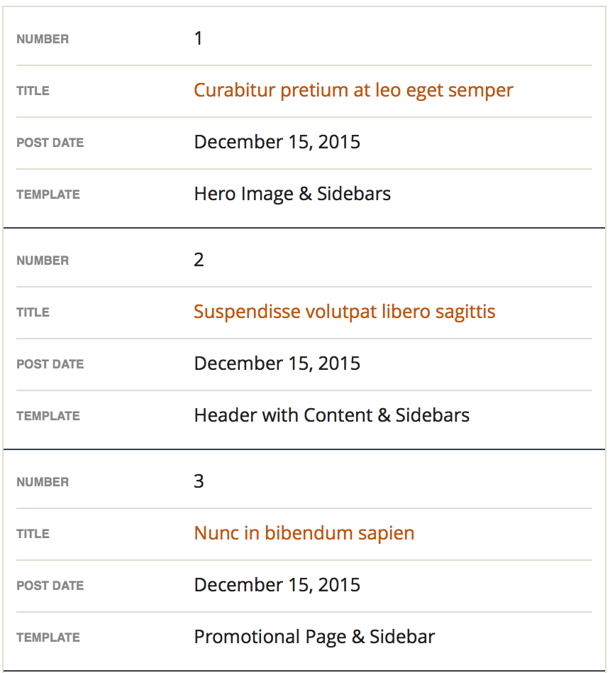
And here’s the responsiveness in action:

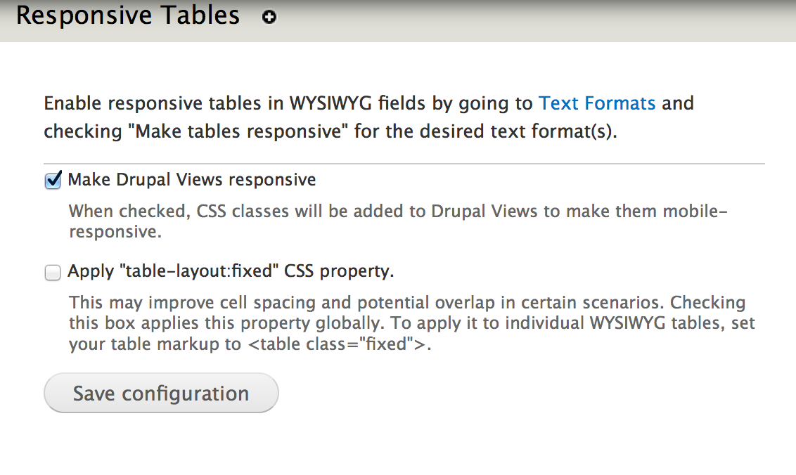
When we implemented this approach in the Kit, we wanted to give website developers control over responsive tables. So we created a custom module, the Tablesaw Filter, enabled by default.
Within the configuration page, you can set whether tables generated by Drupal’s Views should be responsive, and whether to apply a CSS class that helps distribute content:
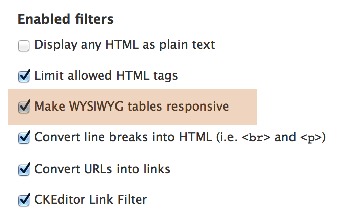
You can automatically make any tables added in any WYSIWYG fields responsive by enabling the text filter for the text format(s) you’re using (usually “Filtered HTML”).
With this functionality as a text format filter, your content creators don’t need to change anything about how they create tables: the appropriate behavior is applied when the page is rendered.
For more details on customizing responsive tables, see our documentation.
Read our full usage documentation on the Drupal Kit, and download the distribution on the ITS Website.
5 replies on “Yes, Drupal Kit does responsive tables”
The tables work great and all tablesaw generated tables are styled via the forty_acres.css too!
Great job ITS!
They’re lovely! One question, how would I make tables built directly into a template responsive?
Hi Lori,
Assuming you’re talking about a
tabletag in a tpl.php file, you would need to add the following classes and data attribute:class="tablesaw tablesaw-stack" data-tablesaw-mode="stack"Then, so long as the Tablesaw Javascript is being loaded on the page where that template is being rendered, the JS will find the table and do the responsive magic.
–Mark
Thanks for the response. The css classes I figured out, I was having problems calling the javascript. Any ideas?
Our Tablesaw module is currently set only to load that JS on pages where the WYSIWYGs have table tags, or, if the setting is checked, on pages built by Drupal Views. You could try doing the following within a
hook_preprocess_page()function in your sub-theme’s template.php file:if (module_exists('utexas_tablesaw_filter')) {
_responsive_tables_filter_add_js_css(TRUE);
}
…which is the function from our module that adds the CSS and JS. One caveat: you would want to make sure that the JS & CSS is not being double-added on pages.
I’ll look into a more “foolproof” solution that developers can call from their own theme, but it might be worth adding another option in our module settings that allows developers to add the JS/CSS to all pages.