The Ransom Center’s two-volume Gutenberg Bible is on permanent display. Every few months the Center’s staff changes the opening, allowing visitors to see different pages and to protect the volumes from overexposure to light. [Read more…] about “Hasty and exuberant” decoration in the Ransom Center’s Gutenberg Bible
printing
From Mainz to Austin: Carl H. Pforzheimer’s Gutenberg Bible and its earlier owners
Eric White, Curator of Rare Books at Princeton University, discusses the Ransom Center’s Gutenberg Bible on Thursday, February 9, at 7 p.m. for the Center’s annual Pforzheimer lecture.
The Jenson Bible joins the Gutenberg Bible’s page turning
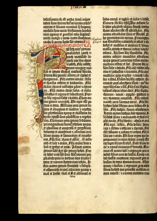
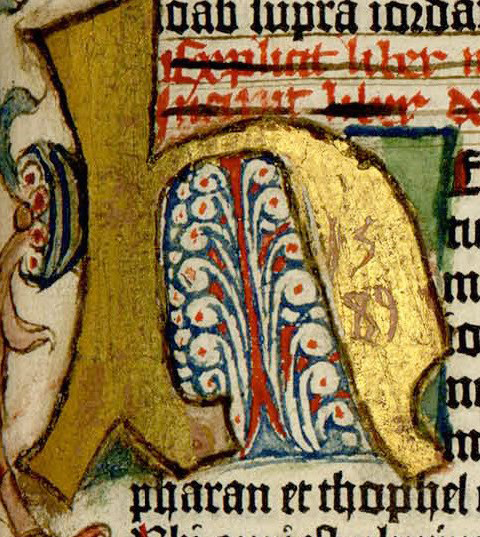
Biblia Latina. Mainz: Johann Gutenberg, 1454–55.
Genesis, Chapter I. Volume I:5r
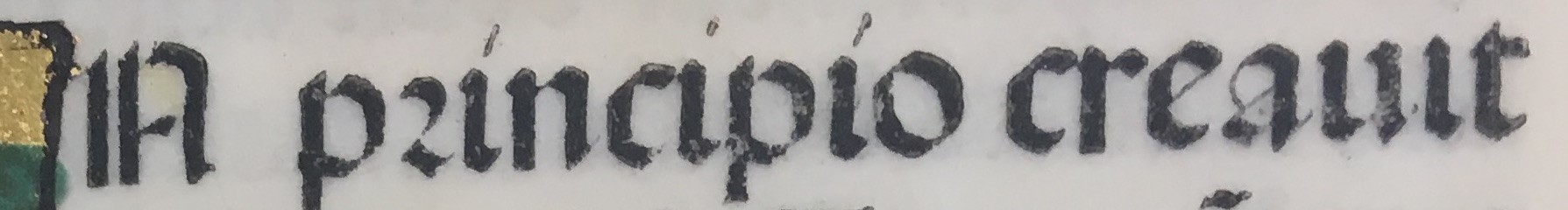
Among the most striking features of the two volume Gutenberg Bible is the consistency of its printing and the elegance of its letterforms: the rich black ink, evenly pressed into the page resembles the applied precision of a pen—and for good reason. The typeface of the Gutenberg Bible is based on the standard hand-written letterform used in religious works of the late-medieval period: Textura, also referred to as Blackletter, or Gothic. The letters have strong vertical stokes and a boxy appearance. The exact technique by which Gutenberg cast his type in lead is not fully agreed upon by scholars, but it is generally thought that the types were produced by casting molten metal into small letter-shaped molds.
[Read more…] about The Jenson Bible joins the Gutenberg Bible’s page turning