Some lawyers feel strongly about text justification. Here’s some background and recommendations.
My books: Legal Writing Nerd: Be One, Plain Legal Writing: Do It
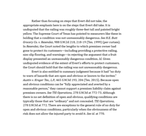
For legal documents, some lawyers prefer left-justified text, also called “left-aligned” text. Left-justified text creates what’s called a ragged right margin. It looks like this:
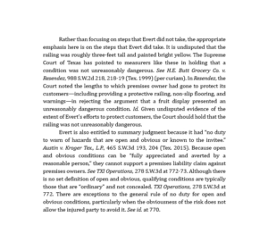
Some legal writers prefer fully justified text. Fully justified text creates clean vertical margins on the left and right, and it’s standard in most books, magazines, and professional publications. It looks like this:
Which is better? The question sparks passionate debates.
In favor of left-justified text
Left-justified text looks less formal and “relaxes the page,” according to the legal-typography expert Matthew Butterick. In addition, many legal documents are left-justified, including most contracts, briefs, letters, and nearly all email messages. So left-justification has tradition and history on its side.
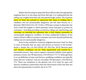
In addition, there’s some data suggesting that you can read left-justified text faster than fully justified text. Fully justified text sometimes exhibits “gappiness” because it adds white space that can slow down reading. Look at the highlighted sentences in the next example. See the slightly bigger spaces between words?
Granted, the difference in reading speed is tiny—fractions of a second—but there you go.
In favor of fully justified text
Fully justified text tends to feel more formal and serious, and that’s one reason professionally printed documents are often fully justified. For example, most books use fully justified text. Formality and seriousness are right for many legal documents, and the clean vertical margins appeal to some legal writers.
And fully justified text is modern: left-justified text is, after all, a vestige of the typewriter, so why not take advantage of the full justification available in word processing?
My recommendations
- Left-justified text with a ragged right margin is appropriate for legal documents—subject, of course, to the preferences of your readers and supervisors.
- Fully justified text is also appropriate for legal documents—subject, of course, to the preferences of your readers and supervisors.
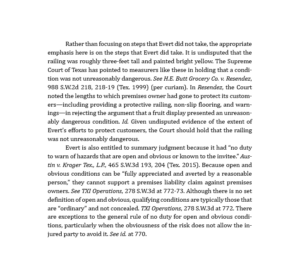
- To reduce gappiness and speed-up reading for fully justified text, turn on hyphenation. The word processor will hyphenate a few multi-syllable words at the right margin.
With hyphenation turned on, the gaps and white spaces disappear. It looks like this:
Hyphenation is appropriate for legal documents. In fact, I’d bet most nonlegal text you read in print is fully justified with hyphenation.
My books: Legal Writing Nerd: Be One, Plain Legal Writing: Do It


