Micro Essay: Curriculum Gaps: 25 Perspectives: Teaching Legal Research & Writing 106 (2017).
![]()
Advice for fonts in legal writing
What are the best fonts for legal writing? Legal text appears most often in traditional, serious documents—statutes, contracts, pleadings, and briefs—so let’s narrow our definition of “best” to professional and readable. This post defines a few terms, reports on some research, and offers some recommendations.
Serif or sans serif?
Fonts come in two broad categories: serif and sans serif. Serif fonts have small extensions at the end of each stroke, called serifs. (Below left.) Examples are Times New Roman, Garamond, and Cambria. Sans serif fonts have no serifs. (Below right.) Examples are Arial, Tahoma, and Calibri.

Most legal writers have, at some point, had to decide whether to use a serif or sans serif font. Yes, some courts and other organizations require a certain font, and you might work for someone who insists on a particular font. (A Social Security Administration lawyer told me that the U.S. Attorney for his district required that all documents filed by federal attorneys be in Arial.)
But what if it’s up to you? Generally, serif typefaces are more common in legal writing than sans serif, and they tend to look more professional to most lawyers. So my recommendation (not a rule) is to use a serif font for most legal documents.
Readability
Which is more readable, a serif font or a sans serif font? For years I heard from lawyers and writing experts that “studies show” that serif fonts are more readable than sans serif fonts.
But when I went looking for the studies, I came across an exhaustive report by a consultant named Alex Poole.[1] He reviewed more than 50 empirical studies on typography and drew three useful conclusions:
As Poole put it, “we should accept that most reasonably designed typefaces in mainstream use will be equally legible.…”[3]
Beyond serifs
For recommendations on specific fonts, the best source is Matthew Butterick’s Typography for Lawyers, also available at typographyforlawyers.com. It’s the most thorough, comprehensive, and informed book on the topic.
Beware: Butterick dislikes some common, widely used fonts. He strongly recommends against Times New Roman, and he hates Arial, saying that he refuses to name it, but it “rhymes with Barial.”[4]
He believes that lawyers should avoid “system fonts”—those that come with Microsoft Word, for example. Lawyers should use professionally designed fonts, and he’ll sell you his, called Equity.
Still, he knows that most lawyers won’t be buying fonts, so he offers recommendations for system fonts that go from “Generally tolerable” to “OK in limited doses” to “Questionable” to “Fatal to your credibility.”[5]
On his “generally tolerable” list are several serif fonts that most legal writers will know and that I recommend for any legal document: Book Antiqua, Century Schoolbook, Garamond, and Palatino.
For email, sans serif fonts are more typical, and Calibri, on Butterick’s “OK in limited doses” list, is common.
_____
[1] Alex Poole, Which Are More Legible: Serif or Sans Serif Typefaces? (Feb. 17, 2008) http://alexpoole.info/blog/which-are-more-legible-serif-or-sans-serif-typefaces/.
[2] Id. citing Ole Lund, Knowledge Construction in Typography: The Case of Legibility Research and the Legibility of Sans Serif Typefaces (1999) (thesis submitted for the degree of Doctor of Philosophy, University of Reading, Department of Typography & Graphic Communication).
[3] Id.
[4] Matthew Butterick, Typograph for Lawyers 78 (2d ed. 2015).
[5] Id. at 79.
Getting started—simply
Two previous columns discussed visuals as valuable tools for persuasion in briefs and how brief writers could overcome obstacles to using visuals. This month I offer some practical tips for using visuals and some simple ideas for creating them.
Two experienced practitioners-turned-legal-writing professors have written an excellent article full of good advice: “Art”-iculating the Analysis: Systemizing the Decision to Use Visuals as Legal Reasoning, by Steve Johansen and Ruth Anne Robbins.[1] They helpfully divide visuals into three categories: Organizational visuals such as bullet lists, timelines, and tables—even the Table of Contents; interpretive visuals such as flow charts, pie charts, and Venn diagrams; and representative visuals such as images and maps. They then ask writers to imagine the legal argument visually and identify what type of visual would aid the reasoning.[2]
Once you’ve decided to use a visual, Johansen and Robbins say it’s worth assessing where the visual falls on a “usefulness” continuum. On one end are merely decorative visuals—eye-catching but with limited connection to the substance. On the other end are visuals that present content connected to the facts or law.[3] Nix purely decorative visuals; visuals that contribute to the substance go in. I also recommend this article: Adam L. Rosman: Visualizing the Law: Using Charts, Diagrams, and Other Images to Improve Legal Briefs.[4]
Some simple examples of graphics
Last month I mentioned two reasons that some brief writers don’t use visuals: creating them can be difficult and time-consuming. So let’s start simple. Here are two ways to use one type of visual—images—in briefs, as recommended by respondents to my survey:
If using an image strengthens your case, do it.
Using a table is another way to start trying visuals, and tables are simple to create.
For example, you might display the defendant’s corporate officers in a two-column table. The information is more quickly and easily grasped than if it were conveyed in textual format—especially if the list is long.
Text: The corporation’s officers were as follows: The president was Chris Smith, the Vice President was Cory Chung, and the Secretary was Jamie Acosta.
Visual: The corporation’s officers were as follows:

In an administrative-hearing brief, one writer needed to apply a 12-factor test to a nurse’s conduct. A two-column table worked well, with the factors described in the left-column cells and the analysis provided in the corresponding right-column cells. It’s a good example of a visual that makes digesting the analysis easier when compared to a traditional-text format.

The following table appeared in a response to a plaintiff’s motion to consolidate. It was the writer’s attempt to emphasize that although the same party owned the apartment-complex phases at issue, the buildings, subcontractors, and materials differed, and the two cases would not rely on the same evidence.

Once you’ve mastered basic tables, a timeline is a good challenge. Here’s a basic example:

I hope these examples give you some ideas. Ultimately, it’s up to you to consider the facts and analysis and decide if a visual is right for your brief. Think creatively, get some help, improve your skills, and recognize that judges are favorably disposed to visuals. Then try it.
_____
[1] Steve Johansen & Ruth Anne Robbins, Art-iculating the Analysis: Systemizing the Decision to Use Visuals as Legal Reasoning, 20 J. of the Leg. Writing Inst. 57 (2015)..
[2] Id. at 67.
[3] Id. at 69.
[4] Adam L. Rosman, Visualizing the Law: Using Charts, Diagrams, and Other Images to Improve Legal Briefs, 63 J. Leg. Educ. 70 (Aug. 2013).
In my survey of practicing lawyers, 30% said they rarely or never use visuals in briefs. Here are the top three reasons for not using visuals:
Let’s take these one at a time.
(1) If your practice doesn’t lend itself to visuals, then you’re not avoiding them because they don’t work at all; you’re avoiding them because they don’t work for the cases and issues you handle. Declining to use visuals is therefore an exercise of editorial judgment. That’s what legal writers should be doing.
The individual comments in the survey reflect the reality that good writers know their content, context, and audience and make decisions about visuals accordingly:
I’m inclined to trust these lawyers and their judgments about their own cases.
(2) Actually, a few judges are recommending the use of visuals in briefs. The legal-writing expert Ross Guberman offers the following unattributed quotations from judges:
Judge J. Nicholas Ranjan, of the United States District Court for the Western District of Pennsylvania, offers the following advice on his website:
In addition to the supportive statements quoted here, after posting my survey about visuals, I received two email messages from judges, saying that they appreciate the use of visuals in briefs and pointing out that they use them in their own opinions and orders.
Still, there’s no large, loud chorus of judges calling for more visuals. Yet 46% of those who rarely or never use visuals said that they would be persuaded to use them if judges recommended the practice. So if you’re a judge reading this, and you appreciate visuals, say so—publicly.
Besides judges’ recommendations, at least one other factor would encourage more writers to use visuals in briefs. One third of the survey respondents said they would be persuaded to use them if colleagues or leading practitioners recommended the practice. So if you’re a visuals-using writer reading this article, recommend the practice to others.
(3) Finally, 9% of survey respondents who rarely or never use visuals in briefs gave as a reason that using them was difficult and time-consuming. Here are some of the individual comments:
This post can do little to remedy these problems, but I have some suggestions: assign visuals creation to others with the expertise, seek out training and education on creating and using visuals, and invest in newer or better software.
Besides, some of us might be thinking too grandly about “visuals.” In part 3, I’ll discuss some practical tips for using visuals in briefs, offer some simple ideas for creating visuals, and recommend additional resources.
_____
[1] Ross Guberman, Judges Speaking Softly, 44 Litigation 48, 49-50 (Summer 2018).
[2] Judge J. Nicholas Ranjan, Judge Ranjan’s Brief-Writing Preferences, at 2, https://www.pawd.uscourts.gov/sites/pawd/files/Ranjan_writing_tips.pdf.
![]()
Visuals can be valuable tools for persuasion in briefs.
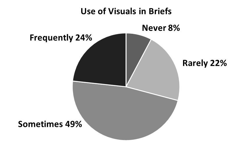
Legal writers should use visuals as persuasive tools in their documents, and it’s already happening: In my survey of 133 lawyers, 70% said they frequently or sometimes use visuals in briefs. The survey targeted writers of persuasive documents at an initial-dispute stage: trials, administrative hearings, arbitrations, and others.
This article displays a simple pie chart showing the answers to survey question 2: “In writing briefs or other persuasive documents, do you ever use visuals: graphics, images, charts, tables, illustrations, and so on?
In part one of this series, I’ll discuss the recommendations in favor of visuals from experts and practicing lawyers.
As the survey results show, many legal writers are already using visuals in briefs. That only makes sense because those who research and write about using visuals have been recommending the practice for several years. Here are two experienced practitioners in 2019:
Here’s a 25-year in-house lawyer, writing in 2013:
No, the written word isn’t dead, said two legal-writing professors in 2015, but “[a]s legal writing moves toward a more digital medium, it is time for lawyers to incorporate visual persuasion into their documents.… [Visuals users] are advancing legal writing in a positive direction.”[3]
My survey produced some supporting recommendations as well. In responding, writers could choose from a list of the potential benefits of visuals, and here are the top three responses:
Survey respondents could also add comments, and there were several strong endorsements:
To these endorsements we can add the obvious point that lawyers have used visuals for live trials and hearings for many years. It’s taken for granted that photos, maps, charts, and other visuals have a strong persuasive impact on judges and juries. So it’s not surprising that the same is true for briefs.
Yet 30% of my survey respondents said that they rarely or never use graphics in briefs. Why not? I’ll address that in the next part of this series.
_____
[1] Emily Hamm Huseth & Michael F. Rafferty, A Picture Can Save a Thousand Words: The Case for Using Images in Appellate Briefs, For the Defense 22, 23 (Feb. 2019).
[2] Adam L. Rosman, Visualizing the Law: Using Charts, Diagrams, and Other Images to Improve Legal Briefs, 63 J. Leg. Educ. 70, 70 (Aug. 2013).
[3] Steve Johansen & Ruth Anne Robbins, Art-iculating the Analysis: Systemizing the Decision to Use Visuals as Legal Reasoning, 20 J. of the Leg. Writing Inst. 57, 59, 60 (2015).