Armani Silos- catwalk
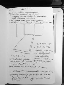
This sketch was of the entrance to the exhibits at Armani Silos. I found it to be a very bold statement with images of Hollywood starlets flashing behind the vivid red ‘carpet’ that also appeared much like a catwalk. Immediately we understand the importance of this brand. We are told right off the bat- ‘we do not seek celebrities to wear Armani. The celebrities seek us.’ The existence of Armani and Hollywood is intertwined- each serving to elevate the status of the other.

The name of Armani Silos- specifically the ‘silos’ bit- was explained that it implies clothing is just as important as the food that we eat. The grains. In the way that food sustains our living, clothing does the same for the way we express ourselves. I agree with this. When we meet someone, we make immediate judgments based on how they present themselves in their dress. It may not always be best to judge based on appearance, but it is at least an opportunity to say something about yourself before you say anything at all.
–
studio FM – designing identity
This was one of my favorite visits. Studio FM is a graphic design firm that works across a range of capabilities- brand identity, art direction, exhibit design, digital, and others.
We learned in depth about the process behind one of their campaigns for the Mudec, a museum of cultures that we had the opportunity to visit our first week of class. FM designed the visual identity for the museum, as well as a launch campaign. I enjoyed learning about the way they approached this task, pulling inspiration from the cultures that the Mudec had on showcase and coming up with creative ways to pull viewers in to their world.
The campaign was broken into different flights in order to seed the campaign.
- The ‘M’ – introduce the new logo
- The Colorful Pattern – introduce the vibrant cultures
- The Space – showcase the architecture, interior
- The Collections – showcase the actual collection
Each approach had a very specific goal in mind, all of flights working in unison to paint a complete picture of the Mudec through advertising. It seemed to be mostly out-of-home placements, which I find to be interesting and appropriate. The sense of adventure and wonder that they captured through the vivid imagery in their graphic design suits the placements well, giving passersby the opportunity to learn about the Mudec while they are moving about their everyday life. A combination of posters, billboards, bus/subway placements, and vehicle wraps placed the Mudec at every stop in the everyday journey of the consumer.
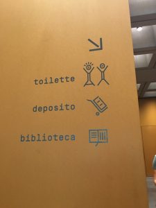
It was also quite nice to learn that FM created all of the icons within the museum, as well. Those were something that all of us noticed when we first arrived at the Mudec! Again and again the things that we learn on this trip seem to come full circle at one point or another.
Here are some links to the campaign on studio FM’s site: Mudec Permanent Collection Campaign | Mudec Visual Identity