Experience in Context

A day in Florence.
A day in Florence.
Floating Piers.
Floating Piers.
IMG_8814

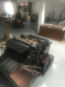
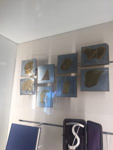
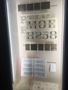
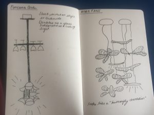
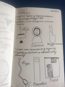
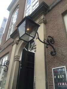
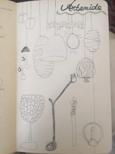
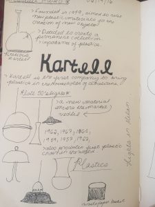
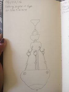
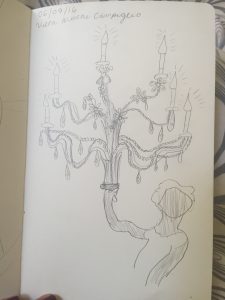
Being able to study abroad in an incredible city like Milan has been such a dream come true. Going into this program, I had no prior knowledge about the design or fashion industry and possessed the stereotypical ideas about what these industries as comprised of. For me, being able to see the work and amount of effort that goes into producing such incredible pieces of craftsmanship was the most important thing I have taken away from this trip. In fact, through my sketch notebook, I was able to detail and see the minute but incredibly important details that go into producing simple objects such as lighting. Even the process of simply copying a sketch was a bit challenging at times! Honestly, I was definitely one of those people that simply thought chairs are just chairs and aren’t quiet capable of being anything more than what they appear to be. However, visits to major chains like Kartell opened my eyes into the world of product design. And being able to see the creation and hard work that goes into producing such beautiful pieces like the plastic chairs Kartell is infamous for was just a wonderful opportunity.

Millions of Lamps in Amsterdam.
The stunning Duomo.
Gelatto in Como.
Gelatto in Como.

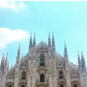
Besides the learning experience, Milan has also opened my eyes into a new culture. I’ve never lived within a European city for this period of time before, and being able to do so has taught me so much about being adaptable and understanding to be less critical and more observatory. It’s just extraordinary to reflect on how booming cities like Milan can surpass or be completely different from what you initially expected. I remember the week before I came here I just had this vivid fixation that Milan would be this place that is just a Mecca for clothing. And while this is true in some sense (Milan is a fashion capital after all), Milan also is a city that is vibrant with art, history, and a multitude of educational resources that deviate from the fashion and design scene. Even the people that live here are more diverse than what I had initially conjured. I’m still slightly shocked at the sheer amount of Indian restaurants the other girls and I were capable of finding. For me, Milan has served not only as a wonderful place to receive an education of the identity of design, but it also has become a place that serves as beacon of incredible experiences and memories. Being able to partake on this study abroad experience has been life changing in so many ways, and Im so grateful to Kate, Jessica and IES for making my time here so lovely!

Tipoteca Italiana

IMG_9130 IMG_9129 IMG_9128

By far the most amazing experience I have had on this trip has been our visit to Tipoteca Italiana. What was so amazing about this visit was being able to get the opportunity to see the intense labour that goes into producing a specific font for a variety of mediums. Of course, when one thinks of type writing or anything associated closely with that term usually what comes to mind is the image of an old school system of production. For Tipoteca Italiana, that image holds very closely to the truth. In fact, every type producing machine within the museum is capable of producing type texts. This to me is amazing because some of these machines just look so incredibly old, and it is mind blowing that they are capable of producing incredible texts. Even the display within the museum demonstrate a certain age and precision that reflects that intense mastery dedicated to this craft. My favorite piece was definitely the display of monopoly money that was creating through using the typing machines.

Definitely what was most memorable about this visit was being able to create a beautiful poster with our group! At first it was a bit intense trying to compete and see which team could create the best design for the poster. I mean a ridiculous amount of thinking and working on layout went into creating a design for my group. However, once again, this was definitely an experience that gave me an important insight into how much work goes on within the design world. Even choosing the colors that we wanted to put on the poster took time and close analyzation. However, what was probably the most difficult was trying to pick a font for the poster that everyone could agree on. Our end result was definitely stunning, and I cannot wait to get back to Austin and have it framed. Regardless of the work involved, it was just such a wonderful way to end the trip – through creating a “design” that is capable of letting us look back and remember the entire purpose of this program: Thinking about “Design in Context”.

Treviso

IMG_9159 IMG_9161

One of the major highlights of this trip was definitely our visit to Treviso. My favorite part was getting to see Fabrica, the design school within the town. As someone who has no previous knowledge about the world of design and its inner workings, getting to see an experience a place like Fabrica was extremely eye opening. It was amazing to see a place where so many students of various nationalities come together to work together on a variety of projects. However, my favorite exhibit within the school was definitely the montage of pictures displayed that each worked as an independent gallery. My favorite set from this piece was definitely the display of pictures that each show cased various albinos from Africa. I think this exhibit demonstrated an important theme about individuality, and how people can perceive something so common as uncommon. Another striking piece was the book that featured a multitude of red headed people. This piece introduced a statement about how red heads are capable of being a dying breed due to gene selection or designer baby phenomenon.

Flos and Fontana Art

What I love about Milan is the seemingly endless number of light shops sprinkled throughout the city. This past week we had the opportunity to visit both Flos and Fontana Art, which both had a wonderful display of lamps that featured some work from Artemide. As soon as we entered Flos, I recognized the amazing display of lights from Artemide, which in essence was this beautiful chandelier structure featuring what appears to be butterflies cascading down and emitting light.

IMG_9075 IMG_9076

In Flos, we saw a multitude of very modern and contemporary light fixtures. One of my favorite pieces was one lamp which not only functioned as a lamp but as an iPhone charger as well. However, personally I must say I definitely preferred the pieces in Fontana Art, seeing as they were less contemporary and played an interesting twist on antique styles of chandeliers. Another piece that stood out to me was this ceiling light which doubled as a way to hold glasses – this I did a rough sketch of in my notebook as you can see from the above photo. Overall, I really enjoyed getting to visit and see many of the Artemide lamps in reality through the stores that sell them.

Sketch Notebook Update: Lights in Amsterdam

IMG_9006 IMG_9008

Amsterdam, is most definitely the city of canals. In fact, I think it pays some heavy competition to Venice in terms of number random canals to be found within the city. However, Amsterdam is also a city that features a multitude of stunning and diverse lighting. And what truly makes the canals so stunning to me is through the way they glow and glisten at night due to the numerous lamp posts plastered throughout the city.

IMG_9035

There is also a huge influence of Moroccan-esq lamps throughout the city as well, and a multitude are to be found dispersed in the various flee markets within the city. It is nearly impossible to walk through Amsterdam without coming across a lamp that is in someway inspired or takes influence from the east. I stumbled upon the most amazing little shop that was just absolutely brimmed with what seemed to be an endless number of chandeliers and floor lamps, and to be quiet honest, I felt like I was back in Venice due to the overwhelming amount of glass. The comparisons to be made with Venice and Amsterdam are endless, and its definitely such a joy to have the opportunity to view and note the fabulous lighting and canals in both cities.

Questions of the Orient; featuring Armani and Gucci

IMG_8871

What I truly loved about visiting the Armani and Gucci museums was the inside information that was provided to us on how these incredible gowns and clothes are manufactured. However, something that I found particularly interesting about both these Italian mega-chains was their constant insistence and assurance that both fashion brands are manufactured through “wholesome” means. Why this can definitely be said about Gucci in terms of their ability to produce clothes entirely within the Italy, it seems slightly strange that through their parent company – which falls under the same roof as Stella McCartney as well as a multitude of other notable fashion brands – they show an intense statistic of outsourcing in terms of producing these garments. For example, It was mentioned during the presentation given to us in Gucci that many garments are sent or produced within India for embroidery work or to China and other Asian countries for silk. This definitely opens up a questionable narrative about how and under what circumstances these garments are produced in. Without a doubt, Gucci creates remarkable pieces of clothing that easily fall under the category of art. But it is always vital to remember that although something as mega as Gucci is easily viewed as impenetrable, it is necessary to critique any areas of production that seem questionable.

IMG_8838 IMG_8845

On a similar note, Armani museum also brought up a few questions about the visual and creative influence in a variety of pieces within their collection. This was more specifically concentrated within the “Orient” section in the museum. It was stated that Armani was influenced through a variety of Eastern cultures that are clearly seen through a quite a few pieces in his collection. However, at times I felt that this was perhaps a understatement in respect to what was actually being displayed. For example, there were two particular dresses that were essentially Sarees being relabeled as an “Armani Piece”. I’m not an expert on the subject of appropriation, but viewing these gowns did make me slightly uncomfortable (As well as the Indian Sitar music being constantly played in the background). In fact, they would probably me more accurately described as Sarees within an Italian twist. However, I do not know the exact details and background behind the creation of these garments, so it would be virtually impossible to see the Armani team’s thought process while creating these specific pieces. Overall, it was an absolute pleasure to be able to see all of these stunning gowns being celebrated through their display in the Armani Museum.

Update: Lights in Milan

IMG_8707 IMG_8708 IMG_8709

Definitely a highlight within the past week has been visiting both the Kartel and Artemide museums. Coincidently, both these fabulous visits included a multitude of lights for me to sketch and detail. One of my favorite pieces was the plastic lamp that we saw at Kartell, I was fascinated by its design that incorporated a vintage structure but was modernized through the plastic material. As I mentioned in my sketchbook, what I loved about the use of plastic was that the way the plastic was formed makes the pieces appear like glass. At Artemide, I found the technology put behind the variety of lamps really intriguing to learn about. In specific, there was a specific technology shown to us during the presentation which detailed how it could be possible to send wifi through a lamp. Overall, the theme at Artemide was creating lighting that could be something more than a simple lamp in their use. Having the opportunity to see the step by step creation of these pieces in the factory was simply amazing. (As a fan of How its made, I felt like I was stepping through the tv screen in an episode of How its Made: Lamps)

Reactions: “Neo Preistoria”

IMG_8609

“By combining 100 tools and 100 verbs, we attempted to delineate the history of human desires as fixed form of poetry… This exhibition is the result of considering, with Mr. Andrea Brandi, what lies ahead in this kind of human evolution, and whether there is really any hope.”

One of the most striking aspects of the Neo-preistoria exhibit at Treinnale was at the sheer rawness of the entire experience. The exhibited consisted of a series of boards (numbered from 1-100, as mentioned in the quote above) which each explicitly stated a verb that in some form was reflective of human behavior. This entire experience was organized to make the individual feel as if they are experiencing the greatest and most troubling aspects of the human condition,which are infinite faults and ambitions of achieving progress.

IMG_8593

Something that truly made an effect on my own experience while walking through this exhibit was how brutally honest Brandi and Hara were in their description of human progress. For example, number 7 within the exhibited reflected on “Kill[ing]”. They described this as, “To take the life from living creatures. To rob an opponent of life. In a struggle for survival.” To me, the key words within this poem is the idea that killing is automatically linked to “surviving”, and that in order to survive, one must kill. Other words such as “Obey” included a similar connotation, Brandi and Hara write that obey is to, “To accept the power of the strong without resistance.” In essence, each board seemed to innately posses a theme of hopelessness, which is an interesting concept due to the fact that Brandi and Hara created this entire space in order to analyze if there is any hope for the human condition. Of course, one should remember that experiencing the exhibit from a crystalized point of view is simply impossible, seeing that Brandi and Hara have attached their own definitions to the experiences.

IMG_8604

This highly structured way of analyzing human progress was especially prominent in number 89, which was labeled “Survive”. Brandi and Hara define Survive as, “To get a new lease on life when one was supposed to leave the world. For a life that should naturally be greeting death to remain longer in this world.” Accompanied by a range of faux drugs on display, Brandi and Hara form a complex identity of survival through their simple words. This is achieved by bringing to surface that to survive is to also cheat death. And through doing so, humans are creating an imbalance within the world. Although survival is often linked with awe and positivity, Brandi and Hara highlight an often overlooked aspect of surviving, that through the act of survival, humans are disalining the natural order of the world.

Teapots, Waterfalls, and Alps: A day at the Alessi Museum

Alessi, Tea pot set

Having the opportunity to visit the Alessi museum today was an absolutely wonderful experience. As one of the handful of students in this group who posses no prior knowledge about the inner workings of design, it was lovely to see the process and intensive commitment involved in creating beautiful pieces. My favorite piece we saw today was most definitely the tea pot set made out of metal. I was absolutely in love with the story our guide told us, she described how Alessi specifically created this set in order to impress his future father in law. I also admired how many of the household items Alessi created all seem to deviate from the standard norm of what typical household products should look like (including the tea pot set). Each item had a certain charm and individuality that just seemed to enhace their use through their physical beauty. On a separate note, the town of Omega was also incredibly stunning. The contrast of the beauty of the household items as well as the stunning alps within the town just seemed to be a dreamlike experience. It almost makes one wonder if natural elements played some small role in the creation of these designs even through their contemporary style. Even the addition of the waterfall in the entrance seems to hint at this possibility.

Chandeliers of Milan

Chandelier, La Scala Theater

For my sketch book, I have been drawing and detailing the numerous lights within the Milan. From the contemporary lights installed with museum and stores, to the draped chandeliers found within Villas, Milan serves as an incredible canvas to the multitude of lights hidden within the city. One of my favorite pieces that we have seen so far is the Stunning chandelier that was the centerpiece of the La Scala theater near the Duomo. This chandelier was massive, and is also perfectly suited to be placed within the theater. Complemented by the lavish interior, the crystals and glass formations were enhanced by the gold detailing within. In my sketch, something I noticed while recreating this ornate piece (this was also a theme I noticed while drawing other chandeliers), was that how the effect of making the chandelier look proportionally impossible is the purpose of creating an ornate piece dedicated to lighting.

IMG_8298IMG_8299

In Villa Necchi, there was an abundance of lighting that offered a variety of juxtapositions between the stereotypical grandiose chandelier as well as more contemporary versions of a chandelier as well. Regardless, these pieces each possessed the quality of seeming almost weightless, an impossibility that results in the magnificent result of being awe stricken by floating crystals illuminated by light. In the Villa, there was a definite contrast between the crystalized chandeliers and the versions of chandelier that are focused more on metal adaptations of the same form. Regardless, these pieces each had the same effect within a room; achieving the feeling of being apart of the weightless appearance of the chandelier. The most unique piece within the villa was a chandelier that appeared to be modeled after some sort of sea plant. It seemed tentacle like, and was perhaps formed using glass or crystal. An interesting effect occurs due to the concentration of the light bulb within the chandelier, drawing central attention to the base of the fixture and slowly dimming out the effect towards the ends. Interestingly enough, others thought that this chandelier bared no similarity to sea weed, and instead saw a different type of flower in its appearance.