in review

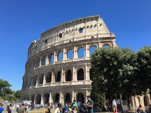
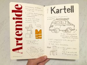
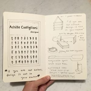
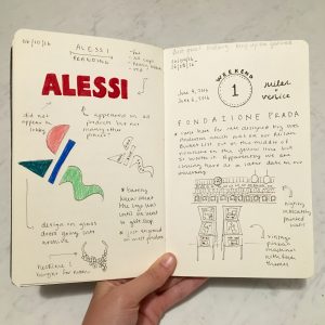
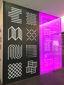
My experience in Italy has been absolutely transformative. My expectations were thoroughly exceeded and as a result my mind has been expanded in ways I never could have imagined prior to departure. I can’t help but start my reflection with design. It was so eye-opening to see how much design is revered in Milan. From the Triennale exhibits to street fashion, you can truly see how design infiltrates the city. Not only is it beautiful, but also conceptual and critical. I can see how our culture back home could greatly benefit from this type of “problem-solving” thinking.

IMG_5267
“Sempering” exhibit at the Mudec Museum of Cultures. One of the first design exhibits of the trip.

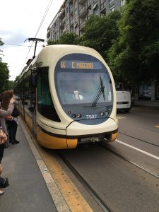
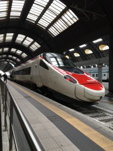
Another aspect of Milan that blew me away and was nothing like I had ever experienced back home was the public transportation. I’m fairly used to trains and subways from growing up in New York but Milan was something else. The metro was so clean, timely, and easy to navigate. Even above ground the options were endless – trams, busses, and streetcars were all readily available to get anyone where they need to go. Outside of the city was where I was really impressed. The trains that travel between Italian cities were fast, but also comfortable. I found myself disappointed at how short a train ride was because I was happy to just sketch and look out the window.

IMG_2540
Street tram that drove on rails imbedded in the pavement.
IMG_2647
Frecciarossa train that took us to Rome in three hours.

Interestingly enough, I found that I really felt myself grow the most when I was alone. Being comfortable with getting lost and finding my own way was very important to me. Its scary to separate from the group in a foreign country where I don’t speak the language but when I did and everything was fine, that’s when I grew confidence in myself. Sometimes the experiences that are only yours are the ones that are most memorable. I really do feel as if I could conquer any sort of travel on my own back in the States.

IMG_2819
Design bookstore I found when wandering by myself a bit north of IES.

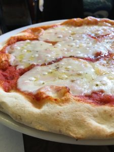
No post about Italy is complete without speaking of food. Not only was the food I ate the best I’ve had in my life, but the experience of eating the food was also new to me. I remember our CA Anna took us out to her favorite restaurant the first week we were in Milan. Towards the end of dessert I checked the time and it was nearly half after midnight. I was so surprised that we spent nearly 4 hours just sitting, eating, and chatting. It was at this moment I realized that meals are an important time to relax and connect with the people around you.

IMG_2803
Best pizza I ate in Italy at our four-hour-long dinner.

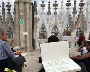
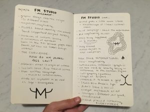
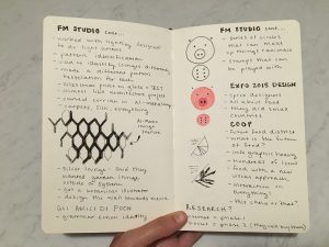
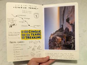
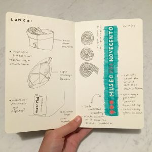
The last point I want to talk about is my realization of the importance of sketching. My time in Italy was made so much more meaningful through sketching the things that resonated with me. I have challenged myself to leave a sketchbook in my purse from now on so I will always have it wherever I go to jot down memorable words or images. I think it will make me a better designer and creator.

IMG_2720
Starting my sketchbook atop the Duomo in Milan.

florence : week 5

Florence was one of my favorite parts of my trip to Italy. Since there is so much to do there, our days were certainly packed. Upon arrival, we walked around our neighborhood which was not hard to figure out that it was the fashion district. The cobblestone roads and fancy window displays were an interesting juxtaposition and perfect home base for our time in Florence. Almost as soon as we put our bags down, we headed to the leather market to hopefully pick up some more bags. I was first struck by the quantity of vendors at Piazza San Lorenzo, and then by the quality of the leather goods they were selling. It was fun to haggle and all in all it was a successful trip for all of us who treated ourselves to a new leather bag. The next day was what we were really excited for, a tour of the Uffizi and Accademia Galleries. We hopped out of bed for our 8am tour and as soon as we could blink we were standing in front of world-famous sculpture, “David”. This was truly one of my highlights of the trip. This magnetism of this sculpture simply has to be experienced. Next stop was the considerably more crowded Uffizi where we saw “The Birth of Venus” and “La Primavera”, two more stunning glimpses of art history. On our way back from the tours, we meandered off of our path and got a bit lost. We knew that we were lost because we approached a big set of bleachers that we were certain we had never seen before. Our curiosity kicked in and we walked closer to see what was going on. Seeing no barriers, we meandered onto the bleachers and sat down in the front row. About ten minutes later horses and men in costumes flooded the Piazza and that’s when we realized it was some sort of jousting game. It was so cool to see this event in such a historical place because it seemed so authentic, like going back in time.

IMG_6506


treviso : week 5

I’m glad that we got to spend our final days in Europe traveling to Treviso. I think some of us were skeptical to be away from Milan in our final moments but the things we saw in Treviso made the four hour bus ride totally worth it. First, we went to Tipoteca Italiana which is a type museum. Our class had had some experience with letterpressing so this place was particularly fascinating. We wandered through there spotless museum and saw the origins of print come to life. Letterpresses, type cases, and important documents lined every wall. Our tour guide emphasized that Tipoteca is “a museum that leaves”, meaning that they want everyone to touch it, interact with it, and be able to take home a piece of it. This led to our next exercise. They were kind enough to let us design and print our own poster, but first we had to come to a consensus as a group about what exactly it would look like. This was a pretty long process. We decided to highlight our program name in Italian (Design in Contesto) with the names of all the designers we learned about scattered behind it. Although it took a long time to get everything right on our end, the poster turned out beautiful!

IMG_6681

Next stop was Fabrica, a communication research center, which to me was almost like a monastery for designers. As our guide toured us aroudn their top-notch facilities, we got a glimpse of the students who work there and learned about how we could apply to be a part of it. Basically, you can apply to study there for a whole year for free, but you have to be selected from a competitive group and then undergo a two week testing period before you are officially accepted. It sounded like a fantastic opportunity and great challenge. Before heading off to the design department, we got to see some of their work, the majority of which was incredibly gripping communication designs that took the form of posters, videos, or sculptures. We met the director of design who explained to us the importance of having people from many different cultural backgrounds at Fabrica. He then showed us a few campaigns that they worked on that were incredibly clever. Our tour guide then showed us the library that many of us never wanted to leave. We could have spent hours or even days scoping out the design books in their tiny but amazing library.

IMG_6742

rome : week 4

This past weekend, many of us had the chance to travel to Rome to see the sites. I was particularly excited for this weekend because I turned 21 on Saturday! When we arrived, we realized that our Airbnb was very close to the Colosseum so we couldn’t resist starting out with the major monuments. The Colosseum turned out to be one of my favorite spots in all of Italy. For some reason it was easy to imagine all that had happened there over so many years. The Colosseum had been the site of gruesome acts but also triumphant victories. We were all very impressed with this world wonder. We pushed through the heat and headed off to see the Pantheon, Trevi Fountain, Spanish Steps, and Piazza Navona. Getting lost in the streets became one of our favorite pastimes because we would all of a sudden stumble upon these mega-famous ancient artifacts. The next day we saw the Pope at the Vatican. This was such an experience because he gave a sermon outside his window that just reverberated throughout the whole piazza. It was interesting to see thousands of people just silence themselves. We should have planned this day a little better because we neglected to think that the Vatican Museum would be closed on Sunday, but it was. So, no Sistine Chapel for us. Instead, we headed over to the Complesso Del Vittoriano museum to see a Mucha exhibition. The exhibition was a fabulous overveiw of the evolution of his work over the years. Next door, we also stumbled across a Barbie exhibit which turned out to be my favorite. They had just about every single Barbie doll ever made and chronicled her (very tall, thin, and blonde) past. It was interesting to see how long it took Mattel to make her look like a realistic woman. All in all, Rome truly met my highest expectations.

IMG_5245

IMG_5528

studio FM : week 4

Our visit to Studio FM was hands-down the highlight of the week. As we approached the loft studio in it’s hip Chinatown neighborhood, I wondered how this graphic design studio would compare with others studios I have visited. This past semester, I had the opportunity to travel to New York and Chicago on a travel initiative grant to visit design studios all over the two cities. Many of them gave a brief tour of the studio, an explanation of their mission statement, and a glimpse at their company portfolio. I found that the FM tour was very similar. The variety of clients that they have is what struck me though.

The first project they showed us was the branding for the Mudec Museum of Cultures. The designer who spoke to us was very animated and honest and explained to us that it was a challenge to make this “boring” museum seem “cool”. As Longhorns, we found it interesting that their main branding concept had to do with horns because horns represent ancient culture in many ways. Their solution was to put “horns” on an M and manipulate that logo to fit with their many advertising campaigns.

Perhaps the most impressive project that they showed us was the branding for the New Doha International Airport. They explained that this project has been a long and drawn out one, but also one filled with much creativity and budget leeway. They started simple with the creation of the logo. They very cleverly decided to take the shape of the airport and then make a grid out of it through tessellation. Everything in the entire airport fit within this grid, which blew my mind. Not only did FM design the logo for the airport, but also the wayfinding and lounge interiors. This was an involved process that required lots of tests and lots of money.

A fun project that we ended with was their branding for the Gli Amici Di Pooh (Friends of Pooh) elementary school. This childish and playful branding juxtaposed with the previous stylish, sleek, and upscale branding of the airport. They came up with ways to engage the children through their branding with animal stamps that can be mixed and matched based on color and shape. As a designer, this kind of interaction seems to be what everyone strives for.

IMG_6606

IMG_6607

the floating piers : week 4

The day we visited Christo’s Floating Piers was one of the most rewarding days of the trip. As we boarded the train for Brescia, we were confronted with massive crowds that prevented us from actually getting on the train. This should have been the first warning sign of what was to come but most of us brushed it off as rush hour. We simply boarded the next train and all was well, until we got to the Brescia train station and faced the next phase of our journey which seemed to be an unending line to the only train that would take us to the Piers. We didn’t know how long the wait would be which was probably for the best. After another delay on the train and a line to get onto the Piers, 8 hours later, we finally took our first steps onto the floating orange pathway. The sweltering heat and test of our patience all receded into the background at this moment. Walking barefoot on the wobbly pier and absorbing the beauty of Lake Iseo was an unforgettable experience. Many of us wondered if something like this could even exist in the States without extensive barriers and extensive peddling of Christo merchandise. Experiencing this ephemeral installation in a place as beautiful as Italy was truly a memory I will keep forever.

IMG_5920

cinque terre : week 3

This past weekend I was able to travel to the Cinque Terre with a few friends. This was hands down the most gorgeous place I have ever visited and a surprisingly relaxing destination given the huge tourist population. We stayed in an Airbnb in the small town of Manarola which was perfectly picturesque. As a visual person, I think places like these are some of the most inspiring because I can feel myself appreciating the colors, shapes, and compositions of every sight I see. Taking photos is always a joy rather than routine documentation as it sometimes is, unfortunately. Thinking of my sketchbook, I decided to pay close attention to the branding of the tourist shops here because it was surprisingly good. I enjoyed meandering the tiny shops and observing their layout and overall aesthetic. On our last morning, we headed out to take a pesto-making class in Levanto. This was another visual experience that I won’t ever forget. Not only did the pesto taste amazing but was also the most radiant green color I had ever seen. The combination of the smashed basil, the light yellow olive oil, and the marble mortar was truly a sensory experience. I will be back someday!

FullSizeRender

future of design : week 3

This week we visited several spots that had clear connections to each other. The first was Artemide, an Italian lighting design company and manufacturer. The initial presentation was so put together and overwhelmingly fascinating. The concept of “Li-Fi” (data transmitted through light photons) was completely illuminating, no pun intended. Reading design blogs and online news sources I feel like I am exposed to new and futuristic concepts pretty regularly but this I had never heard of and had a hard time wrapping my mind around. By the end of the presentation, Artemide made it clear that research was their game.

Heading over to Kartell, a giant global plastic design manufacturing company, they also recognized the importance of innovation. Their plastic designs enjoyed their peak success in the 60’s but they had to quickly reevaluate their brand due to environmental concerns and the growing popularity of cheap plastic.

In class, we questioned whether design was moving forward and I have a few thoughts on that subject. At Giovanni Lauda’s studio, we learned that he thinks design is at a bit of a standstill and that everyone is playing it safe. However, I think it is evident from our visit to Kartell and particularly Artemide, that new design spectacles are on the horizon and companies like theirs value research and new ways of thinking.

FullSizeRenderg

mapping : week 3

This week, Kameron, Zalak, and I made tremendous headway on our mapping project. We took our first walk on Thursday morning with a few inklings of ideas that we could try out for our final project. We made a few connections but overall our ideas didn’t have a strong enough concept.

The next day we headed to the Trienalle to see an exhibit designed by Andrea Branzi and Kenya Hara called “Neo-Preistoria”. Having no prior knowlegde as to what to expect from this exhibit, we entered the dark corridor where we found a series of mirrors, rock formations, and glass cases with artifacts. In the background there was a soundtrack of heartbeats and jungle noises which enhanced the primordial feeling of the exhibit. As we meandered through, we realized that each artifact was labeled with a verb and a poetic definition of the verb. The word and image correlations were so striking at times that I got chills.

As we moved through the exhibit, the artifacts got younger and younger in age. At the beginning, I thought I would be seeing ancient artifacts all the way through but as it turns out, the artifacts were dated more recently the farther along we made it through the exhibit. It was so interesting to make the journey through man’s inventions. It really drew attention to the great strides and downfalls of humanity.

Something interesting I noticed about the exhibit design was the walking pattern. As long as I followed the numbers, it really felt like a trip through time where I was aware of my progression.

Later that day, something clicked. I thought, what if we compared our journey through the city of Milan to the journey of man’s objects through time? Conceptually, it was sound. Our first building is a fascist icon and our end building is a pillar of modernism. Our walk through Milan was a clear evolution that could be represented through found objects.

So, Friday afternoon we set out to walk our path one last time. This time, we paid attention to the mood of our every surrounding and collected items that captured the essence of our locations. Some of these items included flowers, tickets, stones, and perfume samples.

When we went home to work, we had fun figuring out the best way to display our “artifacts”. We decided to use some granola bar boxes and some white paper to create a museum display effect. I had a lot of fun coming up with the words and definitions for our exhibit. It made me realize how much I enjoy language and writing economically. It’s a different kind of artistic challenge. I have included some of my sketches for the project below!

FullSizeRenderfFullSizeRendesr

sketchbook : week 2

I’m so pleased that I have finally gotten over the initial hump of generating content for my sketchbook. In the first week I was thinking too hard about how I wanted to set it up or how neat I wanted it to be but once I stopped caring about it being perfect, all of the visual thoughts I was having starting flowing out onto my pages.

Castiglioni’s studio really kick-started my creativity because there was SO MUCH to sketch and I really wanted to remember all of the ingenious inventions I was seeing. Some of his devices were a challenge to illustrate because they had dual functionality, such as “cow-milking belt” or the tiny swinging desk he built for his daughter. I’ve been enjoying utilizing arrows to demonstrate how things work.

FullSizeRender (3)

Since I finally narrowed down my focus on branding, I started to pay attention to my surroundings much more. For example, when we went to Alessi, I was completely unaware of their logo for the entire duration of the tour. The first time I realized that they use heavy red typography as their logo was when I stepped into the gift shop. I found it interesting that they paid attention to the branding in the gift shop and neglected the factory.

FullSizeRender (4)

On the other end of the spectrum, a few of us went to the Fondazione Prada in Milan to check out Bar Luce which has extremely consistent branding. Bar Luce was designed in part by Wes Anderson which made complete sense upon walking into the cafe. The interior was minimalistic to an almost surreal extent with pale pinks and greens lining the walls and ceilings. The logo was plastered on all of the menus, mugs, and coasters. Everything matched and was perfectly placed, much like how the scenes appear in his movies. I had fun making notations of my observations, it made me feel like I was really taking in the whole experience.

I fell in love with the branding of the Museo del Novecento so that was a great opportunity to use my new Stabilo pens in my sketchbook! All of the coloring was very consistent and the graphics were minimal. It is interesting to see the big museum brands juxtaposed with the small pieces of branding I come across from day to day such as a breadbasket label I stumbled upon at lunch one day. At first I was attracted to the design of the basket which was a machine-washable paper bag material. Upon closer inspection I realized I really admired the label and that ended up taking up a whole page in my sketchbook. The lesson is to always keep my sketchbook in hand so I am ready to sketch when I least expect it.

FullSizeRender (2)