Study of Boccioni

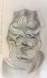
One piece I wanted to focus on is Antigraceful by Umberto Boccioni, which happens to be a bust of his mother from 1913. This sculpture is one of the first sculptures that emphasizes his rejection of past and present art canons. There was this quote that Boccioni stated “We must smash, demolish, and destroy our traditional harmony, which makes us fall into a gracefulness created by a timed and sentimental cubs.” This sculpture was part of Palazzo Reale’s Umberto Boccioni: genius and memory exhibition. This sculpture emphasizes a drastic change from his older work that was very traditional of the time. He painted dozens of rationalists/impressionist paintings and studies of people/portraits. It is tempting to assume that this work was influenced by some of Pablo Picasso’s work, but it could vice versa. The cubist portrait emphasizes his mothers features such as her eyes and nose, but in a way makes each of the wrinkle lines change in different directions.

In the class reading over the past week in the book Made in Italy, there is this quote on futurism and design: “In the words of Merjian, “Rather than use design as bulwark against industry, the Futurists were the first avant-gardists to collapse such distinctions so radically or at least to call for their collapse.” Befitting, perhaps, a movement glorifying war, futurism can be said to have inaugurated Italian design’s age of extremes, by bringing together modernist aesthetics and the material culture of industrial society.” Boccioni is an excellent example of Italian artists of the futurism movement, changing the process and work of his art.

In the drawing and sketches of Contre-Jour in 1910, is also one of his first examples of taking a step back from what he has created in the past, and changed his concepts to a more futuristic approach with the more crazy details than the image looking more like a portrait from the past.

A later painting I wanted to learn more about is called “Study of a Woman with Houses”, by Boccioni. This painting still uses pastels similar to the impressionists but it starts to have more of a cubist futurist aesthetic. I read theFuturist manifesto at the Museo 900, where this painting was located, “ All things move, all things run, all things are rapidly changing a profile is never motionless, before our eyes but constantly appears and disappears.” This painting shows how the light and shapes are frequently changing, and to form compositions with more rigid lines than to make the work perfectly organic and alive.umberto boccioni 1milan2

Post WWII Interior Design

This week I wanted to concentrate on my visits to Museo del Design 1880-1980, and Bar Luce, which is part of Fondazione Prada. While visiting the Museo del Design, I was instantly drawn to Alessandro Mendini’s Poltroon di Proust. This chair was part of the “Made in Italy” movement after WWII. This time period was a “wide diffusion” of artistic experimentation and youth protest which created a new creative energy in Italian Design. Mendini’s “Proust” chair, became a series of redesigns in which Mendini took inspirations from structures and detail of past designs in furniture and design history. The actual structure of this chair was modeled from a Neo-Baroque style chair, and the exterior upholstery is hand-painted, using similar impasto brush strokes from the Impressionists. Mendini perfectly tied the ideas from specific art time periods to help create the radical design movement of post war in Italy.

A few days later I visited Bar Luce at Fondazione Prada. The exterior buildings of the Fondazione Prada is very minimal, and physically walking to the location feels like you are in the middle of nowhere in Milan, with the surrounding area being less developed and is much less populated. The closest comparison I can think of is the contemporary work of Donald Judd in Marfa Texas. At the Fondazione Prada is a bar and cafe called Bar Luce, which was designed by an American film (Raised in Houston) director Wes Anderson. The moment you walk in the bar, you have left the overwhelming feeling of vast contemporary art to a cafe that is modeled after post World War Two Milan. This was were I noticed the similarities of the design from Mendini’s work from the “Made in Italy Movement” and theme of combining old ideas with current times. Bar Luce has a vaulted ceiling, and the upper section of walls display architectural and decorative motifs from the Galleria Vittorio Emanuele. The interior design and furniture are modeled after classical cafe aesthetic from the 1950s to 1960s. The aesthetic and appearance is pushed in new ways creating this time warp that takes you back five decades. The color of the branding is light diner pink, and there are different hues of olive and army greens and yellows that make the pink branding pop. There is a giant record jukebox, several pinball style games that are still in the same appearance as the rest of bar. There are tables, and you can also walk up to the bar and get a quick coffee or drink standing, but also have the option to sit back and enjoy.

In summary I liked both views of the different interpretations of classical post WWII Milan.