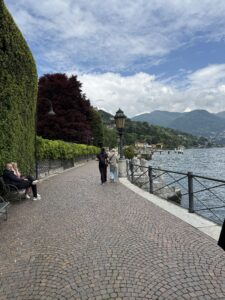
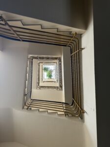
As I look back on this semester, I can now see how ignorant I was to the intricate details that make up the world, and this is done through the genius of design.
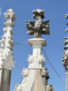
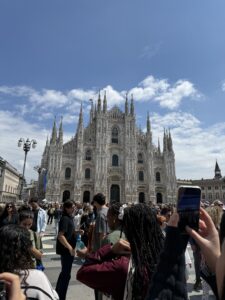
During our very first introduction to Milan, we were brought up to the Duomo where we took in the cascading views of the city. While spotting out the buildings we would later have to do our projects over, we were told to look at how every spire was accompanied by a different design funded by differing designers. At first glance, I would have never noticed this intricacy, but with direction I found the beauty in these creations lied in the story they told. Each spire held the same core elements of having a base leading up to the center display which is where variation occurred, and then melded back into a point at the top. While they all shared this similarity, each one was unique due to its designer and what they believed would represent Milan, Duomo, etc best to be displayed for generations on. These delicate details are what hold such deep meaning below the surface and this was my first exposure to the intricacies of design.
Like I mentioned earlier, we had a project called ‘Mapping the City’ and my group was assigned two drastically opposing architectural buildings. Bosco Verticale and the Federazione del Fasci Milanesi were two quite intimidating locations for differing reasons. Federazione del Fasci Milanesi was originally a household but later turned into Mussolini’s headquarters in Milano, which was evident by the very clean cut straight lines, minimalist design, and overall fascist period style. In opposition, Bosco Verticale was newly build in sustainability and climate change efforts to fix Milans pollution issues by planting thousands of trees in two shiny, high-rise, modern buildings that takes your breath away at first glance. These two contrasted each other in many ways, but through this project we were forced to look deeper and find the connections between the two places. Wealth, power, old to new life, and security were all noted and the design of each element of these buildings preserves its intent which backs those findings. Again, I was flabbergasted that one could pick out specific details about a building and know what period it was most likely built in, and further the history behind the building based on built in contact clues.
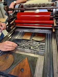
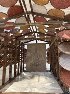
This idea of historical reference was further embellished in my memory and understanding when we visited Tipoteca in Treviso. This letter press and type studio was the perfect representation of design in life and at work. `As the wonderful guide explained, every type face has its own history, and its own design that makes it unique to a point where it can hold meaning of its own without even looking at the words its letters are spelling out. I found myself naturally gravitating to 1930’s fonts, however, this was a very trying time in the world, so I know there is an old soul behind those fonts with stories of wisdom, grit and times of resilience. There is something beautiful about knowing the history behind something so well known, yet so overlooked. As a stem major, this was an epiphany I had, and continued rounding back to over the semester. Tipoteca showed how letter pressing has evolved, the amount of time it takes to print one page of text, and how tedious print pressing can be. I found a new appreciation for literature in the foundational construction of a handmade book because each step has so much purpose and each letter quite literally must fit perfectly in the press making everything down to the size and font of one letter on a line of text deeply thought out and intentional.
Flashing back to the amazing visit we had with the genius Cristiano Bottino, I could see so vividly how intentional every detail of his work was and it was astonishing. From his talk I learned that some of the best designs come from and start with a simple and broad central idea and flower out from there. Specifically, Cristiano mentioned a project of his where he designed an airports signage and specific features with the lounge, carpet, etc. My jaw was on the floor by the use of the simple logo for an airplane, a simple and universal icon, implemented into all of his design work. Universal understanding of certain designs as well is something unique and so delicate as to not offend certain cultures and to surpass any sort of language barriers that could arise. Universal designs and graphics such as fire and stop have saved so many lives, but I never thought about the specificity in using authoritarian font for the stop sign and how that would be better than a cursive font. I never thought about how an airplane tilted up looks like its taking off but an airplane tilted down looks like its crashing unless you add a wheel. Little things like this are the details I’m describing that are like a kaleidoscope in designers minds. They can shift one concept into something completely new and beautiful in the right lighting and the tilt of the head. It’s a talent and skill I’m working on, but I cannot even begin to recognize these intricacies in the ways that I have seen on this study abroad (its so amazing).
My childlike joy and imagination was brought back to life at the Achille Castiglioni visit. We saw how functionality and playfulness can be brought together in a compelling and usable way. Castiglioni was a realist but also enjoyed using the imagination to its fullest advantage to get practical and effective results while maintaining some aspect of joyful play. This is a delicate design type and one I love specifically for that. I remember the display of the never ending wire tool. It morphed into a basket, tray, cake stand, purse, and many other necessary items. This was probably the most multifunctional piece of equipment I have ever seen designed before for everyday house usage. In that moment I was reminded to never stop wondering but also to stay in reality and not wonder off too far.
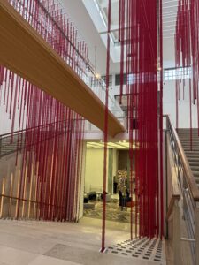
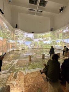
Finally, the most impactful experience I had this semester was one that hit me like a bus. The Triennale first exhibit rocked me to my core and forced me to sit out and just think for a second, but it was amazing. The data visualization was the most impactful and most insightful displays of facts I’ve ever seen in my life. I learned about how attention can be grabbed and how designing information in layers can allow the viewer to consume more information with less loss of attention. I learned so much about the world around me and was given so much world view. Walking up and down the stairs of the red ribbons displaying the casualties of war was heart wrenching and so eye opening. I learned that sometimes, a simple design can be more effective. I learned that history repeats itself and I also learned that design is so much more than meets the eye.
Design is the before, the insight into the why, the small details like pixel pushers that no one else notices, and the beauty in meaning and effort that transcends language barriers, space, time and relevance. Design is the way to remain and the way to send a message that needs hearing. I have met the most intelligent, kind and creative people during this time and I my eyes are open wide and will forever be changed by what I have learned in and out of the classroom of Milano. (Times New Roman is still my favorite font though)
Ciao, Samantha (or Sammie or Sam).