Why did you have to say ‘Goodbye’?

13533181_1721436761442789_1214987468204878949_n

Goodbyes are always more poetic in books and movies than in real life. Because in real life, they’re emotional and downright painful.

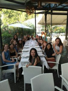
That night, everyone came in their best outfits and high spirits. We greet at the door, talk for a moment, then are seated amongst our new and old friends. Everyone skirts around the reason we’re gathered in the first place; we make small talk and focus on the various wines and dishes they bring us rather than discuss the fast approaching end.

As the night continues, there’s an air of urgency as everyone tries to get out as many thoughts and conversations and last remarks as humanly possible before the final course is served. As dessert is passed around, there’s a more hushed tone to our group; we still converse, but it’s not nearly as rushed now, we revel in the company of one another. Everyone knows what’s to come, but no one wants to admit that it’s time.

As the final drinks are had and the last of the dishes are cleared,  we are left with the stark realization that this is indeed the end of our time together. The month came and went so quickly, it feels like we just got off the train that morning.

We look around, smiles everywhere; we embrace, exchange gifts, and get in any last minute words before we stumble off into the night – our final night in Italy. For some of us this is the end of our time there, for some it’s only a stop along the way of another great adventure; regardless of what comes next, we will all hopefully look fondly back on this month and remember every wonderful, sometimes sweaty moments together knowing we were having the time of our lives.

Fabrica

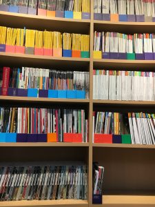
Our last visit for this study abroad was Fabrica in Treviso, Italy. It is associated with United Colors of Benetton and is a midway between a class-based university and a workplace. We got a walking tour of the building, and a look into the different departments that the place has set up. The one most memorable part of the tour was the library, one of the most beautiful works of modern book cataloguing I have seen. I am a sucker for books, so this place was heaven on earth. It might not have had novels and fiction but that didn’t bother me. The rooms structured in a giant spiral that winded downwards with a staircase. Bookshelves and siting areas were fit into landings along the way. It was maybe three floors, hard to judge when there is no clear distinction, but the bookshelves were tall and extensive. They were lines with hordes and hordes of design research books, a few shelves stuffed with National Geographic books, and so much colour, it was overwhelming.

The spiral form of the library
A snapshot of the extensive bookcases.

One thing we got to sit and look at was an edition of the Colors magazine, which is sadly not running anymore, where they mailed blank magazines to people around the world and had them fill it out with anything and everything. People filled the books up with personal photos, spray paint, yarn, their children’s drawings, and one was all about Islamic feminism. That one was my absolute favourite. It talked about how the choice for Islamic women to cover up is a statement of feminism not oppression. The book as filled with writing in Arabic calligraphy and drawings. It was really lovely to see that touch of diversity firsthand.

Hopefully in the future I can get an opportunity to apply and attend Fabrica after I graduate UT and gain some amazing experience from the faculty and resources available there.

Florence

Last weekend, I took a day trip to Florence. While everyone else who went stayed the full three day weekend, I knew I decided to keep it short so that I had time to relax. Sadly Florence should not have been the place I skipped out on especially since there is so much to see. I missed out on seeing Michelangelo’s David and the Uffizi due to the time crunch but that gives me an opportunity to come back with a better planned agenda.

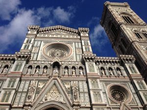
Florence is surprisingly easy to navigate. Nothing is more than a 15-minute, brisk walk away, and it’s pretty obvious what the landmarks are. The difference in construction of landmarks versus commercial and residential buildings is very obvious, not to mention the long, serpentine lines winding back and forth in front of museums. The city was really beautiful to walk through and the statues erected everywhere were magnificent to see. My favourite part, unsurprisingly, was the Duomo. In my opinion, it is definitely more breathtaking than the one in Milan. The hints of colour, the high and low relief sculptures, and the towering glory of it all was really lovely to experience firsthand.

Duomo in Florence

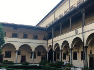
I also got to walk through the open courtyard of Basilica of San Lorenzo. The courtyard was a small taste of the the extensive architectural monuments built by people like Brunelleschi, Michelangelo, Donatello, and more.

The inner courtyard of the Basilica of San Lorenzo.

I definitely plan on visiting this city again.

Armani/Silos

As soon I was i found out that Armani Silos, a four story museum that features Giorgio Armani’s work since the 1980s, I was determined to go. It was originally not part of the class agenda to visit Armani Silos, so I figured I would probably have to drag one of my roommates to go with me during the weekend. However, due to last minute changes in our schedule, I was able to visit Armani Silos with my entire class.
The morning of our visit to Armani Silos, I woke up with butterflies in my stomach. It was so nice that I was able to go with our Design in Context group because I didn’t have to work out any logistics on location, tickets, or getting a private tour.
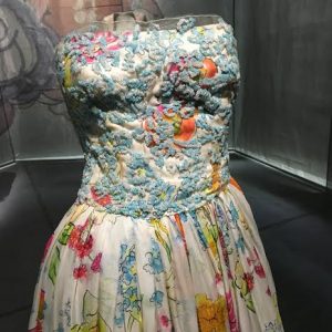
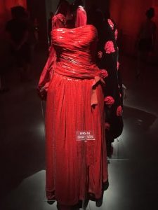
Armani/Silos did not disappoint and I’ll admit I tried extremely hard to not cry. I was just so excited and overwhelmed with beauty! My favorite section of the museum was the accessory section. The room featured gray walls with three long tables lit in a way that they appeared to be glowing. On the three tables there were hundreds of dazzling accessories. It completely blew me away! If only my closet looked like that! My favorite garments from the museum included a black velvet dress that was at the front of the museum, a blood-orange sequined gown from Armani’s F/W 1993 collection, and a floral strapless gown with pale blue embroidery. Visiting Armani/Silos was such an incredible opportunity. I had to to just take a minute to remind myself that I was in MILAN viewing some of Giorgio Armani’s most beautiful work. I’m so grateful for this course and all the opportunities it has provided me!

Armani/Silos Entrance
Embroidered Floral Gown
Gown from Armani F/W 1993

Finding Myself at Fabrica

If everything on this trip had failed to make me consider myself a designer in some small fashion (which isn’t the case, but still-) then our final visit to Fabrica research center picked up the slack.

IMG_2644

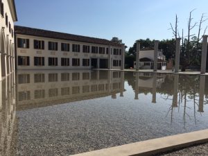
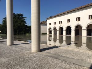
The building that houses this immense concentration of creativity is a 17th century villa, masterfully restored and augmented by one of my favorite architects- Tadao Ando. The telling glassy effect with the water draws the eye to the columns that line the path to the entryway.


IMG_2647

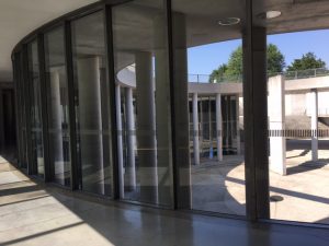
Inside, we were shown around the center, catching glimpses here and there of previous and current works from the young creative minds in residence at the center. Never in my life have I wanted to be a part of something so badly- social change at the hands of designers, artists, writers, filmmakers, and anyone who dares to think outside of the box. In fact, deconstruct the box.

Words of encouragement from their website:

If they pass the rigorous screening process, the young residents start a period of education and research on real projects based on the conviction that communication, in all its applications, must be a vehicle of conscious social change.

IMG_2655

Again, there is the idea that design is multidisciplinary. That it can have a real impact on the world. It’s purposeful design- making a conscious effort for the function of the object to impact the user. Truthfully, seeing the importance of my own skill- writing, communications, storytelling- gave me a great deal of perspective. There is a place for everyone in the pursuit of change through media and design.

Geometrical v. Natural Forms and Geography

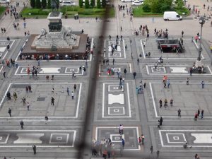
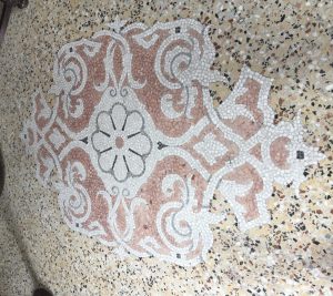
Within the early days in Milan I had already pinpointed the strong use of geometry within not only their architectural design, but in many details of their urban landscapes. One of the most notable uses of geometry that could be found within almost any setting in the city was the various pavements/ ground coverages. Even on day one when we ventured our the the Duomo and Galleria, the mosaics and pavement patterns caught my attention. Although both the Duomo and the adjacent Galleria present more ‘natural’ forms in their architectural and sculptural design, the pavements that create the large gathering space for both of these prominent structures are most definitely more reliant on geometrical forms.

A more urban ground coverage example at the Duomo di Milano
The strongly geometrical patterning of the piaza at the Duomo di Milano

As many of my weekly blog posts have mentioned, there is a strong use of geometry in almost every ground covering or pavement that is noteworthy. Even the handful or more organic forms utilized geometrical shapes and principals more heavily than ‘natural’ inspiration. The most organic forms were found on the islands of Lago Maggoire, unsurprisingly. However, looking back through my sketchbook, I find it interesting that Milano presented more of a hybrid between geometrical forms and natural/ organic forms in their various ground coverings. This is mainly in comparison with Roma and Firenze, where there seemed to be an even more strictly geometrical inspiration of forms in the floors that I had noted.

Flooring example at Stressa
More organic forms being presented on an island of Lago Maggoire 

While the history of each place most definitely defines the styles utilized, I find it noteworthy that the places that were more inclined towards geometry over organic forms were further away from coasts/ large bodies of water and larger geographic icons (ie. mountains) than in comparison with the islands and even Milano. Perhaps the geography of each landscape influenced design aesthetic more than realized at the time and therefore the overlap of geography in Milan presents more variety in forms.


Tipoteca Italiana & the Importance of Craft

The smaller details of everyday objects in life often get overlooked. As sad as this statement is, it is unfortunately the brutal truth. While the average person may pick up a book, newspaper, or poster and admire the quality or ‘it’ factor that they cannot quite describe, but know that they like; there are far less people who look at these everyday objects/prints and question its origins and processes of creation. Being a primarily design focused group of students, I am sure that the majority of us had previously thought about these objects past their surface appearances. However, for those who have not given this subject matter much thought, or are just interested in further information, the Tipoteca Italiana foundation is an incredible resource.

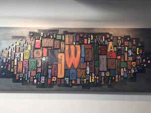
Variation of fonts at Tipoteca Italiana

Being able to readdress the amount of work and meticulous processes that are necessary to print even just one simple page makes one have a deeper appreciation for these prints that unfortunately have the tendency of being overlooked. The foundation explained the original processes of ‘copying’ and ‘printing’ documents and then went further into the benefits of the machine age and technology for these techniques. Little do most people realize, many of these traditional processes are still very much so apart of modern printing. With everything nowadays revolving around technology and digital printing I feel as if the classic principles get lost and the techniques that were once used lose their appreciation.

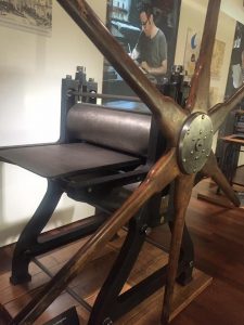
An example of an older printing press at Tipoteca Italiana

Visiting the foundation and being reminded of the processes involved in printing and copying, as well as the creation of fonts, was extremely eye opening to designs/prints that are often taken for granted. The process of designing our own poster as a collective group also reiterated all of the work that is involved in printing. The design and production are a huge part of the process rather than just the context itself being the main focus. Choosing the correct fonts and placements and then beginning the process of trial and error in printing with the press is more of a procedure than most may think.  In the end, the wealth of knowledge at the Tipoteca Italiana foundation is remarkable and the appreciation that one gains for design prints after visiting is imperative, in my personal opinion.

'Design in Context' poster layout for the press
‘Design in Context’ poster layout for the press

Sensory Effects of Architecture

https://vimeo.com/171531544

Our final presentation was tracking our feelings and emotions as we walked from Bocconi University to Torre Velasca. Overall starting at Bocconi, the area was young filled with students on campus, and people running, it was extremely inviting to be a part of. As we walked to Torre Velasca, the emotion shifted completely. Torre Velasca is considered a symbol of modern design of Milan’s architecture but it influenced by the buildings around it. It is also styled to be similar to a medieval clock tower. The building received mix feelings from the people of Milan. While we were walking in the area and around the Torre, the area was vacant with little movement even during a rush hour time period. We also noticed that they are reconstructing the building and have a mini exhibit on the architects who are going to renew the appearance. There are efforts in place to make this important building inviting once again. The walk shifts quickly from happy to uneasy, and we made a color coding system that expresses the emotion/feeling with a specific color as we walked.

Gio Ponti

For the last several weeks this particular building has been calling my name. I hear the wind blowing through its window cavities. It whispered at me saying, “just pause, take a moment, and just watch.” But in the hustle and bustle of things, I’ve ignored it. I paused for a second on Friday, but didn’t listen … I continued on. Finally, on Monday, I took a moment to look deeper into the structure. Low and behold, it was Gio Ponti’s church of San Francesco D’Assisi. It was beautiful, majestic and grand in its simplicity. It only asked you to listen and pause for a moment. The beauty of its simplicity came across that particular moment. That cloud, that car rushing by, and the woman going into confession would only be there at this time and place … with me composing and adding texture of that particular moment. This would never happen again as it just had.

Additionally, adding to the abstract moment of that time and place there were other physical elements that added to the experience. There was a quiet yet powerful organ … Sitting there … with its ceremonious stance, just waiting to be touched. To be played as it was meant to be played. Yet, at that particular moment, it was there, reserve,  just for me to enjoy. Peaceness.

Vico Magistretti

On Friday, we visited Fondazione Vico Magistretti. I wasn’t sure what to expect because I had heard his name in discussions but I hadn’t put his work to the name yet. That’s one reason why I loved going to the Foundations! It helps make those connections so I can be like, “ah! I saw this at Artemide too!” In my head I was making all these connections from my past sketches to our trip to the Fondazione.

Vico’s grandaughter, Margherita, gave us a tour of his studio and talked about his work with anecdotes about his process sprinkled throughout. He was an architect and a designer, but called himself an architect foremost. While we were visiting we peeked at the exhibition of his architecture and building sketches. His granddaughter told us about how he never used a computer, only drew by hand. The only technology they had was a fax machine, and I think that was probably a fight his assistant had to put up!

I really enjoyed seeing all of his chairs in the studio. It gave me tons of content for my sketchbook!! My favorite chair was the saddle chair. I liked the quote that Margherita used to describe his inspiration: “using the usual in an  unusual way.” Vico took the shape and form of a saddle, turned it sideways and used it as a back and arm rest for an office chair! It was surprisingly very comfortable.

*picture coming soon!

His granddaughter said he was quite the snob (haha) but a really nice man. He left behind a great legacy!