Law-related “eggcorns” (malaprops)

TexasBarToday_TopTen_Badge_Small

Legal Eggcorns

An “eggcorn” is a word or phrase that results from a mishearing or misinterpretation of another and often appears as a misspelling of the original. The term itself derived from a mishearing of the word “acorn.” Another term for these errors is malaprop. Some examples you might be familiar with are could of for could’ve, last stitch effort for last ditch effort, and for all intensive purposes for for all intents and purposes.

The following law-related eggcorns are real, and I have the citations to prove it. Some are certainly genuine eggcorns, and others are probably just typos, but they’re all entertaining. All but one are from judicial opinions.

illicit a response (elicit a response)
“The flavor of plaintiff’s counsel’s conduct throughout the trial is perhaps best illustrated by the following episode, in which plaintiff’s counsel was supposedly trying to illicit a response from plaintiff which would describe the size of the warehouse where the accident took place.”

  • Ballarini v. Clark Equip. Co., 841 F. Supp. 662, 667 (E.D. Pa. 1993)

mute point (moot point)
“For forensic patients, the discharge planning process and treatment did not include an initial, meaningful discussion of housing. Aftercare was a mute point.”

  • Bates v. Duby, 2003 WL 21921169, at *124 (Me. Super. May 23, 2003)

flush out (flesh out)
“It is not the role of this Court to construct arguments for the parties, or to flush out incomplete arguments.”

  • Estate of Hurst ex rel. Cherry v. Jones, 750 S.E.2d 14, 25 (N.C. Ct. App. 2013)

quickclaim deed (quitclaim deed)
“In support of her assertion, she has directed the court’s attention to a quickclaim deed executed by Burns McFarland on March 27, 2003.”

  • McFarland v. McFarland, 2009 WL 692298, at *5 n.1 (N.D. Iowa Mar. 16, 2009)

preemptory challenge (peremptory challenge)
“In his application for habeas relief, Jones argued that at trial the prosecution used its preemptory challenges to strike black persons from the jury in violation of his right to equal protection under the Fourteenth Amendment to the United States Constitution.”

  • Jones v. Ryan, 987 F.2d 960, 962 (3d Cir. 1993)

collaborating evidence (corroborating evidence)
“The IJ noted that Liu had failed to provide any additional collaborating evidence.”

  • Bi Gan Liu v. U.S. Atty. Gen., 305 F. App’x 602, 605 (11th Cir. 2008)

tenants of the Constitution (tenets of the Constitution)
“To allow the Respondent the ability to flippantly hide behind a state statute in order to avoid compliance with one of the tenants of our Constitution that proper notice of a property interest must be given, is contrary to that authority and should be corrected.”

  • Cune v. Bryan Indep. Sch. Dist., 2010 WL 8802133, *4 (Tex. 2010) (Petition for Discretionary Review—written by a lawyer; not pro se)

pass mustard (pass muster)
“While it may not pass mustard under the statutory standard for § 1325, most people in the community would not consider such an expense—if not manipulated—to be abusive.

  • In re Vansickel, 309 B.R. 189, 209 (Bankr. E.D. Va. 2004)
Tips for Concision: 6. Deflate compound prepositions

Deflate compound prepositions.

Compound prepositions are prepositions on steroids. Instead of being concise and simple, they’re puffed up, like for the purpose of, by means of, and with reference to.

In Plain English for Lawyers, Richard Wydick says they “suck the vital juices from your writing.” He offers some of his least favorites: by virtue of, in relation to, and with a view toward. And in The Grammatical Lawyer, Morton Freeman calls them “drawn-out prepositional phrases” (an apt name). He particularly dislikes during the course of, in terms of, and on the part of.

They’re almost always unnecessary, so deflate them. For example, the compound prepositions in the next sentence can be easily shortened to one word:

  • The attorney spoke to Chris Santiago with regard to (about) the cease-and-desist letter in order to (to) learn its content.

Put them on your editing checklist.

_____

To comment, email me.

Hyphens, ellipses, and word counts

TexasBarToday_TopTen_Badge_Small

According to reliable style manuals (I’ve cited four at the bottom of this post), writers should use the en dash, not the hyphen, for number spans.

  • With a hyphen (wrong): 343-44
  • With an en dash (right): 343–44

I don’t know if you can see the difference, but the en dash, the correct mark, is longer than the hyphen. Although I agree with the rule, I’ve recently learned something that could affect your choice of horizontal mark.

  • With a hyphen, Microsoft Word counts this as one word: 343-44
  • With an en dash, it counts it as two: 343–44

You get a 50% savings with the hyphen. In a lengthy brief subject to a word count, you could save some words by using the hyphen.

But wait. There’s more.

Do you know the difference between the ellipsis symbol (…) and the Bluebook ellipsis (. . .), which is just three periods with spaces? For example:

  • Bluebook: The court . . . concluded
  • Ellipsis symbol: The court … concluded

In Typography for Lawyers (cited below), Matthew Butterick recommends the ellipsis symbol. You probably never gave it much thought, but check the word counts:

  • With periods and spaces, Word counts this as six words: The court . . . concluded
  • With the ellipsis symbol, it counts it as four: The court … concluded

You save two words every time you use the symbol instead of periods and spaces.

A former student alerted me to these two strange word-count anomalies and said, “On my last brief to the Seventh Circuit, these two tips cut off close to 200 words, and I ended up 119 words under the limit.”

_____

  • Bryan A. Garner, The Redbook: A Manual on Legal Style § 8.13 (3d ed. 2013).
  • Joan Ames Magat, The Lawyer’s Editing Manual 43 (2008)
  • Chicago Manual of Style § 6.78 (16th ed. 2010)
  • Matthew Butterick, Typography for Lawyers 49, 53-54 (2010)

The wisdom of a fortune cookie–UPDATE

TexasBarToday_TopTen_Badge_Small

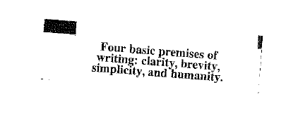
UPDATE: The advice on the fortune is from William Zinsser, a noted writing expert and author of a really good book called On Writing Well, which I recommend. I’ve also learned that many others have received this fortune as far back as 2009. Wow.

After a lovely meal of Spicy Basil Fried Rice, I opened my fortune cookie and found this:

Four

What a surprise. It’s the most unusual but most appropriate fortune I’ve ever seen.

Headings, part 1: Kinds, Typefaces, and Placement

TexasBarToday_TopTen_Badge_Small

Nearly every legal document can benefit from clear, consistent headings. The guidelines here are particularly useful for memos, motions, and briefs. In part 1, I describe two kinds of headings, give typeface advice, and offer suggestions for placement and alignment. I’ll discuss two kinds of headings: topic headings and explanatory headings.

Topic Headings
I use the name topic heading for single-word or short-phrase headings that identify topics, like Argument, Discussion, and Statement of Facts. Because a topic heading isn’t a complete sentence, it doesn’t take a period, and you typically capitalize each main word (Initial Caps). I use the mnemonic C-A-P to remember to capitalize everything but conjunctions, articles, and prepositions. The heading above this paragraph is a topic heading.

Topic headings should stand out from the body text, and here are three good options. (1) Use boldface. Yes, ALL-CAPITALS and underlining are common for topic headings, but if you follow modern typographic principles, you’ll avoid them: they can impede reading and are vestiges of the typewriter. (2) Make topic headings slightly larger than the body text by 1 or 2 points, then add boldface. (3) Use a contrasting font (my preference).

A contrasting font? Yes. If the body text is in a serifed font like Cambria, Garamond, or Century Schoolbook—and it probably should be—then topic headings in a sans-serif font like Calibri, Tahoma, or Verdana will really stand out.

Topic headings designate the major sections of a legal document. For example, in a motion for summary judgment, the topic headings might be Introduction, Statement of Facts, Motion Standard, Argument, and Relief Sought. Because of their nature and the way they’re displayed, they don’t require numbering.

Topic headings are often centered, but that’s not a rule; it’s merely a common convention. Knowing, as we do, that many readers will read memos, motions, and briefs on a screen, and knowing that screen readers have a top-left viewing preference and skim a lot, it makes sense to put topic headings on the left margin. That’s what I do.

Legal documents often use explanatory (point) headings.
I use the name explanatory heading (and point heading) for the full-sentence headings and sub-headings that break up a discussion or argument. The persuasive point headings in motions and briefs are the most common types of explanatory headings, but lawyers use non-persuasive explanatory headings, too. I used one above this paragraph.

If a heading is a complete sentence, and an explanatory heading generally should be, then it takes a period. If it’s a sentence, use sentence case, capitalizing only the first word. DON’T SHOUT AT THE READER WITH ALL-CAPITALS, and Avoid Using Initial Caps For Explanatory Headings Because It Looks Odd.

The best way to make explanatory headings stand out is to use the same (serifed) font as the body text but to emphasize it with boldface, bold italics, or italics. That gives you three outline levels beneath the topic headings. Generally, place the first-level explanatory heading on the left margin and indent each lower level one more tab length.

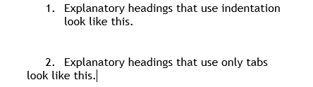
As you format explanatory headings, keep these tips in mind: (1) Avoid over-indenting. If you indent more than three tab lengths, you spoil the left-alignment screen readers and skimmers prefer. (2) Keep explanatory headings to three outline levels if possible. It simplifies things for the reader and helps prevent over-indenting. (3) Use indentation, not mere tabbing, so subsequent lines of text align with the first. Look at these examples.

Indent

Yours should look like number 1.

_____

To comment, email me.