Contingency tables, grouped pie charts, and grouped bar charts display the distributions of two categorical variables and how they relate to each other. They can be used to show how different the distribution of one variable is across the values of the other.
Contingency Tables
Contingency tables, also known as two-way tables, contain the frequency of responses for every combination of values across two categorical variables. When describing the relationship between two categorical variables, it is important to investigate the differences between the conditional and marginal distributions of the variables. A conditional distribution is the distribution of one variable given that the other variable equals some value. The marginal distribution is the overall distribution of one variable, ignoring the other.
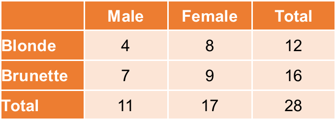
For example, consider the following contingency table:
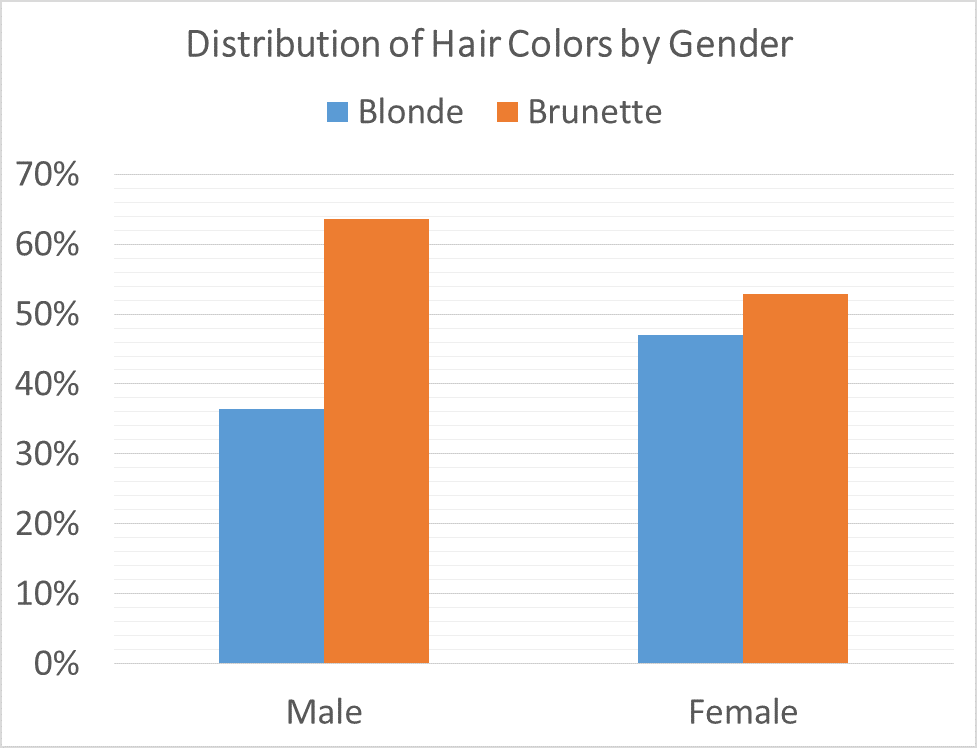
The marginal distribution of hair color is 43% blonde/57% brunette because, of the 28 total subjects in this dataset, 12 had blonde hair and 16 had brown hair. The conditional distribution of hair color for women is 47% blonde/53% brunette (considering only the 17 subjects in the “female” column), while the conditional distribution of hair color for men is 36% blonde/67% brunette (considering only the 11 subjects in the “male” column). By comparing the conditional and marginal distributions, we can see how hair color differs between the two genders.
Visualizing Distributions
Grouped pie charts and grouped bar charts graphically display the data within contingency tables. A mosaic plot is another name for a grouped bar chart where the bars are stacked on top of each other. Below is the grouped bar chart for the data described above:
All of the techniques on this page are only useful for descriptive purposes. For information on conducting an inferential test using two categorical variables, see the chi-squared test of independence.
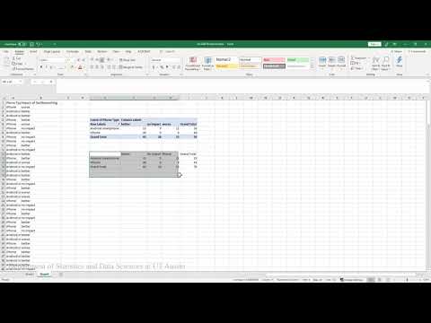
Example 1: Creating contingency tables and pie charts in Excel 2016 on
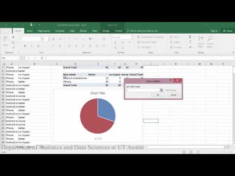
In this example, you will learn to make a contingency table of phone type and beliefs about the impact of social media. You will also learn to make pie charts for conditional distributions.
Creating contingency tables and pie charts:
PDF directions corresponding to video

Creating contingency tables and stacked bar charts:
PDF directions corresponding to video

Example 2: Creating contingency tables and grouped bar charts in RStudio
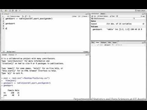
This video shows how to display the relationship between student gender and sports participation at UT.
Dataset used in video
R script file used in video
