Histograms provide a way to visualize the distribution of a numeric variable. Similar to a bar chart in which each unique response is recorded as a separate bar, histograms group numeric responses into bins and display the frequency of responses in each. The x-axis of a histogram reflects the range of values of a numeric variable, while the y-axis can reflect either the frequencies (counts) or relative frequencies (percentage of the total counts) for the range of values of your numeric variable.
Conventionally, it is best to have between 5 and 15 bins, depending on the number of different values that occur in your sample. The larger number of responses you have, the more bins you can use. Bins are created by dividing the range of responses in to an equal number of bins.
Note: In Excel, you must create your own bin ranges, while in R and most other statistical analysis software, the bins will be automatically created for you (and modified as necessary).
Creating Bins
Example: You collected data on the heights of 100 high school students. The heights were measured in inches and ranged from 59 to 81 inches. To create bins, divide the heights up into evenly spaced ranges and record how many students fell in each range. In the images below, we used several different bin sizes to create histograms of the same sample data:
Using four bins does not provide nearly enough detail to interpret the distribution. The same general shape of this distribution is seen in the two histograms using six bins and 12 bins. Using one versus the other is more a matter of taste than a required method.
Describing Histograms
Histograms are useful for showing patterns within your data and getting an idea of the distribution of your variable at a glance. The first distinguishing feature apparent in a histogram is the number of modes, or peaks, in the distribution. A peak occurs anywhere that the distribution falls and then rises again, even if it does not rise as high as the previous peak. A unimodal distribution only has one peak in the distribution, a bimodal distribution has two peaks, and a multimodal distribution has three or more peaks.
Another way to describe the shape of histograms is by describing whether the data is skewed or symmetric. Symmetric data should look nearly identical if folded in half at the center point of the distribution. Data that is symmetrical and unimodal is often described as normal, which is important for checking assumptions of many statistical tests. Skewed data indicates that there is a large portion of the data collected on one side of the chart and only a small portion on the other side. We call the thinning portion of the distribution a ‘tail,’ and the direction of the tail determines how we define the skew of a distribution (left-skewed vs. right-skewed).
The above distribution of heights is unimodal, right-skewed, and contains another interesting feature, an outlier. Outliers are responses that fall well away from the rest of the values. Defining an observation as an outlier is subjective, and should lead to an investigation of that value (not an automatic removal from the dataset).
Example images:
From left to right, the first distribution is unimodal and left-skewed. The middle distribution is unimodal and fairly symmetric (at least as symmetric as real data typically gets). This distribution is close enough that it could be assumed normal. The final distribution is right-skewed.
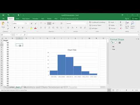
Example 1: Creating histograms in Excel 2016 on
Some of this analysis requires you to have the add-in Data Analysis ToolPak in Excel enabled.
In this example you will learn how to create a histogram of the amount of calories respondents ate at breakfast.
Method #1
PDF directions corresponding to video


Method #2
PDF directions corresponding to video


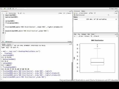
Example 2: Creating histograms in R
This example describes and displays the distribution of BMI measurements from a sample of patients.
Dataset used in videos
R script file used in video


