A correlation or simple linear regression analysis can determine if two numeric variables are significantly linearly related. A correlation analysis provides information on the strength and direction of the linear relationship between two variables, while a simple linear regression analysis estimates parameters in a linear equation that can be used to predict values of one variable based on the other.
Correlation
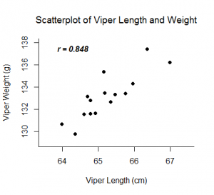
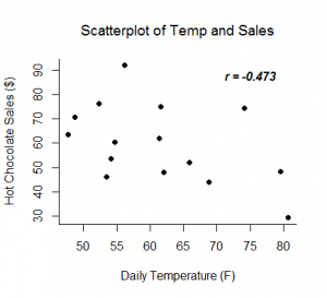
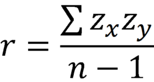
The Pearson correlation coefficient, r, can take on values between -1 and 1. The further away r is from zero, the stronger the linear relationship between the two variables. The sign of r corresponds to the direction of the relationship. If r is positive, then as one variable increases, the other tends to increase. If r is negative, then as one variable increases, the other tends to decrease. A perfect linear relationship (r=-1 or r=1) means that one of the variables can be perfectly explained by a linear function of the other.
Examples:
Linear Regression
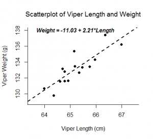
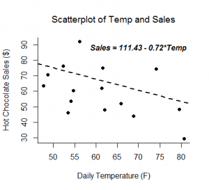
A linear regression analysis produces estimates for the slope and intercept of the linear equation predicting an outcome variable, Y, based on values of a predictor variable, X. A general form of this equation is shown below:
The intercept, b0, is the predicted value of Y when X=0. The slope, b1, is the average change in Y for every one unit increase in X. Beyond giving you the strength and direction of the linear relationship between X and Y, the slope estimate allows an interpretation for how Y changes when X increases. This equation can also be used to predict values of Y for a value of X.
Examples:
Inference
Inferential tests can be run on both the correlation and slope estimates calculated from a random sample from a population. Both analyses are t-tests run on the null hypothesis that the two variables are not linearly related. If run on the same data, a correlation test and slope test provide the same test statistic and p-value.
Assumptions:
- Random samples
- Independent observations
- The predictor variable and outcome variable are linearly related (assessed by visually checking a scatterplot).
- The population of values for the outcome are normally distributed for each value of the predictor (assessed by confirming the normality of the residuals).
- The variance of the distribution of the outcome is the same for all values of the predictor (assessed by visually checking a residual plot for a funneling pattern).
Hypotheses:
Ho: The two variables are not linearly related.
Ha: The two variables are linearly related.
Relevant Equations:
Degrees of freedom: df = n-2
Example 1: Hand calculation
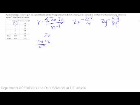
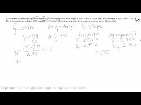
These videos investigate the linear relationship between people’s heights and arm span measurements.
Sample conclusion: Investigating the relationship between armspan and height, we find a large positive correlation (r=.95), indicating a strong positive linear relationship between the two variables. We calculated the equation for the line of best fit as Armspan=-1.27+1.01(Height). This indicates that for a person who is zero inches tall, their predicted armspan would be -1.27 inches. This is not a possible value as the range of our data will fall much higher. For every 1 inch increase in height, armspan is predicted to increase by 1.01 inches.
Example 2: Performing analysis in Excel 2016 on
Some of this analysis requires you to have the add-in Data Analysis ToolPak in Excel enabled.
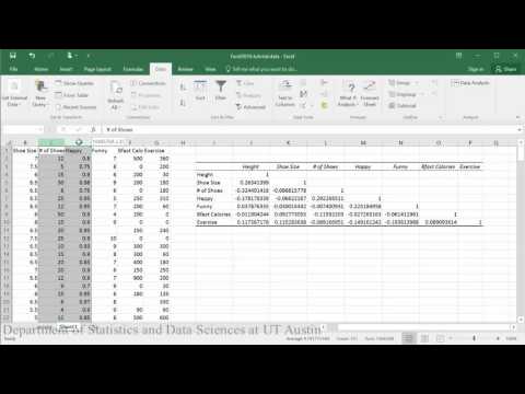
Correlation matrix and p-value:
PDF directions corresponding to video

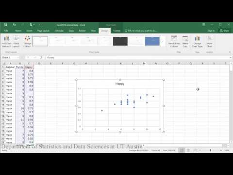
Creating scatterplots:
PDF directions corresponding to video

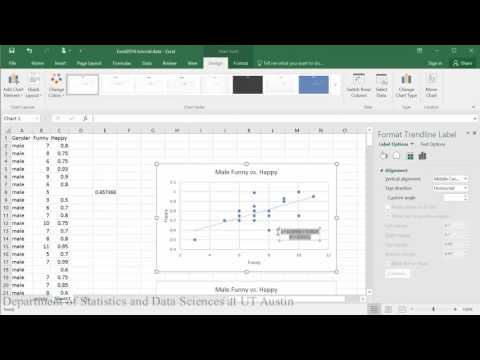
Linear model (first half of tutorial):
PDF directions corresponding to video

Creating residual plots:
PDF directions corresponding to video
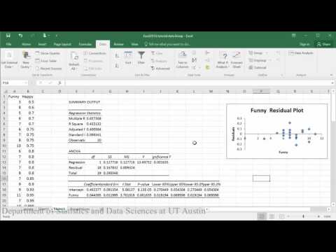

Sample conclusion: In evaluating the relationship between how happy someone is and how funny others rated them, the scatterplot indicates that there appears to be a moderately strong positive linear relationship between the two variables, which is supported by the correlation coefficient (r = .65). A check of the assumptions using the residual plot did not indicate any problems with the data. The linear equation for predicting happy from funny was Happy=.04+0.46(Funny). The y-intercept indicates that for a person whose funny rating was zero, their happiness is predicted to be .04. Funny rating does significantly predict happiness such that for every 1 point increase in funny rating the males are predicted to increase by .46 in happiness (t = 3.70, p = .002).
Example 3: Performing analysis in R
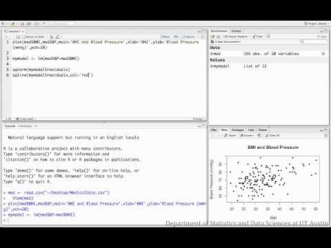
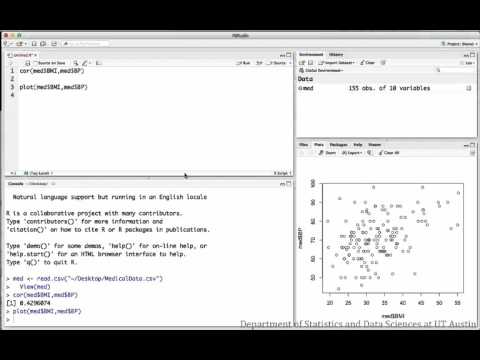
The following videos investigate the relationship between BMI and blood pressure for a sample of medical patients.
Correlation:
R script file used in video

Regression:
R script file used in video
