Milan Week 2 overview

Another exciting week in Milan. From Portaluppi to Terragni to Castiglioni to Boccioni to a small glimpse into Aldo Rossi’s design process. Here are my takeaways from all these designers.

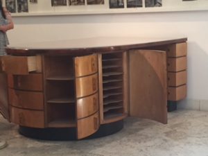
Portaluppi – an explorer, experimenter and visionary. He marbled at patterns, form and function. He loved to throw something old into a contemporary object and vice versa. He designed furniture that was ahead of its time. The black couch in his studio, for example, that particular form is still in use today. He shared his vision for the future and many designers were inspired by that spirit.
IMG_6925

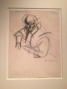
Boccioni – artist, painter and activist. Amazing attention to detail. I was drawn to his pencil studies and portrait work. Especially, the emphasis placed on the human nose—each stroke on the nose added a different quality to each portrait. He truly captured the essence of each person. A shift in his work occurred when he started to deconstruct the image. By placing equal focus on both the object and subject with movement and color, he reversed the importance of the image. He was inspired and drew from his environment. He went from representative to abstract. Or to better describe this shift, he became a futurist, which was similar to cubism, but more powerful, in my opinion, as they were also making political statements. His shift in philosophy also separated him from the Divisionists.
IMG_6973

Terragni – an architect that designed for the fascist regime. He loved to design utilitarian buildings with uniformity and symmetry. He represented uniformity, but designed for very specific needs. He was mindful of every object and its use. The attention to project’s needs was incredible. He designed an elementary school that completely captured my interest. Although, a bit off putting for me, it was amazing to see that he designed every single element of the building was designed to fit a child’s body. The chairs, the tables, the bathrooms, the sinks and even the stairs. The stairs in the back of the building were situated exactly to the Roman tower on top of the mountain (maybe, placed for a historical lesson for the children.) Every aspect of a building had to have a purpose.

Castiglioni – an amazing collector, observer and a very creative man with a sense of humor. He was a problem solver that truly believed in the term form follows function. He was known to say … “if you are not aware, you are not a designer.” His inspiration for his designed objects were actually anonymous objects. For example, he was inspired by a fisherman’s cup to design a lamp. He was also inspired to design a 3 point balance system by a milking chair/stool. His studio was filled trinkets and anonymous object.
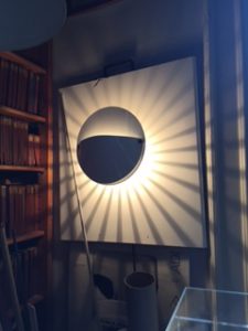
IMG_7579IMG_7576

Alessi

The project that captured my attention at Alessi was the “memory containers” workshop, which prompted designers to draw from their cultural heritage or personal experience to design an object (or I’d like to think, to design a memory). It was great to hear our host discuss the rituals of gifting. “Every culture all over the world has an offering ritual.” They had the designers explore the memory of their gifting culture. There was no prescribed goal or object to design—only explorations. Alberto wanted the designers to have freedom to explore and play without any restrictions. This allowed the designers to explore their traditions, cultures and even childhood memories to generate activities. What arose from this activity was a variety of products. The outcome was so successful that 15 objects were produced from this project. Although, I am not an industrial designer, my thesis project closely relates to this gifting ritual and workshop generated by Alberto. The outcome was different than my Cultura within thesis project, but the intention was the same to use one’s culture to strengthen and build connections. My project involved learning about one’s culture to find strength within. The hope for my project is to create agency and perseverance to continue with one’s goals rather than be paralyzed by fear and doubts. Just as Alberto is interested in developing products that encourage development in the public, I am interested in the development of the community through objects—taking it one step further—I’m making a connection between object and subject to build a stronger, supportive and better community.

Another aspect of Alessi’s visit that captured my attention was the designers’ process of creation and design. I was fascinated by seeing Aldo Rossi’s process compared to Michael Graves, Ricardo Dalisi, Ettere Sottsass, etc … I loved seeing the varying making processes of all designers. It was interesting learning about the transition process for all designers, from drawing to paper to wood prototype to stainless steel prototypes. The contrast from progression to simplification of the final product intrigued me. I was enthralled by Aldo Rossi’s “hands off” style of designing, where he allowed the technical team to solve the small, technical details of the object. He was never preoccupied with the minutia of an object, just the larger vision. He was mainly interested in the final outcome. Unlike, Ricardo Dalisi—he needed to visualize every step of the process so, he created prototype after prototype. He was a visual maker—he created varying prototypes from paper to wood to generate a final product. All artists, designers, and architects had a particular process of designing, whether it be collecting, making, writing or drawing, they all followed different processes. Their practice was based on personal style, they all discovered their way of working. There was no prescribed process. They all wanted to make better products for a better living.

Mapping Project

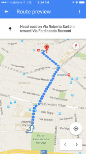
As a group we had our first walk from our first location Universita Luigi Bocconi, to the Torre Velasca Piazza.

IMG_3379

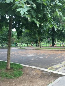
The route was about an 18 min walk. At first arriving to the Universita, it is encompassed by a beautiful public park, with students and people buzzing all around. The closest feeling of this space would be Washington Square Park in New York. As we continued to walk down the path the buildings went from some student living apartments, to hip bistros and bars, and then to a residential area that was less modern with huge magnolia trees, and Jasmine growing everywhere.

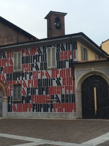
IMG_3362There was a turning point when we  passed an archive building that the whole front was covered in Medieval gothic text. Once we passed this building, the path we were walking was no longer inviting, and felt very stark. We arrived to the Torre Velasca, and the area was basically dead. The tower spread this cold feeling, and there was not many people walking in the area. It was very fascinating to see the transformation of our walk from the beginning to end.

IMG_3376

Sketchbook- Windows into Worlds

I want to preface this post with the fact that I’m not someone who can consistently keep up with a journal or a sketchbook, especially if it is assigned. There is this inherent dislike of regimented cataloguing and documentation that I refuse to do when it is an assignment. So the fact that I have kept up with this assignment, and with enthusiasm that has surprised me, is really an exciting and encouraging prospect. Maybe I am growing out of my childish rebellion, who knows.

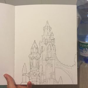
Milan has to much to document and draw that at first, I couldn’t settle. I spent the first two days so overwhelmed with what ti draw on the very first page of my sketchbook that I ended up doing nothing for that time period. Finally, I had to just scold myself into sitting and doing SOMETHING. Ironically, I opened up my sketchbook the wrong way, so the scribbled drawings of the arches seen at the roof of the Duomo are at the back of the book. The actual first page is a sparse outline of a display window I drew while waiting for some classmates to finish up shopping one free evening the first week. So much for a good start…

But those two drawings gave me a good starting point for what I wanted to fill up my sketchbook with.Over the course of this study abroad, I decided to catalogue the different types of moulding and decor that adorns doors, windows, and arches. Milan, and Italy in general, has some really beautiful windows and doors, with elaborately carved detailing added to what is essentially a hole in a wall. There certainly isn’t a lack of simple glass windows around the city, but the abundance of old structures drowns out the simpler buildings.

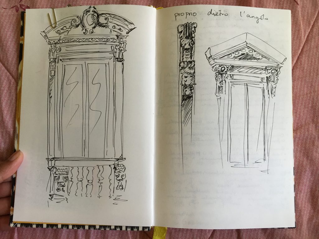
The first spread I chose for this post was the sketch of two windows that I noticed from the window during one of our lectures in basic Italian. The two windows are from the same building, seen one on top of the other, and they’re so very different. The former used more circular motifs, coifs, and has a beautiful little balcony rail. The latter seems to reference the triangular pediment of the Parthenon in Athens. The common motif is the leafy bands that run down the sides of the windows. They are set into the flat facade of the building.

Windows from the window of IES

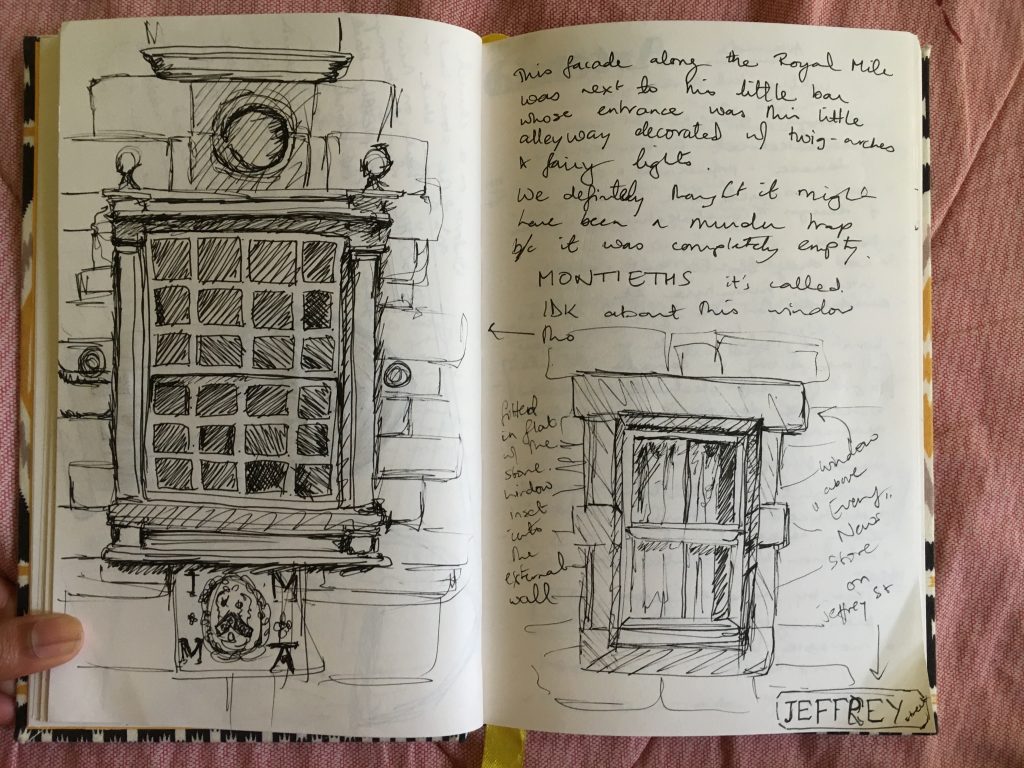
This past weekend in Edinburgh, the window and door vibe was drastically different. Both Milan and Edinburgh are intertwined with their respective old heritages but Scotland hails from a very different time. The history in Edinburgh really begins in the Middle Ages, and that is quite apparent, even through the little windows and doors of places. The windows (as seen in the sketches in the spread below) are simply decorated with linear patterns, and maybe the occasional moulding for decoration.

Windows from a caffè along the Royal Mile in Edinburgh.

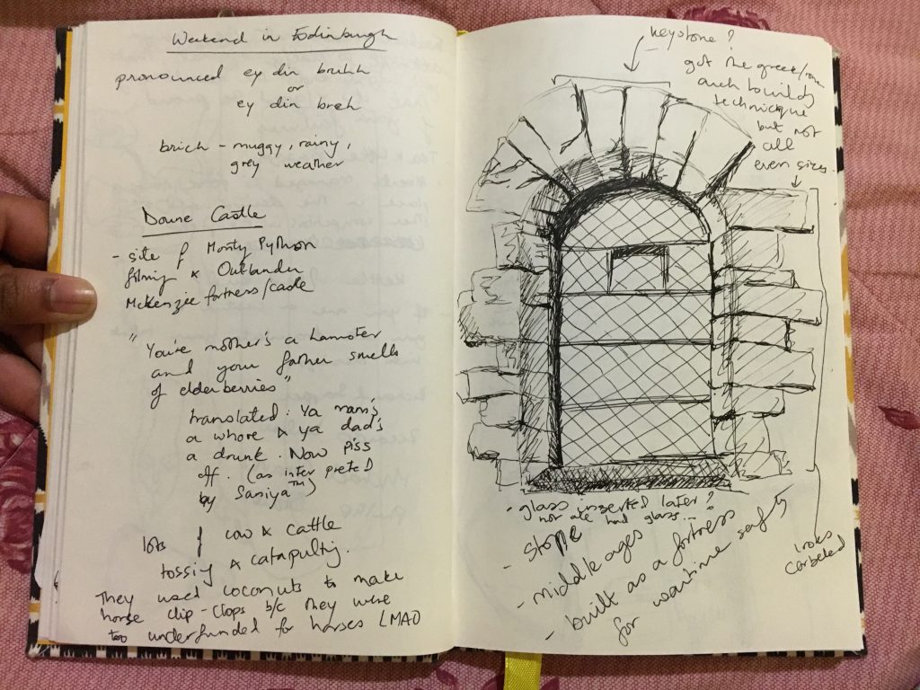
The windows at Doune Castle, where certain scenes from Outlander and Monty Python were filmed, had arched windows with a keystone to hold the arch together. But again, these windows were very very simple, set into the corbeled stone walls and not protruding like the windows in Milan.

Doune Castle near Edinburgh in Scotland.

With this bit of comparison and background in mind, I’m looking forward to finding more patterns and history through doors and windows.

Alessi

The Alessi factory and “museum” was quite frankly the most amazing space ever. I’ve said on multiple occasions that as long as I had a supply of food, I could live my life out in an art supply store. The same applies to the Alessi design archive. I bet there wouldn’t be a single dull day there because I’d be finding some small little work of design that had a deeply intriguing backstory to it. Our tour guide for the archive was the cutest little Italian lady who perhaps was the best estimate for a middle aged Luna Lovegood.

One of the central themes in their process of design is functionality and durability while also building an emotional relationship with the user. That primarily seemed to manifest itself through the “cute” aspect whether it be gimmicky and silly or just compact and adorable. As our lovely tour guide started to elaborate on that theme though, the relationship aspect became clearer. She mentioned a project that Alessi had for a group of designers where they were asked to create a tray or object that drew inspiration from memories of comfort and home. The artists involved drew inspiration from childhood memories or things commonly used in places where they grew up to forge a sort of emotional bond with the piece they created.

This concept of functionality and familiarity seems like a rather clever way of denoting their products are worthy of a place in someone’s home. The environment of comfort and warmth that Alessi strives to imbue in their sensible and necessary domestic products really came through.

Alessi Museum

Alessi Reflections

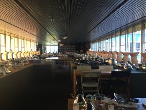
We visited the Alessi Factory and Museum. We had a fantastic and thorough tour of the archives, or what they call the “museum.”  They had rows and rows of every product they’ve ever made. Including the prototypes, and final products. There were even some items that never saw production. I loved seeing the process the designers for Alessi go through to get to the final result.

Alessi mainly focuses on home goods, especially kitchen products. Their showroom, which greeted us when we walked in, was vast and full of their favorite collections. It showed the evolution of Alessi products nicely.

Alessi Showroom
Alessi Showroom
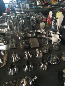
Some items from the showroom

One thing that I enjoyed hearing about was their failures. Their failures helped them become the company they are today. Without their biggest flops, they would not be as creative, as design oriented or as innovative. They took leaps of faith and took on projects that were not the usual Alessi projects. For example, they started working with artist’s to make affordable art for the home. They were hand designed objects that were supposed to be put in production, but ultimately never were. Alessi worked with Dali to create a designed object for the home, but the project was shut down before it hit the production line. Failure = future success for Alessi!

Sketching//week 2

My sketch notebook theme has changed a few times since we arrived in Milan. At first, I wanted to focus on shoes. I had noticed that Italians wear nicer shoes on the everyday. But then I thought I might get bored of drawing shoes. From shoes, I decided to focus on children’s clothes. But I felt creepy taking pictures of kids to draw later or staring at kids to sketch them. Children in Milan are also dressed so nicely. The are little fashionistas. I was inspired by Humans of New York’s “micro fashion” segment that he shares every week. After I had decided it might be difficult for me to capture exactly what I wanted about my travels through children’s fashion, I decided to change my theme for the third and final time!

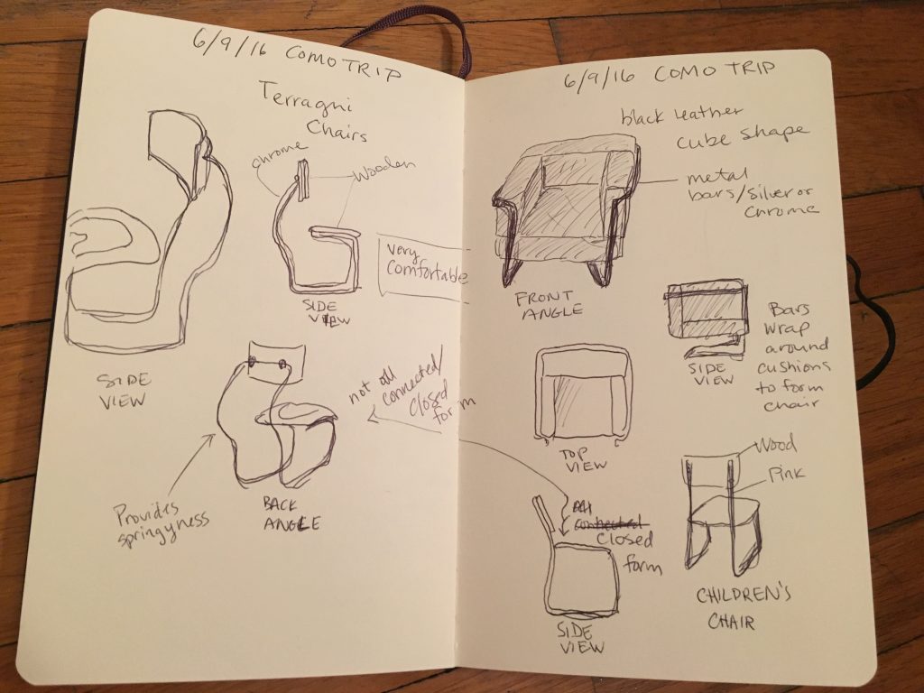
Now, I am focusing on chairs. After visiting a lot of designers studios, I noticed that chairs were very important for design. Many designers, designed their chairs, which I was surprised by. Even architects designed chairs! So I started y sketching so designs from the Castiglioni Studio visit and took off from there. I’ve started to notice chairs everywhere now. Designers tend to think about every aspect of the chair, of course, because they are designers! But I have noticed that the mass produced chairs are less comfortable. Their main purpose other than being sat in is usually storage-ability. That is an interesting way to think about designing a chair. It is an important factor for institutions such as museums, schools, restaurants, and anywhere that could need chairs to be stackable, or collapsible.

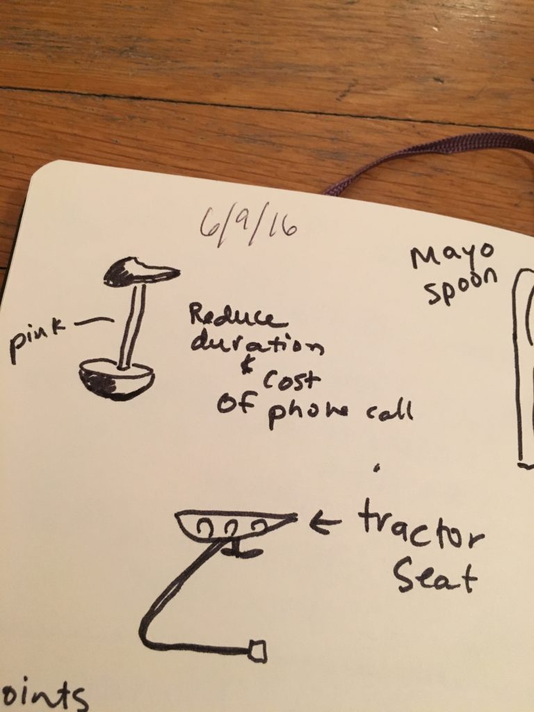
The Castiglioni and Terragni chairs, however, were designed with other things in mind. Comfort level being one of them. Castiglioni designed a chair that had one leg, which balanced on a half sphere. It had a bicycle seat for a seat as well. The object of this chair was to be uncomfortable. It was designed to keep people on the phone for less time. Phone calls were expense back then, so he wanted to make sure no one talked for long. Terragni, on the other hand, created dynamic and comfortable chairs. He thought of the curve of the back and the angle of recline for sure. The metal bar in the sketch of the chair below had a nice springiness to it that made it quite comfy.  The other sketch of the chair pictured was plush and soft. Shaped like a cube, this chair allowed the sitter to rest their arms comfortably while still supporting the back. A+ designer chairs!!

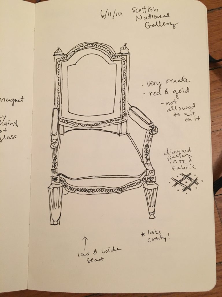
This past weekend in my travels to Edinburgh, Scotland, I found lots of older style chairs. I took tons of pictures so I can fill up my sketchbook with the royalty worthy chairs of Scotland.

Scottish National Gallery Chairs

Futurism in Umberto Boccioni’s Work

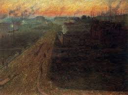
The first time I had heard of futurism was two weeks ago. Umberto Boccioni is one of the most well known futurists, so it wasn’t too difficult to make connections from his work in the Palazzo Real to the futuristic style. His piece “Twilight” really stuck out to me and exhibits different characteristics of futurism. The factories in the painting portrays the beauty of speed and machine of the futuristic era. Space does not exist in the painting. Due to the dark hues you can’t tell where the landscape begins and where it ends.

"Twilight" by Umberto Boccioni
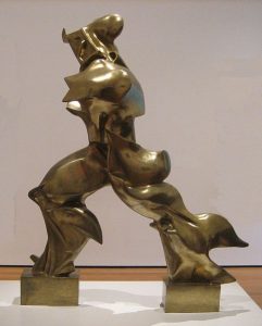
Another piece of artwork that stood out to me was the beautiful bronze sculpture “Unique Forms of Continuity in Space” also by Umberto Boccioni. The sculpture appears to be of a man running. The movement of the sculpture corresponds to the speed of the fast paced factories in Boccioni’s other painting “Twilight”. The sculpture is definitely unique, following the rule in the Futurist Manifesto that states that all forms of originality will be glorified. The sculpture also portrays movement where you can’t fully tell where the man begins. Another piece of artwork by Umberto Boccioni I enjoyed that was at the Palazzo Real was “Tre Donne”.

image

Scotland Excursion

Edinburgh, Scotland. land of the kilts, bagpipes, and fine whiskey. All of which should be consumed in moderation.

day 1:

We arrived around noon and decided to take a taxi to a hotel we had previously booked. we were early and decided to have lunch in the bar downstairs. that was when we realized we weren’t in milan anymore, because our waitress and hostess spoke english. not broken english either. after a few weeks of only hearing italian or english with a heavy italian accent, english (albeit with a scottish accent) was quite jarring to say the least.

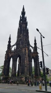
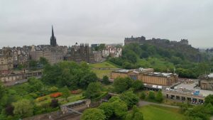
After checking in we explored the grass market – a tourist-y location. Then we paid 5 pounds for an amazing view; we climbed to the top of Sir Walter Scott’s memorial building, and we were able to see all the way to the sea.

Sir Walter Scott's' Memorial Building
Sir Walter Scott’s’ Memorial Building
13418704_1715174985402300_3900500980492552705_n
View from the very top

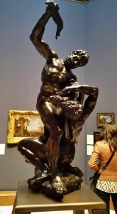
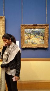
We were also able to explore the Scottish National Art Gallery that housed quite a few spectacular pieces of art shown below:

Cain and Abel Statue
Van Gogh
Van Gogh


day 2:

We took a bus tour that allowed us to explore 2 castles as well as the Scottish highlands. It was an extensive 10-hour, gorgeous bus ride. We stopped to eat, take photos, and generally enjoy being in Scotland, while simultaneously learning about its’ history.

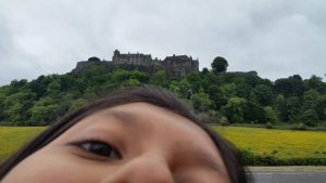
Campbell's Castle
Saniya ft. Campbell’s Castle
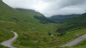
A place called "Rest and Be Thankful"
A place called “Rest and Be Thankful”

day 3:

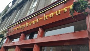
We decided to sleep in and grab a late breakfast. Where better to go than the cafe that J.K. Rowling spent hours upon hours bringing Harry Potter to life. The place is called “The Elephant House”, and they sell t-shirts that read “the birthplace of Harry Potter”.

The Elephant House - "birthplace of Harry Potter"
The Elephant House – “birthplace of Harry Potter”

Also, the bathrooms are covered in graffiti from people all over the world thanking J.K. for Harry Potter as well as making punny jokes or quoting the book itself.

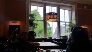
The view from inside the Elephant House (you can see Edinburgh Castle just outside the window)

It truly was a magical place.

For the rest of the day we simply roamed Scotland, and we tried to take in as much as possible before departing.

Strange to think that after only 2 weeks in Milan and it already feels like home, and I genuinely was looking forward to returning after such a long and eventful weekend. I’ve missed my CA Anna and the already familiar roads and cafes. Oddly enough, I also missed the uncomfortable feeling of not completely understanding what everyone is saying 100% of the time. Being forced out of my comfort zone is what attracted me to Milan in the first place; so, although Scotland was an incredible, English-speaking country, I am quite happy to be able to drink my caffe macchiato here in Milan.

Week 2: Sketchbook + Mapping

Here you can see the transition to Scottish buttons at the bottom of the page
Details of divisions of flushers

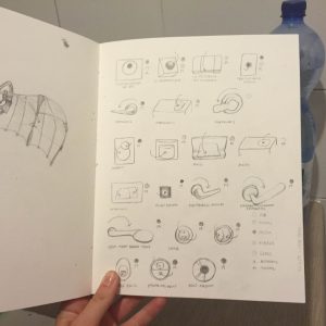
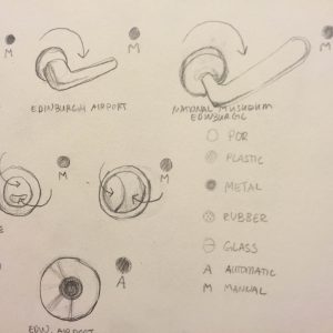
This week I gathered more toilet handles from interesting places. Portaluppi’s creations housed the most handle (often traditional in America) devices. Terrangi’s kindergarten. Alessi’s bathroom. Such famous handles. Out of the roughly 15 photos/drawings I have made only two even vaguely match up. Terrangi’s and Portaluppi’s handles seem to have the same thin silver handle, unfortunately I did not think to ask the tour guide if these were originally there or later altered (something I will be better about in the future). Also branding, in my rushed moments of taking photos in a bathroom stall, the images of the brands often come out unidentifiable. It’s already so easy to identify how much more variation in branding and form Milan has than the US.

Snapshot sketch of some of the Edinburgh views

Taking photos of toilet handles in Edinburgh, Scotland (on our beautiful weekend trip) also showed a change from Italy’s. Most of them were not handles at all, but a circle push. It’s interesting to see the transition in my sketchbook as the variety of the forms single down to circular shapes.

I may have to do background research and match branding up with the handles post image and online. After this I plan to reserve a page each for all of the different brands I learn about, their history and (if any) company mottos of functionality/design. I have also divided up the devices by material (plastic, metal, glass, rubber) and automatic vs manual. I am starting to take more interest in their locations and what establishment they were found in.

As for the mapping, my group and I have lightly established what we find interesting about the project (although we have been unable to walk to the actual path yet). My idea is that since we have been so heavily focusing on the history of the architecture of Milan, I was thinking it would be interesting to pick out little traces of history (ie: an art nouveau window bar, any remnants of rationalism on a street corner, etc). It could be as specific or broad as we wanted. And then creating a sort of ‘timeline’ that includes our present walk down the street + all of these historical moments (could be with simply typography + line mapping + possibly icons).

This historical map could be combined with our own little intricacies. How we feel at each spot. Where gum got on our shoes. Where I may or may not trip and skin my knee. Where the pasta smells good and garbage smells bad. It could be a huge collaboration of time periods clashing (could be shown in different colors or directions of the lines). Walking the area will most definitely affect my vision, but I’m so excited to have an idea I am passionate about to spark ideas from!