Week 2: Palazzo Reale+ Museo Del Novecento

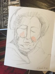
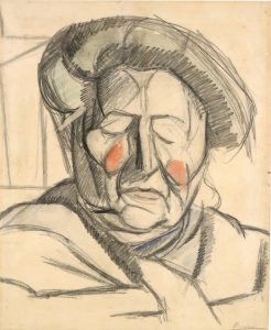
The two musuems, of Palazzo Reale (showcasing Boccioni) and the Museo Del Novecento, offered varying perspectives on the tumultuous time before and during the Futurists. The Boccioni museum gave an indepth account of his life, as a student and then master. Umberto Boccioni, one of the future signers of the Futurist Manifesto, was once a student of Impressionism. In this way, the museum walks viewers through his education, later rejection of this education, and to his new futuristic creations. A piece that struck me was, La madre dell artista (1913). This piece seemed to defy the oft violent nature of the Futurists, and instead depicted a motherly figure (specifically his). Although the lines of the sketch are brash, quick, and bold, the rosiness of her cheeks seem to soften both her face and the entirety of the sketch. It is a moment in which modernity to meets motherhood. One can also note his interest in Picasso’s work  intertwined with his own (towards the end of his life) in this sketch..
Bocciolini
Boccioni Personal Sketch

At the Museao Del Novecento, one can see another female depicted with a Futurist twist in Bambina per Balcone by Giacomo Balla in 1912. The painting is a blur of blocks depicting his daughters motion across the floor. (Interestingly, Balla was a Divisionist teacher of Boccioni’s in 1902 and they later on they both signed the Futurist Manifsto in 1910.) This painting is not the study of a car, or horse, or train’s movement, but that of a little girl. Both pieces showcase a refreshing intervention of femininity into the Futurist movement.
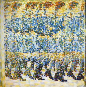
 

Giacomo Balla, 1912
Giacomo Balla, 1912
Boccioni 1913
Boccioni 1913

Architecture in Italy

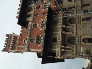
Italy. Just hearing or reading this word, a sign of amazement comes onto our face. Elaborate buildings, food, paintings, sculptures, renaissance, and thousandths of years of history is reminded. Coming to Italy has been a dream and seeing this dream getting fulfilled every morning here in Milan is something that I would have never imagined occurring at such a young age. I still remember the first day when I came to Milan a week ago. Decorated balconies and windows with eye-catching color of the buildings really stunned me. Having seen only the pictures of Italy and now getting the opportunity to experience this country in real, was out of my imagination. During this first week, a lot of exploration was done. Amazement was discovered at every step. The continuous sighting of elegant buildings endlessly kept my attention. Intricate designs, colorful flowers by balcony, expressive paints used outside of apartments kept me immersed into its beauty. While a lot of this week was spent outside to discover Milan, a discussion was also led onto the topic of futuristic movement. Though loathing of old styles and traditions in arts and politics did not receive positive response, futurism did influence new era into discovering new ideas in the fields of technology, arts, and architecture. Architecture today that I have seen so far in Milan, still appears as sophisticated with a touch of ancient times design. Less contemporary designs are seen or at least to me have been discoverable. However, in urban side of Milan neo-futurism designs can be possibly seen. But the chances of seeing antique architecture is higher than contemporary designs. Buildings following traditional architecture form instead of following the futuristic movement, is more admirable for tourists. This particular use of decorative buildings draws every individuals’ sight, including me. If buildings in Milan or any other European city is like western society, there would be no difference left at different points of the world. While there will be admirers for futurism architectural designs, there is nothing like looking at hundreds of year old building to be fascinated by. In western culture, we typically see neo-futuristic buildings at metropolitan cities but getting a chance to see different patterns, colorful, unimaginable buildings here in Europe is something that needs to be kept rather than changed. Yesterday, when visiting Venice, I discovered the same thing. Buildings, streets, little restaurants gave immense fascination to the way they have been for many years. Changing this style and bringing an unsuitable movement in architecture could leave behind the amazement that one gets when discovering years old of architectural design. With my time being here in Italy, I wish to discover more in the fields of architecture and the beautiful city of Milan itself.


IMG_5041

From Divisionism to Futurism

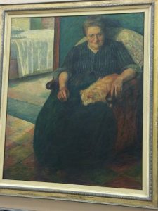
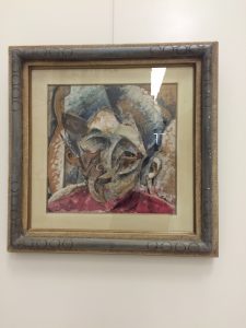
Umberto Boccioni, an Italian painter, shaped the futurist movement during the 1900s as one of the principle characters. When walking around Boccioni’s exhibition, a change could be seen directly in his works of art. As time passed over the years he started going from more realistic paintings to creating more of an abstract pieces. During the early 20th century, art is still in the realm of Divisionism. With focus more on light and color, paintings could be discovered following this concept. Using Divisionist techniques, Giacomo Balla leads Boccioni and other artists to follow this trend. With Balla’s teaching, Boccioni creates a masterpiece called La signora Virginia in 1905. When seeing this painting at the exhibition, the colors and the realistic feeling that I was getting by just looking at it awed me. Divisionist technique is described as a painting with divided colors rather than mixed. In this painting, just this type of technique can be observed. The white color of the bed in the background is separated by the blue and green color of the woman’s clothing. Also, the cream color of the sofa is separated from the blue-green color of the wall. Lastly, the yellow and orange color tiles are also separated from each other. By following this technique, the overall painting is made to look more realistic. Even the facial expression on the woman’s face gives off a subtle yet expressive tone. Later around 1910, Boccioni starts experimenting with shapes and geometry. Passing Divisionism and entering the era of Futurism, Boccioni along with other artists started creating more of a modern art. Speed and dynamics is their motto in creating modern yet heroic images. This type of modern art can be seen when Boccioni creates an abstract piece called Dinamismo di una testa di donna in 1914. From creating realistic pieces before 1910 to designing abstract paintings in 1914, an effect of futurism can be seen. When looking at this abstract masterpiece of Boccioni, a loss of divisionism can be sighted. Additionally, loss of definite lines, shape of the face, eyes, mouth, nose can be easily discovered. Furthermore, the medium of this art piece is also mix media with tempera and collage on canvas. With this type of media, one can tell that Boccioni was experimenting new techniques in this futurist era. When I looked at this art piece, it was hard to tell exactly the type of emotion Boccioni was trying to portray on the woman’s face. Without focusing more on the emotions, the artist instead focuses on the technique to signify the movement that artists of modern society were moving towards.

IMG_5641 IMG_5648

Plants in Urban Life!

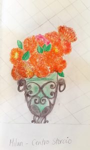
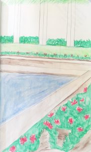
I wanted to focus my sketch notebook on vegetation in urban life across Italy. The climate in Italy is amazing, allowing so many flowers and plants to flourish, and that immediately grabbed my attention. With most of the streets of Milan covered in centuries and new architecture, I expected there to be much less plant life similarly to when traveling to New York. This was actually a surprise, but the more you look at most apartments and buildings there are vertical gardens, and lots of mini squares hidden within the developed space of Milan. They are interesting to look for because most much of the plant life is hidden or high up above. There are also several plants that are found back at home in austin like Jasmine for instance. Plant life is also a prime way Italians can also decorate and customize their living spaces and differentiate what their balcony or square looks like from their neighbor and house located near them. These few drawings I have included are all different spaces. One is a private pool to a house that was built by an architect that we discussed in class. Another one of the sketches was a vase that I walk past every few days that has bright orange and warm colors. The last picture is of a balcony that had intricate details with small yellow flowers

.sketch3sketch2sketch1

week two : alessi

Processed with VSCO with p5 preset

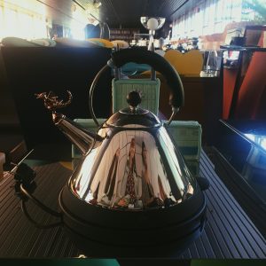
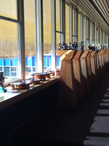
Walking into Alessi, you immediately know you are walking into a place full of creativity and history. From the colorful, quirky hallways to the enormous showroom, the Alessi factory is the home of so much design and so much inspiration. As a company, Alessi follows suit with a popular tendency of Italian design: fusing design with art and architecture.

Seeking out designers from all different backgrounds, they open themselves and their customers up to diversity in their products: in the way they are viewed, contextualized, prototyped and produced.

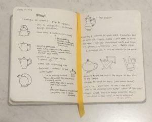
Alessi has the noble goal (in my opinion) to not only make things that are efficient and functional but that are exciting and pleasing! They want people to get excited about buying a lemon juicer or a coffee maker. Alberto Alessi, when he transformed the company to focus on design, knew that those everyday, “common” objects are a part of a life, family and home. They need to satisfy not only functional needs but those of poetic and emotional needs as well. That kind of thinking is the way that I would like to think of all design. Not only in the context of my sketchbook or prototypes but in the way it interacts with the world and becomes a part of someone’s life.

With my focus being on the Italian relationship with the table, meals and food, seeing the different approaches to gadgets used in the kitchen and restaurants gave me more insight into that relationship and how it can be effected by products such as those from Alessi.

IMG_7354

Alessi

For a company, creating an attractable consumer good can mean a whole new game. Alessi, a design company producing everyday items for household and kitchen supplies, dates to as long as the 1920s. A firm that began with Giovanni Alessi creating objects out of wood and metal, now is remembered by its design element that his son, Carlo Alessi, brought into. During the 1970s, Alberto Alessi is also responsible for collaborating with famous designers such as Castiglioni, Sapper, Mendini, and Sottsass. It was during this time that having a design element in mass production was necessary. When visiting Alessi this past week, a sense of attraction could be felt from every corner. Seeing a mere household item, such as a spoon so charming with its shining and smoothly curved element, brought amazement just viewing at it. Even sighting items such as the strange looking lemon squeezer, made me realize the importance of inspiration. Even though in market some items don’t work so well, by still having inspiration and the willingness to create anything, everything can be possible. Old elements can be transformed for new items to be created. Even today, Alessi continues to follow the same pathway through designing appealing objects for consumers to utilize and I’m grateful to have received the opportunity to visit this company.IMG_5951IMG_5946

Achille Castiglioni

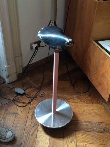
As a designer, Achille Castiglioni, never failed to impress viewers. Walking into his studio and seeing a flat silver object turn into a drinking glass on the go, brought an immense admiration of his work. Just hearing that Castiglioni worked and lived entirely in his studio, explained the dedication that he gave for his work. Though Achille grew up in a household of artists and architects, he did manage to mark his own name in the design industry. In his studio, various items were found that were inspired by various events, individuals, and other objects. Furniture, lamps, and everyday items for kitchen were discovered in his studio. One particular lamp that I remember seeing was one inspired by his wife. As she loved to read but would leave the lights on at night for reading, Achille designed a penguin shaped lamp that had only three pieces. Additionally, he designed a bicycle shaped sit and placed it next to a telephone so conversation duration is short due to discomfort caused by the bicycle sit. With many of the objects as eye-catching as these two objects, it can be concluded that Achille was indeed a curious man with a curious mind. IMG_5837 IMG_5824

sketchbook : week 2

I’m so pleased that I have finally gotten over the initial hump of generating content for my sketchbook. In the first week I was thinking too hard about how I wanted to set it up or how neat I wanted it to be but once I stopped caring about it being perfect, all of the visual thoughts I was having starting flowing out onto my pages.

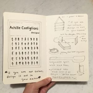
Castiglioni’s studio really kick-started my creativity because there was SO MUCH to sketch and I really wanted to remember all of the ingenious inventions I was seeing. Some of his devices were a challenge to illustrate because they had dual functionality, such as “cow-milking belt” or the tiny swinging desk he built for his daughter. I’ve been enjoying utilizing arrows to demonstrate how things work.

FullSizeRender (3)

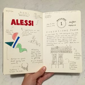
Since I finally narrowed down my focus on branding, I started to pay attention to my surroundings much more. For example, when we went to Alessi, I was completely unaware of their logo for the entire duration of the tour. The first time I realized that they use heavy red typography as their logo was when I stepped into the gift shop. I found it interesting that they paid attention to the branding in the gift shop and neglected the factory.

FullSizeRender (4)

On the other end of the spectrum, a few of us went to the Fondazione Prada in Milan to check out Bar Luce which has extremely consistent branding. Bar Luce was designed in part by Wes Anderson which made complete sense upon walking into the cafe. The interior was minimalistic to an almost surreal extent with pale pinks and greens lining the walls and ceilings. The logo was plastered on all of the menus, mugs, and coasters. Everything matched and was perfectly placed, much like how the scenes appear in his movies. I had fun making notations of my observations, it made me feel like I was really taking in the whole experience.

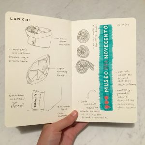
I fell in love with the branding of the Museo del Novecento so that was a great opportunity to use my new Stabilo pens in my sketchbook! All of the coloring was very consistent and the graphics were minimal. It is interesting to see the big museum brands juxtaposed with the small pieces of branding I come across from day to day such as a breadbasket label I stumbled upon at lunch one day. At first I was attracted to the design of the basket which was a machine-washable paper bag material. Upon closer inspection I realized I really admired the label and that ended up taking up a whole page in my sketchbook. The lesson is to always keep my sketchbook in hand so I am ready to sketch when I least expect it.

FullSizeRender (2)


Study of Boccioni

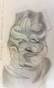
One piece I wanted to focus on is Antigraceful by Umberto Boccioni, which happens to be a bust of his mother from 1913. This sculpture is one of the first sculptures that emphasizes his rejection of past and present art canons. There was this quote that Boccioni stated “We must smash, demolish, and destroy our traditional harmony, which makes us fall into a gracefulness created by a timed and sentimental cubs.” This sculpture was part of Palazzo Reale’s Umberto Boccioni: genius and memory exhibition. This sculpture emphasizes a drastic change from his older work that was very traditional of the time. He painted dozens of rationalists/impressionist paintings and studies of people/portraits. It is tempting to assume that this work was influenced by some of Pablo Picasso’s work, but it could vice versa. The cubist portrait emphasizes his mothers features such as her eyes and nose, but in a way makes each of the wrinkle lines change in different directions.

In the class reading over the past week in the book Made in Italy, there is this quote on futurism and design: “In the words of Merjian, “Rather than use design as bulwark against industry, the Futurists were the first avant-gardists to collapse such distinctions so radically or at least to call for their collapse.” Befitting, perhaps, a movement glorifying war, futurism can be said to have inaugurated Italian design’s age of extremes, by bringing together modernist aesthetics and the material culture of industrial society.” Boccioni is an excellent example of Italian artists of the futurism movement, changing the process and work of his art.

In the drawing and sketches of Contre-Jour in 1910, is also one of his first examples of taking a step back from what he has created in the past, and changed his concepts to a more futuristic approach with the more crazy details than the image looking more like a portrait from the past.

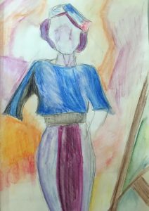
A later painting I wanted to learn more about is called “Study of a Woman with Houses”, by Boccioni. This painting still uses pastels similar to the impressionists but it starts to have more of a cubist futurist aesthetic. I read theFuturist manifesto at the Museo 900, where this painting was located, “ All things move, all things run, all things are rapidly changing a profile is never motionless, before our eyes but constantly appears and disappears.” This painting shows how the light and shapes are frequently changing, and to form compositions with more rigid lines than to make the work perfectly organic and alive.umberto boccioni 1milan2

week two : boccioni

Umberto Boccioni only lived to be 34 years old, yet he is known to be the “principal artist of futurism.” This speaks to how the vast amount and quality of his work and how high he is held especially by the city of Milan.

Being able to walk through his beginnings allowed for a better understanding of Boccioni’s work and process. Due to his worldly travels as a young man, he was able to study under some great European artists and try out many different styles and techniques to help shape his career.

three women

One work of his that I was drawn to at the Boccioni exhibit is “Three Women,” a portrait that was done at the dawn of futurism. Categorized as a divisionist work, Boccioni’s brush strokes are done in a way so that you can see the individual colors instead of there being a gradient between them. This piece is a good example of the transition from divisionism to futurism because you can see Boccioni begin to focus more on the lighting in the women’s hair and dresses instead of the actual women. The strokes that are meant to be rays of light coming in somewhat take the focus away from the women.

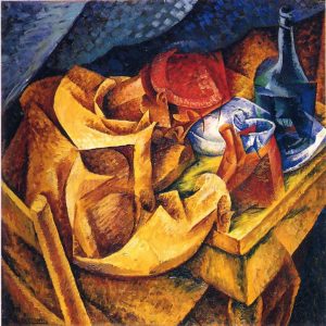
the-drinker

This painting, “The Drinker 1914,” was done at the height of futurism for Boccioni. Compared to the portrait above, the brush strokes are much more pronounced, the lighting is even more dramatic, and the color is more intense and vibrant. Unlike much of his earlier commissioned work, this painting is an observation of Boccioni’s, not something he is getting asked to paint by a patron. The man featured is not really the focus at all. Boccioni has also broken down the painting into shapes and colors, leaning towards some inspiration possibly from Pablo Picasso.