florence : week 5

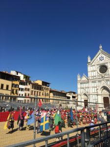
Florence was one of my favorite parts of my trip to Italy. Since there is so much to do there, our days were certainly packed. Upon arrival, we walked around our neighborhood which was not hard to figure out that it was the fashion district. The cobblestone roads and fancy window displays were an interesting juxtaposition and perfect home base for our time in Florence. Almost as soon as we put our bags down, we headed to the leather market to hopefully pick up some more bags. I was first struck by the quantity of vendors at Piazza San Lorenzo, and then by the quality of the leather goods they were selling. It was fun to haggle and all in all it was a successful trip for all of us who treated ourselves to a new leather bag. The next day was what we were really excited for, a tour of the Uffizi and Accademia Galleries. We hopped out of bed for our 8am tour and as soon as we could blink we were standing in front of world-famous sculpture, “David”. This was truly one of my highlights of the trip. This magnetism of this sculpture simply has to be experienced. Next stop was the considerably more crowded Uffizi where we saw “The Birth of Venus” and “La Primavera”, two more stunning glimpses of art history. On our way back from the tours, we meandered off of our path and got a bit lost. We knew that we were lost because we approached a big set of bleachers that we were certain we had never seen before. Our curiosity kicked in and we walked closer to see what was going on. Seeing no barriers, we meandered onto the bleachers and sat down in the front row. About ten minutes later horses and men in costumes flooded the Piazza and that’s when we realized it was some sort of jousting game. It was so cool to see this event in such a historical place because it seemed so authentic, like going back in time.
IMG_6506


treviso : week 5

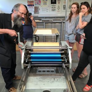
I’m glad that we got to spend our final days in Europe traveling to Treviso. I think some of us were skeptical to be away from Milan in our final moments but the things we saw in Treviso made the four hour bus ride totally worth it. First, we went to Tipoteca Italiana which is a type museum. Our class had had some experience with letterpressing so this place was particularly fascinating. We wandered through there spotless museum and saw the origins of print come to life. Letterpresses, type cases, and important documents lined every wall. Our tour guide emphasized that Tipoteca is “a museum that leaves”, meaning that they want everyone to touch it, interact with it, and be able to take home a piece of it. This led to our next exercise. They were kind enough to let us design and print our own poster, but first we had to come to a consensus as a group about what exactly it would look like. This was a pretty long process. We decided to highlight our program name in Italian (Design in Contesto) with the names of all the designers we learned about scattered behind it. Although it took a long time to get everything right on our end, the poster turned out beautiful!

IMG_6681

Next stop was Fabrica, a communication research center, which to me was almost like a monastery for designers. As our guide toured us aroudn their top-notch facilities, we got a glimpse of the students who work there and learned about how we could apply to be a part of it. Basically, you can apply to study there for a whole year for free, but you have to be selected from a competitive group and then undergo a two week testing period before you are officially accepted. It sounded like a fantastic opportunity and great challenge. Before heading off to the design department, we got to see some of their work, the majority of which was incredibly gripping communication designs that took the form of posters, videos, or sculptures. We met the director of design who explained to us the importance of having people from many different cultural backgrounds at Fabrica. He then showed us a few campaigns that they worked on that were incredibly clever. Our tour guide then showed us the library that many of us never wanted to leave. We could have spent hours or even days scoping out the design books in their tiny but amazing library.

IMG_6742

rome : week 4

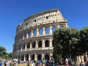
This past weekend, many of us had the chance to travel to Rome to see the sites. I was particularly excited for this weekend because I turned 21 on Saturday! When we arrived, we realized that our Airbnb was very close to the Colosseum so we couldn’t resist starting out with the major monuments. The Colosseum turned out to be one of my favorite spots in all of Italy. For some reason it was easy to imagine all that had happened there over so many years. The Colosseum had been the site of gruesome acts but also triumphant victories. We were all very impressed with this world wonder. We pushed through the heat and headed off to see the Pantheon, Trevi Fountain, Spanish Steps, and Piazza Navona. Getting lost in the streets became one of our favorite pastimes because we would all of a sudden stumble upon these mega-famous ancient artifacts. The next day we saw the Pope at the Vatican. This was such an experience because he gave a sermon outside his window that just reverberated throughout the whole piazza. It was interesting to see thousands of people just silence themselves. We should have planned this day a little better because we neglected to think that the Vatican Museum would be closed on Sunday, but it was. So, no Sistine Chapel for us. Instead, we headed over to the Complesso Del Vittoriano museum to see a Mucha exhibition. The exhibition was a fabulous overveiw of the evolution of his work over the years. Next door, we also stumbled across a Barbie exhibit which turned out to be my favorite. They had just about every single Barbie doll ever made and chronicled her (very tall, thin, and blonde) past. It was interesting to see how long it took Mattel to make her look like a realistic woman. All in all, Rome truly met my highest expectations.

IMG_5245

IMG_5528

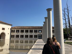
Brion-Vega Cemetery

cem3cem5 cem2cem1

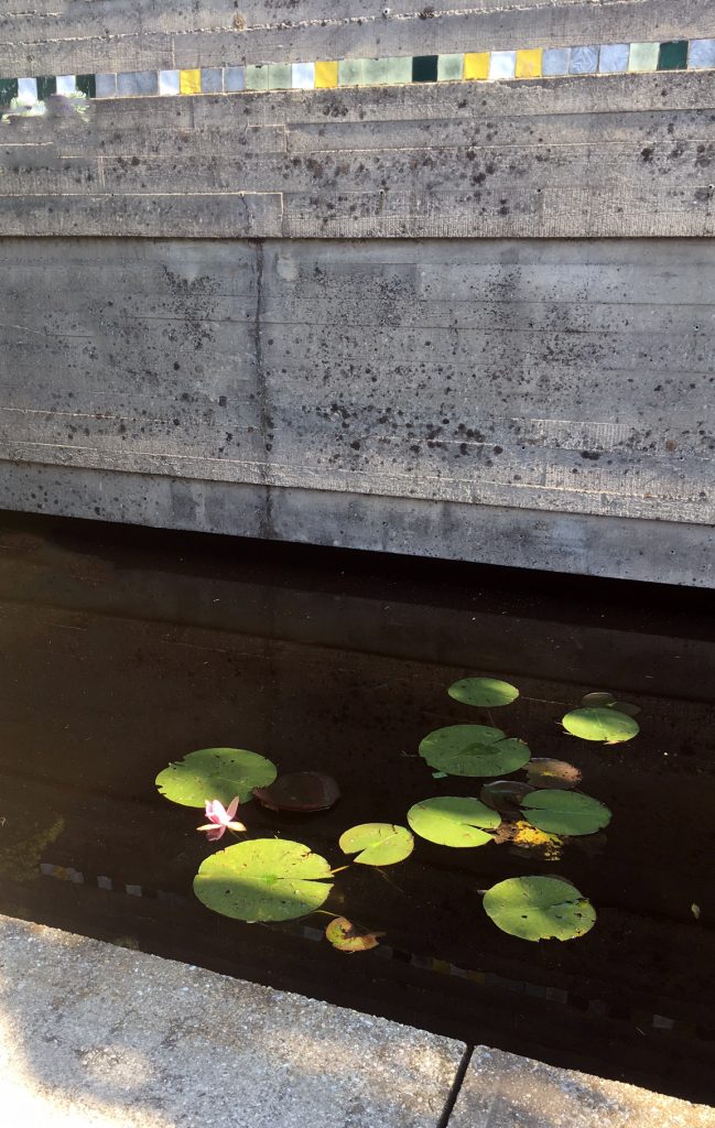
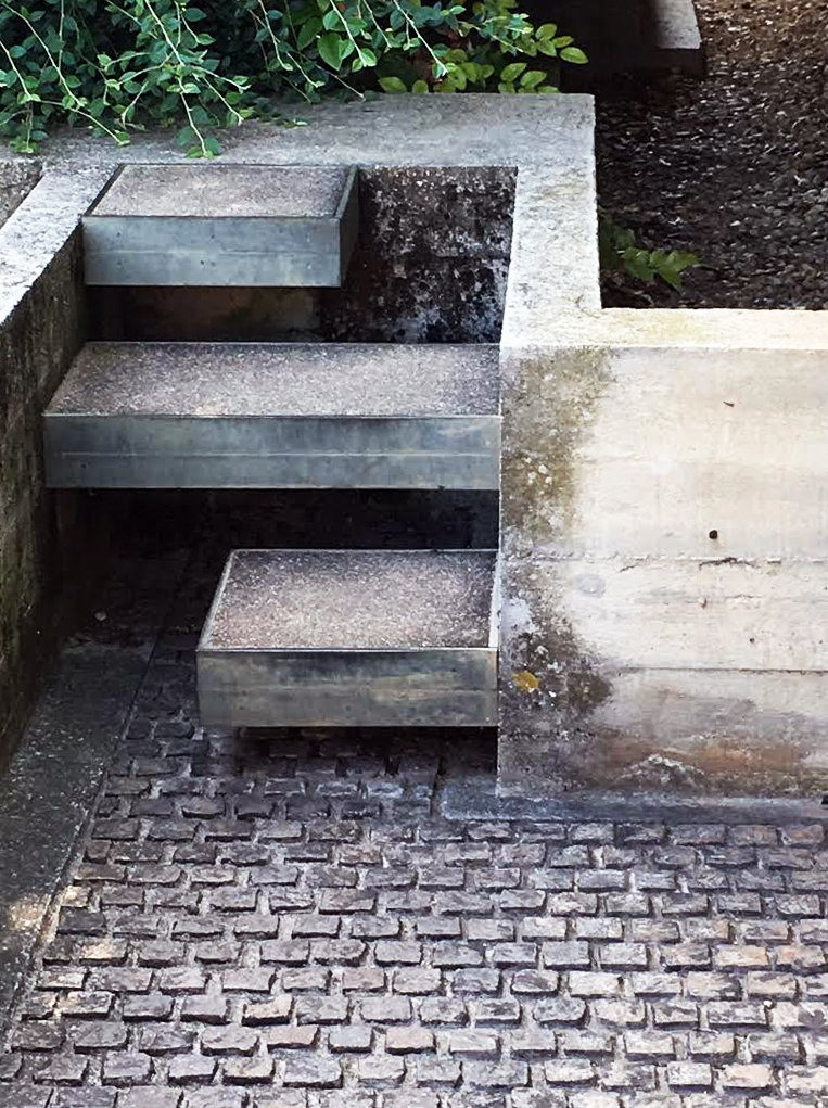
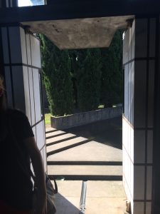
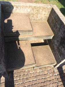
Visiting the Brion Cemetery and the cemetery in Milan, has made me think and reflect more on death. While first looking at Brion Cemetery, I noticed that there was no iconography or overwhelming amount of religious symbols, even within the chapel. I was curious to see the religious beliefs of Scarpa, and I fount this quote he said, “I would like to explain the Tomba Brion…I consider this work, if you permit me, to be rather good and which will get better over time. I have tried to put some poetic imagination into it, though not in order to create poetic architecture but to make a certain kind of architecture that could emanate a sense of formal poetry….The place for the dead is a garden….I wanted to show some ways in which you could approach death in a social and civic way; and further what meaning there was in death, in the ephemerality of life—other than these shoe-boxes.” This so far has been the closest person that I agree about life after life. Personally I have been raised Catholic, and Catholic funerals are very heavy, and create this uneasy feeling and confusion. I feel with Scarpa, his post modern aesthetic compliments the meaning of death. In our reading written by Kenneth Frampton, Frampton claims “Scarpa sought a transcultural, ecumenical expression that would transcend the Christian preoccupation with guilt and redemption. The idea of death as a joyous reunion, indissolubly linked to the erotic, is subtle confirmed in this instance by Scarpa’s cunning use of Chinese character Double happiness, a character traditionally employed on the occasion of a wedding.” One thing I was struggling with was the meaning of the water. At first I thought the water and the path walking on water, was similar to being close to death, and that we are always close to death, we can always fall. Frampton states that the water symbolizes both regeneration and death. After I read more into depth after reading and seeing in person, I thought the water lily garden was a way for the water to symbolize that water contributes and creates life and does not always only associate with death. Frampton summarizes Scarpa, “Throughout his work, the join is treated as a kind of tectonic condensation, as an intersection embodying the whole in the part, irrespective of whether the connection is question is an articulation or bearing or even an altogether larger linking component such as a stair or a bridge.” Scarpa pays attention to very small details that help the viewer of his work understand the message and meaning he is portraying in his work.

studio FM : week 4

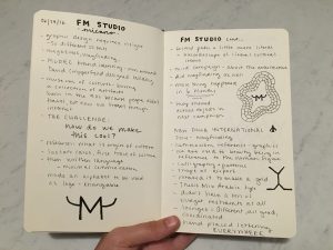
Our visit to Studio FM was hands-down the highlight of the week. As we approached the loft studio in it’s hip Chinatown neighborhood, I wondered how this graphic design studio would compare with others studios I have visited. This past semester, I had the opportunity to travel to New York and Chicago on a travel initiative grant to visit design studios all over the two cities. Many of them gave a brief tour of the studio, an explanation of their mission statement, and a glimpse at their company portfolio. I found that the FM tour was very similar. The variety of clients that they have is what struck me though.

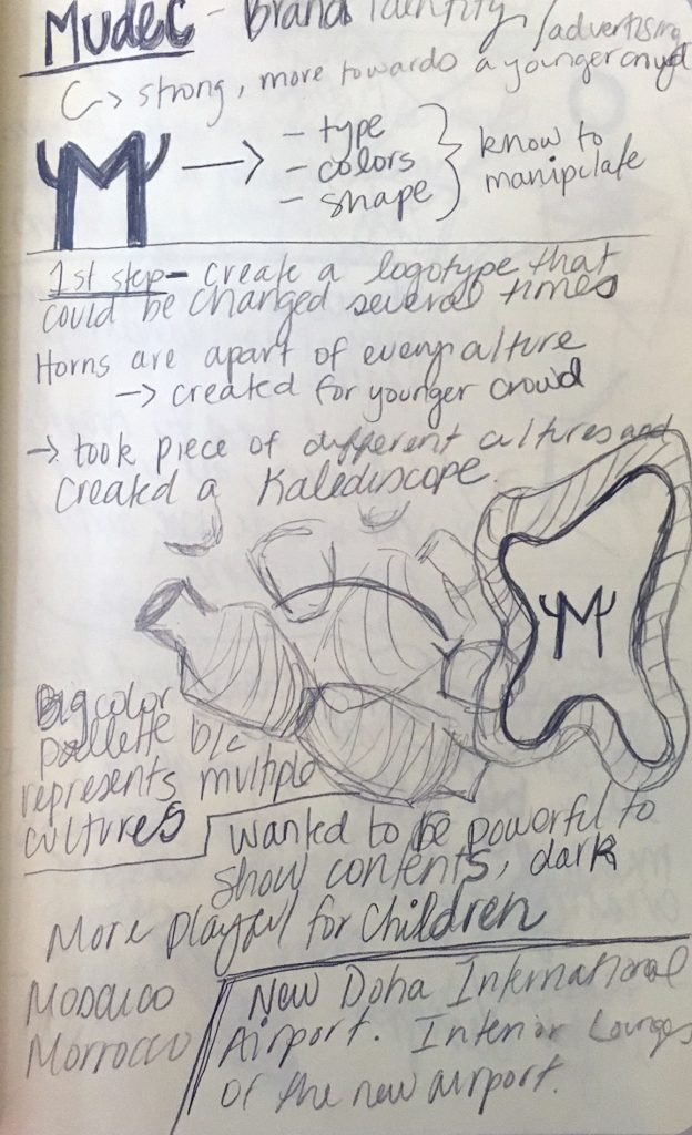
The first project they showed us was the branding for the Mudec Museum of Cultures. The designer who spoke to us was very animated and honest and explained to us that it was a challenge to make this “boring” museum seem “cool”. As Longhorns, we found it interesting that their main branding concept had to do with horns because horns represent ancient culture in many ways. Their solution was to put “horns” on an M and manipulate that logo to fit with their many advertising campaigns.

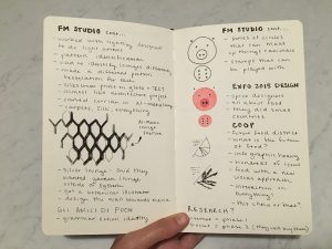
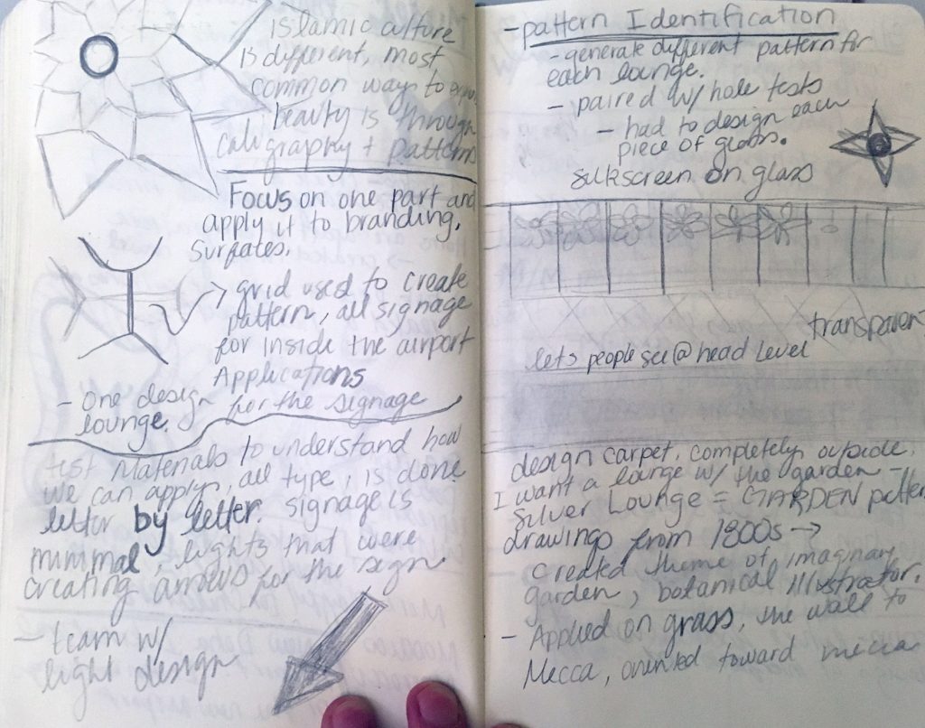
Perhaps the most impressive project that they showed us was the branding for the New Doha International Airport. They explained that this project has been a long and drawn out one, but also one filled with much creativity and budget leeway. They started simple with the creation of the logo. They very cleverly decided to take the shape of the airport and then make a grid out of it through tessellation. Everything in the entire airport fit within this grid, which blew my mind. Not only did FM design the logo for the airport, but also the wayfinding and lounge interiors. This was an involved process that required lots of tests and lots of money.

A fun project that we ended with was their branding for the Gli Amici Di Pooh (Friends of Pooh) elementary school. This childish and playful branding juxtaposed with the previous stylish, sleek, and upscale branding of the airport. They came up with ways to engage the children through their branding with animal stamps that can be mixed and matched based on color and shape. As a designer, this kind of interaction seems to be what everyone strives for.

IMG_6606

IMG_6607

Carlo Scarpa and the Cemetery

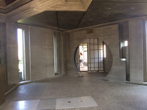
Interior of Brion Cemetery, spacious and calming

photo 1 (4)

photo 2 (5)

photo 3 (2)

photo 4 (1)

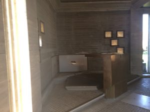
In the preface of sort for the reading about Carlo Scarpa, an excerpt from an Italian philosopher was paraphrased.  Gianni Vattimo discussed the commonalities of philosophy and architecture, establishing that at the core of both fields is edification. He then mentioned how the term is defined by “two principal meanings – to build and to be morally uplifting.” In context to Carlo Scarpa, specifically the Brion Cemetery, this seems ideal for approaching an architectural job for a cemetery. I found one thing I thought interesting and worth mentioning. While watching a lecture given by Scottish architect (Richard Murphy) about Carlo Scarpa, I learned that not only was Carlo Scarpa a well known exhibition designer, but was not technically an architect as defined by one who went to school with a focus on architecture. All these three things explain well the context of the Brion Cemetery. I learned that at the time Carlo Scarpa was working as an exhibition designer, Italy was changing its focus from presenting the exhibition, and its content, as a worldwind show and more so on creating this one-on-one connection or dialog between the viewer and the work. This, plus Carlo Scarpa’s interest in Japanese styles, heightened the moral uplifting part of edification as described by Vattimo in respect to the cemetery. There was a calmness created by the Japanese style that fit well with the surround area of the cemetery.  I believe that the high contrast between the individual styles within and outside the cemetery mimics meditation in the sense of escaping the body and surrounding area to reflect and reach a more spiritual place. Scarpa’s understanding of how to design in a way that creates a close and individual connection is what, I think, makes this cemetery so successful in providing a beautiful design that does not take away from the objective of the project. Speaking personally, I think that one of my favorite things about the cemetery is there covered infrastructure. With something like a cemetery in the sun, there is a good possibility that visitors will get emotionally drained and physically drained. The open space, that is also darker and cooler than any other place within the cemetery was brilliant structural layout that gives the visitor a place to reflect and regain that balance. Having to walk back through an area that has live vegetation and fish swimming before exiting is a wonderful way to create that balance of living and dead that I think many cemeteries are missing.  Although when we went upkeep of the ponds and lakes was not prevalent, I looked up pictures of the area when it was kept up and it confirmed everything I imagined it to be. It looked like an ideal place to visit and connect with loved ones who have passed.

TIF

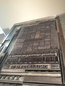
photo 1 (3) The logo of TIF using ligatures.

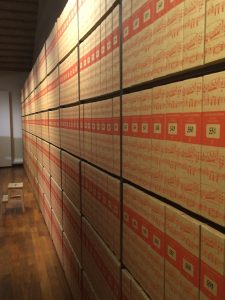
photo 2 (4) The printed sheet music cataloged.

photo 3 (1) Example printing layout for mono and line type.
Our trip to Tipoteca Italiana fondazione introduced me to a type of business I was not aware existed. Walking in, I could feel the esteem of the place and the company. With the first few showrooms alone were rich in information. Researched and tried, there was a comfort in listening to the tour because they did not leave much room for skepticism. Everything seemed so incredibly thorough in understanding the processes of type and printing, but in also the explanation of those processes.With so much knowledge, it is impossible not to feel so fortunate to listen. Even better than that, Tipoteca Italiana fondazione opens their doors to the community and those who share a common interest. I am only newly entering the world of the design and researching about different companies, but I think this is the first non-school establishment to offer lesson and classes. A company that endorses learning so much that they offer classes to public people is immensely empowering to know opportunities to learn will still exist for life after college for people. This place in ways was my own version of “The Magic School” where you learn by doing and greatly mimicked the style of learning during the trip.

Studio FM Milano

gd2

gd1

One of my favorite places to see was the visit to Studio FM Milano. I loved walking into courtyard and seeing all of the bikes lined up near the door with random flower pots. Walking into the studio, I felt nostalgia of my old internship with Transmission Events in Austin. In both offices/Studio they have a huge table where the whole team is a part of the table, and the upstairs is the conference room for meetings or clients. Studio FM Milano was bit different and felt slightly more tangible than other studio visits. The studio did all completely different projects from the Culture Museum, The Mudec, Airport design, School Branding, and Expo Design. It was fascinating how for the Mudec branding they played and made different complete typefaces for just a few letters they needed in the alphabet. I think this is a great strategy while struggling with a brand or identity that you are stuck with. I also liked how they based all of their brands with one or very few symbols and then they incorporate them in every component of the design process and final product. This studio was amazing!

Solo trip to Switzerland

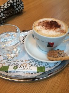
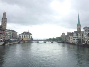
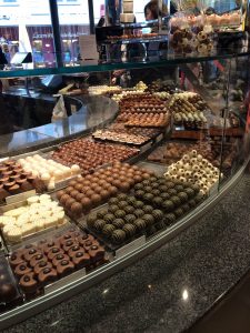
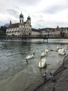
This past weekend I had an opportunity to do something that I have never done before: travel alone. Growing up in a large extended family, I have always been told about the places we were visiting but never were allowed to give my own opinion in what I wanted to do. Traveling alone and that too in Switzerland was out of my thoughts. I never would have imagined that I would get a chance to go to this BEAUTIFUL country and eat all the chocolate I want (even though it did hurt my wallet). From Milan, I left for Zurich on Saturday. On the train ride, there were so many mountains filled with green trees, waterfalls at every corner, colorful houses, a stream of water passing by, horses, and so much more. Seeing of all this just made me want to live there! When arriving in Zurich, I could already feel the different ambiance that I was in. Different foods, language, transportation, the smell in air, and buildings made me want to go around this welcoming city. Though on the first day I was able to make it outside in the city despite rain in the forecast, it started pouring as soon as I finished my lunch and when I began my exploration. As I stood on the side, I saw that I was on the shopping district so instead of waiting for the rain to stop I went to a mall and gave my wallet a big shock. Later as the rain stopped a little, I was able to roam around the streets and main city center. As the day came to an end, I also stopped by a café to take a little break during my exploration. The next day I started early but instead of at Zurich, I went to Lucerne. On my way there, I got to grasp the actual beauty of Switzerland: small lakes, beautiful houses in middle of nowhere, sheeps roaming around farmland, and just the greenery surrounding the land that made everything so beautiful. Having been living in Milan and visiting other urban cities, now getting to see a beautiful rural side of Europe just presented the many qualities that Europe has. Switzerland was really a great solo adventure. Finding the quality time for myself was worth it as it gave me the independence and confidence that I have wanted to engulf. I still remember my last day at Zurich when I was sitting by the lake, watching ducks and swans, and quietly working on my sketchbook. That peaceful moment in a tranquil environment was what I had wanted to do. With this great of an experience, I can’t wait to continue with it when I travel to London and Paris alone after the program.

IMG_6644 IMG_6664 IMG_6729 IMG_6813

Design in Context: a reflection

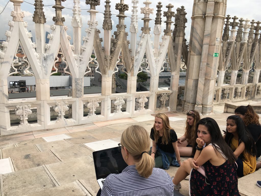
Class on top of the Duomo!

This was a trip of a lifetime. I never expected anything like this. I was so surprised and pleased with how much design we saw and learned about. Plus, we didn’t only see and learn about design in the graphic sense, but in the architectural, industrial, urban, and product sense. I can say that I have gained a new outlook on design and a new way to observe and think about design. I have also gained a new sense of curiosity so, in the words of my newest favorite designer, Castiglioni, “if you are not curious, forget it.”

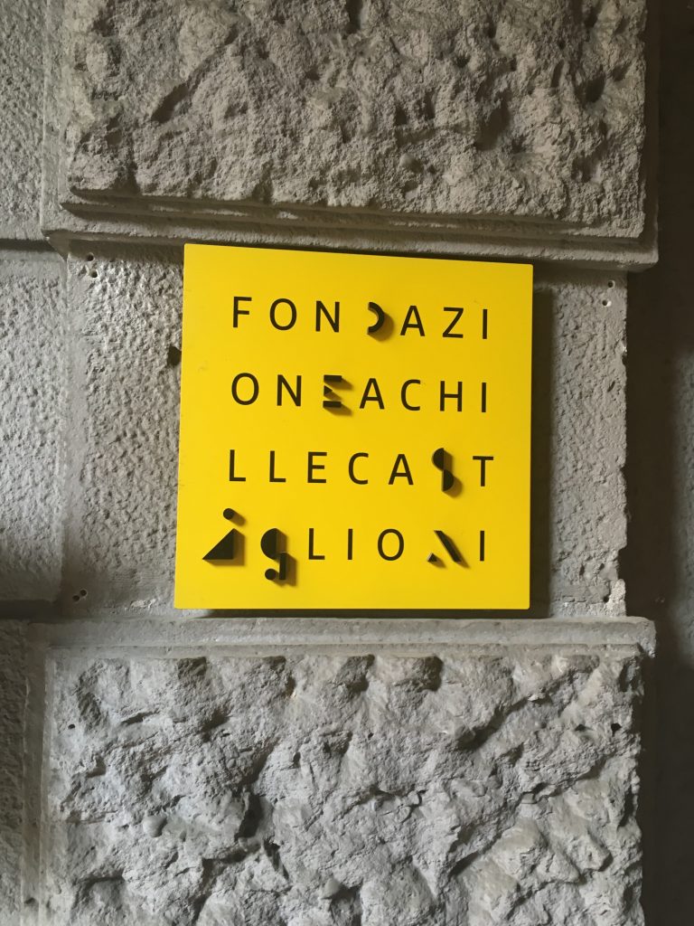
Fondazione Castiglioni sign, my favorite foundation visit

Culture in Italy has its differences and its similarities to American culture I noticed. Things like coffee, public transportation, and food were just a few of things pretty different from the American way. I don’t think I will ever be able to enjoy a Starbucks again after experiencing coffee in Italy. I thought I liked bold coffee before, but boy was I missing out! There is nothing more pleasing than a piping hot espresso in the morning, or afternoon. Milan also had an amazing public transportation system. I haven’t been to many big transportation hubs around the world, so I don’t have much to compare it with, but compared to Austin and New York, Milan was great. They had subways, trams, trains, and buses! Everything was clean and on time, for the most part. Compared to Austin, who only had some buses that run on a schedule no one can nail down and the lousy train thing, Milan blows it out of the water. Speaking of water, I really didn’t like how we had to pay for water everywhere we went. I don’t even want to think about how many euros I spent on the water. The food was as expected for me, tons and tons of pasta! I think I have reached my pasta quota for at least six months. Walking down the aisles at the store I remember thinking, “wow, it really is just pasta everywhere.” I thought that I ate a lot of pasta at home, but not compared to the Italians. Luckily, I did manage to find some other yummy meals to balance out my pasta intake.

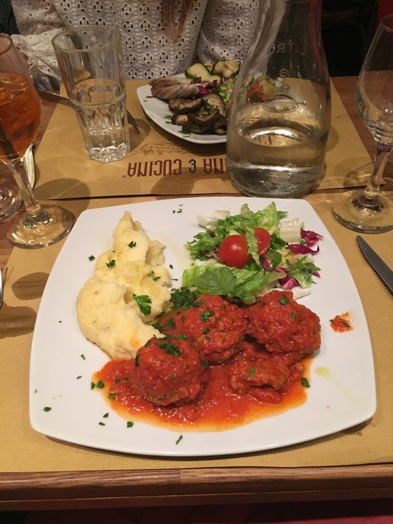
Some yummy meatballs! No pasta here!!

It would be silly of me not to talk about how design in Italy impacted me since the class is all about design! I have taken away so much from this course. I never really had an interest in product or furniture design, but after learning about all of it in Italy, I am curious on how I can spin it my own way back here at UT. My head is spinning with inklings of senior design projects now! My favorite thing about Italian design is how they look at everything. They analyze, observe, and think differently. I don’t want to say more creatively, but in a different way, maybe more holistically is the word I’m looking for. Something that I think describes the Italian way of design thinking is, “unusual uses for ordinary things.” They have a knack for flipping things on the side and making a chair out of it!! I hope to take that way of thinking back with me in my design studies, for sure.