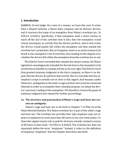
Practitioners must follow court rules for their pleadings and briefs, but courts can do what they want. Here are my suggestions for formatting court orders and opinions. For more and better guidance, see Matthew Butterick, Typography for Lawyers (2d ed. 2015) or his website.
Don’t use Courier. I recommend a serifed typeface for the body text (my example uses Cambria), and I follow the recommendations of many layout experts to avoid Times New Roman. I believe it’s appropriate to format short, topic headings in a contrasting sans serif font (my example uses Calibri Bold).
Although double line spacing is ubiquitous in legal documents, it’s problematic for on-screen skimming and readability and because it uses lots of paper if printed. Some say double-spacing makes documents readable. Yet no one reads double-spaced books, magazines, or newspapers, let alone web pages. Instead, apply reasonable line spacing (my example uses 1.2) and push in the left-right margins to reduce the line length (my example uses 1.5 inches).
Use only one tab to indent paragraphs, and consider shortening the tab (my example uses .25 inches).
If you want full justification, you should turn on hyphenation to reduce gaps and spaces (my example does). If you dislike hyphens, check out most newspapers and magazines and nearly all books: they’re hyphenated. If you still dislike hyphens, left justified text with a ragged right margin is fine for legal documents, I say.
Use italics instead of underlining. Avoid ALL-CAPS.
Add text to the outline numbers. You can use topical headings: Introduction. You can also use explanatory headings (point headings): The structure and punctuation of Maine’s wage-and-hour law creates an ambiguity.
And if you can bring yourself to do it, abandon Roman numerals and, possibly, use a numbering system that allows readers to know where they are at any point in the document. It might look like this:
1.
1a.
1b.
2
2a.
2b.
3.
4.
Here is my reformatted example (click to view):

