Hyphens, ellipses, and word counts

TexasBarToday_TopTen_Badge_Small

According to reliable style manuals (I’ve cited four at the bottom of this post), writers should use the en dash, not the hyphen, for number spans.

  • With a hyphen (wrong): 343-44
  • With an en dash (right): 343–44

I don’t know if you can see the difference, but the en dash, the correct mark, is longer than the hyphen. Although I agree with the rule, I’ve recently learned something that could affect your choice of horizontal mark.

  • With a hyphen, Microsoft Word counts this as one word: 343-44
  • With an en dash, it counts it as two: 343–44

You get a 50% savings with the hyphen. In a lengthy brief subject to a word count, you could save some words by using the hyphen.

But wait. There’s more.

Do you know the difference between the ellipsis symbol (…) and the Bluebook ellipsis (. . .), which is just three periods with spaces? For example:

  • Bluebook: The court . . . concluded
  • Ellipsis symbol: The court … concluded

In Typography for Lawyers (cited below), Matthew Butterick recommends the ellipsis symbol. You probably never gave it much thought, but check the word counts:

  • With periods and spaces, Word counts this as six words: The court . . . concluded
  • With the ellipsis symbol, it counts it as four: The court … concluded

You save two words every time you use the symbol instead of periods and spaces.

A former student alerted me to these two strange word-count anomalies and said, “On my last brief to the Seventh Circuit, these two tips cut off close to 200 words, and I ended up 119 words under the limit.”

_____

  • Bryan A. Garner, The Redbook: A Manual on Legal Style § 8.13 (3d ed. 2013).
  • Joan Ames Magat, The Lawyer’s Editing Manual 43 (2008)
  • Chicago Manual of Style § 6.78 (16th ed. 2010)
  • Matthew Butterick, Typography for Lawyers 49, 53-54 (2010)

Headings, part 2: Consistency, Outlining, and Numbering

Nearly every legal document can benefit from clear, consistent headings. Here in part 2, I offer recommendations for making headings consistent, commend some traditional outlining rules, and suggest a simple numbering system. These guidelines should help you create readable, skim-able documents.

Consistency
Your headings should form an outline, and in outlines, entries at the same level should be structured and formatted the same way. That may seem obvious, but not all legal writers do it, as I recently learnedwhen reading motions and briefs in preparation for a CLE seminar.

For example, suppose an Argument has the following heading outline:

1.
a.
b.

2.
a.
b.

In that outline, 1 and 2 are at the same level, so they should be structured and formatted the same way. Likewise, both a and b pairs are at the same level, so all four should be structured and formatted the same way.

Specifically, if 1 is a topic heading in boldface initial caps, then 2 should be a topic heading in boldface initial caps. If 1a and 1b are full-sentence, explanatory headings in italics, then 2a and 2b should also be full-sentence explanatory headings in italics. For example—

Poor
1. Trial Court Errors
a. The trial court erroneously instructed that police officers may pretend to be electors.
b. The trial court failed to have the court reporter record statements made on audio recordings.

2. Sufficiency of the Evidence
a. Sufficiency of the evidence on attempted election bribery.
b. Sufficiency of the evidence on conspiracy to commit election fraud.

The structure of 1a and 1b (full sentences) does not match the structure of 2a and 2b (phrases). We need to revise 2a and 2b into full-sentence, explanatory headings. The format, italics, should match, too.

Outlining
In creating headings and sub-headings, follow two key outlining rules.

Rule 1: Keep main topics at the same level and keep sub-topics at the same, lower level. So don’t place main headings and sub-headings at a single outline level. For example—

Poor
1. Preliminary Statement
2. Argument
3. The Plaintiff Cannot Prove Consequential Damages.
4. The Plaintiff Cannot Prove Expectation Damages.
5. Conclusion

Better
1. Preliminary Statement
2. Argument
a. The plaintiff cannot prove consequential damages.
b. The plaintiff cannot prove expectation damages.
3. Conclusion

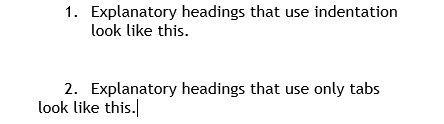
Rule 2: Don’t create a sub-heading unless you have two. If you have only one sub-heading, incorporate it into the main heading. But if your argument or discussion contains only one major issue, it’s okay to have a single major heading for that issue. For example—

Poor
a. The suit is barred by laches.
(1) The suit was brought twenty-five years after the original certificate was issued.

Better
a. The suit is barred by laches because it was brought twenty-five years after the original certificate was issued.

Numbering
The rules for traditional outlining call for outlines to begin with Roman numerals (I, II, III) and to proceed through letters (A, B, C, and a, b, c) and Arabic numerals (1, 2, 3). If you supplement those levels with Romanettes (i, ii, iii), and parentheses ((a), (b), (c) and (1), (2), (3)), you can create an outline with 7 levels: I. A. 1. a. (1) (a) (i). Two suggestions.

First, don’t write a document (motion, brief, or even a contract) that needs seven levels of headings. Find a way to condense and consolidate; strive to limit yourself to four or even three levels. You’ll be less likely to lose your reader—and yourself.

Second, if you know any level of your outline will go beyond six or seven items, consider using Arabic instead of Roman numerals or romanettes for that level. Roman numerals get harder to decipher the higher they go. I once read a lengthy contract divided into 60 major sections, each designated with a Roman numeral. It was difficult to refer to any particular article because it took too long (or became impossible) to figure out. What’s XLIV?

In my own outlines, I use Arabic numerals and the alphabet, and I still have four levels available: 1. A. (1) (a)

It’s 44 by the way.

_____

To comment, email me.

The wisdom of a fortune cookie–UPDATE

TexasBarToday_TopTen_Badge_Small

UPDATE: The advice on the fortune is from William Zinsser, a noted writing expert and author of a really good book called On Writing Well, which I recommend. I’ve also learned that many others have received this fortune as far back as 2009. Wow.

After a lovely meal of Spicy Basil Fried Rice, I opened my fortune cookie and found this:

Four

What a surprise. It’s the most unusual but most appropriate fortune I’ve ever seen.

Headings, part 1: Kinds, Typefaces, and Placement

TexasBarToday_TopTen_Badge_Small

Nearly every legal document can benefit from clear, consistent headings. The guidelines here are particularly useful for memos, motions, and briefs. In part 1, I describe two kinds of headings, give typeface advice, and offer suggestions for placement and alignment. I’ll discuss two kinds of headings: topic headings and explanatory headings.

Topic Headings
I use the name topic heading for single-word or short-phrase headings that identify topics, like Argument, Discussion, and Statement of Facts. Because a topic heading isn’t a complete sentence, it doesn’t take a period, and you typically capitalize each main word (Initial Caps). I use the mnemonic C-A-P to remember to capitalize everything but conjunctions, articles, and prepositions. The heading above this paragraph is a topic heading.

Topic headings should stand out from the body text, and here are three good options. (1) Use boldface. Yes, ALL-CAPITALS and underlining are common for topic headings, but if you follow modern typographic principles, you’ll avoid them: they can impede reading and are vestiges of the typewriter. (2) Make topic headings slightly larger than the body text by 1 or 2 points, then add boldface. (3) Use a contrasting font (my preference).

A contrasting font? Yes. If the body text is in a serifed font like Cambria, Garamond, or Century Schoolbook—and it probably should be—then topic headings in a sans-serif font like Calibri, Tahoma, or Verdana will really stand out.

Topic headings designate the major sections of a legal document. For example, in a motion for summary judgment, the topic headings might be Introduction, Statement of Facts, Motion Standard, Argument, and Relief Sought. Because of their nature and the way they’re displayed, they don’t require numbering.

Topic headings are often centered, but that’s not a rule; it’s merely a common convention. Knowing, as we do, that many readers will read memos, motions, and briefs on a screen, and knowing that screen readers have a top-left viewing preference and skim a lot, it makes sense to put topic headings on the left margin. That’s what I do.

Legal documents often use explanatory (point) headings.
I use the name explanatory heading (and point heading) for the full-sentence headings and sub-headings that break up a discussion or argument. The persuasive point headings in motions and briefs are the most common types of explanatory headings, but lawyers use non-persuasive explanatory headings, too. I used one above this paragraph.

If a heading is a complete sentence, and an explanatory heading generally should be, then it takes a period. If it’s a sentence, use sentence case, capitalizing only the first word. DON’T SHOUT AT THE READER WITH ALL-CAPITALS, and Avoid Using Initial Caps For Explanatory Headings Because It Looks Odd.

The best way to make explanatory headings stand out is to use the same (serifed) font as the body text but to emphasize it with boldface, bold italics, or italics. That gives you three outline levels beneath the topic headings. Generally, place the first-level explanatory heading on the left margin and indent each lower level one more tab length.

As you format explanatory headings, keep these tips in mind: (1) Avoid over-indenting. If you indent more than three tab lengths, you spoil the left-alignment screen readers and skimmers prefer. (2) Keep explanatory headings to three outline levels if possible. It simplifies things for the reader and helps prevent over-indenting. (3) Use indentation, not mere tabbing, so subsequent lines of text align with the first. Look at these examples.

Indent

Yours should look like number 1.

_____

To comment, email me.

Tips for Concision: 5. Eliminate excessive prepositions

Eliminate excessive prepositions.

One way to lengthen a sentence is to stack up prepositional phrases, especially using of. With too many prepositions, writing lacks flow. It’s also longer. Count the prepositions in this sentence—they’re conveniently highlighted:

There is no current estimate of the number of boxes of records in the possession of the school.

The sentence has five prepositions among its 18 words. That’s not an error, but it’s choppy. So when you edit, tune your ear for excessive prepositions and cut the ones you can. In this example, we can cut at least two and possibly three, reducing sentence length from 18 to 15 or even 14:

There is no current estimate of the number of boxes of records the school possesses.

We have no current estimate of how many boxes of records the school possesses.

Eliminating excessive prepositions is a well recommended technique for improving prose:

  • “Multiple prepositional phrases will affect the vigor of your writing.” Megan McAlpin, Beyond the First Draft 55 (2014).
  • “Reducing the ofs by 50% or so can greatly improve briskness and readability.” Bryan A. Garner, Legal Writing in Plain English 51 (2d ed. 2013).
  • “Look closely at any sentence that depends heavily on prepositions, and if you count more than three phrases in a row, consider revising.” Claire Kehrwald Cook, Line by Line 8 (1985).

Here’s another example:

A knowledge of correct trial procedures is the duty of all of the members of the bar of this state.

This sentence has five prepositional phrases in 21 words. And you’ll agree, I hope, that it’s an awkward little thing. But now we have better terminology; we don’t just say it’s awkward, we say it has excessive prepositions. When we edit, we focus on removing them:

All state-bar members must know correct trial procedure.

That’s concision.

_____

Care to comment? Email me.