Even with a print run of fewer than 200 copies, the Gutenberg Bible was a major undertaking. A complete copy, like the Ransom Center’s, includes 1,277 large pages that have text printed on them. Each full page required that approximately 2,500 individual pieces of metal type be set by hand, one at a time. And some pages had to be set twice, because Gutenberg decided to increase the Bible’s print run. With some rough multiplication, we end up with well over 3,000,000 times that someone had to pick up a piece of type and put it into a page forme and, then, after all copies of that page had been printed, take that piece of type out of the page forme and put it back so it could be used again. I think we’d all agree that that’s a lot of work.

It has long been known that Gutenberg’s team used different stocks of paper in the course of printing his Bible edition, each defined by one of four watermark designs. There’s the famous bull’s head, two types of grape clusters, and an ox. Extensive analysis has revealed patterns of where these different stocks appear in surviving copies, leading to the conclusion that four units of compositors began setting type simultaneously, no doubt in an effort to speed up the printing process and get the book to buyers sooner—and get paid sooner.
In order for the four units to start at the same time, the text of the Bible first had to be divided and assigned. There is also evidence that each unit further divided their text to create additional efficiencies. While watermarks tell most of this story, some evidence is in plain sight: a typesetter that finished with their section before they’d filled a page had little choice but to leave some or all of it blank.

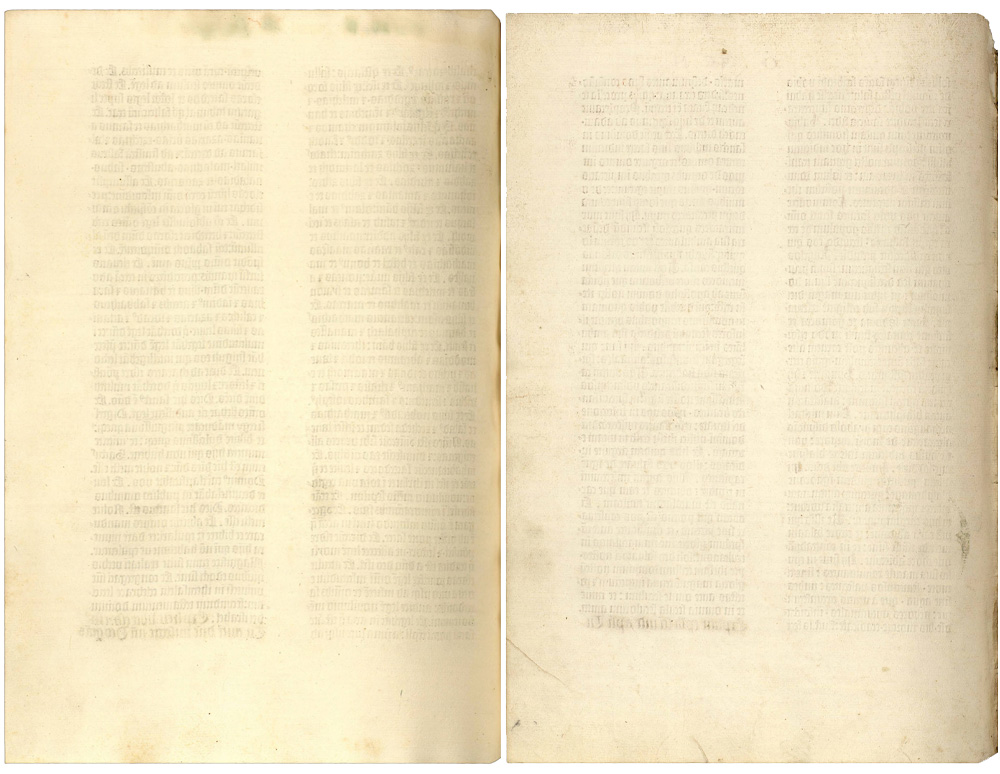
In a complete Gutenberg Bible, the backs (versos) of five leaves have nothing on them at all. They’re completely blank. And in some copies—the most complete of complete copies—there are two blank leaves at the very end of the whole Bible, ones with nothing on either of their two sides. As in the case of the Ransom Center’s copy, binders often removed these terminal blanks for use elsewhere. (The nine blank pages are why I wrote above that there are 1,277 pages with text on them and not 1,286, which is total number of pages you’ll usually see given in literature about the Gutenberg Bible.)

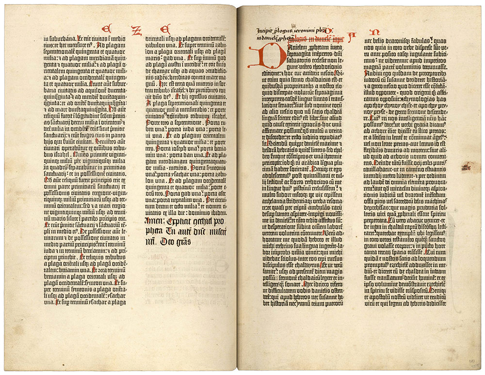
Other pages that signal typesetting divisions aren’t totally blank but have a column of text that doesn’t reach the bottom. In the image above, the end of Ezekiel (left) marks the transition between the third typesetting unit’s first division of text and its second, which begins with the Prologue to Daniel (right). To be maximally efficient, pages of the Gutenberg Bible were supposed to look like the one on the right, with two dense columns of justified text that run the full length of the page. On the left, though, there’s a healthy amount of blank space at the end of the second column. The compositor tackling the end of Ezekiel couldn’t move on to Daniel because the page on the right had already gone through the press: there was no text left to set. In fact, Princeton curator Paul Needham believes that the page from Ezekiel belongs to one of the very last groups of sheets that the Bible team printed.* Everything else, except for some sheets that needed to be reprinted because of the print-run increase, had already been finished.
With Europe’s earliest printed books, even blank space has a story to tell.
* Paul Needham, “The Paper Supply of the Gutenberg Bible,” Papers of the Bibliographical Society of America 79, No. 3 (1985): 303–374.