In Reflection

Studying abroad on this program helped me learn everything I wanted to learn about Italian design in Milan. I was interested in seeing how a city and country that is known for design, and even labelled as a design capital of the world, goes about designing various products, and how those products are displayed.

Bruno Munari. Saw this in someone’s house…

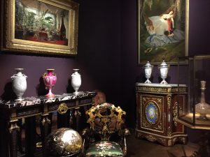
I was surprised how integral design is to Milan. Now that I’m back in the US I’m a bit jealous of how easy it is to access material (I bought so many books). Compared to the US, there is a lot more emphasis in design. I thought this was the most obvious in the amount of space in Milan that was dedicated to creating, teaching, and even selling design. All of the museums we saw and either did or did not go into were spaces dedicated to Italian art and design. The Triennale did the best at explaining design history in Milan, apart from the lectures. Getting to see all of the objects we had been studying and seeing in their creator’s studios in a timeline was actually a bit overwhelming, but helpful… I even found a few objects that we hadn’t gone over but I saw in places we often visited.

Illustration on building construction cover-up. On the Duomo they used shapes from what the previous/finished product would look like.

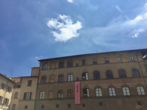
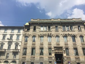
Other smaller spaces for design to exist were the buildings, which varied from older architecture to new. I loved being able to see how newer architecture is applied to older structures, as well as the preservation of historical places like the Duomo or older Liberty-style buildings.

        
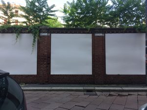
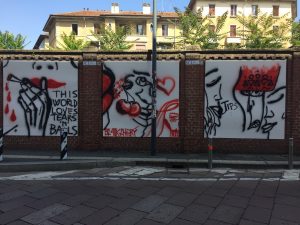
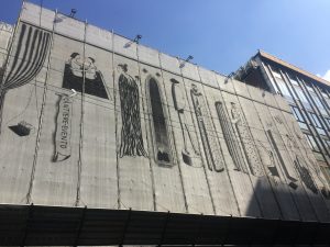
Even on the buildings were other areas for artists or brands to put their work. Although I’m not sure if this was an intentional space for graffiti and posters. But I liked it.

I would never throw this away.

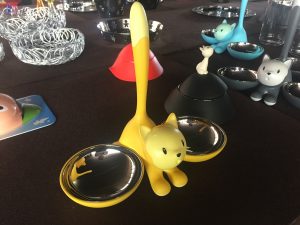
There is also more focus on making products are intended to last (versus planned obsolescence in the US). My favorite part of the study abroad was the visit to Alessi, a company that designs products with the idea of human design. I liked the anthropomorphic and humorous designs that we got to see inside their museum, and the mobile shelves that they were displayed/stored in. One thing that stood out to me in the Alessi presentation was the company’s message, and how they use shapes and forms based on other objects (like buildings, people, animals) to create a bond between the object and its user. Creating products that last was something they emphasized, and I loved that they create longevity by creating objects with personalities and forms that anyone can recognize and love.

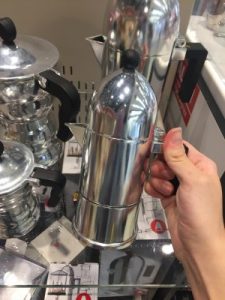
The trip to the gift shop was kind of rushed, and I’m very indecisive, so I only got a small magnet and keychain, but I found more Alessi products in the airport before I left (I thought I was going to miss my flight). While I was trying to decide which coffeemaker to get, I watched kids go up and play with the salt shakers and bottle openers. I liked that I got to see how people would interact with Alessi products on the shelf, and that the kids I saw loved the salt shakers (although I think they thought they were toys) as much as I did. I thought it showed how effective Alessi’s message and playful vibe is, and is something I want to show in my own work.

Cats in Venice

On the walk to the other part of the Biennale there was a cat sleeping on the ledge of a window. The further we walked, wooden houses began showing up on the windows of the building. Most of them were decorated with cats, so I assumed it was the house of a cat person who liked to make cat things (I do that). but when I jumped up, I saw cats sleeping in the boxes. I looked around and found more crates with cats napping in them. 

One was a handmade shelving unit with cat cutouts and a sign that read “Without my catnip, mornings are impossible”.


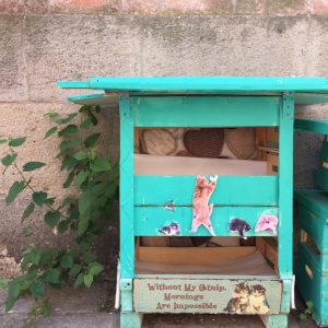
Another, smaller crate was placed in a hole in the wall of the building, and a white cat was sleeping inside.


Although it wasn’t part of the Biennale, I thought it was interesting to think about how people build shelters for cats. Cats will sleep almost anywhere, but I think the crates were perfect because they were out of the sun and in a quiet area, away from tourists.

If this was part of the Biennale it would probably be my favorite exhibit (otherwise I liked reading about apartment-living in Latvia and the Austrian exhibit). I was really tempted to knock on the cat-house door and ask questions. I think I’m going to build cat houses when I’m old and retired.

Artemide

Things I noticed at the Artemide:

  1. A flat lamp with a precise shadow casted over the shade. The shade also helped block direct light at viewers.
  2. Diffusion of light. I liked the light panels that they showed us. The lighting was soft and something I wish I considered in one of my previous design projects (Objects and Spaces).                                                                                                                                                                                                                                                                  
  3. Lighting in the Microsoft building in Milan. Thin rods of light run parallel to the building’s overall shape, which helped highlight the structure. I walked past it the other day but I think the lights were off.
  4. “Alphabet of Light”. It’s like a cleaner version of fluorescent lighting. The contrast of the sleekness of the alphabet underneath the arcade of the University of Milan was stunning. I also like the idea of using light to create shapes in the other parts of the collection.                                                                                                                                                                                                                                                 
  5. Creating outdoor lighting that is non-invasive, doesn’t stand out or cause light pollution in the surrounding area.
  6. The tests that the lights have to go through in order to be safe enough for packaging and selling to customers. Overall, I think I learned that lighting design requires a lot of thought into the product itself and how it will be used. For example, thermal testing for plastics to see if the product can withstand heat from the light, or creating a precise design to reduce light pollution were both aspects I took away from Artemide that highlight how in-depth light design goes.

Paris

This weekend I went to Paris with some friends. I wasn’t expecting a big difference in architecture from Milan, but I was surprised by the design in both the architecture and objects. The buildings didn’t have any paint and were all a plain white, which I thought was interesting because it made the buildings feel a lot older than how the buildings are in Italy.


When we went to the Museum of Decorative Arts (MAD) across from the Louvre, I also realized how distinct French design is (or at least was). The name “decorative” was pretty literal, everything from the 18th and 19th century was heavily ornamented with floral-like forms, similar to the liberty style buildings in Milan.

The gardens in front of the Louvre, as well as the Louvre itself were beautiful. I wasn’t expecting to be amazed by any of the touristy things in Paris, namely the Eiffel Tower, but it was probably one of my favorite parts. It was a lot taller than I was expecting, and there were many details in the metalwork that reflected the French design we saw in the MAD exhibit earlier that day.  

Gucci Garden

Within the tourist trap of Florence, we finally found the entrance of the Gucci Garden. The exterior of the place looked ordinary in comparison to other Florence buildings, and a large pink banner which helped us identify the place. 
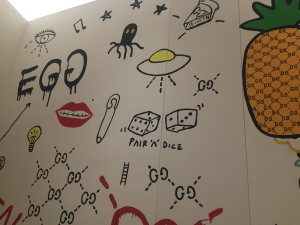
I was surprised more people weren’t inside the Gucci Garden, especially after seeing how crowded the areas in front of the duomo were. I was also surprised this place existed in Florence, which, as a small town, felt like an homage to old design of the Renaissance. But after learning more about the inspiration for Gucci’s design, May Morris and Arts and Crafts era patterns, I guess it makes sense.

Although Gucci’s goal is to be a luxury brand, there is also emphasis on beauty and imagination in their products. My favorite aspect of the brand is their ability to transform their signature (sometimes the double-G symbol, sometimes the green and red stripe, sometimes both).  Some of the bags and coats we saw weren’t vegan-friendly, so the materials become very pricey. I think the “luxury” of Gucci’s branding was made most obvious in the prices and surveillance throughout the entire museum.

I also liked the fact that they let us view the museum for free because we’re students (and they asked us before we asked them, because this was before we realized the EU prioritizes students’ education. I’m not familiar with this as an American student). I would have paid if we didn’t though. 

I watched a girl kill a lavender plant at Milano Arch Week

Sunday was the final day of the Milano Arch Week, so I and some others went to a lecture by Toyo Ito. He’s famous. I didn’t know that, but some of his work looks like stuff you can get in a Sims 4 expansion pack, so you can say I’m familiar with his work. The garden area of the Triennale was packed (this is when we realized that he’s a famous architect), so a girl sat down on one of the plants. Not very nice…

I enjoyed his lecture about combatting homogenization in Tokyo’s architecture. Newer architecture in Japan is very rational and strict (I’m not sure if this is what Ito meant by “homogeneous” though), in contrast to Milan’s architecture, which I feel is more unique to the designer and period. His main goal in his projects is to create a space that functions well for the area and the people using it. This is done by both drawing from and integrating nature. For example, the Gifu Library Ito built acts like a living structure, and adjusts its temperature by using water from the land around it (or something like that, I don’t get physics).

WordPress won’t let me upload photos, so here is a photo
of the Tama University Library from an Australian website.

I thought it was interesting to think about Ito’s goal in comparison to the Milan designer, Portaluppi. Like Portaluppi, Ito’s work is a reaction to rapid urbanization, although his focuses more on the functionality of a specific space, whereas Portaluppi wanted to capture a message through structure and aesthetic.

Social Widgets powered by AB-WebLog.com.