Kartell: An Important Name

13499564_10155019723424126_394869395_o

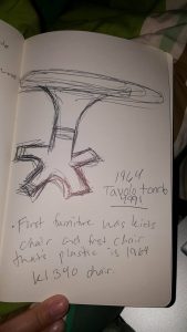
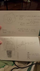
For this week, my favorite experience was the Kartell museum. This was filled with plastic in beautiful shapes and sizes that I’d never seen before. I really enjoyed getting a chance to see plastic in this way and shaped in a way that heavily influenced to Italian people. It allowed for the simple production of buckets and even something as simple as a chair. In one instance, the guide told of how a child’s chair was created. This was done at first because of the molding that required a certain amount of plastic; however, it was actually a great creation because it allowed parents to give this chair to their children and no longer worry about getting stains or other substances on the chair that would ruin it in the long run since it could easily be washed off. This was an important piece and eventually paved the way to my above sketch of tables with unique and interesting designs created by the husband and wife duo that had an interesting background in chemistry and architecture. These two were design geniuses and paved the way for plastics to be seen as not a cheap solution, but a creative one that would allow Italians to do the jobs they needed and not worry about decaying material or even fragile material with the use of combining plastic and other materials.

Mapping and Me

13442311_10155008185699126_31935901009279619_n

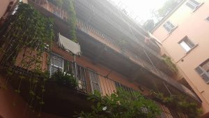
So, this week we began really delving into the mapping project we were given. It was an interesting experience and a great way to discover Milan in our own way and give our own perspective on this magnificent place. An interesting part of the adventure was finding a woman that actually allowed us to venture into her apartment complex. It seemed odd at first as we were talking about the architecture in the surrounding area and how it would influence our project, but the woman approached us stating she had a design of the apartment she lives in that is interesting and would help us. Inside we were amazed to find a courtyard in what seemed to be a motel sort of set up. She stated that this type of building was meant to be a sort of village that would allow people to easily communicate with each other and share resources and stories. It was an important part of Italian culture as it was attempted to be the standard. However, it’s not as widely known and because of this, the woman wanted us to experience this small taste of Italy’s past in terms of architecture. This was only a small piece of our project, but to have such important information early on was truly a blessing and made our outlook of our map all the different by the wonderful community that seemed to live in the area.

cinque terre : week 3

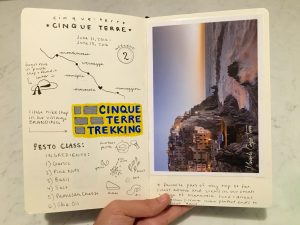
This past weekend I was able to travel to the Cinque Terre with a few friends. This was hands down the most gorgeous place I have ever visited and a surprisingly relaxing destination given the huge tourist population. We stayed in an Airbnb in the small town of Manarola which was perfectly picturesque. As a visual person, I think places like these are some of the most inspiring because I can feel myself appreciating the colors, shapes, and compositions of every sight I see. Taking photos is always a joy rather than routine documentation as it sometimes is, unfortunately. Thinking of my sketchbook, I decided to pay close attention to the branding of the tourist shops here because it was surprisingly good. I enjoyed meandering the tiny shops and observing their layout and overall aesthetic. On our last morning, we headed out to take a pesto-making class in Levanto. This was another visual experience that I won’t ever forget. Not only did the pesto taste amazing but was also the most radiant green color I had ever seen. The combination of the smashed basil, the light yellow olive oil, and the marble mortar was truly a sensory experience. I will be back someday!

FullSizeRender

future of design : week 3

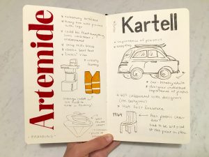
This week we visited several spots that had clear connections to each other. The first was Artemide, an Italian lighting design company and manufacturer. The initial presentation was so put together and overwhelmingly fascinating. The concept of “Li-Fi” (data transmitted through light photons) was completely illuminating, no pun intended. Reading design blogs and online news sources I feel like I am exposed to new and futuristic concepts pretty regularly but this I had never heard of and had a hard time wrapping my mind around. By the end of the presentation, Artemide made it clear that research was their game.

Heading over to Kartell, a giant global plastic design manufacturing company, they also recognized the importance of innovation. Their plastic designs enjoyed their peak success in the 60’s but they had to quickly reevaluate their brand due to environmental concerns and the growing popularity of cheap plastic.

In class, we questioned whether design was moving forward and I have a few thoughts on that subject. At Giovanni Lauda’s studio, we learned that he thinks design is at a bit of a standstill and that everyone is playing it safe. However, I think it is evident from our visit to Kartell and particularly Artemide, that new design spectacles are on the horizon and companies like theirs value research and new ways of thinking.

FullSizeRenderg

mapping : week 3

This week, Kameron, Zalak, and I made tremendous headway on our mapping project. We took our first walk on Thursday morning with a few inklings of ideas that we could try out for our final project. We made a few connections but overall our ideas didn’t have a strong enough concept.

The next day we headed to the Trienalle to see an exhibit designed by Andrea Branzi and Kenya Hara called “Neo-Preistoria”. Having no prior knowlegde as to what to expect from this exhibit, we entered the dark corridor where we found a series of mirrors, rock formations, and glass cases with artifacts. In the background there was a soundtrack of heartbeats and jungle noises which enhanced the primordial feeling of the exhibit. As we meandered through, we realized that each artifact was labeled with a verb and a poetic definition of the verb. The word and image correlations were so striking at times that I got chills.

As we moved through the exhibit, the artifacts got younger and younger in age. At the beginning, I thought I would be seeing ancient artifacts all the way through but as it turns out, the artifacts were dated more recently the farther along we made it through the exhibit. It was so interesting to make the journey through man’s inventions. It really drew attention to the great strides and downfalls of humanity.

Something interesting I noticed about the exhibit design was the walking pattern. As long as I followed the numbers, it really felt like a trip through time where I was aware of my progression.

Later that day, something clicked. I thought, what if we compared our journey through the city of Milan to the journey of man’s objects through time? Conceptually, it was sound. Our first building is a fascist icon and our end building is a pillar of modernism. Our walk through Milan was a clear evolution that could be represented through found objects.

So, Friday afternoon we set out to walk our path one last time. This time, we paid attention to the mood of our every surrounding and collected items that captured the essence of our locations. Some of these items included flowers, tickets, stones, and perfume samples.

When we went home to work, we had fun figuring out the best way to display our “artifacts”. We decided to use some granola bar boxes and some white paper to create a museum display effect. I had a lot of fun coming up with the words and definitions for our exhibit. It made me realize how much I enjoy language and writing economically. It’s a different kind of artistic challenge. I have included some of my sketches for the project below!

FullSizeRenderfFullSizeRendesr

Rough Week

culture_shock_curve_new


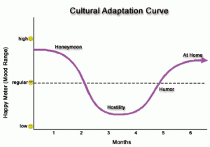
When I first began this journey abroad, one important graph our coordinator showed us was the downward slope that’s created near the end of the journey and how it affects those around you. In this case, it was quite a few factors that created my downward slope. The first of which was my loss of internet. I am currently taking this course as well as a physics course, so not having an internet connection was, honestly, a death sentence. I couldn’t finish my blogs in time and I wasn’t able to reach out to my friends or family because I didn’t have data. This also led to the realization that unlike the U.S., where there are random cafes that give wifi and allow you to sit and work, these cafes don’t exist here. It seems that Italians don’t have this type of lifestyle, which didn’t work in my favor. Once I finally did get an internet connection, I decided to celebrate! Hooray, internet! I may as well go out with friends to enjoy Milan a bit. However, in the process of my celebration, I actually lost my wallet. It was honestly a stab to the chest in an already rough week.

However, even though these events did happen to me and I do feel poorly about it, I do have some bright sides. Thanks to the outstanding staff at IES, I did manage to communicate with the police and file a report, then get a new metro pass at the Centrale station. Also, thanks to the outstanding teacher I have, I was only met with understanding when I couldn’t post my blogs in a timely fashion. So, though these awful events did happen, it didn’t bring me all the way down. I did manage to look on the positive side which was that at least my wallet wasn’t filled with a lot of money or with important documents such as my passport. This situation could have been a lot worse, and we could have even been without an internet connection for longer, but was only without it for most of the week, not for the next week and the weekend. It was quite a turn of events to receive the text saying the internet was back.

I also feel that, just like the graph shown to us, the downward curve does have an incline and I honestly have a greater appreciation for the time I do have and the exhibits that are to come in the future. It seems that these small realizations have shaped and accustomed me to a standard of living in Italy that I was not used to before. It humbles me to my past and my future and makes me grateful for this opportunity at becoming more cultured and being able to laugh about these events. And also hopefully, my family doesn’t get too worried about me being on my own and can trust me a bit more on how I handle a crisis type situation.

Umberto Boccioni

bcee5ed2ed5c876c533e00250160a88e

Grand Canal of Venice by Umberto Boccioni

9b993bbe81a40e1809385abfe32b6f5c

Novel of a Seamstress by Umberto Boccioni

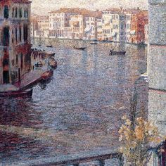
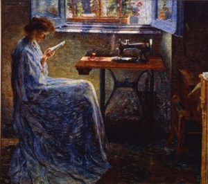
While visiting exhibits we were able to see some amazing works of art that really inspired and brought together the ideas of futurism with many colors and talents from many artists. Two that really stood out to me was Novel of a Seamstress and Grand Canal of Venice by Umberto Boccioni. Both of these amazing works done with oil on canvas and done beautifully. I had never seen such detail done with oil paints before and to allow for such depth and shadow to appear in this work. Umberto Boccioni himself focused his energy on working during the futurism movement and creating pieces from this time. However, I felt the strongest connection with these portraits that were created earlier in his life in Italy where he pushed for portraits, mainly of his mother and landscapes of the beautiful scenery. I felt a deep connection with these portraits even though they aren’t too closely related to his more intense work done during the futurism movement which focused more on abstract shapes and designs. I felt that this was remarkable in its own right and deserved to be recognized as an astounding piece.

Alessi: One of the Greats

13460805_10155018842709126_247680548_o

During this week, we actually had a chance to visit the Alessi museum. It wasn’t quite a museum as told by the host, but it was something to behold. Even the extravagant way in which our guide moved the shelves was amazing. With this turnstile type wheel, the shelves were moved across the floor and pushed each other into one direction in order to get to the shelf beside the one being pushed. It was amazing and a remarkable use of engineering and creative genius. The entire presentation of the items in this museum was amazing. There was constantly something interesting to look at and another interesting story to back it up. One of my absolute favorites was how the son of the original owners, made his own by bringing in amazing artists such as Salvador Dali to come in and create an interesting piece of their own. It was so great to see someone born from such a creative family to admire the art of those around them and understand the importance of these artists when it comes to the inspiration of great design. It was even interesting seeing how architects were the main assets for design genius during this time and weren’t used for strictly designing buildings, but also modeling their tea set to the shape of cities.

Week 3: Mapping

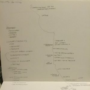
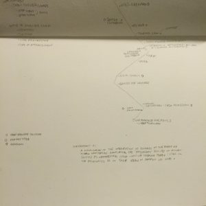
The mapping is ready to be presented! We did our walk twice, from the Pirelli building to Via Marcello Malpighi. The first time we played the role of the casual observer. We were good little flâneurs. We took note of signs in different styles (Art Deco, Rationalist, etc). We took note of smells, colors, culture, and food.

Then our second walk took on the spirit of the Situationists International. The situationists believed that it was important to construct situations, deliberately, to reawaken the soul. We did not want to simply take our walk as observers, but create a situation in which we had to directly interact with our walk. Our solution was to acquire as many business cards as possible from establishments that held meaning to us.

By collecting cards and talking to people from cafes, sushi bars, massage parlors, and commercial shopping, we experienced an array of (often awkward) encounters. Yet, I can assure the reader that each place is remembered and now dear to me. Our map presentation showcases the cards we received and guides the viewer through some of their subtle (or not subtle) historical references in Milan’s patchwork of the past. Top of map + Musings

Bottom of map + Musings
Shopping + American + Contemporary
Italian + Art Nouveau

Mapping: Fascism to Modernism

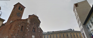
Hillary, Zalak,and myself were teamed together to map the experience between the Headquarters of the Federazione del Fasci Milanesi and the Triennale di Milano. Although we had previously visited the Triennale, we were completely unfamiliar with the Federazione del Fasci Milanesi – a Piero Portaluppi design. Not too far off from the Duomo, the Piazza S. Sepolcro (Federazione del Fasci Milanesi) is much more dense and heavy in the mood of the atmosphere. Taken away by the church across from our starting building, we noticed the odd juxtaposition of styles between the Romanesque church and the fascist tower that suppressed the surrounding structures. 

Piazza S. Sepolcro
Piazza S. Sepolcro

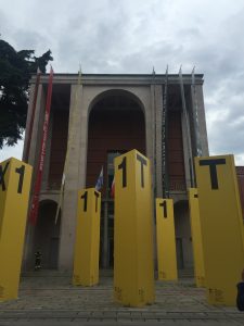
In absolute contrast to the dense and heavy atmosphere of our beginning building, the Triennale is located in an open area surround by light and greenery overflowing from the adjacent parkland. Although the building is also large and of similar coloring on the front-most facade, the architectural style is much lighter and of a different time. Both buildings were built in the early 1930s, but their stark differences in architectural styles make them seem decades apart in age. While the fascist tower is a prime example of fascist design, the Triennale is modern in aesthetic and belongs to the Novecento movement.

Triennale di Milano
Triennale di Milano

The walk between these two differing endpoints was interesting and ended up reflecting a path of heaviness to lightness in environment along the route from the Headquarters of the Federazione del Fasci Milanesi and the Triennale di Milano. As a part of our mapping project, we are drawing inspiration from an event hosted at the Triennale, however, the main focus will be on moods and environments as we shifted from point A to point B. Our inspiration was realized in the form of exhibiting objects from key areas along our route and using verb definition to iterate the mood/impression of each area along our route.