Week 3: Sketchbook

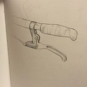
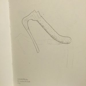
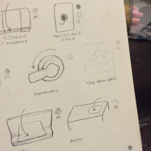
This entire trip my sketchbook has been torn between my love of bicycles, and interest in the variety of appliances (aka toilet handles). The toilet handles have hit a little bit of a plateau and are starting to look the same, which does of course mean I can now start researching the brands and functions. Yet this week, while adding a few new sketches to the flushers (including one very obnoxious one found on the way home from Rome that flushed without warning) I was entirely enamored with a bike exhibit within one of the Triennales we visited.

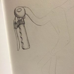
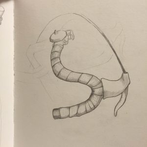
I figured I’d go ahead and post about my secret obsession (bike handles) because it has been consuming a lot of pages within my book. These bike-handle sketches have also made me realized how unique the craftsmanship and variety is in Milan. I will look more carefully when I return home to Texas, but I swear I haven’t noticed such extravagant bikes in such common areas as I do here. The Triennale show also introduced me to Paolo Manfredi and his talk about about craft-built bicycles in Italy, another venue to look down.

Bike outside apartment-very common
Street bike with wrapped handles w/ holes
Marble + plastic handle
The Urushi Bicycle, 2015
Awful + mean trenitalia flusher

Kering Factory

Outside the Kering Factory [/caption]As a textiles and apparel major, I’ve lost count of the number of times I’ve studied the product development process for a garment. In fact, I even took a course entirely dedicated to the product development process. While I’ve been able to enjoy all the beautiful museums and and workshops we’ve visited thus far,the Kering Factory was one of the main attractions I most anticipated. I was aware that Kering developed runway samples for luxury lines such as Gucci and Stella McCartney, but never in my wildest dreams did I think I would get that up close andintimate with the garments.
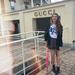
As soon as I walked in the door of Kering Factory and saw giant “Gucci” signage, I immediately felt at home. Our group first sat down in a conference room where a representative gave us a presentation about Kering and its background.
Kering specifically makes runway samples for Gucci, Saint Laurent, Bottega Veneta, Altuzarra, and Stella McCartney, but they also create PR sample garments as well as red carpet gowns. After receiving an overview of the factory the tour began. I made sure to be in the front of the line closest to the representative. I was so excited that I started to feel the tingle in your nose that you feel when you’re about to cry. Thankfully, I was able to collect my emotions and maintain a calm composure.
The first stop on our tour was the CAD center. CAD stands for computer aided design, where you design the technical flats of the garments. UT offers a CAD class which I have yet to take, but I hope to enroll in it in the future. After visiting the CAD center, we made our way to the position of the factory that cut patterns and fabric. The majority of fabric is cut by intricate machines, however some fabrics must be hand cut due to their delicacy.
My favorite part of the tour had to be the next part of the tour, where we saw seamstresses attaching zippers, buttons, and any other adornments to the garments. I have never seen so many beautiful items in my life. I’ve always been sure that I’ve wanted to have a career in the fashion industry, but my visit to the Kering Factory just reaffirmed everything. It would be my dream to work as a representative for Kering. In fact, I told our guide that I would see her in a few years!

Outside the Kering Factory

Update: Lights in Milan

IMG_8707 IMG_8708 IMG_8709

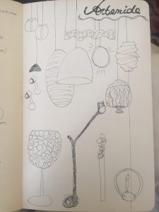
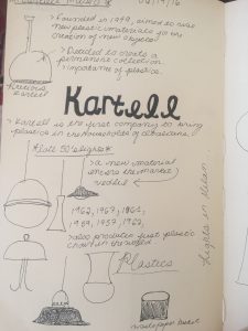
Definitely a highlight within the past week has been visiting both the Kartel and Artemide museums. Coincidently, both these fabulous visits included a multitude of lights for me to sketch and detail. One of my favorite pieces was the plastic lamp that we saw at Kartell, I was fascinated by its design that incorporated a vintage structure but was modernized through the plastic material. As I mentioned in my sketchbook, what I loved about the use of plastic was that the way the plastic was formed makes the pieces appear like glass. At Artemide, I found the technology put behind the variety of lamps really intriguing to learn about. In specific, there was a specific technology shown to us during the presentation which detailed how it could be possible to send wifi through a lamp. Overall, the theme at Artemide was creating lighting that could be something more than a simple lamp in their use. Having the opportunity to see the step by step creation of these pieces in the factory was simply amazing. (As a fan of How its made, I felt like I was stepping through the tv screen in an episode of How its Made: Lamps)

Weekend in Rome

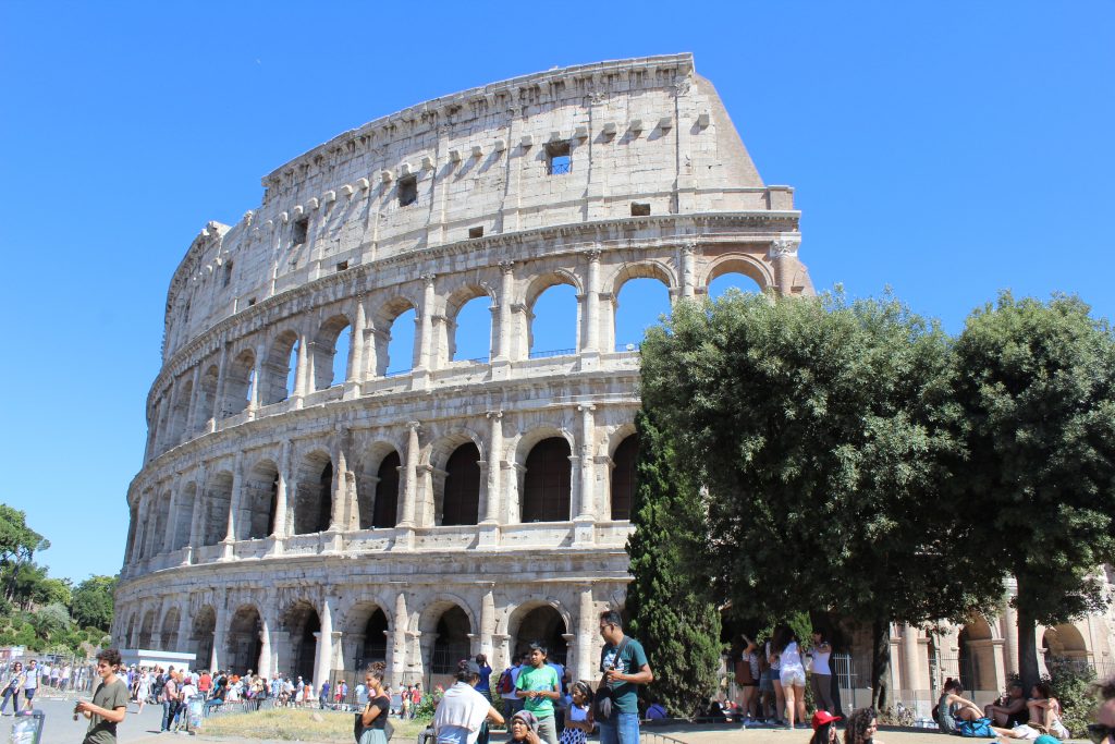
This past weekend a group of us spent the weekend in Rome! It’s very different from Milan, I must say. The public transportation is not nearly as well designed as Milan’s. The city has a different feeling that Milan. Tourists are wandering around everywhere, and there are ancient ruins on every corner. I guess it might be difficult to build a modern city around an ancient city. The metro was confusing.

The metro was confusing. They used the same “M” as Milan to indicate an underground stop, and similar signage, but the layout was not intrinsic. We couldn’t figure out which line we were going into when we entered, and just hoped we would see the stop we needed on the map. And this was not attributed to human error! Underground was not as well lit, or open as Milan’s Metro. The metro cars were jammed packed. I see why they say to watch your bags in Rome.

Rome was a beautiful city, though. I wasn’t sure what to imagine since I’ve only ever seen Rome through a screen in films. The history was rich and I loved imagining what life might have been like in Caesar’s time. Although I must say, Milan has a special space in my heart!

Colosseum
Colosseum

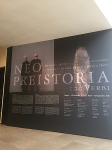
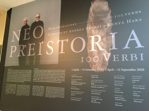
Reactions: “Neo Preistoria”

IMG_8609

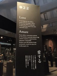
“By combining 100 tools and 100 verbs, we attempted to delineate the history of human desires as fixed form of poetry… This exhibition is the result of considering, with Mr. Andrea Brandi, what lies ahead in this kind of human evolution, and whether there is really any hope.”

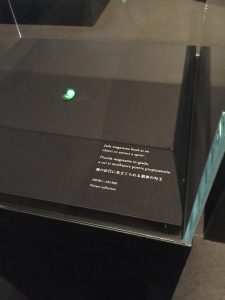
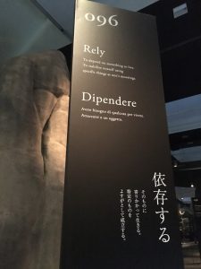
One of the most striking aspects of the Neo-preistoria exhibit at Treinnale was at the sheer rawness of the entire experience. The exhibited consisted of a series of boards (numbered from 1-100, as mentioned in the quote above) which each explicitly stated a verb that in some form was reflective of human behavior. This entire experience was organized to make the individual feel as if they are experiencing the greatest and most troubling aspects of the human condition,which are infinite faults and ambitions of achieving progress.

IMG_8593

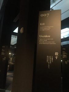
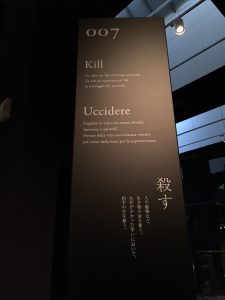
Something that truly made an effect on my own experience while walking through this exhibit was how brutally honest Brandi and Hara were in their description of human progress. For example, number 7 within the exhibited reflected on “Kill[ing]”. They described this as, “To take the life from living creatures. To rob an opponent of life. In a struggle for survival.” To me, the key words within this poem is the idea that killing is automatically linked to “surviving”, and that in order to survive, one must kill. Other words such as “Obey” included a similar connotation, Brandi and Hara write that obey is to, “To accept the power of the strong without resistance.” In essence, each board seemed to innately posses a theme of hopelessness, which is an interesting concept due to the fact that Brandi and Hara created this entire space in order to analyze if there is any hope for the human condition. Of course, one should remember that experiencing the exhibit from a crystalized point of view is simply impossible, seeing that Brandi and Hara have attached their own definitions to the experiences.

IMG_8604

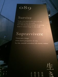
This highly structured way of analyzing human progress was especially prominent in number 89, which was labeled “Survive”. Brandi and Hara define Survive as, “To get a new lease on life when one was supposed to leave the world. For a life that should naturally be greeting death to remain longer in this world.” Accompanied by a range of faux drugs on display, Brandi and Hara form a complex identity of survival through their simple words. This is achieved by bringing to surface that to survive is to also cheat death. And through doing so, humans are creating an imbalance within the world. Although survival is often linked with awe and positivity, Brandi and Hara highlight an often overlooked aspect of surviving, that through the act of survival, humans are disalining the natural order of the world.

Quality is Key

This past week, we had a large variety in the exhibitions, studios, and factories that we visited. However, I believe that the combination of visits were a true testament to quality control and longevity of design on the market. The Artemide factory truly emphasized quality of not only design, but materials and finished products as well. The tour demonstrated the extensive processes that are taken in order to control quality and consistency of Artemide products. While the market trusts high-name brands for quality and reliability, knowing the actual processes behind the trusted quality is incredibly important to understanding the steps behind making a good design into a great product.

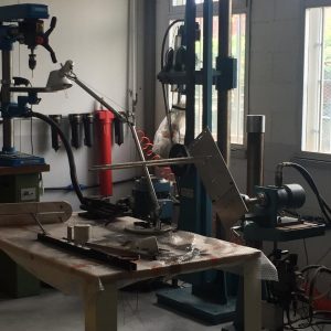
Artemide Quality Control Test of Lamp Joints

The merging of good design and product quality sounds obvious, but so often today quality is sacrificed for expense, which only contaminates the market with deceptive products. Kartell’s showroom inly emphasized this point further. Everyone, including Kartell’s staff, knows that plastic is often deemed as a ‘cheap’ material and it can easily be used to make similar style products with significantly less quality. Unfortunately, it is undeniable that certain pieces of Kartell’s collection looks as if they could be found at either an Ikea or Target; however, they have not altered the material processes to compete with the prices of these look-alike competitors. Not only are they remaining loyal to their processes, but they are making a statement about the importance of quality in products. Yes, their products do have a higher price tag than look-alike products on the market, but their quality and attention to detail is unmatched by these ‘competitors’ and will be able to have a longer product lifetime.

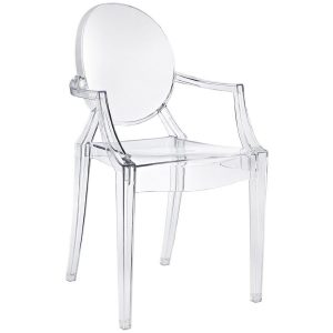
Kartell Ghost Chair
Kartell Ghost Chair

Not only is this conversation prevalent to product design, but fashion design as well, which Kering reiterated throughout the visit to their product factory. Although the designs themselves are remarkable across the lines of Artemide, Kartell, and Kering brands, the attention to quality and consistency are what I believe have helped launch and maintained each of these companies success and prevalence on the consumer market.

Consistency in Italian Flooring

My focus over the weeks in Milan has remained consistent with my sketches still being focused on the representation of various ground coverages and patterns found around the city. Almost all of the floors, thus far, have consistently utilized geometrical shapes and patterns as well as a mosaic method. However, coloring has varied significantly from bright and playful tones to neutrals and serious colors. I have yet to find a justifiable correlation betweens place and color use – except for the fact that the most colorful examples have most often been found in sections of halls, walkways, or more public space as well as more often being found within interior spaces rather than outside.

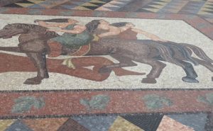
The ground floor mosaic at the bottom of the main stair.
The ground floor mosaic at the bottom of the main stair of the Triennale.

Since returning from my previous weekend trip to Lille, France and Bruxelles, Belgium, I have become more aware of the extensive floor patterns found in all areas of Milan due to the fact that there seemed to be far less example within either Lille or Bruxelles. Granted that more patterned floorings seemed to be found in Bruxelles than in Lille, they were duller in comparison with the floorings I have seen so far in Milan.

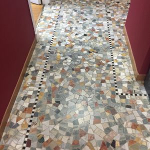
IMG_4595
IES Flooring. Pattern and coloring consistent across various areas in Milan.

Curious as to whether or not these examples of floorings were descriptive or representative of Milan more so than Italy as a whole, I thought back to the places outside of the city of Milan that we have visited and kept my eyes on the lookout in Rome this weekend. I feel as if it is reasonable to take these intricate floor coverings as a representation of Italian design since they have been found relatively consistently throughout various Italian regions- Milan, Como, Lago Maggiore, Borromean Islands, Venice, Rome, etc. The floors on the Islands and in Rome both reflect the geometrical patterns and use of mosaics, as well as a variation in use of color that is not completely explanatory. Therefore, rather than my sketchbook being primarily reflective of Milanese floorings in specific, there will be a representation of different floorings in the regions of Italy that I am able to explore to show certain consistencies in Italian design.

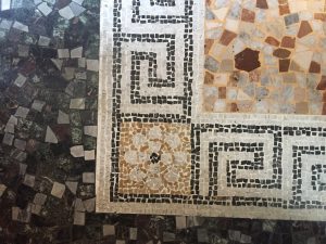
IMG_4640
Flooring found at site on Italian Island.

Unusual Architectural Findings

This past weekend I braved a solo adventured to Lille, France to meet up with old friends, who had previously studied abroad in Texas. My ‘mini-adventure’ consisted of three countries in three days (Italy, Belgium, and France) and it was incredible! Once I had finally arrived in Lille, I walked the city center to learn more about this surprisingly not so small place in France. While I have become more acquainted to the less than grid-like layout of Milan, Lille introduced an entirely new level of maze-like qualities within the landscape of its city center.

The center of Lille was a maze of radial grids without any of the typical straight axes out from the center. However, the pedestrian-friendly streets / walkways and old cobblestone streets were quaint and refreshing in comparison to the narrow and traffic heavy areas I have been experiencing in Milan. In the center of the maze was another intriguing discovery, the Norte Dame de la Treille.

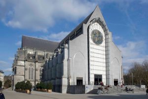
Differing drastically from the scale and architectural style of the Duomo in Milan, the Norte Dame de la Treille is a cathedral with an odd juxtaposition of styles. The drastic mash-up of architectural styles is what made this structure stand out to me as something different from most other structures I have seen, or studied, previously. Similar to the Duomo, the Norte Dame de la Treille was in the beginning stages of construction around the 13th century and utilized gothic style architecture. However, in comparison to the Duomo, which also took several centuries to complete, the Notre Dame de la Treille was not complete in the same style as when it began. Construction began in the 13th century and continued on into the 20th century on Lille’s cathedral. And while many remarkable structures of this time took centuries to complete, there was often a consistency in the overall design of the original plans. However, the Notre Dame de la Treille is striking simply because it did not follow this typical consistency.

While the back portion of the Notre Dame de la Treille is an example of classic gothic architecture, the front facade appears as a modern aesthetic from the 20th century. This visual juxtaposition of architectural styles, which also expresses the timeline of construction for this particular structure, was definitely one of my favorite findings of my weekend getaway.

Notre Dame de la Trielle, Lille, France
Notre Dame de la Treille, Lille, France


Week 3 Sketches – Kartell Museum & Triennale

Kartell Museum – simplicity is key
IMG_2449

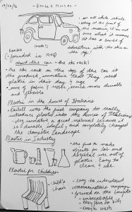
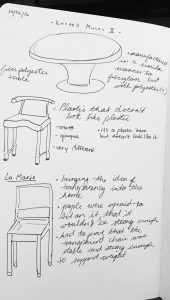
On Tuesday we visited the Kartell Museum and learned about the company’s history as we traveled through time with various famous designs from the company. It was quite fascinating to see the inception and transformation of the designs, and how something as simple as plastic could be transformed in wonderful ways. The designs of Kartell are all very familiar to us, even if we have never heard of the company. I believe many of their designs are timeless.

I’ll admit, while the history was fascinating and the items quite lovely, I won’t be forgetting the sticker shock I experienced in the gift shop anytime soon.€200 for a plastic chair? I will let it remain as a beautiful memory instead of purchasing it.
IMG_2450

Triennale – focus sketches

IMG_2448

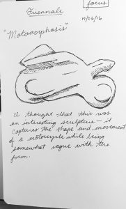
While we were visiting the Triennale on Friday, I stumbled upon two perfect subjects for my focus, which is transportation. The first is an interesting form- a sculpture which resembles a motorcycle. It is part of a project called MOTOMORPHOSIS. From the text about the project:

“MOTOMORPHOSIS is a project of social awareness on the issue of education, safety and mobility of all aimed to improve living together and sharing the road.”

I liked the shape and sense of movement from the sculpture. The project is a relevant one. Different modes of transportation- cars, scooters, motorcycles- give us a great deal of freedom, but we must be mindful of one another on the roads in order to live peacefully.
IMG_2447

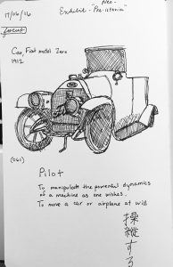
The second sketch was of a Fiat model Zero (1912) as part of the exhibition “Neo-Preistoria”. It was number 61 in the exhibit, which was a progression of items throughout our human history, accompanied by a poem/definition that describes our relationship with each one.

061 – Pilot

To manipulate the powerful dynamics

of a machine as one wishes.

To move a car or airplane at will.

I like this definition of “pilot”, as it conveys the relationship people had with vehicles well- especially Fiat. “Manipulating… as one wishes” gives a sense of freedom- of power. As I’ve been walking, busing, and using the metro across Milan, I’ve sometimes wished that I had a car or scooter to get to a destination quicker. The independence that a vehicle allows us is one I often take for granted.
Neo-preistoria

IMG_2206

This exhibit gave me a lot of mixed feelings.

IMG_2187IMG_2188

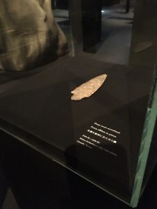
It showed a progression through time— objects created by humans and our relationships with these objects. Words and their definitions associated with the object- an emotion or purpose for it. Our intentions, our desires, sometimes consequences we had not foreseen.

IMG_2191IMG_2190

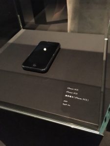
I stood in front of the atomic bomb we (America) dropped on Hiroshima and almost came to tears. I specified “America” in parenthesis but upon writing it, I realized I could have left that out and simply said “us”—humanity. Surely it was a collective fault of humankind that we allowed such a monstrosity to occur. I couldn’t help but notice that toward the most recent chapter of humankind that the objects and associations seemed negative… World War II, addiction to smartphones…

IMG_2202IMG_2203

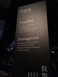
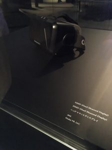
And then, there were the absolute newest innovations. 3D printing, virtual reality, the manufacture of artificial organs. These things carried no sentiment in their definition. As someone involved in virtual reality, I read every day how the technology could be used for good, used for bad…

IMG_2204IMG_2205

Just as any other object in the exhibit could have carried a different definition if we had used it in another way- it is up to us to define how these new technologies will impact our species.

I suppose- it is our destiny to determine how they will define us.