milan : in review

Processed with VSCO with c1 preset
Collaboration for class poster at Tipoteca

Exploring Milan this past month has been exhausting and wonderful and eye-opening. Everyday was a struggle to get out of bed, but everyday was far more than worth it.

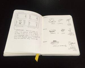
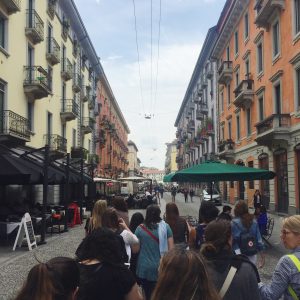
Something I really wanted by the end of this trip was to feel like I had truly immersed myself in the culture of Italy and more specifically Milan. Although this couldn’t completely happen because my Italian is limited to “ciao” and “non parlo italiano”, I feel like I got to know Milan in a way that I never could have just going on my own. Exploring so many parts and being asked to focus on the architecture and the food and the daily routines of the people forced me to learn so much about Italian culture and how it compares to that of Texas. I fell in love with the long meals and tiny espresso breaks. I was so proud of myself when I knew where I was going on the metro and didn’t have to double check every time (and could stand without holding on). 

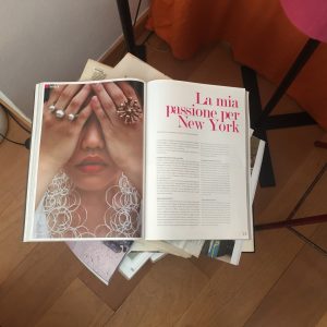
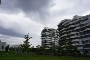
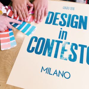
Seeing how design is woven into the everyday life of Milan was also unexpected. I knew Milan was popular for fashion, but I had no idea how focused and supportive and reliant it is on design in general. The Triennale exhibits scattered all throughout the city is one example of how every person in Milan is exposed to design without even seeking it out. There is such a difference in respect and acknowledgement of designers in this city than there really anywhere in the US.

More than anything, living in Italy for a month has changed the way I view myself as a designer. I have learned that design is so big and open. It is not something that has to be categorized and broken up, but can be free and explorative. I think it must be explored in order to find what you really love to do. I observed a passion amongst everyone we visited and studied for creating that I have only seen glimpses of in the past. I want to continue searching for something that I am that passionate about: something that gets me excited to create and solve problems for and not settle for anything else.

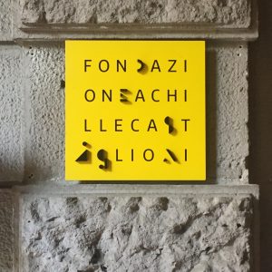
Lastly I want to end with this quote from Achille Castiglioni. 

“There has to be irony, both in design and in the objects. I see around me a professional disease of taking everything too seriously. One of my secrets is to joke all the time.” 

From all of the things I have learned from this trip, I think my favorite will always be to not take myself too seriously and to joke all the time.

Processed with VSCO with c1 preset

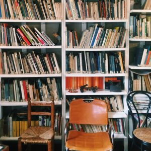
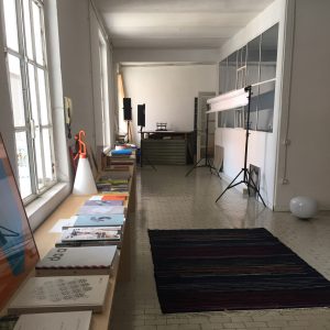
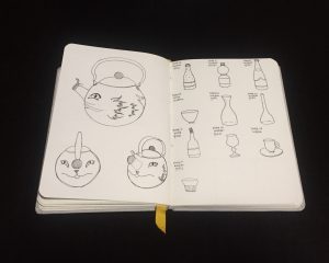
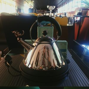
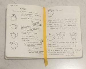
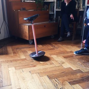
Castiglioni’s studio

image

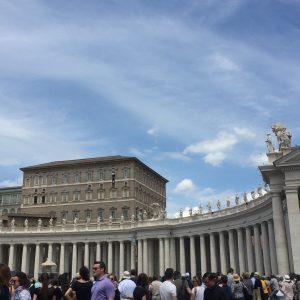
Seeing the pope in the tiny window at the Vatican

Processed with VSCO with c1 preset
Traveling along Christo’s floating piers
Processed with VSCOcam with c1 preset
Bri sketching Milan

image

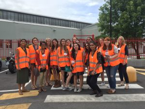
Group picture in cool vests at Artemide

week four : mapping the city

Screen Shot 2016-06-27 at 11.12.17 PM

Screen Shot 2016-06-27 at 11.12.07 PM

After our walks and examination of the two areas, City Life and the Rustic House, we moved onto how we wanted to represent our observations and question about modernity in an effective and efficient way.

While trying to answer the question about what modernity is and how both City Life and the Rustic House could somehow fit into this category, we also wanted to focus our presentation on different ways of living in Milan. This city is constantly developing. It is a lively area with a whole bunch of history but also a whole bunch of building. Because of this combination of new and old, and the fact that almost every decade is represented in the architecture as you walk down the street, Milan is called a patchwork. And this patchwork is constantly growing. New developments are not necessarily trying to change Milan but simply to add on a new way of living in the city.

Modern is relative term pertaining to a certain instances in time. Over the years, many movements have claimed to be modern. So what is modern? If modern acts as a time capsule for different movements, we question what certain modern styles can tell about the people attracted to it or the residents who choose to live within it? Is there a type?  We observed the area between two contrasting community to evaluate the individuals who choose to make up the community and to test whether each building attracts the like-minded people who share the same values as the movements.

These two residencies, and all other apartment buildings, offer the people of Milan different ways to live their lives. The surrounding green areas, sounds, smells, gates, parking, colors, and many other factors affect the way people live in their communities. It also affects the type of people who would decide to live there. In order to represent this, we decided to divide our observations into three main sections: people, commute and community.

For people, we looked at the residents. In City Life, although children are seen in the area, it does not appear to be a family oriented environment. The residents need to have a certain economic standing in order to afford the luxury apartments. It is even known for housing professional athletes and musicians. The apartment prices can reach over 2 million euro. The Rustic House

The commute also affects how people interact with the spaces. In terms of driving and parking, City Life is the largest car free area in Milan and one of the biggest in Europe, however it offers underground parking space for over 7,000 vehicles. Rustic House on the other hand has a bunch of parking in the surrounding area and offers free access at any place with loose gravel. For underground transportation, the closest metros to City Life are Amendola (5 minute walk, 400m) and Tre Torri (9 minute walk, 650m). The closest metro to Rustic House is Gerusalemme (5 minute walk, 450m), the second closet is nearly 20 minutes away (walking). It seems that City Life is much more welcoming to people taking the metro.

The last section is community. We analyzed this in terms of the community within each residency and the larger community surrounding it. In City Life, the gated community promotes exclusion of outsiders more than the safety of the residents. Because it is trying to become self sufficient and the communal parks are located at the center of the property, the builders of City Life are more focused on enhancing the community with the space than with the community outside their gates. On the other hand, the courtyard of the Rustic House is open on one side, available to both the residents of the house as well as the surrounding metropolitan area. And to kill two birds with one stone, there are bridges across the one open side that promote community within the building as well.

week four : studio FM milano

FullSizeRender

Hearing from Cristiano Bottino, one of the partners at studio FM milano, was probably one of my favorite parts of the trip. Being enthusiastic about graphic design, I am always so curious about what the life and work of a graphic designer looks like and how they got to where they are. I was so inspired and obsessed with all of the work he showed us. I loved the cleverness in each project. Kind of like in rationalist architecture where if a building was taken out of its context it would no longer make sense or have as much meaning, their work would not make sense if it were not for that particular client and purpose. FM does not seem to have a formula where they just plug and chug to get a product. They do intense research and go through many steps specific to each project in order to create something that will fit the need best.

This is the kind of designer I want to be. I don’t want all of my work to look the same despite the purpose or need. As of now, I also think I would love working in a small studio like this one. They get to work on such diverse projects and they seem to tackle each one with zeal.

I did not leave studio FM milano empty-handed. I not only left with a lot of inspiration and hope for my future as a designer, but also with a truly adorable and clever book full of type “faces”!

IMG_8984

week three : monica castiglioni

IMG_8033 

Visiting the shop of Monica Castiglioni was a real crowd pleaser. Not only was I eager because her father’s studio was so great, but we had seen one of her rings on our guide the week before and it was really something special. Walking in, I knew this was not like any other jewelry store I had ever been inside. The designer and the little girl in me were both in awe as I looked into case after case of rings, earrings and necklaces. Each piece was funky yet stunning and possessed a whole lot of character.  

One aspect I love about her work is the artistry. Something we talked about the first week in Milan was that Italian designers love combining design with other things, such as art or architecture: making it so they are not mutually exclusive. Monica’s jewelry is art and design in one. Every necklace, every ring is tended to carefully as if it were its own little sculpture. She is also very conscious of the materials she uses. The jewelry we saw were made of either bronze, felt or were 3D printed. She is very particular about her materials and that’s what makes her body of work so cohesive and so compelling.

IMG_8031

IMG_8035

week three : mapping the city

sketch book

IMG_8977

Like many other groups, our initial plans for the mapping walk were altered by the actual experience of the walk. Our first focas was accessibility. When we realized we were given a route where the two endpoints were residential areas, we know this was not a coincidence. We were all in agreement from the start that we wanted to focus on the human interaction with the places we came across since these places are where people live. So in the most basic form, we chose accessibility with a focus on safety. Who and how people would enter the area, move around within the area, and then exit the area. Our reasoning behind this choice was that we were given a mini community, the CityLife area, that without knowledge of the buildings, looks and feels vastly different than the surrounding area. With anything intended for longevity, especially buildings, there has to be a purpose or a reasoning behind basically every aspect of the construction. We decided to focus on accessibility as a way to understand the difference in intention.

Upon entering the gates, we immediately noticed the sense of order in City Life. The area seemed quiet and composed, which is something we had not yet experienced in Milan. There were not many people on the perimeter of the street, and those who were there were moving a lot slower than the average Milanese person outside of the CityLife area. Besides that, the area had clear and visible ramps for sidewalks and parking garage areas, clearly marked crosswalks and bike lanes, and well-lit streets. The next thing we took note of was the perimeter gate around the CityLife property. Typically, this would not be something special since almost every other apartment building is gated. But this gate was different. It looked almost as to be for aesthetic. The gate wasn’t very high or made out of material deemed threatening. It may have been built as a formality or subliminal message of consciousness. The gate function, or lack of, reminded us of suburban living. This is where our focus shifted from accessibility to urban vs. suburban planning. The conversation of what separates a suburban neighborhood and an urban area came up. We talked about how urban development is shaped by the area of land whereas a suburban area shapes the land. We were almost fully committed to this idea until we talked to one of the CAs, Ilenia Costa. She mentioned how Milan was constantly changing (always trying to stay up to date) but the new construction is never meant to change to area absolutely but to be another addition to what Milan is (less of a melting pot and more of a curio stand).

This is where our final plan came together. We realized that CityLife is reimagining what it means to live in the city incorporating modern styles. Similar to the Rustic House during its creation. This is when we decided to focus on the new or shift in modern and it’s meaning in context.

_DSC2391

_DSC2407

_DSC2436

week three : sketchbook

As I have moved along through Milan and through my sketchbook, I have continued to observe the table and patterns that occur during mealtimes. One thing I have enjoyed noticing is the relationship Italians have with each mealtime. I have been able to see options for food for each meal and different behaviors regarding how and when they are eaten. 

Breakfast for instance is not typically as big of a meal as it can be in the US. The people I have observed in the morning either do a grab and go with a pastry or stand at the coffee bar as they throw back their tiny coffees. This might have something to do with the fact that most of my observations are taken on business days, but I think it is true that traditionally, breakfast consists of coffee and something small in Italy. Now of course under the same circumstances in the US I would argue there is a large number of people who stop for coffee and a pastry in the morning before work. But even on the weekends, it seems that breakfast is not a leisurely event.

Another difference that I’m sure everyone notices right away in Italy is that there is no coffee to go. Yesterday I did see a to go cup in a coffee bar in the train station, but that was quite a rare siting. Like I said, most people who order coffee here stand at the bar as they order it, the barista makes it, they drink it: all in under 5 minutes.

IMG_8535

IMG_8534

week two : alessi

Processed with VSCO with p5 preset

Walking into Alessi, you immediately know you are walking into a place full of creativity and history. From the colorful, quirky hallways to the enormous showroom, the Alessi factory is the home of so much design and so much inspiration. As a company, Alessi follows suit with a popular tendency of Italian design: fusing design with art and architecture.

Seeking out designers from all different backgrounds, they open themselves and their customers up to diversity in their products: in the way they are viewed, contextualized, prototyped and produced.

Alessi has the noble goal (in my opinion) to not only make things that are efficient and functional but that are exciting and pleasing! They want people to get excited about buying a lemon juicer or a coffee maker. Alberto Alessi, when he transformed the company to focus on design, knew that those everyday, “common” objects are a part of a life, family and home. They need to satisfy not only functional needs but those of poetic and emotional needs as well. That kind of thinking is the way that I would like to think of all design. Not only in the context of my sketchbook or prototypes but in the way it interacts with the world and becomes a part of someone’s life.

With my focus being on the Italian relationship with the table, meals and food, seeing the different approaches to gadgets used in the kitchen and restaurants gave me more insight into that relationship and how it can be effected by products such as those from Alessi.

IMG_7354

week two : boccioni

Umberto Boccioni only lived to be 34 years old, yet he is known to be the “principal artist of futurism.” This speaks to how the vast amount and quality of his work and how high he is held especially by the city of Milan.

Being able to walk through his beginnings allowed for a better understanding of Boccioni’s work and process. Due to his worldly travels as a young man, he was able to study under some great European artists and try out many different styles and techniques to help shape his career.

three women

One work of his that I was drawn to at the Boccioni exhibit is “Three Women,” a portrait that was done at the dawn of futurism. Categorized as a divisionist work, Boccioni’s brush strokes are done in a way so that you can see the individual colors instead of there being a gradient between them. This piece is a good example of the transition from divisionism to futurism because you can see Boccioni begin to focus more on the lighting in the women’s hair and dresses instead of the actual women. The strokes that are meant to be rays of light coming in somewhat take the focus away from the women.

the-drinker

This painting, “The Drinker 1914,” was done at the height of futurism for Boccioni. Compared to the portrait above, the brush strokes are much more pronounced, the lighting is even more dramatic, and the color is more intense and vibrant. Unlike much of his earlier commissioned work, this painting is an observation of Boccioni’s, not something he is getting asked to paint by a patron. The man featured is not really the focus at all. Boccioni has also broken down the painting into shapes and colors, leaning towards some inspiration possibly from Pablo Picasso.

week two : castiglioni

IMG_7350

This visit, hands down, was the highlight of my week. In all honestly, I had no idea who Achille Castiglioni was until a few weeks ago. Now I am obsessed with him: the way he brought a certain wit into every one of his projects, his seemingly controlled hoarding of funky objects, his fearlessness to dive into any and all challenges, and his beautiful and chaotic studio space.

One thing I kept hearing and witnessing during our visit was Castiglioni’s practice of “shape follows function.” I find it so easy to run head into a project with a focus on how the end product will look. I know that this is wrong, and seeing it worked out in so many of his designs really helped me digest why function should be a designer’s first thought. I want to begin studying the world as he seemed to. Looking at everything and every situation as a potential place to step in and make things a little better, make things run a little smoother. One way in which Castiglioni seemed to do this is by making things minimal. If you don’t need to complicate things, don’t!

Not only did I love ogling at all Castiglioni created and collected, but I learned so much in the hour we spent in his studio. Not only about him, his process, and his design philosophies (all wonderful by the way) but about myself as a designer. I tend to want to put myself in a box. I’ve spent the last two years trying to figure out how to label myself. I want to be able to say, “I am a graphic designer,” or “I do brand design,” or “my focus is in user interface design.” Not that these things are bad, but something I’ve begun to notice on this trip is that I do not need to set up camp in a certain genre of design. Massimo Vignelli, the man who designed the New York subway signage, said that “if you can design one thing, you can design everything.” I want to live my life as a designer with that saying as my mantra. Castiglioni came running wherever a need popped up: whether it was a massive arching lamp, a mayonnaise jar knife or a bike seat chair. I think he believed that he could design anything and everything. So if it’s good enough for Castiglioni, it’s good enough for me.

Processed with VSCO with g3 preset

Processed with VSCO with c1 preset

week one : overview

Processed with VSCO with f2 preset

This week has been kind of a whirlwind, but it is a crazy, beautiful, exciting whirlwind that I’m so happy to be a part of! Milan is wonderful. The metro is ridiculously clean, our new Italian friend Anna is so helpful, gelato is on every corner, and there are flowers on almost every balcony in the city. We have only been here a week and we have already seen so much. My feet are a little tired but it is all more than worth it. Going to museums to see exhibits is comparable to walking down the streets here. You can see so much history and gain insight into the workings of the city just by observing your surroundings. 

 And if I haven’t said it enough, everything in this city is beautiful: the people, the architecture, the cafes, the language, and honestly, one of the most important, the food.

Coming here, I knew the food would be one of my favorite parts. Don’t get me wrong, I know this might not seem as important as some of the wonderful architectural history or monumental things such as that, but it’s a necessity so it is pretty important in my opinion. Being so struck from the beginning by the food and the coffee and the gelato, I became interested in Italians’ relationships with food and really meals in general. While I am here in Milan, I am planning on studying the Italian dining experience. As of now, I am keeping my topic broad so it can lend itself to the exploration of the different facets within this category. I have begun to notice and sketch different gadgets in the kitchen, customs in cafes, and “timelines” in restaurants. I want to observe and experience as much as I can involving Italian dining and eating habits while I am here. I want to know how things work and why they operate that way.

As this next week goes on, I hope to narrow down my focus and get more in depth in my research.