A Vico Magistretti quote that adequately describes the new perspective this last month in Milan has given me.
I knew it would be hard to come back to the states after living what seemed to be a different life for the last month. Traveling has been a part of the daily life over the last month, within Milan and Italy as a whole. Metro trips, buses, and trains have just been second nature, but upon arrival in Houston it was back to the American mode of transport- private vehicles. Don’t get me wrong, I am excited to be back in a place of familiarity, Mexican food, and sweet tea; however, my eyes have also been opened to a new lifestyle that makes me question the way in which our country currently functions.
Back to the land of private vehicular travel and long flights.
Granted, not all states and towns are the same across the United States or even Europe. However, I find it noteworthy that the U.S. has not taken further note from the urban infrastructure of European cities. My original culture shock upon arrival in Milan, followed by my awe of their intensive recycling system, has now turned into lingering questions of how far off the urban environments in the United States are. Austin is one of the most ‘tree-hugging’ communities in the United States, yet the enforcement of recycling and strong encouragement of public transport seems far lacking in comparison to that of not only Milano, but other European cities that I visited along the way over this last month.
The use of the metro became the prime use of transportation while in Milano.
The intensive recycling system in Italy is actually a law. Therefore, there is enforcement of the use of these various bins rather than the “encouragement” offered in some parts in the U.S. that often results in the various bins being ignored in favor of the general waste bin.
On top of eye opening moments in regards to urban development and design, I have also gained a new sense of awareness overall. While everyone has been questioning the difficulty of a month in a country with an unknown language, I have been wondering why the language barrier was not more of hindrance in reality. And that also made me aware of the importance of design elements such as iconography throughout cities. While it is true that English can be found in many places throughout Europe, there are also more remote areas in each community that are not as emerged in English basics. This could have been daunting if it were not for familiar pictorial images, icons, and symbols that created a universal language to lead me through wherever I was at the time. It was not until this point that I realized the importance and necessity of urban graphic design elements for not only visitors with language barriers, but also the local community who may lack the capability to comprehend more the simplistic images.
Images are sometimes more powerful than words due to their universal nature. Often times, I do not think we realize the importance and usefulness of imagery when we are surrounded by a familiar language.
These small pieces of the puzzle that I observed over my time in Milano have made me more aware of my surroundings not only in the more urban environments of Austin and Houston, but also more rural environments such as my home of San Angelo. With my main academic focus being of urban developments, city infrastructure, and relational planning, this trip awarded me a new perspective on the city and urban lifestyles. Although I have read and studied various European planning and architectural developments, none could have provided me the information that I was able to experience first hand. Not just seeing, but actually living in Milano for a month as well as my new gained knowledge about various basic aspects of design will definitely be something that will forever be apart of my thought processes throughout my life and future professional career.
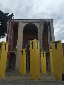
A new urban development within Milano that reiterates the inspiration this trip provided.
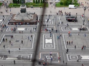
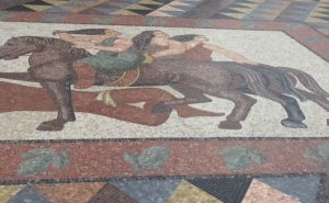
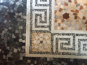
Within the early days in Milan I had already pinpointed the strong use of geometry within not only their architectural design, but in many details of their urban landscapes. One of the most notable uses of geometry that could be found within almost any setting in the city was the various pavements/ ground coverages. Even on day one when we ventured our the the Duomo and Galleria, the mosaics and pavement patterns caught my attention. Although both the Duomo and the adjacent Galleria present more ‘natural’ forms in their architectural and sculptural design, the pavements that create the large gathering space for both of these prominent structures are most definitely more reliant on geometrical forms.
The strongly geometrical patterning of the piaza at the Duomo di Milano
As many of my weekly blog posts have mentioned, there is a strong use of geometry in almost every ground covering or pavement that is noteworthy. Even the handful or more organic forms utilized geometrical shapes and principals more heavily than ‘natural’ inspiration. The most organic forms were found on the islands of Lago Maggoire, unsurprisingly. However, looking back through my sketchbook, I find it interesting that Milano presented more of a hybrid between geometrical forms and natural/ organic forms in their various ground coverings. This is mainly in comparison with Roma and Firenze, where there seemed to be an even more strictly geometrical inspiration of forms in the floors that I had noted.
More organic forms being presented on an island of Lago Maggoire
While the history of each place most definitely defines the styles utilized, I find it noteworthy that the places that were more inclined towards geometry over organic forms were further away from coasts/ large bodies of water and larger geographic icons (ie. mountains) than in comparison with the islands and even Milano. Perhaps the geography of each landscape influenced design aesthetic more than realized at the time and therefore the overlap of geography in Milan presents more variety in forms.
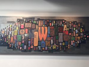
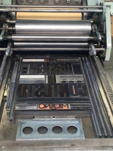
The smaller details of everyday objects in life often get overlooked. As sad as this statement is, it is unfortunately the brutal truth. While the average person may pick up a book, newspaper, or poster and admire the quality or ‘it’ factor that they cannot quite describe, but know that they like; there are far less people who look at these everyday objects/prints and question its origins and processes of creation. Being a primarily design focused group of students, I am sure that the majority of us had previously thought about these objects past their surface appearances. However, for those who have not given this subject matter much thought, or are just interested in further information, the Tipoteca Italiana foundation is an incredible resource.
Variation of fonts at Tipoteca Italiana
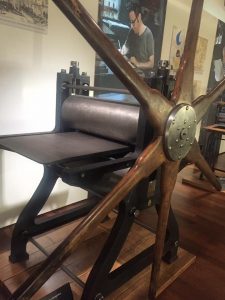
Being able to readdress the amount of work and meticulous processes that are necessary to print even just one simple page makes one have a deeper appreciation for these prints that unfortunately have the tendency of being overlooked. The foundation explained the original processes of ‘copying’ and ‘printing’ documents and then went further into the benefits of the machine age and technology for these techniques. Little do most people realize, many of these traditional processes are still very much so apart of modern printing. With everything nowadays revolving around technology and digital printing I feel as if the classic principles get lost and the techniques that were once used lose their appreciation.
An example of an older printing press at Tipoteca Italiana
Visiting the foundation and being reminded of the processes involved in printing and copying, as well as the creation of fonts, was extremely eye opening to designs/prints that are often taken for granted. The process of designing our own poster as a collective group also reiterated all of the work that is involved in printing. The design and production are a huge part of the process rather than just the context itself being the main focus. Choosing the correct fonts and placements and then beginning the process of trial and error in printing with the press is more of a procedure than most may think. In the end, the wealth of knowledge at the Tipoteca Italiana foundation is remarkable and the appreciation that one gains for design prints after visiting is imperative, in my personal opinion.
Last week was crammed packed with a day trip to visit the ‘Floating Piers’ exhibit on Lake Iseo. All week we had mentally prepared for this adventure and the long 4.5km walk along the piers. However, when the day finally came not one of us were ready for what was to come. It ‘only’ took not fitting into a packed train,running to a new train with no A/C, standing for two hours in a mob of sweaty travelers, and about eight hours of travel to finally arrive at Lake Iseo.
Along the way, the heat and exhaustion mixed with the aching and swollen feet convinced many of us that the journey just was not worth it. I cannot lie, I definitely considered bailing out of the madness on several occasions. Let me tell you- I am so glad that I did not! Once we arrived at Lake Iseo it was not quite a remarkable experience, but shortly after it truly was.
Maybe it is just me, but being barefoot is one of the absolute best things in the world. Once we got through the madhouse of lines and arrived at the pier entrance people began to remove their shoes and walk along the golden pathways- HEAVEN. At first, the sight of this act did not make much sense, but who was I to complain? However, once we got on the pier and removed our shoes there was a sudden relaxation, relief, and overall tranquility that overcame me.
Although that may sound lame or cheesy, it was absolutely true. Perhaps it had just been the breathing point at the end of a journey filled with agony, but the piers somehow made it all worth it. The views were remarkable, unquestionably, but the experience through motion and sensation were what made this ‘exhibit’ the most incredible in my opinion. At the end of the day I was left questioning the exhibit though. Had it been the intention for it to be a relieving experience at the end of chaos? Or if it hadn’t, would the experience have been the same – or as rewarding – had I not just spent eight hours on my aching feet to get there? Maybe the agony is what made the piers so worth it. Maybe, if I had not endured the draining journey then I would not have appreciated the total experience. But it was a once in a lifetime experience so I suppose I may never know.
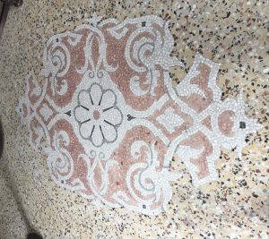
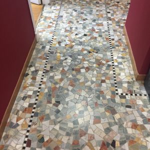
I have continued my sketching of the various floorings, pavements, and ground coverages that I have been running across within not only Milan, but surrounding areas as well. While many floors have continued similar styles and color tones, I am surprised that I have not seen the same pattern twice. Each place has offered its own unique presentation of geometric patterning and neutral coloring. The only time that I have seen a flooring resemble a previous patterning has been in hallways or exterior walkways. Typically, these floorings are basically mosaics that are bordered in. The majority of these just vary in size and coloring, but still offer something new to my collection of patterns.
Flooring example at Stressa
The most continuity between floorings has often occurred – non surprisingly- within the area of specific places/ buildings. Some of the prime examples that I have in my sketchbook to demonstrate this are at Stressa, one of islands of Lake Maggiore. While some of these floorings offer similarities in patterns, they are all unique and some even vary drastically from organic forms to strict geometry. However, the overall color compilation of these various floorings is cohesive. While this seems like it could be a simple statement of commonsense, it became more notable as a priority to look for similarities and differences in color combinations once in the more dense areas of Milan.
A more urban ground coverage example at the Duomo di Milano
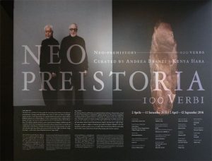
As previously mentioned, my team and I were assigned the Headquarters of the Federazione delFasci Milanesi and the Triennale di Milano as the two endpoints of our mapping assignment. For our presentation we decided to display a miniature exhibition inspired by that of Neo Preistoria – 100 Verbs by Andrea Branzi and Kenya Hara. Neo Preistoria was one of the first exhibits that we walked through at the Triennale and we were inspired by the journey it told through objects that at first glance were almost too abstract to connect. The connection and explanatory factor was the 100 verbs that were used to simply notate a characteristic at each key point.
Neo Preistoria – 100 Verbi Andrea Branzi & Kenya Hara
While the exhibit at the Triennale was displaying a journey of mankind and objects overtime, our team’s goal was the use a miniature exhibit to map the ‘moods’ overtime during the journey from the Headquarters of the Federazione delFasci Milanesi and the Triennale di Milano. Rather than the 100 verbs that broke down the long and continuous history of mankind and objects, our exhibit was broken down into seven main transitions in moods; each of which was assigned a descriptive verb.
Our exhibit could be read either ‘A’ to ‘B’ or ‘B’ to ‘A’, heaviness to lightless or vice versa. For our presentation, we followed to path that we first traveled and began with the heavy atmosphere of the fascist headquarters and moved towards to lightness surrounding the Triennale. The following words and contrived definitions were used to represent each key point throughout our journey, followed by the representative object.
SUPPRESS– To lower an opponent through intimidation. To stymie all hope.
DEPLETE– To exhaust completely. Continual loss from a supply.
STIMULATE– To pique interest. To stir physically and emotionally.
ROUSE– To awaken and captivate through thought or experience. To differentiate the immediate past and present.
MOBILIZE– To transport. To transcend spaces and locations.
UPLIFT– To fuel the spirit. To amplify the feeling of happiness or wellness.
EXPAND – “To broaden a space. Physically or mentally. To breach new territory in a literal or figurative manner.”
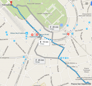
Our walking route from point ‘A’ to ‘B’
The first point after the headquarters of fascism, DEPLETE, was located at Borsa- Piazza degli Affari. This area is the financial district of Milan and is notable for the iconic middle finger statue in the center of the piazza. While this area was still suppressing in the function and atmosphere, is was slightly lighter than the Piazza San Sepolcro where the fascist headquarters is located. There started to be more people roaming the area- although all wearing the same attire of business professionals- and an overall sense of equality between the buildings around the piazza that differed from San Sepolcro where the fascist headquarters dominated.
After Borsa, the mood began to lighten more gradually as we came across an area more so dominated by commerce rather than cubicles. While business professionals could still be spotted in the area, there were also casual walkers, shop owners, and customers. The intersection that we labeled as the ‘core’ of this mood shift was at Via S. Marigalla alla Porta and Via Meravigili. The fragrances pouring out on the sidewalks from various shops inspired the chosen object and verb: A Jo Malone perfume sample ( from a shop on the corner) and STIMULATE. This was the beginning of a lighter mood beginning to take priority in our walk.
Just past the main section of commerce, an area more so dedicated to cafes and greenery came into sight. A romantic pathway of cobblestone and gardens connected the compressed commercial district of our walk to the large and open core of traffic on the other end. Notable for being the first part of walk that was adorned with greenery and flowers, ROUSE was chosen to help described the mood that this area emitted.
At the other end of the green walkway a familiar and unexpected area came into our line of sight. The oversized needles with the bright red, yellow, and green thread peaked out behind the trees. Cadorna. A main artery of traffic, vehicular and pedestrian, as well as commerce, MOBILIZE was the word that we felt best expressed the mood of this point in our walk. While we had previously seen a commerce area in our walk, the area had still been slightly depressed in its architectural and urban design. However, Cadorna represents a different mood of commerce – open, amplified, and fast-paced.
Just past Cadorna we came across our sixth shift in mood as we entered the edge of a park that led to the Triennale. It is important to note that over our last three weeks in Milan we have rarely seen anyone running or participating in physical activity for the purpose of working out. However, in this area- even just on the edge of the park- we came across person after person jogging in workout attire. This area probably had the most sporting attire in one outside public location at a time in Milan. Between the refreshing greenery and the inspiring runners that filled this area, UPLIFT seemed to be the proper explanation of what it felt like to be in this area of the walk.
And then, we arrived at our final destination – The Triennale di Milano. This area opened up completely and not only the physical environment changed, but also the mentality of the space. Although built of the same fascist time period at the headquarters of fascism, the Triennale represented something new. Built/designed by Muzio, a key figure in the Novecento Italiano movement, the Triennale was originally a way displaying fascist art and representations of Mussolini’s principles. However, with time the movement began to have friction with the fascist movement and authorities. The modern movement that began to be seen in the exhibits have shaped the Triennale and the environment surrounding. Although of similar materials to that of the headquarters of fascism, the Triennale has a lighter atmosphere architecturally and environmentally as well as mentally. Therefore, EXPAND was the proper verb to represent what the Triennale and its surroundings.
Overall, we feel as if we adequately captured the transition in moods overtime throughout our walk from the Headquarters of the Federazione delFasci Milanesi and the Triennale di Milano. The verb choice and object choice were reflective of the characteristics of each key point in the walk that we identified and we hope that others were able to imagine the experience of the walk through the presented exhibition as well.
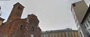
Hillary, Zalak,and myself were teamed together to map the experience between the Headquarters of the Federazione delFasci Milanesi and the Triennale di Milano. Although we had previously visited the Triennale, we were completely unfamiliar with the Federazione del Fasci Milanesi – a Piero Portaluppi design. Not too far off from the Duomo, the Piazza S. Sepolcro (Federazione del Fasci Milanesi) is much more dense and heavy in the mood of the atmosphere. Taken away by the church across from our starting building, we noticed the odd juxtaposition of styles between the Romanesque church and the fascist tower that suppressed the surrounding structures.
Piazza S. Sepolcro
In absolute contrast to the dense and heavy atmosphere of our beginning building, the Triennale is located in an open area surround by light and greenery overflowing from the adjacent parkland. Although the building is also large and of similar coloring on the front-most facade, the architectural style is much lighter and of a different time. Both buildings were built in the early 1930s, but their stark differences in architectural styles make them seem decades apart in age. While the fascist tower is a prime example of fascist design, the Triennale is modern in aesthetic and belongs to the Novecento movement.
Triennale di Milano
The walk between these two differing endpoints was interesting and ended up reflecting a path of heaviness to lightness in environment along the route from the Headquarters of the Federazione delFasci Milanesi and the Triennale di Milano. As a part of our mapping project, we are drawing inspiration from an event hosted at the Triennale, however, the main focus will be on moods and environments as we shifted from point A to point B. Our inspiration was realized in the form of exhibiting objects from key areas along our route and using verb definition to iterate the mood/impression of each area along our route.
This past week, we had a large variety in the exhibitions, studios, and factories that we visited. However, I believe that the combination of visits were a true testament to quality control and longevity of design on the market. The Artemide factory truly emphasized quality of not only design, but materials and finished products as well. The tour demonstrated the extensive processes that are taken in order to control quality and consistency of Artemide products. While the market trusts high-name brands for quality and reliability, knowing the actual processes behind the trusted quality is incredibly important to understanding the steps behind making a good design into a great product.
Artemide Quality Control Test of Lamp Joints
The merging of good design and product quality sounds obvious, but so often today quality is sacrificed for expense, which only contaminates the market with deceptive products. Kartell’s showroom inly emphasized this point further. Everyone, including Kartell’s staff, knows that plastic is often deemed as a ‘cheap’ material and it can easily be used to make similar style products with significantly less quality. Unfortunately, it is undeniable that certain pieces of Kartell’s collection looks as if they could be found at either an Ikea or Target; however, they have not altered the material processes to compete with the prices of these look-alike competitors. Not only are they remaining loyal to their processes, but they are making a statement about the importance of quality in products. Yes, their products do have a higher price tag than look-alike products on the market, but their quality and attention to detail is unmatched by these ‘competitors’ and will be able to have a longer product lifetime.
Kartell Ghost Chair
Not only is this conversation prevalent to product design, but fashion design as well, which Kering reiterated throughout the visit to their product factory. Although the designs themselves are remarkable across the lines of Artemide, Kartell, and Kering brands, the attention to quality and consistency are what I believe have helped launch and maintained each of these companies success and prevalence on the consumer market.
My focus over the weeks in Milan has remained consistent with my sketches still being focused on the representation of various ground coverages and patterns found around the city. Almost all of the floors, thus far, have consistently utilized geometrical shapes and patterns as well as a mosaic method. However, coloring has varied significantly from bright and playful tones to neutrals and serious colors. I have yet to find a justifiable correlation betweens place and color use – except for the fact that the most colorful examples have most often been found in sections of halls, walkways, or more public space as well as more often being found within interior spaces rather than outside.
The ground floor mosaic at the bottom of the main stair of the Triennale.
Since returning from my previous weekend trip to Lille, France and Bruxelles, Belgium, I have become more aware of the extensive floor patterns found in all areas of Milan due to the fact that there seemed to be far less example within either Lille or Bruxelles. Granted that more patterned floorings seemed to be found in Bruxelles than in Lille, they were duller in comparison with the floorings I have seen so far in Milan.
IES Flooring. Pattern and coloring consistent across various areas in Milan.
Curious as to whether or not these examples of floorings were descriptive or representative of Milan more so than Italy as a whole, I thought back to the places outside of the city of Milan that we have visited and kept my eyes on the lookout in Rome this weekend. I feel as if it is reasonable to take these intricate floor coverings as a representation of Italian design since they have been found relatively consistently throughout various Italian regions- Milan, Como, Lago Maggiore, Borromean Islands, Venice, Rome, etc. The floors on the Islands and in Rome both reflect the geometrical patterns and use of mosaics, as well as a variation in use of color that is not completely explanatory. Therefore, rather than my sketchbook being primarily reflective of Milanese floorings in specific, there will be a representation of different floorings in the regions of Italy that I am able to explore to show certain consistencies in Italian design.
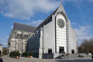
This past weekend I braved a solo adventured to Lille, France to meet up with old friends, who had previously studied abroad in Texas. My ‘mini-adventure’ consisted of three countries in three days (Italy, Belgium, and France) and it was incredible! Once I had finally arrived in Lille, I walked the city center to learn more about this surprisingly not so small place in France. While I have become more acquainted to the less than grid-like layout of Milan, Lille introduced an entirely new level of maze-like qualities within the landscape of its city center.
The center of Lille was a maze of radial grids without any of the typical straight axes out from the center. However, the pedestrian-friendly streets / walkways and old cobblestone streets were quaint and refreshing in comparison to the narrow and traffic heavy areas I have been experiencing in Milan. In the center of the maze was another intriguing discovery, the Norte Dame de la Treille.
Differing drastically from the scale and architectural style of the Duomo in Milan, the Norte Dame de la Treille is a cathedral with an odd juxtaposition of styles. The drastic mash-up of architectural styles is what made this structure stand out to me as something different from most other structures I have seen, or studied, previously. Similar to the Duomo, the Norte Dame de la Treille was in the beginning stages of construction around the 13th century and utilized gothic style architecture. However, in comparison to the Duomo, which also took several centuries to complete, the Notre Dame de la Treille was not complete in the same style as when it began. Construction began in the 13th century and continued on into the 20th century on Lille’s cathedral. And while many remarkable structures of this time took centuries to complete, there was often a consistency in the overall design of the original plans. However, the Notre Dame de la Treille is striking simply because it did not follow this typical consistency.
While the back portion of the Notre Dame de la Treille is an example of classic gothic architecture, the front facade appears as a modern aesthetic from the 20th century. This visual juxtaposition of architectural styles, which also expresses the timeline of construction for this particular structure, was definitely one of my favorite findings of my weekend getaway.