After visiting enough design oriented companies, it was fully apparent that the companies put a substantial focus on research. Especially when one of your biggest competitors is within driving distance of your main headquarters, research is one of the definite ways of having a unique product. Maybe I am naive but I think one of the most untapped markets I’ve seen this week is the need based one. I don’t want to sound unimpressed, the strides Artemide and Kartell have made to move towards the future is nothing but impressive, but I think this trip has made me aware of what type of design I would like to be a part of. I think an interesting project for both companies could be how to use their platforms to solve some of the problems of the average Italian. With most of the material research already done, I can’t image there would be a big jump from applying that information to the problems that the average italian faces. Kartell began their company trying to attack these issues but has changed its focus in its most recent years. I thought this could be a good food-for-thought exercise to see if I could find a connection between the work that companies like Kartell and Artemide are doing and problems that have not been fully addressed as expressed by the Italian people. This also makes me think about my personal projects I have either already done or are planning to do and reevaluate how much of an impact it is making on its target audience. I think this is something I will think about for a project after this study abroad is over.
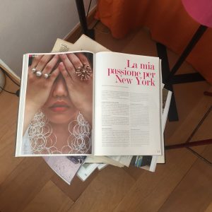
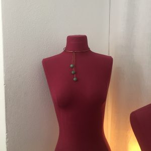
Visiting the shop of Monica Castiglioni was a real crowd pleaser. Not only was I eager because her father’s studio was so great, but we had seen one of her rings on our guide the week before and it was really something special. Walking in, I knew this was not like any other jewelry store I had ever been inside. The designer and the little girl in me were both in awe as I looked into case after case of rings, earrings and necklaces. Each piece was funky yet stunning and possessed a whole lot of character.
One aspect I love about her work is the artistry. Something we talked about the first week in Milan was that Italian designers love combining design with other things, such as art or architecture: making it so they are not mutually exclusive. Monica’s jewelry is art and design in one. Every necklace, every ring is tended to carefully as if it were its own little sculpture. She is also very conscious of the materials she uses. The jewelry we saw were made of either bronze, felt or were 3D printed. She is very particular about her materials and that’s what makes her body of work so cohesive and so compelling.
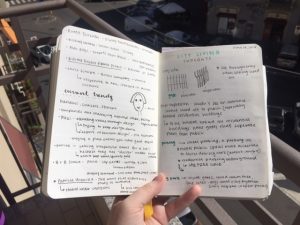
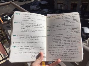
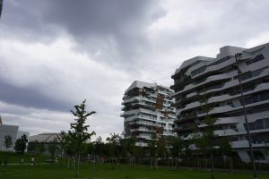
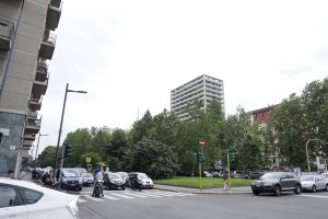
Like many other groups, our initial plans for the mapping walk were altered by the actual experience of the walk. Our first focas was accessibility. When we realized we were given a route where the two endpoints were residential areas, we know this was not a coincidence. We were all in agreement from the start that we wanted to focus on the human interaction with the places we came across since these places are where people live. So in the most basic form, we chose accessibility with a focus on safety. Who and how people would enter the area, move around within the area, and then exit the area. Our reasoning behind this choice was that we were given a mini community, the CityLife area, that without knowledge of the buildings, looks and feels vastly different than the surrounding area. With anything intended for longevity, especially buildings, there has to be a purpose or a reasoning behind basically every aspect of the construction. We decided to focus on accessibility as a way to understand the difference in intention.
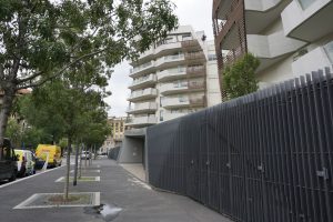
Upon entering the gates, we immediately noticed the sense of order in City Life. The area seemed quiet and composed, which is something we had not yet experienced in Milan. There were not many people on the perimeter of the street, and those who were there were moving a lot slower than the average Milanese person outside of the CityLife area. Besides that, the area had clear and visible ramps for sidewalks and parking garage areas, clearly marked crosswalks and bike lanes, and well-lit streets. The next thing we took note of was the perimeter gate around the CityLife property. Typically, this would not be something special since almost every other apartment building is gated. But this gate was different. It looked almost as to be for aesthetic. The gate wasn’t very high or made out of material deemed threatening. It may have been built as a formality or subliminal message of consciousness. The gate function, or lack of, reminded us of suburban living. This is where our focus shifted from accessibility to urban vs. suburban planning. The conversation of what separates a suburban neighborhood and an urban area came up. We talked about how urban development is shaped by the area of land whereas a suburban area shapes the land. We were almost fully committed to this idea until we talked to one of the CAs, Ilenia Costa. She mentioned how Milan was constantly changing (always trying to stay up to date) but the new construction is never meant to change to area absolutely but to be another addition to what Milan is (less of a melting pot and more of a curio stand).
This is where our final plan came together. We realized that CityLife is reimagining what it means to live in the city incorporating modern styles. Similar to the Rustic House during its creation. This is when we decided to focus on the new or shift in modern and it’s meaning in context.
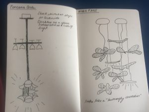
What I love about Milan is the seemingly endless number of light shops sprinkled throughout the city. This past week we had the opportunity to visit both Flos and Fontana Art, which both had a wonderful display of lamps that featured some work from Artemide. As soon as we entered Flos, I recognized the amazing display of lights from Artemide, which in essence was this beautiful chandelier structure featuring what appears to be butterflies cascading down and emitting light.
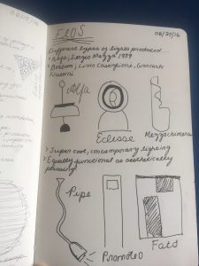
In Flos, we saw a multitude of very modern and contemporary light fixtures. One of my favorite pieces was one lamp which not only functioned as a lamp but as an iPhone charger as well. However, personally I must say I definitely preferred the pieces in Fontana Art, seeing as they were less contemporary and played an interesting twist on antique styles of chandeliers. Another piece that stood out to me was this ceiling light which doubled as a way to hold glasses – this I did a rough sketch of in my notebook as you can see from the above photo. Overall, I really enjoyed getting to visit and see many of the Artemide lamps in reality through the stores that sell them.
Here we have CAs that are native to Italy, speak the language, and are here to help us with any questions or needs we may have. Anna is my CA, and she is only a year older than me, at 19 that makes her one of the youngest among us. It’s been great having someone closer to my age always around to talk to and to ask questions, since everyone else here is already about 20 and older, and they all know what they’re doing.
This last weekend, I decided to stay home and enjoy Milan. I went out for drinks with some friends, met some new people, and simply enjoyed sleeping in and catching up on OITNB (amirite, ladies?).
Now Anna had to go home to visit a doctor on Monday, but she wanted to invite some of us to go with her to meet her family and get a chance to experience a bit of her hometown. Sadly, I was one of the only ones who answered her, but Noor was home with nothing better to do so she tagged along as well. It was refreshing to have such a small, intimate group. We joked, talked about music, and enjoyed each others company without the stress of school or worrying about 15+ other people.
When we arrived, her younger sister and father were waiting outside the station, and they walked us over to their home – a mere 5 minute walk. Her parents were lovely, and despite not speaking any English, they were so warm and welcoming.
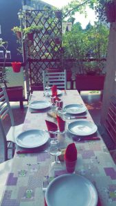
As her father poured us some wine, Anna’s mother began setting the table. Now, her mother made us all homemade recipes using ingredients fresh from Anna’s grandfather’s garden.
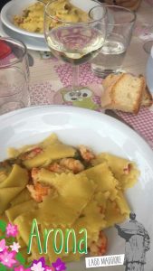
She made a pasta recipe with fish and zucchini and handmade pasta that Anna’s father and sister had made.
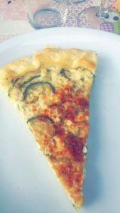
Then we had a zucchini and ricotta cheese “pie” with pan-seared eggplant (all of the vegetables were fresh from the garden).
Then they brought out a simple salad: just some lettuce and olive oil and vinegar; a nice reprieve after the delicious pasta and pie.
Lastly, they served us homemade melon and yogurt gelato with fresh berries picked from – you guessed it – the magical garden. It was hands down the best Italian food I’ve had this entire trip, and I think it was due to the fact that you could taste all of the love used to make it.
**Food pictures courtesy of Noor.
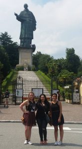
After lunch, we cleaned up and headed out to the second tallest statue in the world (only second to our Statue of Liberty back home), the San Carlone:
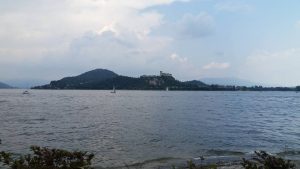
Her father bought us tickets to be able to climb atop the terrace part for a better view and some photos. (Side note: Anna is terrified of heights, so we didn’t want to go much further.) The view was spectacular, you could see Laggo Maggiore in full view even the castle across the water was clearly visible.
Once we got down, her father drove us down to the lake and dropped us off where we said our goodbyes. Anna stayed with us since we still had a few hours left; she took us down to the water then around the shops.
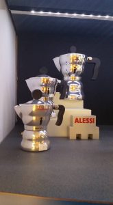
Inside one of the shops, they had an Alessi display. Moka machines, wine bottle openers, even the little knick knacks they had at the Alessi Factory, so I bought an Alessi Moka coffee maker for back home pictured below.
Alessi Moka
We didn’t spend very long there since our train left at 5:30, but it was such a wonderful time. Meeting Anna’s family and getting to spend quality time with her and Noor while seeing such a beautiful city was a nice, relaxing way to spend my last Sunday in Italy.
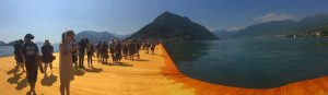
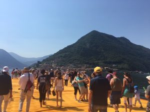
What a journey. After countless hours (just kidding, I counted- it was about 8-9 hours) of waiting, we arrived at a once-in-a-lifetime art installation on Lake Iseo. The heat building in my cheeks from the sun exposure became cool from the air that floated up from the water of Lake Iseo. The blisters on my feet vanished as I walked across the soft fabric lining the piers, the bumps in the material emulating the waves. To me, the way the piers seemed like the waves of the lake was the most beautiful part.
The Floating Piers is a temporary work, so we are lucky to be among the expected thousands that will ever experience it. This ephemeral quality of the installation is what always draws people to Christo’s work. Especially for the Floating Piers, it is given a spiritual feeling- visiting this work is truly like a pilgrimage. Combine this spiritual undertone with the sensation of walking on water- well, it’s all very religious. Perhaps it is only meant to be something beautiful- fleeting, but beautiful, as is life.
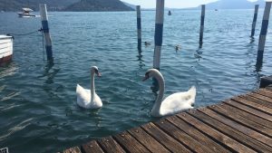
This outlook that the work inspires- to appreciate the beauty right in front of you, in this moment- is what made me so entranced by the swans. Swans themselves are so beautiful and magical-feeling, it only felt right that they fit right in with the dreamy state of the whole expedition. Even if there was no intention for the Floating Piers to seem as spiritual as it did, there’s no doubt that the natural beauty of Lake Iseo was meant to enhance the wonder of the installation.
Last weekend, several of us took a trip to Rome. The city was overwhelmingly full of tourists, smelly streets, and very old but gorgeous buildings. We managed to get around the city using the subway quite easily, thanks to all the subway riding we’ve done here in Milan, and we managed to cram quite a lot into two days of travel.
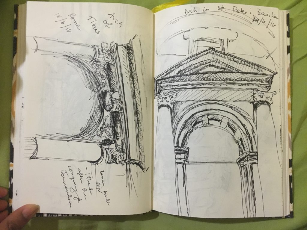
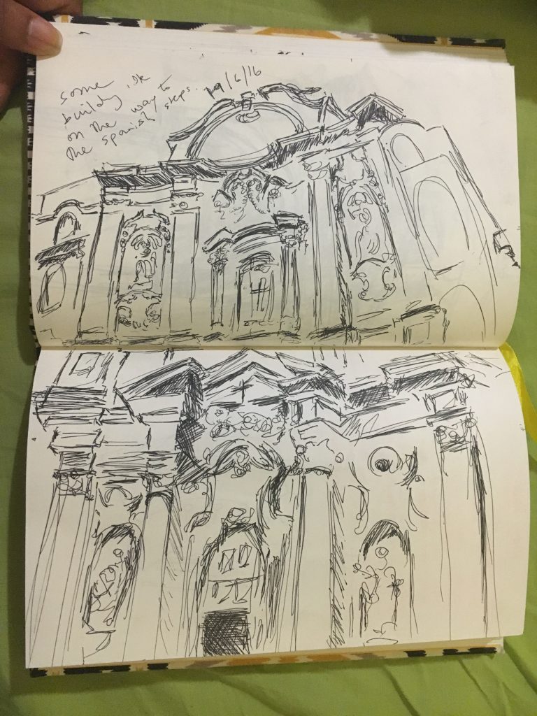
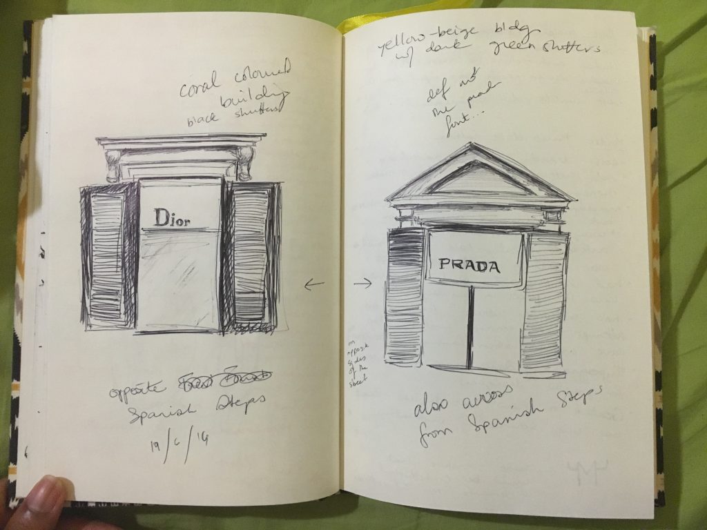
A couple of my sketchbook entries included several windows, doors, and arches that i saw in Rome. My badly thought out presumption of Rome was that everything would be Roman style, but I keep forgetting that although historical events might not take place simultaneously, they do tend to layer upon each other. Seeing all this history overlap really set that misconception straight, and the jarring reality that so much has already transpired in this world hit me. Here was the evidence right in front of me. The early Roman period, the rule of the Tetrarch, the introduction of Christianity, the Italian Renaissance, Michelangelo, the Vatican, all that happened, and there it stood right infant of my eyes. Wow.
I couldn’t scribble my sketches down fast enough, nor pick out a few favorites to draw. I did pen down a few that captured some of the different events that transpired in Rome:
This first sketchbook spread has the arch of Titus and an arch inside the St. Peter’s Basilica side by side.
Arch of Titus and one of the arches within St. Peter’s Basilica
This second spread was a church facade we stumbled upon while walking the back roads to the Pantheon.
Church facade
And finally, some of the crowning commercial brands of today, Prada and Dior.
Windows to the upper floors of Dior and Prada stores opposite the Spanish Steps
Amsterdam, is most definitely the city of canals. In fact, I think it pays some heavy competition to Venice in terms of number random canals to be found within the city. However, Amsterdam is also a city that features a multitude of stunning and diverse lighting. And what truly makes the canals so stunning to me is through the way they glow and glisten at night due to the numerous lamp posts plastered throughout the city.
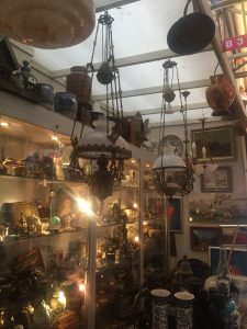
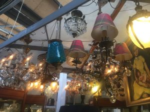
There is also a huge influence of Moroccan-esq lamps throughout the city as well, and a multitude are to be found dispersed in the various flee markets within the city. It is nearly impossible to walk through Amsterdam without coming across a lamp that is in someway inspired or takes influence from the east. I stumbled upon the most amazing little shop that was just absolutely brimmed with what seemed to be an endless number of chandeliers and floor lamps, and to be quiet honest, I felt like I was back in Venice due to the overwhelming amount of glass. The comparisons to be made with Venice and Amsterdam are endless, and its definitely such a joy to have the opportunity to view and note the fabulous lighting and canals in both cities.
What I truly loved about visiting the Armani and Gucci museums was the inside information that was provided to us on how these incredible gowns and clothes are manufactured. However, something that I found particularly interesting about both these Italian mega-chains was their constant insistence and assurance that both fashion brands are manufactured through “wholesome” means. Why this can definitely be said about Gucci in terms of their ability to produce clothes entirely within the Italy, it seems slightly strange that through their parent company – which falls under the same roof as Stella McCartney as well as a multitude of other notable fashion brands – they show an intense statistic of outsourcing in terms of producing these garments. For example, It was mentioned during the presentation given to us in Gucci that many garments are sent or produced within India for embroidery work or to China and other Asian countries for silk. This definitely opens up a questionable narrative about how and under what circumstances these garments are produced in. Without a doubt, Gucci creates remarkable pieces of clothing that easily fall under the category of art. But it is always vital to remember that although something as mega as Gucci is easily viewed as impenetrable, it is necessary to critique any areas of production that seem questionable.
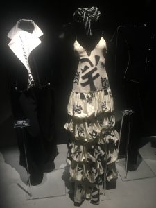
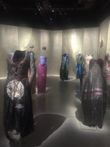
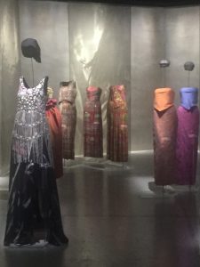
On a similar note, Armani museum also brought up a few questions about the visual and creative influence in a variety of pieces within their collection. This was more specifically concentrated within the “Orient” section in the museum. It was stated that Armani was influenced through a variety of Eastern cultures that are clearly seen through a quite a few pieces in his collection. However, at times I felt that this was perhaps a understatement in respect to what was actually being displayed. For example, there were two particular dresses that were essentially Sarees being relabeled as an “Armani Piece”. I’m not an expert on the subject of appropriation, but viewing these gowns did make me slightly uncomfortable (As well as the Indian Sitar music being constantly played in the background). In fact, they would probably me more accurately described as Sarees within an Italian twist. However, I do not know the exact details and background behind the creation of these garments, so it would be virtually impossible to see the Armani team’s thought process while creating these specific pieces. Overall, it was an absolute pleasure to be able to see all of these stunning gowns being celebrated through their display in the Armani Museum.
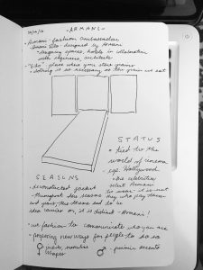
This sketch was of the entrance to the exhibits at Armani Silos. I found it to be a very bold statement with images of Hollywood starlets flashing behind the vivid red ‘carpet’ that also appeared much like a catwalk. Immediately we understand the importance of this brand. We are told right off the bat- ‘we do not seek celebrities to wear Armani. The celebrities seek us.’ The existence of Armani and Hollywood is intertwined- each serving to elevate the status of the other.
The name of Armani Silos- specifically the ‘silos’ bit- was explained that it implies clothing is just as important as the food that we eat. The grains. In the way that food sustains our living, clothing does the same for the way we express ourselves. I agree with this. When we meet someone, we make immediate judgments based on how they present themselves in their dress. It may not always be best to judge based on appearance, but it is at least an opportunity to say something about yourself before you say anything at all.
–
studio FM – designing identity
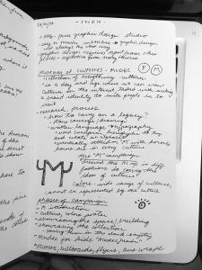
This was one of my favorite visits. Studio FM is a graphic design firm that works across a range of capabilities- brand identity, art direction, exhibit design, digital, and others.
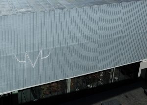
We learned in depth about the process behind one of their campaigns for the Mudec, a museum of cultures that we had the opportunity to visit our first week of class. FM designed the visual identity for the museum, as well as a launch campaign. I enjoyed learning about the way they approached this task, pulling inspiration from the cultures that the Mudec had on showcase and coming up with creative ways to pull viewers in to their world.
The campaign was broken into different flights in order to seed the campaign.
The ‘M’ – introduce the new logo
The Colorful Pattern – introduce the vibrant cultures
The Space – showcase the architecture, interior
The Collections – showcase the actual collection
Each approach had a very specific goal in mind, all of flights working in unison to paint a complete picture of the Mudec through advertising. It seemed to be mostly out-of-home placements, which I find to be interesting and appropriate. The sense of adventure and wonder that they captured through the vivid imagery in their graphic design suits the placements well, giving passersby the opportunity to learn about the Mudec while they are moving about their everyday life. A combination of posters, billboards, bus/subway placements, and vehicle wraps placed the Mudec at every stop in the everyday journey of the consumer.
It was also quite nice to learn that FM created all of the icons within the museum, as well. Those were something that all of us noticed when we first arrived at the Mudec! Again and again the things that we learn on this trip seem to come full circle at one point or another.
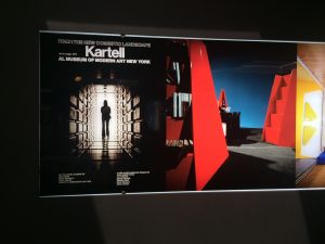
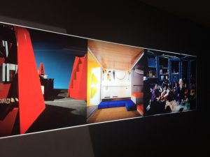 After visiting enough design oriented companies, it was fully apparent that the companies put a substantial focus on research. Especially when one of your biggest competitors is within driving distance of your main headquarters, research is one of the definite ways of having a unique product. Maybe I am naive but I think one of the most untapped markets I’ve seen this week is the need based one. I don’t want to sound unimpressed, the strides Artemide and Kartell have made to move towards the future is nothing but impressive, but I think this trip has made me aware of what type of design I would like to be a part of. I think an interesting project for both companies could be how to use their platforms to solve some of the problems of the average Italian. With most of the material research already done, I can’t image there would be a big jump from applying that information to the problems that the average italian faces. Kartell began their company trying to attack these issues but has changed its focus in its most recent years. I thought this could be a good food-for-thought exercise to see if I could find a connection between the work that companies like Kartell and Artemide are doing and problems that have not been fully addressed as expressed by the Italian people. This also makes me think about my personal projects I have either already done or are planning to do and reevaluate how much of an impact it is making on its target audience. I think this is something I will think about for a project after this study abroad is over.