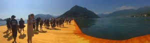
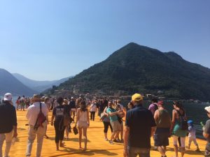
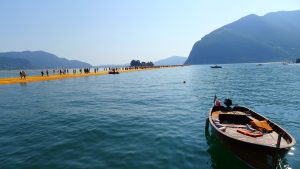
What a journey. After countless hours (just kidding, I counted- it was about 8-9 hours) of waiting, we arrived at a once-in-a-lifetime art installation on Lake Iseo. The heat building in my cheeks from the sun exposure became cool from the air that floated up from the water of Lake Iseo. The blisters on my feet vanished as I walked across the soft fabric lining the piers, the bumps in the material emulating the waves. To me, the way the piers seemed like the waves of the lake was the most beautiful part.
The Floating Piers is a temporary work, so we are lucky to be among the expected thousands that will ever experience it. This ephemeral quality of the installation is what always draws people to Christo’s work. Especially for the Floating Piers, it is given a spiritual feeling- visiting this work is truly like a pilgrimage. Combine this spiritual undertone with the sensation of walking on water- well, it’s all very religious. Perhaps it is only meant to be something beautiful- fleeting, but beautiful, as is life.
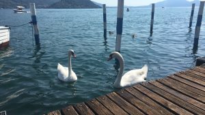
This outlook that the work inspires- to appreciate the beauty right in front of you, in this moment- is what made me so entranced by the swans. Swans themselves are so beautiful and magical-feeling, it only felt right that they fit right in with the dreamy state of the whole expedition. Even if there was no intention for the Floating Piers to seem as spiritual as it did, there’s no doubt that the natural beauty of Lake Iseo was meant to enhance the wonder of the installation.
Last weekend, several of us took a trip to Rome. The city was overwhelmingly full of tourists, smelly streets, and very old but gorgeous buildings. We managed to get around the city using the subway quite easily, thanks to all the subway riding we’ve done here in Milan, and we managed to cram quite a lot into two days of travel.
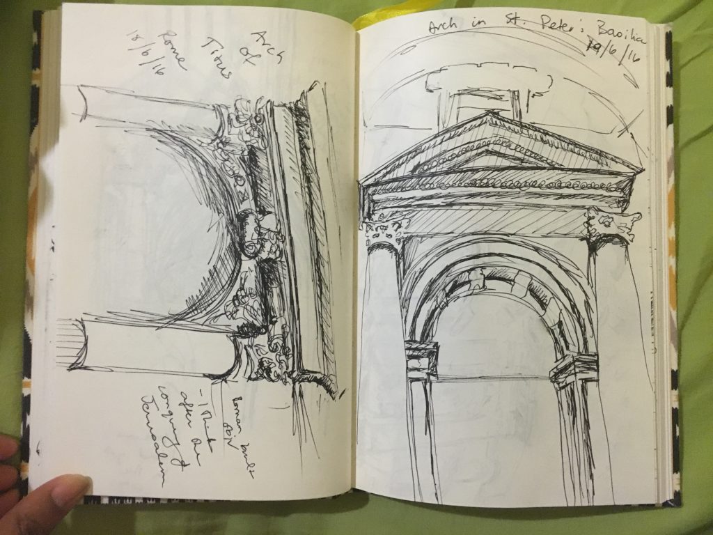
A couple of my sketchbook entries included several windows, doors, and arches that i saw in Rome. My badly thought out presumption of Rome was that everything would be Roman style, but I keep forgetting that although historical events might not take place simultaneously, they do tend to layer upon each other. Seeing all this history overlap really set that misconception straight, and the jarring reality that so much has already transpired in this world hit me. Here was the evidence right in front of me. The early Roman period, the rule of the Tetrarch, the introduction of Christianity, the Italian Renaissance, Michelangelo, the Vatican, all that happened, and there it stood right infant of my eyes. Wow.
I couldn’t scribble my sketches down fast enough, nor pick out a few favorites to draw. I did pen down a few that captured some of the different events that transpired in Rome:
This first sketchbook spread has the arch of Titus and an arch inside the St. Peter’s Basilica side by side.
Arch of Titus and one of the arches within St. Peter’s Basilica
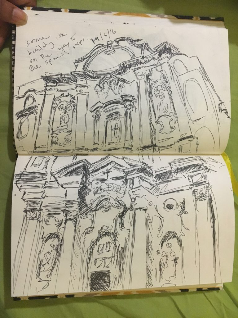
This second spread was a church facade we stumbled upon while walking the back roads to the Pantheon.
Church facade
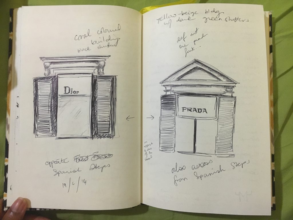
And finally, some of the crowning commercial brands of today, Prada and Dior.
Windows to the upper floors of Dior and Prada stores opposite the Spanish Steps
Amsterdam, is most definitely the city of canals. In fact, I think it pays some heavy competition to Venice in terms of number random canals to be found within the city. However, Amsterdam is also a city that features a multitude of stunning and diverse lighting. And what truly makes the canals so stunning to me is through the way they glow and glisten at night due to the numerous lamp posts plastered throughout the city.
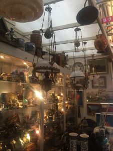
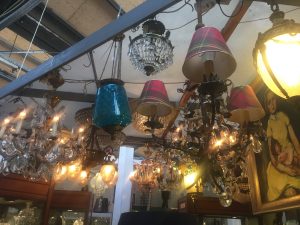
There is also a huge influence of Moroccan-esq lamps throughout the city as well, and a multitude are to be found dispersed in the various flee markets within the city. It is nearly impossible to walk through Amsterdam without coming across a lamp that is in someway inspired or takes influence from the east. I stumbled upon the most amazing little shop that was just absolutely brimmed with what seemed to be an endless number of chandeliers and floor lamps, and to be quiet honest, I felt like I was back in Venice due to the overwhelming amount of glass. The comparisons to be made with Venice and Amsterdam are endless, and its definitely such a joy to have the opportunity to view and note the fabulous lighting and canals in both cities.
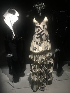
What I truly loved about visiting the Armani and Gucci museums was the inside information that was provided to us on how these incredible gowns and clothes are manufactured. However, something that I found particularly interesting about both these Italian mega-chains was their constant insistence and assurance that both fashion brands are manufactured through “wholesome” means. Why this can definitely be said about Gucci in terms of their ability to produce clothes entirely within the Italy, it seems slightly strange that through their parent company – which falls under the same roof as Stella McCartney as well as a multitude of other notable fashion brands – they show an intense statistic of outsourcing in terms of producing these garments. For example, It was mentioned during the presentation given to us in Gucci that many garments are sent or produced within India for embroidery work or to China and other Asian countries for silk. This definitely opens up a questionable narrative about how and under what circumstances these garments are produced in. Without a doubt, Gucci creates remarkable pieces of clothing that easily fall under the category of art. But it is always vital to remember that although something as mega as Gucci is easily viewed as impenetrable, it is necessary to critique any areas of production that seem questionable.
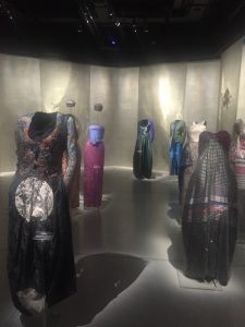
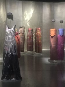
On a similar note, Armani museum also brought up a few questions about the visual and creative influence in a variety of pieces within their collection. This was more specifically concentrated within the “Orient” section in the museum. It was stated that Armani was influenced through a variety of Eastern cultures that are clearly seen through a quite a few pieces in his collection. However, at times I felt that this was perhaps a understatement in respect to what was actually being displayed. For example, there were two particular dresses that were essentially Sarees being relabeled as an “Armani Piece”. I’m not an expert on the subject of appropriation, but viewing these gowns did make me slightly uncomfortable (As well as the Indian Sitar music being constantly played in the background). In fact, they would probably me more accurately described as Sarees within an Italian twist. However, I do not know the exact details and background behind the creation of these garments, so it would be virtually impossible to see the Armani team’s thought process while creating these specific pieces. Overall, it was an absolute pleasure to be able to see all of these stunning gowns being celebrated through their display in the Armani Museum.
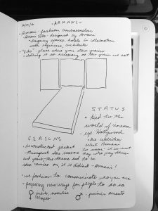
This sketch was of the entrance to the exhibits at Armani Silos. I found it to be a very bold statement with images of Hollywood starlets flashing behind the vivid red ‘carpet’ that also appeared much like a catwalk. Immediately we understand the importance of this brand. We are told right off the bat- ‘we do not seek celebrities to wear Armani. The celebrities seek us.’ The existence of Armani and Hollywood is intertwined- each serving to elevate the status of the other.
The name of Armani Silos- specifically the ‘silos’ bit- was explained that it implies clothing is just as important as the food that we eat. The grains. In the way that food sustains our living, clothing does the same for the way we express ourselves. I agree with this. When we meet someone, we make immediate judgments based on how they present themselves in their dress. It may not always be best to judge based on appearance, but it is at least an opportunity to say something about yourself before you say anything at all.
–
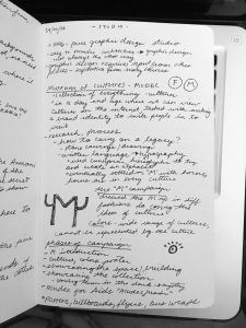
studio FM – designing identity
This was one of my favorite visits. Studio FM is a graphic design firm that works across a range of capabilities- brand identity, art direction, exhibit design, digital, and others.
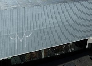
We learned in depth about the process behind one of their campaigns for the Mudec, a museum of cultures that we had the opportunity to visit our first week of class. FM designed the visual identity for the museum, as well as a launch campaign. I enjoyed learning about the way they approached this task, pulling inspiration from the cultures that the Mudec had on showcase and coming up with creative ways to pull viewers in to their world.
The campaign was broken into different flights in order to seed the campaign.
The ‘M’ – introduce the new logo
The Colorful Pattern – introduce the vibrant cultures
The Space – showcase the architecture, interior
The Collections – showcase the actual collection
Each approach had a very specific goal in mind, all of flights working in unison to paint a complete picture of the Mudec through advertising. It seemed to be mostly out-of-home placements, which I find to be interesting and appropriate. The sense of adventure and wonder that they captured through the vivid imagery in their graphic design suits the placements well, giving passersby the opportunity to learn about the Mudec while they are moving about their everyday life. A combination of posters, billboards, bus/subway placements, and vehicle wraps placed the Mudec at every stop in the everyday journey of the consumer.
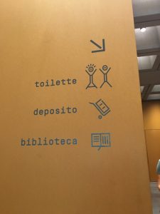
It was also quite nice to learn that FM created all of the icons within the museum, as well. Those were something that all of us noticed when we first arrived at the Mudec! Again and again the things that we learn on this trip seem to come full circle at one point or another.
The exhibition is a project of the XXI International Exhibition Triennale Milano 2016, hosted by Pirelli HangarBicocca. It’s about 30-45 minutes away from our apartments here in Milan if you take the metro and walk a little ways.
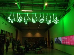
When you walk in, you’re immediately greeted by a large, neon-green sign that says “Welcome” (pictured below), and just beyond the sign was the second exhibit we visited.
“Welcome”
First, however, we went to a cirque-styled Triennale exhibition where we flew (well, it was more of a glide), were blinded by lights, thrown into complete darkness, and went through many optical illusions. We had to wear green wristbands in order to fly, and the second I was strapped in I was ready to go. They only let us “fly” around about 4 times, but it was well worth it. It goes almost painfully slow, but it makes you observe your surroundings, the other objects in the room, and the people down below.
The second exhibition is titled “Architecture is Art”.
Exhibition #2
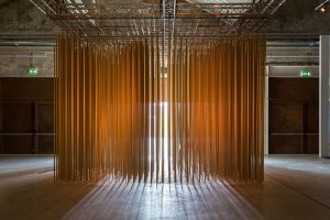
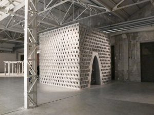
We were deafened by hanging, ringing poles as we walked in. Then we sat on top of garbage like the trash we are. It was less interactive, but the pieces were still incredible to walk through and experience, including the piece pictured below:
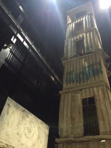
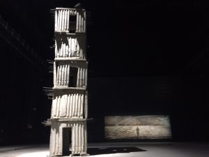
Lastly, we went around the building (took a little while to find it) to get to another exhibition that’s a permanent piece. It consisted of 7 towers and a few canvas pieces, and the massive towers were made of lead and concrete and various objects. The tone completely shifted inside the room: it became ominous and almost suppressing.
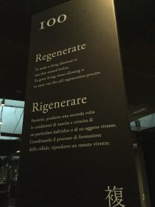
Andrea Branzi and Kenya Hara. PreHistory Exhibit. Another great designer that inspired me on this trip was Andrea Branzi, extremely sad that I missed his talk, but hopefully, I was able to understand his message. His 100 power verbs took me into an unexpected journey—from our dark ages into this new technological age. The creation of our survival tools only marks the beginning of what the human hand can create. It can design many wonderful artifacts, but it can also destroy… if allowed. I loved that the ending element was not a glimpse into the future, but rather a conscious decision to investigate the past. To organize, become aware and REGENERATE the past for progress … “just like the way life begins.” The exhibition electrified me to investigate my past to better prepare for the future. To grasp from my ancestors all the elements that strengthen cultural values for the betterment of society and humanity.
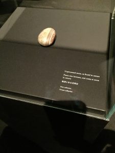
From the 100 verbs, there were a few key words that captured my attention. 1). Exist – “To believe that things are. The universe is. And people are.” This was visually, represented by an unprocessed stone. This caught my attention as this was my initial inspiration to the jewelry pieces I designed for my workshops. I guess, this is an intuitive form that is embedded in all of us, yet we have ignored.
Powerful. 2). Hold – “to grasp things with finger and thumb. Hand engages a stone. Stone encounters hand.” Although, I didn’t like that this stone was an axe, I did appreciate that the stone provided a grip—in my opinion, a form of security or power. My project seems to have intuitively connected to a primitive desire or need to hold on to an object in one’s hand. We just have to learn to listen to our inner desires. This is where I found Branzi’s work amazing. The word chosen to describe the object gave me chills. The definition was powerful—although, it was a working tool, Branzi decided to use the word DESTROY. Granted the tool displayed was a “working tool” to work the land or to capture a prey (or destroy for one’s benefit). He strategically chose the word Destroy because it was created to destroy a living thing or breakdown a landscape. I had to take a moment to inhale this particular information.
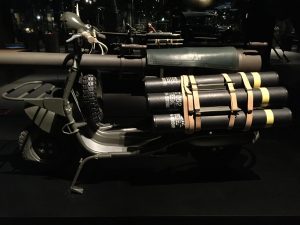
(This image was under “Annihilate”, but it clearly represents a stronger definition for destruction.
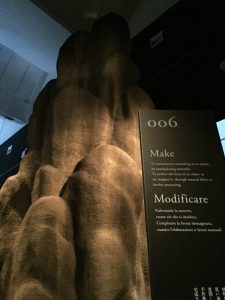
3). Make – Interestingly enough, Branzi chose to place the word MAKE sixth from the list. I would have thought, this would have been third on the list, but he decided the affect of the hand destroying a living creature was more important than the creation of something. Fascinating. Make – “To manufacture something as we desire. By manipulating materials…”
Branzi then took me into a rollercoaster of a journey from varying sounds to visuals of progression and darkness of regression. The background music generated some apprehension at certain points, at others it gave me hope. I happened to notice the heartbeat sound as I reached the “religious” section or the next key word that caught my attention 4). Worship – “to offer prayers, conscious of the great power beyond human control.” Although, the music brought some uneasiness, the visuals and definition brought me comfort. There were other keywords that captivated my attention such as Cultivate, Share, Love, Learn, Navigate, Build, Observe and Think, but the main takeaway from this exhibition for me was to wake-up, acknowledge the past and become aware of technology rather than be consumed by it or its politics.
Listen and wake-up to your true nature. … just like the way life began!
The Triennale exhibition has compounded a deeper and better understanding of political and critical art and design for me. I find myself drawn to works that have political and/or philosophical statements. The deeper, more ambitious projects seem to draw me in, especially the ones that take a moment to comprehend. The two major projects that captured my attention were Andrea Branzi’s project and now, Anselm Keifer. Both Branzi and Keifer are new discoveries for me. I had never heard of either artists, but I have quickly become a fan. They both make political, personal and philosophical work. Formally, the works speak in a quiet, aesthetically pleasing mode. It takes a moment to discover the hidden treasures.
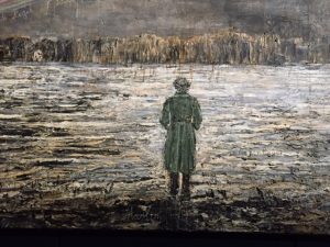
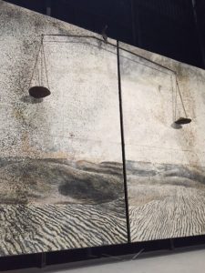
Having just returned from Germany, I immediately connected to Kiefer’s work, which I had never experienced or seen before, I automatically connected to his work through the reinterpretation of Germany. Although, the theme for this particular exhibition was “The Seven Heavenly Palaces”—which spanned across a broad spectrum from Melancholia to Magnetico, the pieces hold remnants of post-war (post-apocalyptic) Germany. The towers stood high, powerful (in an authoritative manner, waiting to be seen, yet a bit unsure of themselves and off-balanced, almost ready to collapse. It allowed for the viewer to take from them as they wished. The empty rooms and broken elements added to the darkness and unbalanced isolation. The paintings added to the desolation—dark, contained, but well-balanced. The Alchemie was my favorite piece—drawn by the balancing scales. They clearly represented the positive and negative of life, space and time. The scales were balanced by Salt on one side for sterility and Sunflower seeds on the other for fertility. At the end of the walk opposite the entrance on the back of the room across a long, wide path, you were presented with a solitary man staring at a sunset or maybe, his life—this new apocalyptic world that has dismantled the old has problems, but the individual has a vision. But is it his vision? Is he there by choice? Has he been awaken to the realities of war or to the realities of peace. The man is surrounded by the names of great philosophers that have seemingly opened a path (represented by the rainbow above the man) for him. Does this mean that the path can only be brought through learnt knowledge? Has he been set free by shared knowledge? Or has he set himself free through self-recognition and self-awareness or is he merely in a meditative space? … as he is floating on water.
Happily admiring the darkness and light of the exhibit. There is a light at the end of a tunnel which seemingly came through knowledge, meditation and self-awareness.
Monica Castiglioni’s little jewelry boutique near Piazza Garibaldi was one of the most memorable trips from last week. The store is hidden in a residential-looking area, wedged between buildings: quite hard to find unless you’re really looking for it.
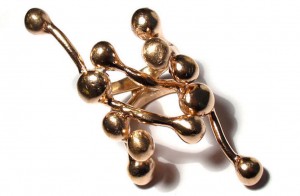
The jewelry in the store were all custom designs by Monica Castiglioni whose main medium of work is bronze and wax. There were two main types of jewelry on showcase in the store: her bronze coral-like collection, and the 3D printed jewelry.
The consultant at the store explained that Monica was inspired by fractals for the coral-like design. Incidentally I was quite infatuated with fractals for two whole years of my life, so I genuinely peed a little when I heard Monica Castiglioni understood the appeal. She uses the lost wax technique to create the bronze models. The permanent mold is made out of silicone, so the designs can be replicated, but considering the soft quality of silicone, no copy is really ever the same. All unique.
Bronze coral reef-like ring inspired by fractals
The consultant also told us about the properties of the bronze used. The casts are 100% bronze so the material reacts quite easily to different bodies, atmospheres, and maintenance techniques. The oxidization of the bronze also adds to the uniqueness of each piece. Since the bronze also reacts to body oils and pH, there is a very personal and contact based relationship between the wearer and the jewelry. I though this was a rather ingenious was of strengthening the relationship between consumer and material possession, and making her creations a little more valuable and personal to her customers.
This also changed my perspective on how i view oxidized jewelry. Typically it indicates impure quality of the material used in the creation of the piece. Monica Castiglioni flipped the tables here and actually used what degrades the value of most jewelry as valuable. If nothing, the prices clearly indicate just how much they’re worth.
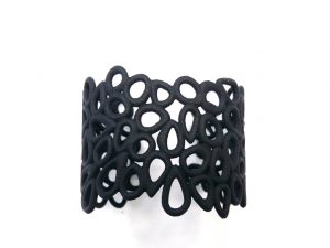
Her other set was the newer collection of 3D printed jewelry. Monica Castiglioni apparently prefers to work hands on, so with her 3D creations, she didn’t actually create digital renditions, but used her bronze and silver models as prototype designs, and left the rest to the digital experts. The pieces we looked at, a variety of bracelets and one long chainlink necklace, seemed very brittle and delicate, but the material is surprisingly pliable and allowed for the hand to slip in and out easily.
3D printed bracelet.
Beautiful jewelry, and fascinating methods of creation.