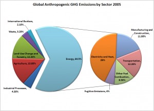
 Source: Center for Climate and Energy Solutions
For at least a decade, electricity production has been the largest single contributor to global greenhouse gas emissions. Yet, apples to apples comparisons between countries and fuel sources are surprisingly difficult to find. To address this problem I decided to calculate the numbers myself using readily available data sources.
First, I needed to identify the most appropriate metric for cross-country analysis of electricity. Traditionally, comparisons among energy sources use British Thermal Units (BTUs). This can be a really useful metric if you want to compare consumption across multiple sectors, such as electricity production, natural gas heating, and transportation. But because I was only interested in the electricity produced from power plants, it was much more useful to use watts for comparison (a measure of the rate of energy transfer). Each power plant has a calculated maximum electricity output potential, known as nameplate capacity, which is measured in millions of watts, or megawatts (MW). Some studies will compare installed capacity across countries, but I dislike this method as well because it fails to take into account actual power produced over time.
All power plants, regardless of fuel source, will be down from time to time. A power plant’s capacity factor measures this ratio of power produced over time against its potential output at full nameplate capacity. Thus, nuclear plants in the US have capacity factors between 88%-91% because they are slow to start up and expensive to turn off, whereas solar PV averages 15%-25% because the sun does not always shine at the proper angle, or at all, for half the day. Ultimately, electricity output for some fuel sources will stay constant throughout the day, while others vary significantly depending upon location, technology, maintenance, electricity demand, and weather, among other factors. For all of these reasons, the best way to capture the true output of power plants (and thus GHGs) is to measure how many watts of electricity are actually generated by the plant over time. This is measured in thousands of watts expended for one hour, or kilowatt hours (kWh). For a sense of scale, the typical home in the US uses 902 kWh per month.
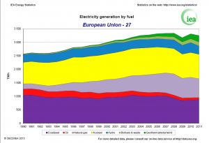
The IEA publishes excellent standardized time series data for electricity generation by fuel for most countries around the world. For country-level analysis, the IEA uses annual terawatt hours generated (TWh – trillion watt hours), organized by fuel source. However, when laid side by side, I find that the IEA’s presentation of this data can be very misleading.
At first glance, these two graphs give the impression that India’s electricity generation has taken off, while the EU-27’s has remained fairly stagnant. This is misleading because both the x-axes and y-axes for the two graphs are scaled differently. The analysis for India begins in 1971, when the IEA began tracking these statistics. Obviously, the EU did not exist in 1971, so the IEA’s analysis for these states begins in 1990. If we were to compare the gross increase in electricity generation for the EU and India in Terrawatt Hours (TWH – trillion watt hours) from 1990-2011, we would see that their absolute growth has been closer than the two graphs would lead us to believe. The EU produced ~700 TWh more in 2011 than they did in 1990, while India produced ~900 TWh more in 2011 than they did in 1990. The graphs also give the impression that India is catching up to the EU-27 in electricity production, when in reality the EU-27 produced 3x more electricity than India in 2011.
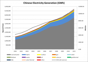
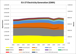
Luckily, the IEA makes their data on annual electricity generation by fuel freely available to the public, so I used their data to make my own graphs from 2001-2011 for the world’s top 5 GHG emitters. I also added a line for emissions output by country for the same time period to show the relationship between electricity production and aggregate GHG output from all sources. Here is the real picture of electricity generation and GHG in absolute terms:
These five entities produce 65% of the world’s electricity and 55% of the world’s anthropogenic greenhouse gas emissions (data combined from IEA and CAIT). The charts also make clear that the power sectors in China, the US, and the EU are magnitudes larger than any other country on Earth. For this reason, their GHG emissions are magnitudes larger as well. I thought it was quite interesting that the GHG emissions line trended right along with electricity production. The dips in production from 2008-2010 represent the global recession, the effects of which were most pronounced in the US and the EU. I found it very interesting that the recession corresponded with similar dips in GHG emissions. Furthermore, the Chinese and Indian electrical output appeared unaffected by the recession.
In my opinion, rather than seeking a grand multilateral agreement between every country in the world, regardless of GDP and political will, perhaps the more practical solution is for the US, China, and the EU to find ways to change their fuel mix to less carbon intensive power generation. This is already occurring in some EU countries like Germany, France, and the Netherlands (at least before the Fukushima disaster) as well as in the United States. China already possesses the largest hydroelectric capacity in the world as well as burgeoning wind, solar, and nuclear industries. China also possesses vast shale gas reserves. If China can deploy these new technologies and slow down their construction of new coal-fired power plants, then perhaps their emissions will level off in the next decade. From these charts, it appears that China is certainly in the driver’s seat for the foreseeable future.


