Reflection

IMG_4051 IMG_5358.JPG IMG_5559 IMG_5661 IMG_5667 IMG_5901 IMG_6241

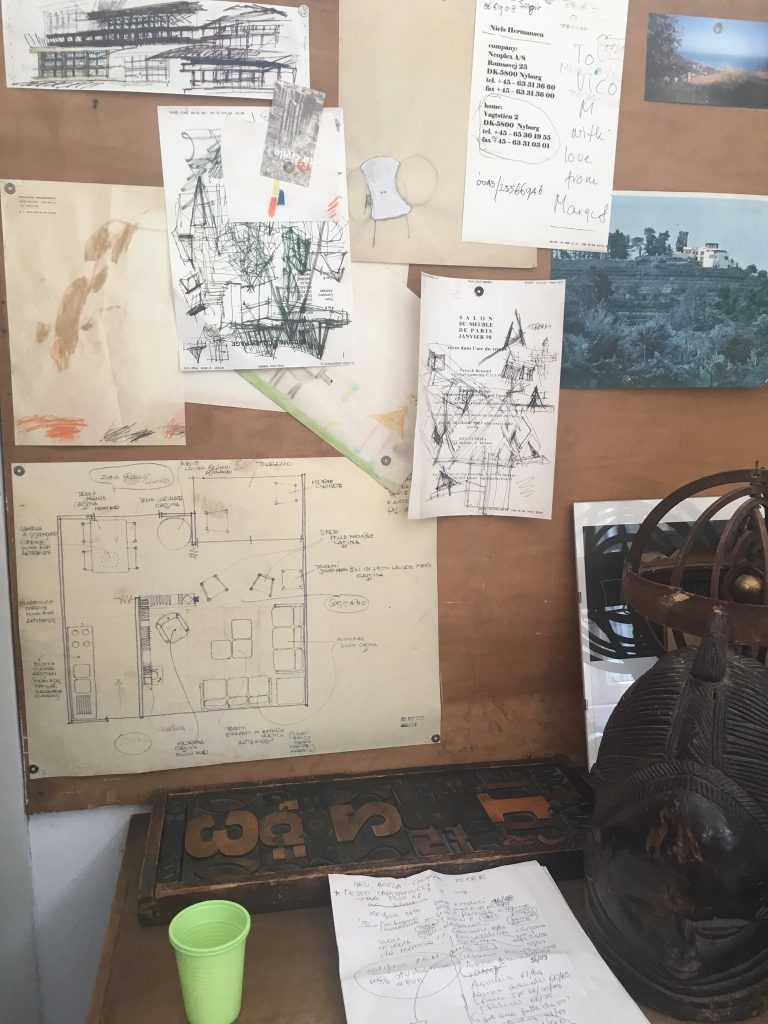
Italy changed my perspective on Design. Going through my years at UT I thought I always wanted to focus on purely graphic design, but learning about many Italian Designers they were successful in many different sectors of Design. Personally I am now very interested in light and furniture design and would like to not just focus one part of design but dabble in many various areas of design. Visiting Castiglioni’s studio, was one of my favorite days in Milan. I like how he would have a problem or something minuscule that bug him and he would create something to fix it. For instance the Mayo jar spoon that goes around in the very bottom part of the jar that usually you have to just keep it in the jar and throw it away. Another one of his inventions that I liked was the small sugar spinner that allows you to add sugar to your espresso without rudely dinging your cup to dissolve the sugar. This started to get me to pay attention to small things in life like this and how I could propose a way to add something new that would benefit a small change.

Also lack of phone data was a good push for learning your surroundings better than I could have possibly if I depended on a maps app. In Austin, I have been there my whole life so it is harder to get lost. In Milan, it was fun to get lost and find your way back. The first day I was a little overwhelmed, but by the third day I started to notice how close the different metro stops and different areas of Milan are, and how it is very walkable. One morning I recall running in a small park near my apartment, and the park was much smaller than I thought, so I kept just running and found another path that took me to CityLife. At the time I did not know anything about CityLife, but it was amazing to just run and see how different a city can change within a five minute walk/run down the street from my apartment.

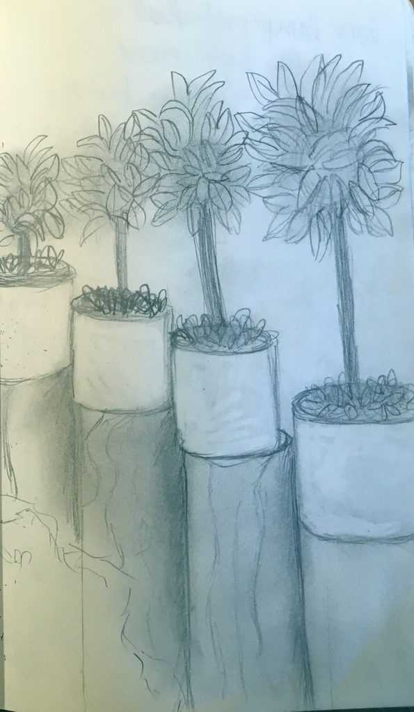
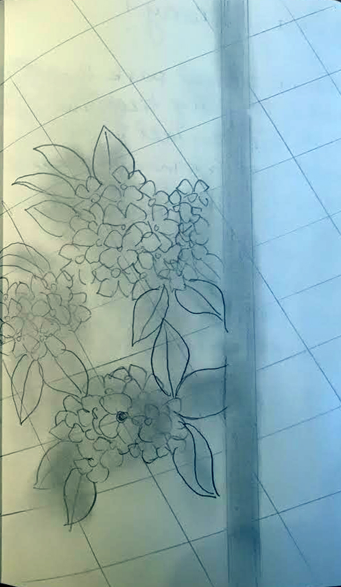
The last thing that I really enjoyed was capturing and sketching the biodiversity and plants in an urban city like Milan. I would really like to play with different growing methods of vegetation in Austin. Overall I think it will be challenging and the seasons for different foods such as tomatoes are a bit shorter in Texas. I would like to push for more plant life within urban developments and architecture as Austin is loosing more and more rural and less developed rural areas. I would also like to reach out to UT’s microfarm and to Farmhouse on how they think the best way plant life in urban areas can flourish.

This trip has really inspired me to shake up my typical design thought process and work in areas that I typically thought were out of my reach.
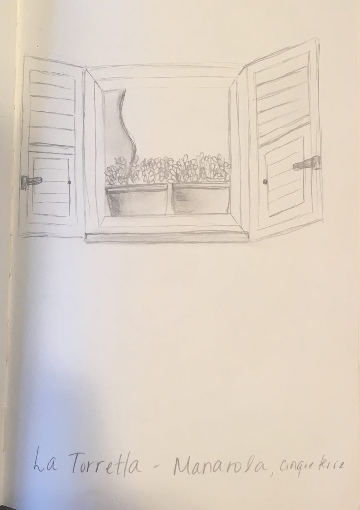
Cinque Terre – Sketchbook

IMG_3108Cinque Terre Day Trip was a heavy influence on my decision to focus on vegetation in urban areas and developments within the city. Overall Milan has been very groomed and the plants and trees are contained with much maintenance. In Cinque Terre, many of the plants just grow wildly and they take over the area they are growing in. Personally I stayed in Manarola, and noticed there was a large population of elderly people, so one thought was that the flowers and plants were not as contained because it would be harder to control plants at such a steep level for older generations of people. Another spot in Manarola, was the cemetery had crazy amount of pink flower bush, which I’m pretty sure was Bourgenvilla. I liked how the flowers took over the cemetery with new life, in comparison to other cemeteries that have dead flowers sadly sitting on top a tombstone. Manarola was where I noticed the most plant life because it was more quiet. While traveling to Monterosso I’m sure I missed lots of vegetation but the crazy amount of tourists walking within area was very overwhelming and it made enjoying the area around very difficult. Cinque Terre had beautiful plant life, despite the overwhelming amount of tourists. I hope to be able to hike the whole thing If I ever get the opportunity to go back.sketch 5
Milan – Sketchbook

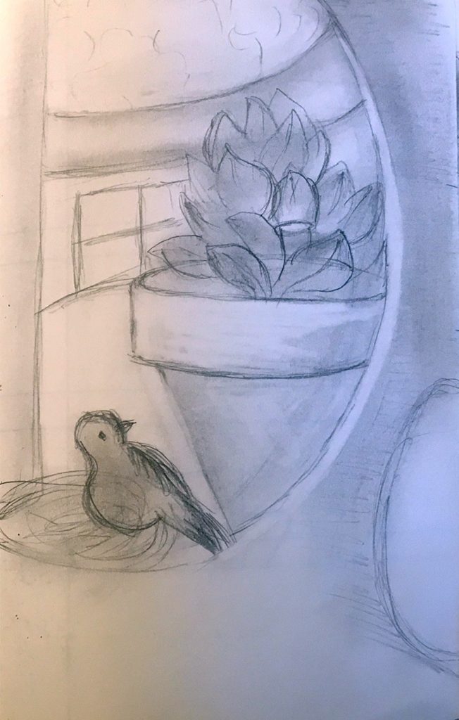
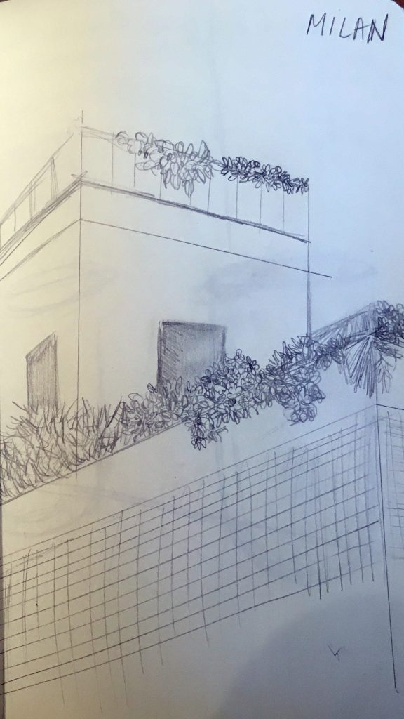
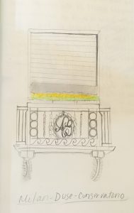
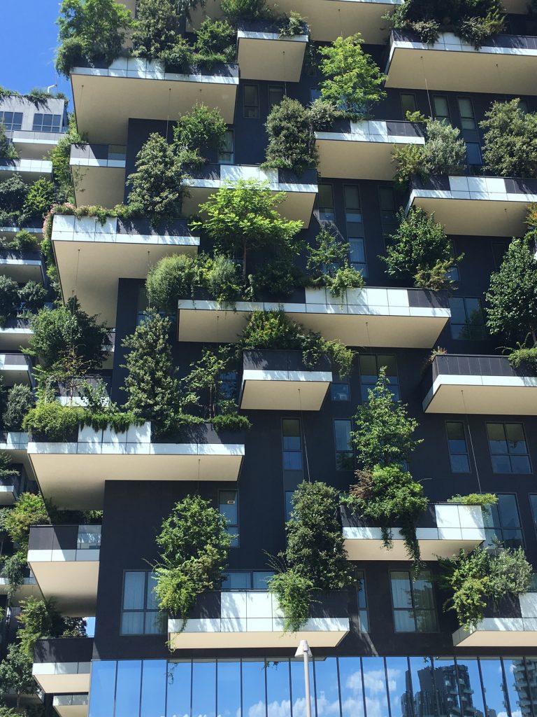
Milan is filled with hidden gardens, whether they are in the courtyards of buildings or if you look up to the rooftops. I was amazed at how there is so much vegetation in such an urban city, and wanted to explore the different ways urban plant life flourishes compare to many of the most populated cities. A key factor I am sure is the climate and fertile soil within Italy, but I hope there is a way to spread this idea of continuing to have plant life as populations continue to grow in urban cities. At the Exhibit at the triennale Milano of Women Italian Designers, towards the end of the exhibit had petite circular windows that I noticed many people just walked by. Once you look through the windows there was a larger than life flowerpot, and a huge bird in a bird nest. This was a true exaggeration of how hidden and quaint so much of the vegetation is within Milan. The next buildings such as the Bosco Verticale (Vertical Forest) and CityLife by Hadid are great examples of how we can have Vegetation flourish and have sustainable residential buildings and continue to help urban biodiversity grown.sketch1 sketch2 sketch3 sketch4

Brion-Vega Cemetery

cem3cem5 cem2cem1

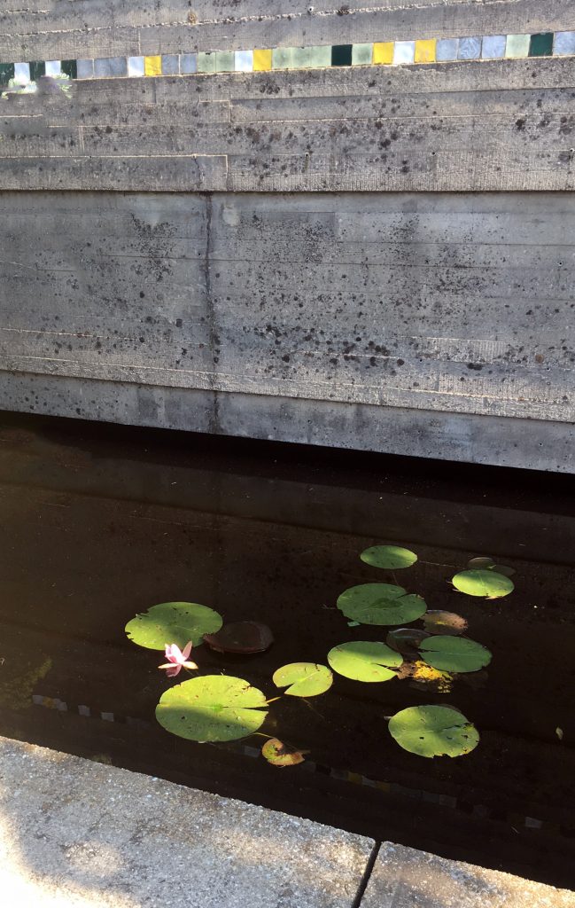
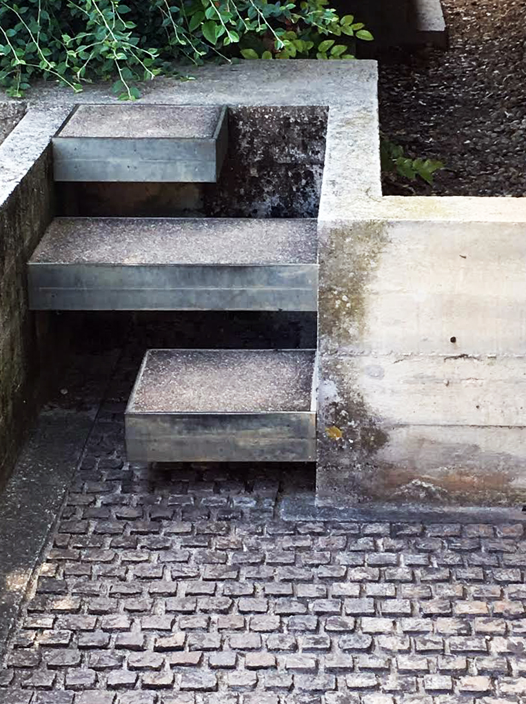
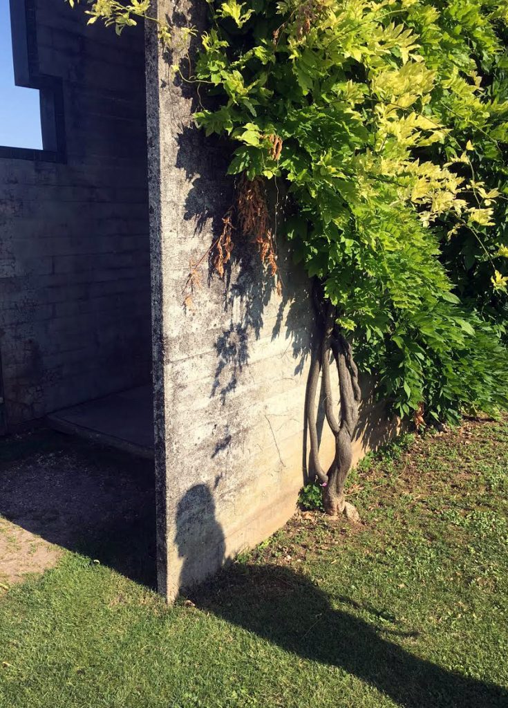
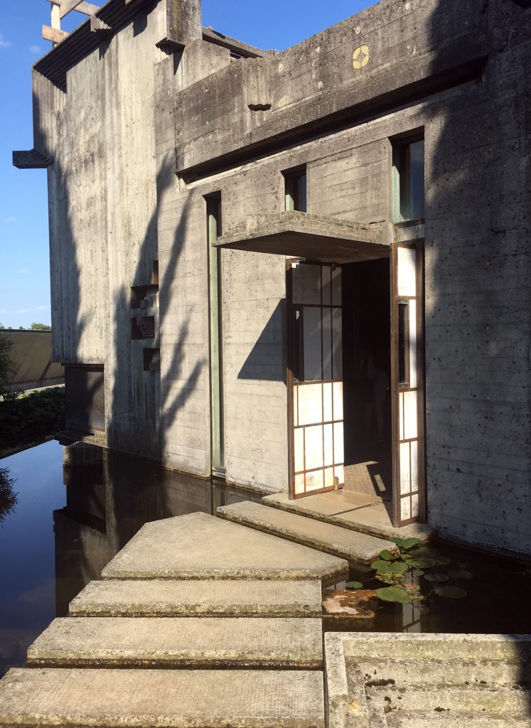
Visiting the Brion Cemetery and the cemetery in Milan, has made me think and reflect more on death. While first looking at Brion Cemetery, I noticed that there was no iconography or overwhelming amount of religious symbols, even within the chapel. I was curious to see the religious beliefs of Scarpa, and I fount this quote he said, “I would like to explain the Tomba Brion…I consider this work, if you permit me, to be rather good and which will get better over time. I have tried to put some poetic imagination into it, though not in order to create poetic architecture but to make a certain kind of architecture that could emanate a sense of formal poetry….The place for the dead is a garden….I wanted to show some ways in which you could approach death in a social and civic way; and further what meaning there was in death, in the ephemerality of life—other than these shoe-boxes.” This so far has been the closest person that I agree about life after life. Personally I have been raised Catholic, and Catholic funerals are very heavy, and create this uneasy feeling and confusion. I feel with Scarpa, his post modern aesthetic compliments the meaning of death. In our reading written by Kenneth Frampton, Frampton claims “Scarpa sought a transcultural, ecumenical expression that would transcend the Christian preoccupation with guilt and redemption. The idea of death as a joyous reunion, indissolubly linked to the erotic, is subtle confirmed in this instance by Scarpa’s cunning use of Chinese character Double happiness, a character traditionally employed on the occasion of a wedding.” One thing I was struggling with was the meaning of the water. At first I thought the water and the path walking on water, was similar to being close to death, and that we are always close to death, we can always fall. Frampton states that the water symbolizes both regeneration and death. After I read more into depth after reading and seeing in person, I thought the water lily garden was a way for the water to symbolize that water contributes and creates life and does not always only associate with death. Frampton summarizes Scarpa, “Throughout his work, the join is treated as a kind of tectonic condensation, as an intersection embodying the whole in the part, irrespective of whether the connection is question is an articulation or bearing or even an altogether larger linking component such as a stair or a bridge.” Scarpa pays attention to very small details that help the viewer of his work understand the message and meaning he is portraying in his work.

Studio FM Milano

gd2

gd1

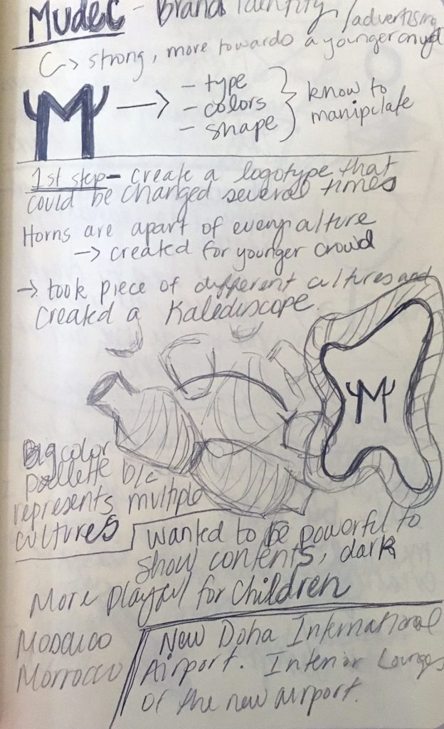
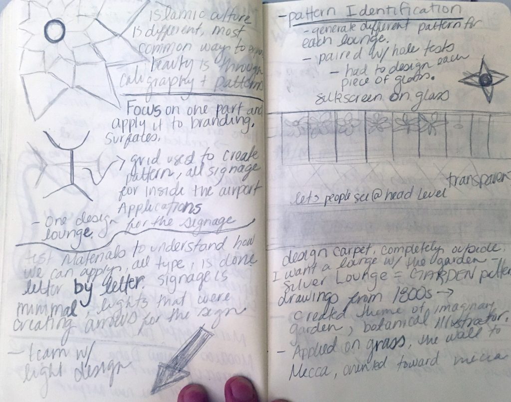
One of my favorite places to see was the visit to Studio FM Milano. I loved walking into courtyard and seeing all of the bikes lined up near the door with random flower pots. Walking into the studio, I felt nostalgia of my old internship with Transmission Events in Austin. In both offices/Studio they have a huge table where the whole team is a part of the table, and the upstairs is the conference room for meetings or clients. Studio FM Milano was bit different and felt slightly more tangible than other studio visits. The studio did all completely different projects from the Culture Museum, The Mudec, Airport design, School Branding, and Expo Design. It was fascinating how for the Mudec branding they played and made different complete typefaces for just a few letters they needed in the alphabet. I think this is a great strategy while struggling with a brand or identity that you are stuck with. I also liked how they based all of their brands with one or very few symbols and then they incorporate them in every component of the design process and final product. This studio was amazing!

Museo – Kartell experience

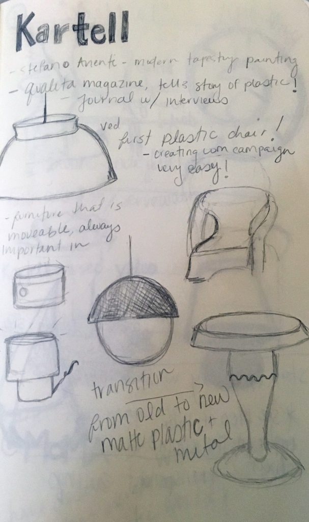
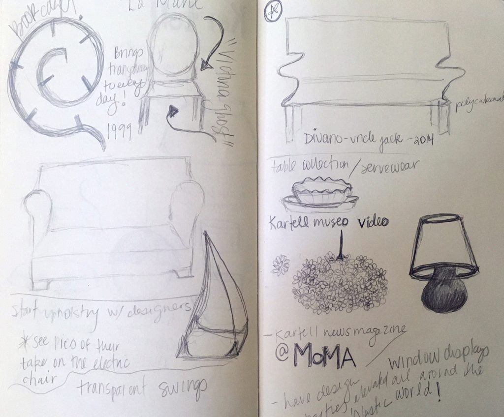
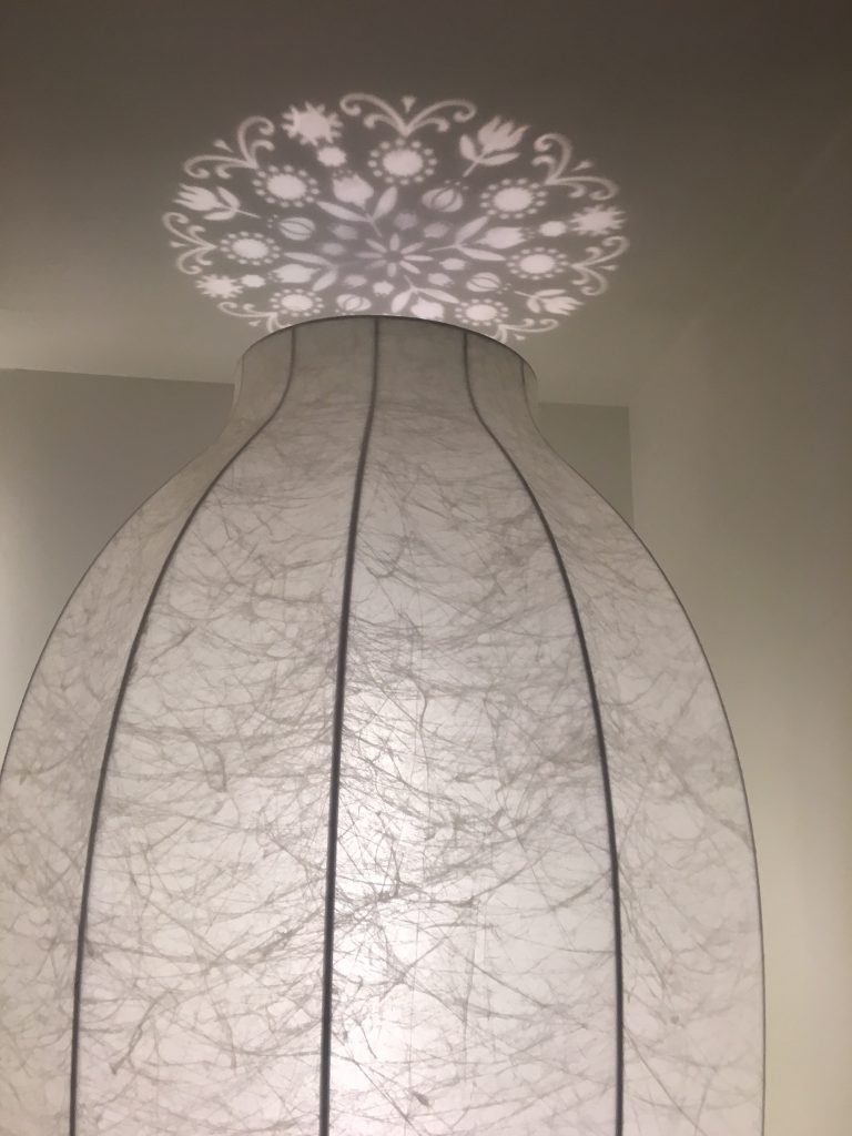
As a class, we got to see the the Museo Kartell. The space when you initially walk in is open and you are encompassed by clean and stunning exhibitions and window displays. Kartell was initially started by selling car equipment and lab materials, but as time progressed Kartell’s goal was to introduce plastics into people’s homes. This was at the same time as “the Beatles reached number one in the charts in 1963, so young consumers sought out design artifacts to express shared youth culture and identity.” With the emergence of this new type of interior furniture, I couldn’t help connect the new concepts to the rise in Popular culture. In one of the readings for class, they defined the shift in 1960s-70s, as “This appreciation of popular culture grew enormously in the 1960s, with the emergence of Pop Art, and the relationship between design and popular culture went from strength to strength. The motifs, forms, and cultural references of popular culture are now integrated into our understanding of contemporary fashion, graphics and advertising.” Kartell began to pick up speed in the 1960s and was a crucial part of Italian Interior Design. In the 1970s, there was a shift. Kartell was invited to be apart of an exhibition at the MOMA. The exhibition was called “Italy, the new domestic landscape” which was dedicated to Italian furnishing design. This exhibition at the MOMA resulted in Kartell gaining much more world wide publicity. This relationship of design and art is good example of the Modernist Movement and how popular culture as we know it, is defined by art and what encompasses us daily. Pop design “particularly in graphics, was also characterized by a revival of Victorian and Edwardian forms”, and the main staples that Kartell produce are a modernized version of these classical art time periods. For example, The Bougie lamp, designed by Laviani is a baroque-like styled mix of modernity, that has a classic appearance but is also ironic and funny. Similarly, the LaMarie chair by Phillipe Stark is timeless, but it was also the world’s first completely transparent chair, its a combination of robust exterior at the same time having a new kind of lightness that has never been made before in interior furniture. Kartell continues to create and be influenced by the ever-changing world around us. They continue to work with famous musicians, and designers to keep their name and quality high, as there is more competition with cheaper products that are less timeless. Kartell has also dabbled in place settings and fashion, and they are continuing to shift their brand as the popular culture is continuing to change.Kartell 1Kartell 2

Sensory Effects of Architecture

Our final presentation was tracking our feelings and emotions as we walked from Bocconi University to Torre Velasca. Overall starting at Bocconi, the area was young filled with students on campus, and people running, it was extremely inviting to be a part of. As we walked to Torre Velasca, the emotion shifted completely. Torre Velasca is considered a symbol of modern design of Milan’s architecture but it influenced by the buildings around it. It is also styled to be similar to a medieval clock tower. The building received mix feelings from the people of Milan. While we were walking in the area and around the Torre, the area was vacant with little movement even during a rush hour time period. We also noticed that they are reconstructing the building and have a mini exhibit on the architects who are going to renew the appearance. There are efforts in place to make this important building inviting once again. The walk shifts quickly from happy to uneasy, and we made a color coding system that expresses the emotion/feeling with a specific color as we walked.

Tra Arte e Moda – Ferragamo


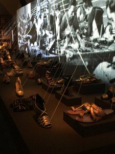
sam4While In Florence I visited the Museo Salvatore Ferragamo, and the exhibit in English is called Across Art and Fashion. When you first walk into the museum there is an installation that has multiple kinds of shoes, and a piece of string that connects the shoe to the a mini animation of shoemakers from the past. The show illustrates Salvatore Ferragamo’s inspirations, and collaborations of the 1950s and 1960s. Osam1nce you pass the shoes that are with the animation there is a wall that is covered in custom shoes of famous celebrities like Audrey Hepburn. There is a constant back and forth between fashion and art. As you continue walking there is a series of huge self-portraits of Andy Warhol. A few of them are out of focus, and there is one that he has completely transformed his appearance as a girl with 60s hairspray hair. The museum also features multiple pieces of fashion like dresses, and mirrors, that go beyond just Ferragamo’s shoes. Not only was Ferragamo inspired by pop culture but also the Futurists. He shared their views and interests of bright colors, and geometric shapes, and he also enjoyed experimenting with unusual materials. This exhibit is a must if you are in Florence! It is also nice to be in a museum that you do not have to wait in a very long line as well!
sam2

Mapping Project

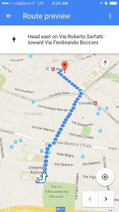
As a group we had our first walk from our first location Universita Luigi Bocconi, to the Torre Velasca Piazza.

IMG_3379

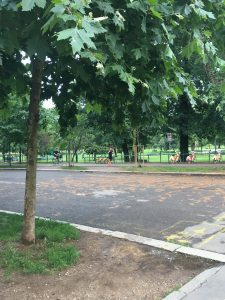
The route was about an 18 min walk. At first arriving to the Universita, it is encompassed by a beautiful public park, with students and people buzzing all around. The closest feeling of this space would be Washington Square Park in New York. As we continued to walk down the path the buildings went from some student living apartments, to hip bistros and bars, and then to a residential area that was less modern with huge magnolia trees, and Jasmine growing everywhere.

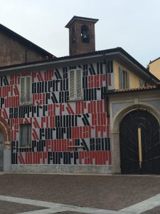
IMG_3362There was a turning point when we  passed an archive building that the whole front was covered in Medieval gothic text. Once we passed this building, the path we were walking was no longer inviting, and felt very stark. We arrived to the Torre Velasca, and the area was basically dead. The tower spread this cold feeling, and there was not many people walking in the area. It was very fascinating to see the transformation of our walk from the beginning to end.

IMG_3376

Plants in Urban Life!

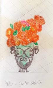
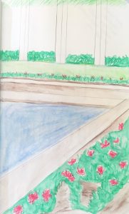
I wanted to focus my sketch notebook on vegetation in urban life across Italy. The climate in Italy is amazing, allowing so many flowers and plants to flourish, and that immediately grabbed my attention. With most of the streets of Milan covered in centuries and new architecture, I expected there to be much less plant life similarly to when traveling to New York. This was actually a surprise, but the more you look at most apartments and buildings there are vertical gardens, and lots of mini squares hidden within the developed space of Milan. They are interesting to look for because most much of the plant life is hidden or high up above. There are also several plants that are found back at home in austin like Jasmine for instance. Plant life is also a prime way Italians can also decorate and customize their living spaces and differentiate what their balcony or square looks like from their neighbor and house located near them. These few drawings I have included are all different spaces. One is a private pool to a house that was built by an architect that we discussed in class. Another one of the sketches was a vase that I walk past every few days that has bright orange and warm colors. The last picture is of a balcony that had intricate details with small yellow flowers

.sketch3sketch2sketch1

Social Widgets powered by AB-WebLog.com.