sketchbook : week 2

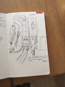
I’m so pleased that I have finally gotten over the initial hump of generating content for my sketchbook. In the first week I was thinking too hard about how I wanted to set it up or how neat I wanted it to be but once I stopped caring about it being perfect, all of the visual thoughts I was having starting flowing out onto my pages.

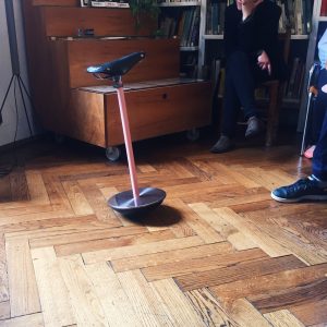
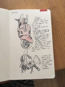
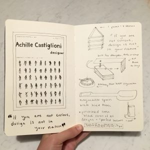
Castiglioni’s studio really kick-started my creativity because there was SO MUCH to sketch and I really wanted to remember all of the ingenious inventions I was seeing. Some of his devices were a challenge to illustrate because they had dual functionality, such as “cow-milking belt” or the tiny swinging desk he built for his daughter. I’ve been enjoying utilizing arrows to demonstrate how things work.

FullSizeRender (3)

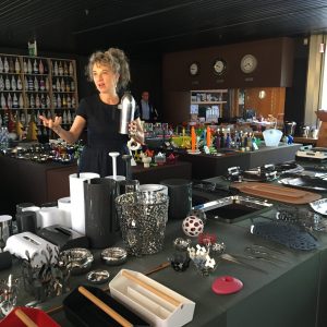
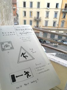
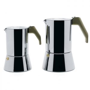
Since I finally narrowed down my focus on branding, I started to pay attention to my surroundings much more. For example, when we went to Alessi, I was completely unaware of their logo for the entire duration of the tour. The first time I realized that they use heavy red typography as their logo was when I stepped into the gift shop. I found it interesting that they paid attention to the branding in the gift shop and neglected the factory.

FullSizeRender (4)

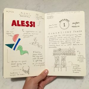
On the other end of the spectrum, a few of us went to the Fondazione Prada in Milan to check out Bar Luce which has extremely consistent branding. Bar Luce was designed in part by Wes Anderson which made complete sense upon walking into the cafe. The interior was minimalistic to an almost surreal extent with pale pinks and greens lining the walls and ceilings. The logo was plastered on all of the menus, mugs, and coasters. Everything matched and was perfectly placed, much like how the scenes appear in his movies. I had fun making notations of my observations, it made me feel like I was really taking in the whole experience.

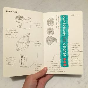
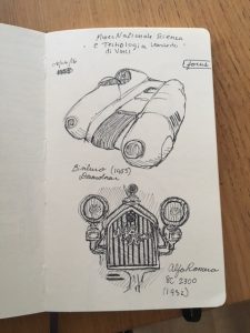
I fell in love with the branding of the Museo del Novecento so that was a great opportunity to use my new Stabilo pens in my sketchbook! All of the coloring was very consistent and the graphics were minimal. It is interesting to see the big museum brands juxtaposed with the small pieces of branding I come across from day to day such as a breadbasket label I stumbled upon at lunch one day. At first I was attracted to the design of the basket which was a machine-washable paper bag material. Upon closer inspection I realized I really admired the label and that ended up taking up a whole page in my sketchbook. The lesson is to always keep my sketchbook in hand so I am ready to sketch when I least expect it.

FullSizeRender (2)


Study of Boccioni

One piece I wanted to focus on is Antigraceful by Umberto Boccioni, which happens to be a bust of his mother from 1913. This sculpture is one of the first sculptures that emphasizes his rejection of past and present art canons. There was this quote that Boccioni stated “We must smash, demolish, and destroy our traditional harmony, which makes us fall into a gracefulness created by a timed and sentimental cubs.” This sculpture was part of Palazzo Reale’s Umberto Boccioni: genius and memory exhibition. This sculpture emphasizes a drastic change from his older work that was very traditional of the time. He painted dozens of rationalists/impressionist paintings and studies of people/portraits. It is tempting to assume that this work was influenced by some of Pablo Picasso’s work, but it could vice versa. The cubist portrait emphasizes his mothers features such as her eyes and nose, but in a way makes each of the wrinkle lines change in different directions.

In the class reading over the past week in the book Made in Italy, there is this quote on futurism and design: “In the words of Merjian, “Rather than use design as bulwark against industry, the Futurists were the first avant-gardists to collapse such distinctions so radically or at least to call for their collapse.” Befitting, perhaps, a movement glorifying war, futurism can be said to have inaugurated Italian design’s age of extremes, by bringing together modernist aesthetics and the material culture of industrial society.” Boccioni is an excellent example of Italian artists of the futurism movement, changing the process and work of his art.

In the drawing and sketches of Contre-Jour in 1910, is also one of his first examples of taking a step back from what he has created in the past, and changed his concepts to a more futuristic approach with the more crazy details than the image looking more like a portrait from the past.

A later painting I wanted to learn more about is called “Study of a Woman with Houses”, by Boccioni. This painting still uses pastels similar to the impressionists but it starts to have more of a cubist futurist aesthetic. I read theFuturist manifesto at the Museo 900, where this painting was located, “ All things move, all things run, all things are rapidly changing a profile is never motionless, before our eyes but constantly appears and disappears.” This painting shows how the light and shapes are frequently changing, and to form compositions with more rigid lines than to make the work perfectly organic and alive.umberto boccioni 1milan2

week two : boccioni

Umberto Boccioni only lived to be 34 years old, yet he is known to be the “principal artist of futurism.” This speaks to how the vast amount and quality of his work and how high he is held especially by the city of Milan.

Being able to walk through his beginnings allowed for a better understanding of Boccioni’s work and process. Due to his worldly travels as a young man, he was able to study under some great European artists and try out many different styles and techniques to help shape his career.

three women

One work of his that I was drawn to at the Boccioni exhibit is “Three Women,” a portrait that was done at the dawn of futurism. Categorized as a divisionist work, Boccioni’s brush strokes are done in a way so that you can see the individual colors instead of there being a gradient between them. This piece is a good example of the transition from divisionism to futurism because you can see Boccioni begin to focus more on the lighting in the women’s hair and dresses instead of the actual women. The strokes that are meant to be rays of light coming in somewhat take the focus away from the women.

the-drinker

This painting, “The Drinker 1914,” was done at the height of futurism for Boccioni. Compared to the portrait above, the brush strokes are much more pronounced, the lighting is even more dramatic, and the color is more intense and vibrant. Unlike much of his earlier commissioned work, this painting is an observation of Boccioni’s, not something he is getting asked to paint by a patron. The man featured is not really the focus at all. Boccioni has also broken down the painting into shapes and colors, leaning towards some inspiration possibly from Pablo Picasso.

boccioni : week 2

This week we visited two museums in the heart of the Duomo area of Milan. The first was an Umberto Boccioni exhibition at Palazzo Reale and the second was the Futurism wing at the Museo del Novecento. I chose two peices from each museum that I thought captured the essence of Futurism in similar ways. The first is the classic scultpure by Umberto Boccioni, “Unique Forms of Continuity in Space”, that depicts a man in motion. With the growth industrialization and the machine age, the futurists were obsessed with the idea of movement. Motion manifested itself in transportation and the general mechanization of products used in everyday life. When we headed over to the Museo del Novecento, I stumbled across a painting by Giacomo Balla that featured shapes similar to those on the sculpture. This painting features Giacomo’s daughter running on a balcony. He chose to represent the motion by repeating the shape of her body over and over again. I thought it was interesting to see a similar concept fleshed out in two dimensions versus three dimensions. I can imagine this style being radical at the time because not only were people being exposed to new style, but they were also having a whole new industrialized world thrust upon them which was probably overwhelming.


'Unique_Forms_of_Continuity_in_Space',_1913_bronze_by_Umberto_Boccioni
“Unique Forms of Continuity in Space”, 1913, Umberto Boccioni
fut_069
“Bambina x Balcone”, 1912, Giacomo Balla


week two : castiglioni

IMG_7350

This visit, hands down, was the highlight of my week. In all honestly, I had no idea who Achille Castiglioni was until a few weeks ago. Now I am obsessed with him: the way he brought a certain wit into every one of his projects, his seemingly controlled hoarding of funky objects, his fearlessness to dive into any and all challenges, and his beautiful and chaotic studio space.

One thing I kept hearing and witnessing during our visit was Castiglioni’s practice of “shape follows function.” I find it so easy to run head into a project with a focus on how the end product will look. I know that this is wrong, and seeing it worked out in so many of his designs really helped me digest why function should be a designer’s first thought. I want to begin studying the world as he seemed to. Looking at everything and every situation as a potential place to step in and make things a little better, make things run a little smoother. One way in which Castiglioni seemed to do this is by making things minimal. If you don’t need to complicate things, don’t!

Not only did I love ogling at all Castiglioni created and collected, but I learned so much in the hour we spent in his studio. Not only about him, his process, and his design philosophies (all wonderful by the way) but about myself as a designer. I tend to want to put myself in a box. I’ve spent the last two years trying to figure out how to label myself. I want to be able to say, “I am a graphic designer,” or “I do brand design,” or “my focus is in user interface design.” Not that these things are bad, but something I’ve begun to notice on this trip is that I do not need to set up camp in a certain genre of design. Massimo Vignelli, the man who designed the New York subway signage, said that “if you can design one thing, you can design everything.” I want to live my life as a designer with that saying as my mantra. Castiglioni came running wherever a need popped up: whether it was a massive arching lamp, a mayonnaise jar knife or a bike seat chair. I think he believed that he could design anything and everything. So if it’s good enough for Castiglioni, it’s good enough for me.

Processed with VSCO with g3 preset

Processed with VSCO with c1 preset

alessi : week 2

It seems as though after the conclusion of every one of our design outings, the latest is always dubbed “my new favorite”. This could not be truer for our visit to the Alessi factory. As we approached Alessi by bus, we wound through the mountains and small scenic towns. Near the entrance, we crossed a bridge with water running under it which we later learned powered the entire factory when it was founded in the early 20th century. We were swiftly greeted by our enthusiastic tour guide who led us through the Alessi “archives”, which were huge, moveable vaults that contained everything that Alessi has ever produced. The mere organization of it all was something to be marveled. I can’t describe how moving it was to be able to see and handle the prototypes and objects designed by the fathers of Italian design such as Ettore Sottsass, Richard Sapper, Achille Castiglioni, Alessandro Mendini, Aldo Rossi, and Philippe Starck. I got a ton of sketchbook content from this tour because it was all so fascinating. Next we headed to the Alessi store right across the bridge where we were tempted by all of the beautifully designed products. I’m excited about my purchase that is Mario Trimarchi’s ‘Fiato Sul Collo’ necklace, which is part of his highly successful line of products that feature many rectangular pieces converging together. I can’t wait to see what will be my next favorite trip!

IMG_3814       MT11_19472


impressions : week 1

It is hard to believe that we have already been in Milan for a week. I’m surprised at how quickly and easily we all have adapted to the European city life and survived our jam-packed days. Before I discuss my sketchbook, I want to make note of a few impressions I have had during these past 7 days.

It is hard to ignore the high level of sophistication in Milan. As a fashion admirer, I have so enjoyed observing the style of the women and men here. It seems that even the most “casual” outfits are carefully planned and always polished. The street styles often exhibit neutral colors, elegant lines, towering heels, and sleek hair. I spotted my favorite outfit so far on a women ordering a cappuccino while wearing striped palazzo pants, a white tank, and a pair of dainty black lace-up stilettos. One can tell that this is a design-oriented city in every sense.

Another observation I have made is that Italians are patient and kind. I’m trying hard to learn the language both with Duolingo and through the teachings of our linguist, Ilaria, but some phrases are not sticking. I am so grateful that the people I have encountered make a sincere effort to speak English or are kindly receptive to my broken Italian. Hopefully one day I will master this beautiful language so that I can come back to visit or live.

Even coming from New York, the U.S mecca of public transportation, I have been absolutely blown away by how clean, reliable, and navigable the public transportation in Milan is. The options are endless! The metro, train, bus, and tram systems have given me immense confidence in terms of getting out and exploring the city. I’m beginning to think it would be nearly impossible to get lost in the subway because it is so user-friendly.

The convergence of all of these impressions have made for some curious sketchbook content. I am still deciding what topic I will ultimately focus the whole book upon but I have taken some time to explore a few options. Originally, I was thinking that I would focus on the design of chairs throughout the city because I figured I would have lots of content and be able to explore some design history aspects. Our visit to the Musei Italiani provided some great forms to experiment with. However, since I am not truly interested in furniture design, I figured branding, typography, signage, or wayfinding would be a better path for me since I have experience with researching and creating within these facets of design. My week one sketchbook reflects those explorations. We shall see what next week brings!

FullSizeRender (1)


week one : overview

Processed with VSCO with f2 preset

This week has been kind of a whirlwind, but it is a crazy, beautiful, exciting whirlwind that I’m so happy to be a part of! Milan is wonderful. The metro is ridiculously clean, our new Italian friend Anna is so helpful, gelato is on every corner, and there are flowers on almost every balcony in the city. We have only been here a week and we have already seen so much. My feet are a little tired but it is all more than worth it. Going to museums to see exhibits is comparable to walking down the streets here. You can see so much history and gain insight into the workings of the city just by observing your surroundings. 

 And if I haven’t said it enough, everything in this city is beautiful: the people, the architecture, the cafes, the language, and honestly, one of the most important, the food.

Coming here, I knew the food would be one of my favorite parts. Don’t get me wrong, I know this might not seem as important as some of the wonderful architectural history or monumental things such as that, but it’s a necessity so it is pretty important in my opinion. Being so struck from the beginning by the food and the coffee and the gelato, I became interested in Italians’ relationships with food and really meals in general. While I am here in Milan, I am planning on studying the Italian dining experience. As of now, I am keeping my topic broad so it can lend itself to the exploration of the different facets within this category. I have begun to notice and sketch different gadgets in the kitchen, customs in cafes, and “timelines” in restaurants. I want to observe and experience as much as I can involving Italian dining and eating habits while I am here. I want to know how things work and why they operate that way.

As this next week goes on, I hope to narrow down my focus and get more in depth in my research.

Adventures at Alessi

IMG_1979

I received a piece of inspiration this week from the Alessi factory- great designers can come from all walks of life. The wide variety of creative backgrounds of the designers showcased in the Alessi archives was a testament to this fact. Architects, artists, designers- all have a different perspective to lend to creating something great.

ars09-3-6-alessi-big

Viewing the various designs was quite inspiring. Seeing so many familiar shapes and forms- I had no idea that Alessi was the birthplace of these designs. I suppose a great design is eternal. It cannot be broken- as evident by the iterations on the famous Alessi coffee maker. It is probably every designer’s dream to create something that lasts so long.

IMG_1980

(Side note: This may be cliché or lame… But the idea that a great designer can come from any school of thought reminded me of the Disney movie Ratatouille. The quote- “Not everyone can become a great artist; but a great artist can come from anywhere.” This gave me hope that I can still create great things even from a different perspective than a designer.)

Week 2 Sketches – A History of Transportation

The focus for my sketchbook is transportation- a topic that allows me to capture bits and pieces of Italian life and the way that people move around the city. Coming from America, where owning a car is practically essential in most cities, adjusting to public transportation has been quite a task.

IMG_2115

Trams, buses, subways, trains- all of these are pretty foreign to me, especially since I’ve lived in cities with no real public transport to speak of. (Do the buses really count in Austin?) Understanding the trams and subways has taken some time, but that doesn’t stop me from looking on at the cars and scooters with envy.

IMG_2113

It’s easy to see why the tiny cars and Vespas became a symbol of independence. With the lack of space in the city and fast pace on the streets, having a small, nimble vehicle is the best option for those commuting or with little time to fuss with public transport. However, I would like to imagine that car and scooter owners still ride the subway, but that their vehicles allow them the choice in the matter of their transportation.

IMG_2114

Alternatively, cars can also be a symbol of status and glamour. We visited the Museo della Scienza e della Tecnologia “Leonardo da Vinci” where some of the most famous Italian cars in history were on exhibit. I sketched the 1955 Bisiluro Dalmonar (an aerodynamic racer that proved to be too aerodynamic) and an Alfa Romero circa 1932. Yes, an automobile can be a symbol and tool for independence- but also for style.