If only students would read the syllabus…
Have you ever wondered how to get students to actually pay attention to the information you’ve provided them in your carefully-written syllabus?
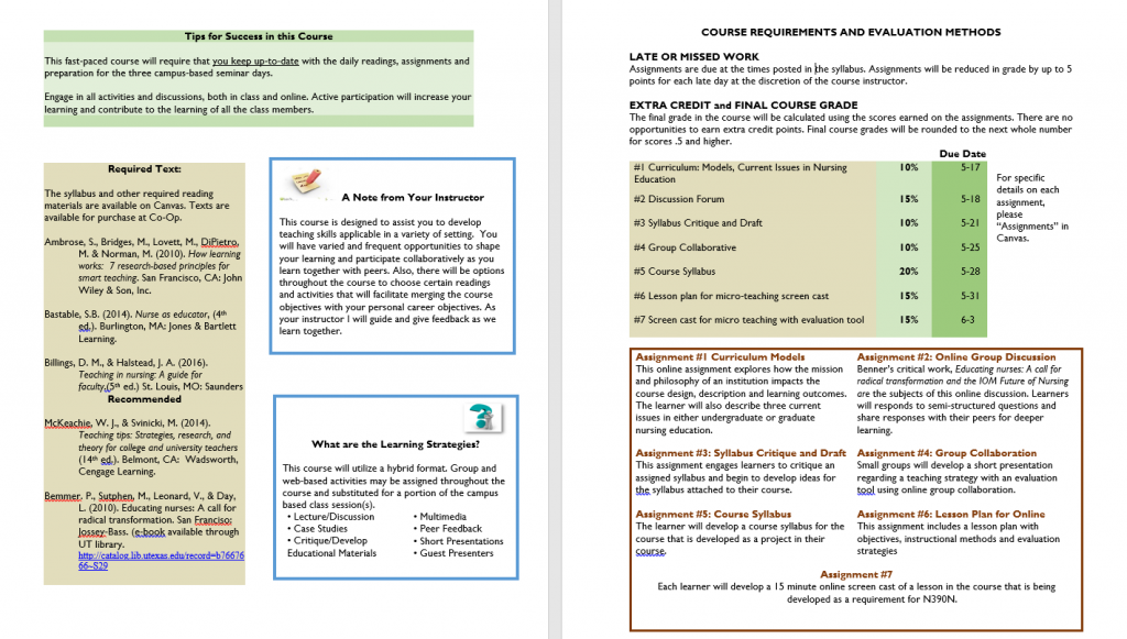
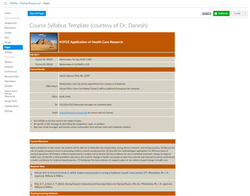
Well, even though you’ve spent a LOT of time on your syllabus, consider this: rather than giving students what looks like a 30-page contract, consider instead giving them something they WANT to read.
Like this:

Or this:

With summer approaching, what better time to take a critical look at your course syllabus consider what an effective syllabus means and looks like?
It might even be just the right time to consider re-designing your syllabus in various ways.
You could create a graphic syllabus as in this example from Jen Moon in CNS.

If you use a Mac, you’re in luck, Apple Pages comes with a Syllabus Template built right in.
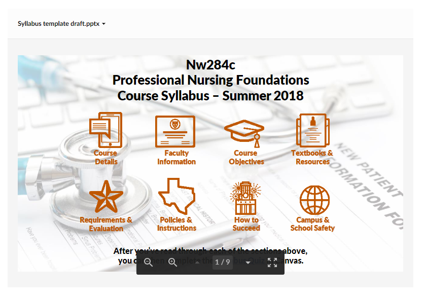
It’s even possible to build an INTERACTIVE syllabus using PowerPoint and other software to make your syllabus not just informative, but maybe even fun!
Here’s just one example of what that could look like:

Finally, here are a few examples of what instructors at other universities are doing:
Your Syllabus Doesn’t Have to Look Like a Contract
Creative Approaches to the Syllabus
If you’d like to know more, please don’t hesitate to contact me at your convenience.


Leave a Reply
You must be logged in to post a comment.